Create scenes with DEPTH that read CLEARLY! - Narrated Procreate Timelapse

Вставка
- Опубліковано 5 тра 2024
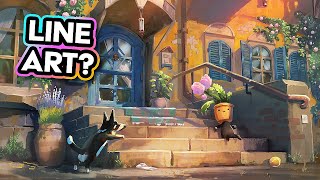
- We might have heard about using large, medium, small for shape designs, but how exactly do we use it in a meaningful way in our art, especially compositions? This video will go over how I think about it in order to create scenes with depth and strong readability!
Follow me on Instagram! / jtuffdesigns
Music credits:
Green Tea by Purrple Cat | purrplecat.com/
Music promoted on www.chosic.com/free-music/all/
Creative Commons Attribution-ShareAlike 3.0 Unported (CC BY-SA 3.0)
creativecommons.org/licenses/...
Cozy Place by Keys of Moon | / keysofmoon
Music promoted by www.chosic.com/free-music/all/
Creative Commons CC BY 4.0
creativecommons.org/licenses/...


I watched a video of yours and thought, yeah it was nice. Then I saw this video and you have CHANGED my life ! I am self-taught, 71 yrs old, and you have just taught me more than I ever considered. I have subscribed, Bookmarked and put you at the TOP of my bookmarks. Absolutely stunned, and very excited as I get back into doing artwork ! Cannot thank you enough.
I am so happy to hear of how this video has been able to have such as impact on you! I will do my best to continue to earn that spot on the top of your bookmarks 😉
The way he explains the drawing process makes it seems so easy to draw dynamic background 😭
There's definitely a lot more to it than what I talk in the video but I think awareness of these concepts and principles should help you better understand the underlying reason why something works or doesn't :) It took me many years of practice to get to this stage so just keep at it 🙌
This video was extremely helpful to me! I love how you break down and explain the whole process and how you're using these tools to create depth in the piece. It makes it so much easier to use in my own works. Thank you so much for this
Gorgeous composition, I hope I can make something like that someday.
Loved the additional diagrams on top. Great content as usual :D
Thank you Lorraine, I think I may have had a little too much fun with the diagrams in this video :D
Thank you for the lecture!
OMG that was amazing 🥰
That’s the good stuff ❤
Very informative!
Thank you again Jourdan! Always an inspiration for us all!
Thanks Danny! :D
Best one Jourdan. Really like how you include the mistakes and explain your decision making :)
Thank you Mr Canon, maybe I'll show more of my mistakes in the future then ;)
I’m taking notes every time, so much advice!
Hope those notes will come in handy! Thank you for checking my vids out!
I just found ur chanel today ..and omg am I glad . Love the content ..helps me a lot
Happy to hear that you are enjoying the content and that it is helping you!😄
Thank you❤ love your works 🥰
Glad you like it!😃
Amazing video , taking notes constanly throughout thank you so much
Thank you so much, happy to hear that you're getting a lot of useful things from it!
thank you so much 🫶✨✨
a very detailed analysis, thank you
Hope oyu found it useful!
Awesome video. I like the idea to use the same shapes to force perspective and forcing smaller shapes in the distance. Inversely I think I have a problem with closer shapes being too small. I gotta get comfortable with bigger shapes upclose.
So many lessons in here. never heard anyone ever call a path, a curved triangle. brilliant.
Thank you! With that said, nothing in art is truly a rule, but the most important concept to take away is the idea of contrast. if you have big shapes in the background, then by contrast, you want your foreground to be smaller! So being mindful about what decisions you are making can help you strategize what you could do for other elements in the scene :)
Wow, this is very useful!!! Thanks!!
Glad you found it useful!
Great video! Share your different color rectangle brush settings, please!
yaaayyy great
Great tips! thanks for sharing your experience :)
Thank you for checking the vid out!
Again, great video Jourdan! At the end everything in art theory is about contrast 😆Great tips on the overdetailiing. Also, I think the topic of sub focal points deserves a video of it's own, at least for me it is a big challange to include those in a composition, Inside my head an Image has to work even when it is cropped, but obviously it is not that easy to create a composition like that
Thanks again for watching Fernando! Absolutely, everything is about contrast in the end. I think cropping it isn't a bad way to check for micro-compositions, but it gets to a point where a super small random crop could feel too abstract to make sense of it, so at least do it at a reasonable size haha.
Could you say how the settings for creating a different color for every next brush stroke called? I would love to try it!
What a great video thank you😊
Thanks for the kind words and for checking it out!
Wow, that painting is cool bro, i just wanna live in a fantasy world : [
Thank you for some excellent content! You are a great teacher. I am very interested in how you create those two brushes you started the composition with. The color changing brush and the scatter brush that creates shapes that go from large to small. Do you have a video explaining these? If not can you tell us about how you set these up? Thanks!
Thank you so much! Currently working on a video covering just that and more! 😄 so keep your eyes peeled for that!
love this vid! watched it through and followed along myself to try and learn the workflow
Thank you! I think what usually causes muddiness is not so much to do with the color but values being too similar. If you take my painting and turn it into black and white (especialyl during the sketch stage) you'll notice that I try to keep a contrast between all of the different materials. On top of that, i also try to keep the shadow values mostly grouped. (I cover this in more depth in my video on Value Paintings!)
great video , bro
Thank you! Glad you like it :)
I love your work, it’s so gorgeous! What inspires you to create what you do?
Thank you so much! Not to sound too cheesy but most of my experiences come from every day life. I highly enjoy slice of life shows where they celebrate the ordinary, as I find moments like those that most people can resonate with. Add in a little fantastical setting about them, and that's my general approach for my art :) "Finding the extraordinary in the ordinary"
Thank you for providing such insightful information! I truly enjoy watching and learning with them.
Could you break down the process of how you render? Or how you use layers in your creations? (if you haven't already)
New subscriber btw, Thank you once again. 🤗
Thank you so much and happy to have you here!! I'd love to get around to doing a video like that sometime and I appreciate the suggestion :)
🤘🤘
How can we get your brushes?
Where can I found brush ? Or what is setting ?
how do i get that scatter brush ?
Can u tell me all your names of ur brush?
hello great tutorial, do you have a link for your brushes ?
Thank you! I'm planning to do a tutorial on how to create it for yourself, so stay tuned :)
@@jtuffdesigns thats even better lestgoo
Hi! Can someone tell me how to change the setting of the brush to make it like his? I think it’s such a good technique and I’d like to incorporate it in my work!
Hey! I'm thinking about doing a video on how to do this since it's been widely requested! So hang tight :)
It get so difficult to learn human anatomy and landscape perspective drawing at same time can I learn only one thing first or I have to learn both at same time ?
It really depends on your goals. But generally, as a beginner, I suggest specializing in one area first. Think of it as spreading your skill points in a game into too many trees. You end up with being mediocre at a lot of things but not being particularly effective at anything. You can always move on to another subject later once you feel more comfortable in one.
I replied to the offender of this but I think others should definitely read this too……You may not agree how he created the piece…but Please understand that there is a profound arrogance in taking someone else’s work and claiming to “fix” it when a simple critique is fine by it’s own. Don’t be this person. Be the opposite of a so-called “art fixer” as they are pretty much the worst kinds of artists. Believing it’s their duty to take other people’s work without their consent and then “fix” it. What’s more arrogant is the belief they are somehow doing the artist a favor…they will come up with flimsy arguments and mental gymnastics as to why they should be allowed to do it. ……there is a market for fixing art….its called giving consent. Never do this without express permission, people. Public doesn’t mean it’s free to take their art and use as you please.
If you don’t agree with what the artist did with their own work, say so. It doesn’t have to go any further than that.
Again for those who are definitely going to need it…NEVER take someone else’s work and alter it in any way.
I almost ignored this cause I thought it was A.I. Great digital painting.
I don't blame you for not wanting to watch vid that had AI art on the cover haha. Thanks for checking the vid out!
Here's a question
How do I know which shapes are more appealing?
That's a topic that deserves it's own video. But at least in the context of this video, my main focus is to make sure that they have the effect of getting smaller as it goes further into the background. To get even more technical, you can push the shapes so they create more flow in the composition, similar to how I designed the overall shape of the path. There's so much more that can go into what makes it appealing but hopefully this is a good starting point :)
@@jtuffdesigns Thank you so very much! I think I understand a bit better now. I'll try to apply that to my drawings.
I'd really, really appreciate another video where you go into appealing shapes in depth!
When you want to, of course!
your focal point still isnt the girl at all. it's the empty space with flowers to the left of her head. by drawing her at this crooked angle you accentuate the space of emptiness as the obvious focal point, though it's clearly entirely unintentional. I did a drawover trying to bring your stones forward and then finally twisted the girls body to a more correct position and that removed the incorrect unintentional focal point and brought it to where it should have been [the girl, primarily where sun hits her]
Who are you? Where could I find your art? I'm seeing your comments and I'm intrigued to know how you exactly fixed this art, I'm impressed at your knowledge
Hello future readers of this comment. Please understand that there is a profound arrogance in taking someone else’s work and claiming to “fix” it when a simple critique is fine by it’s own. Don’t be this person. Be the opposite of a so-called “art fixer” as they are pretty much the worst kinds of artists. Believing it’s their duty to take other people’s work without their consent and then “fix” it. What’s more arrogant is the belief they are somehow doing the artist a favor…they will come up with flimsy arguments and mental gymnastics as to why they should be allowed to do it. ……there is a market for fixing art….its called giving consent. Never do this without express permission, people. doesn’t mean it’s free to take their art and use as you please.
If you don’t agree with what the artist did with their own work, say so. It doesn’t have to go any further than that.
Again for those who are definitely going to need it…NEVER take someone else’s work and alter it in any way.
I feel like you should've removed the sheep's outline
That's fair
The outline makes it look like an animation frame where you have pretty distinct difference between characters and background. Can be an aesthetic choice, but for illustration I tentatively to prefer a consistent style between characters and scenery. Great video though!