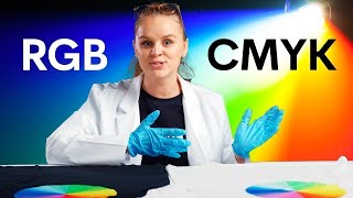
Deep Rich Black vs 100k Black in Adobe Illustrator - What's the difference?

Вставка
- Опубліковано 6 лип 2024
- Deep Rich Black vs 100k Black in Adobe Illustrator - What's the difference?
You might think that black is, well, black; but when it comes to design and printing there is 100K black and rich black. In this video, I'm going to show you how to create a rich black in Adobe Illustrator that will allow you to create much more creative designs when working with a palette of black.
Stay Creative!
Col
-------------------------------
You can also find me on these other platforms too:
Website: pixelsink.com
Twitter: / pixelscol
Facebook: / pixelsinkdesign
Instagram: / pixelscol
-------------------------------
If you are growing your own UA-cam channel, then you need
TUBEBUDDY:
www.tubebuddy.com/pixelsink
MORNINGFAME:
morningfa.me/invite/pixelsink


Thank you thank you thank you! Out of several videos I watched this is the only one that truly helped me with the black color problem
The most concise "help" video I have seen, thank you!
Thank you Cind. For your kind comment and for taking the time to leave your comment :)
Thank you for the tips!
BRILLIANT video! Thank you so much. Very useful for our brand as we used a lot of black print!
Love this tutorial.
Thank you :)
Thank you, Very helpful.
So helpful, thanks so much! (P.s. Awesome beard!)
Very usefull info, Thanks!
My Printer and Clients are going to bless you for this!! Thanks a bunch... You present vital info in such a simplistic way. Quality content as always 👍🤩
Thanks Saveena :)
Brilliant - that solved a problem!
Great tip Col! I work in a sign shop and we have to change black on so many files we receive. Each printer will have it's own special formula to get the best black as well, for the printer we have in the shop it's 75%, 68%, 67% and 90% - this gives us the best rich black print.
Yeah, I work with printers who all have very specific settings for the best rich black on their machines. That's why I made sure to mention in the video that you should always check with your printer first.
Useful? This is essential! As always, you don't stop to amaze me!!! This is truly AWESOME!!! Greetings from Romania!
Btw... you are shared on Facebook!
Really appreciate the Facebook share Teofil 🤘
Bravo. Clear, concise, and very useful.
Thanks very much DJ P 🤘
I love using blacks and had no idea that I could experiment with the level of blackness in my designs. This is going to be lots of fun. Tons of value here. Thank you so much for the demo and tips.
Excellent. Have fun playing around with the blackness levels in your designs :)
Thank you
Perfect! Thank you so much!
Glad it helped!
Thank you!
thank you
Thank you very much! I didn't know about the "appearance of black" settings. No more frustration on that front. Thank you!
I went over to InDesign's preferences and noticed there's also an "appearance of black" option.
Yeah, InDesign has it too. I should have probably mentioned that in the video, but I think people who have Adobe software will probably check the different apps after they find out that Illustrator has that option :)
Thanks for bringing that up 🤘
thank you, sir
Thx master!
Thanks for the video. Great info. I enjoy all of them. 💛💙👍 From Sweden
Hey there Melody from Sweden 😃
Glad you are liking the videos 🤘
OH my Gosh THANK YOU
This was so informative! Thank you! I am wondering if you can help me solve a mysterious problem. I am a surface pattern designer. For some reason all of the black outlines in my recent patterns look so dark and muddy. For example, I made a wildflower pattern years ago in 2018-19. The original black outlines look so light and thin. I recently cleaned up this pattern, and now the outlines look so much darker. I didn’t change the thickness of the lines but now it looks awful! After watching your video, I checked my preferences in adobe illustrator and noticed that "Rich Black" was selected. I am wondering if back in 2018 my preferences were different? Do you know what that black was or how I can change it back? I work in RGB mode because this will go on fabric.
Really useful thanks
Thanks Chris.
Thanks a lot man.very useful.
Thanks Vignesh 🤘
@@RockYourBrand 🙌
Super sir
Amazing tip! Always wondering why i had problems lol
You are not alone in this, which is why I knew it would be worthwhile to create a video on this topic.
Thanks for leaving a comment Leodagan.
Great channel. Keep it up :)
Thanks, will do!
This video is knowledge!, thank you for sharing with all of us something I would never of even thought of. I need your help and wanted to ask what CMYK settings would you need to achieve a print of both the exact orange and also the exact black on that filing cabinet behind you?
Hey there. The filing cabinet is actually bright red and black (Pantone 200 / Pantone Black 6)
The closest CMYK would be:
Red: 3 / 100 / 70 / 12
Black: 100 / 79 / 44 / 93
:)
@@RockYourBrand Really, I think I want to also get the right paint to do my room like this. How would I get the two colours in the correct paint colour?
What would be the benefit or purpose of of using the output display “all black as rich black”?
does that apply to white color as well?
So if I understand this correctly, the same applies for Photoshop if I'm working in CMYK there, right?
Yeah, any application where you are working in CMYK you can create rich black, including Photoshop.
To get a black on text that is darker than 100k, and to avoid registration issues, is it possible to use a Pantone black for small thin text? Pantone 6 U?
You can use Pantone, but that will be a more expensive printing process for you. So you would need to weigh up the risk of potential registration issues versus the cost of including a Pantone spot colour in the job.
A question around logo transparency, I have a client who wants to use the logo on the reverse side of the business card. The full BG colour of the reverse side is their brand colour and the logo is pure white, I set its transparency down to 20 - 30% and wondering if that's a good idea and would printing the card have any issues?
Hey Max,
Am I right in saying it is the logo's transparency that you have set to 20-30%?
Is there a reason you do not want the logo to be shown as pure white if that is how the logo is supposed to be seen?
@@RockYourBrand This is on the reverse side, the front is 100%.
On the back is their brand colour which covers the entire reverse side, the logo is then going to be semi-transparent as more of a subtle visual element to compliment the reverse layout.
I don’t see there being any print issues with that Max :)
Pixels Ink thank you!
Can you use rich black for printing text on white bag? Would you every get any visible colour shifts?
When it comes to text, if it is small or very thin, I would normally just go for 100K black. If you go for a rich black there may be some very slight movement with the registration of the CMY plates and so you could end up with what looks like blurry text. I tend to only use rich black for text which is large and of a heavy weight.
I hope that answers your question Max.
@@RockYourBrand Thank you so much, yes this answers it perfectly!
@@RockYourBrand approximately how small? If the text is 7 point (and background is K100%) can you still use Rich Black successfully?
Rich Black Colour CMYK in CorelDrawX9
Hey Rajveer, I'm not sure if there is a setting in Coreldraw for Rich Black / 100k Black.
If there isn't, then a good CMYK mix for Rich Black is 40/40/40/100
Thank you. Now I know why my black looked lighter when exported it.
One thing though, I’m new to illustrator. How do I change the shades to actually make a rich black? You didn’t really show that.
Hey Milan, there are many different types of 'rich black', but when I am working in print, if the printer I am going to be sending the artwork to doesn't have a specific rich black they want me to use I set my rich CMYK black to:
C = 60
M = 40
Y = 40
K = 100
You can see a screen grab at this link: pixelsink.com/Rich_Black_Settings.jpg
@@RockYourBrand you’re really late, but still thanks. I found out that for digital files to get the deepest black you need to use 100% for all the colours.
Sorry. It can be hard to keep up with all of the comments on videos.
For on screen/digital, you would use RGB or Hexadecimal rather than CMYK.
R = 0
G= 0
B = 0
Hex = #000000
Hello sir here i am again can i have some tipz to you how can i sell my logo design or how can i find a client on logo design ?
Hey Paulsheen,
You should join a design community such as Logo Geek or Just Creative on Facebook. You will get lost of helpful information from those groups. Unfortunately I can't give out 1 to 1 advice via UA-cam as I have clients who pay me for consultation.
Cheers,
Col
Pixels Ink you know what sir i love to make a logo design , but i reach to that point that i wanna give my career as a logo designer because it's hard to find a client ?? But thank you for the i advice and for godbless
@@Paul_graphitic06 one of the best ways to find clients is to attend local business networking events in your area.
That is where I started :)
When I make a gradient from 100% black from 30%black in cmyk and print it, I get purplish colors. How can a get perfect black?
If you are printing on an inkjet printer it can sometimes choose to make the black output using all inks - CMY and K, even if in your design/image software you have the ink set only to K with no CMY in the image.
You may have to choose Grayscale as the print output in your printer settings to get it to print using only the black ink cartridge.
@@RockYourBrand I have a black gradient background psd and vector design over it. Should I make background in greyscale instead of cmyk?
@mordavian I’m not sure that would make a difference if you are still going to also be printing other elements in colour on your inkjet printer.
It’s maybe worth trying though.
@@RockYourBrand I will give it a try. Thank you.
I was appalled to see "Display All Blacks as Rich Black" in my preferences after all these years of using Illustrator 🤦
It is one of those weird settings. I'm not sure when I would ever really want to have black always as a rich black. There must be a reason for that option being there and maybe someone will enlighten me in the comments at some point :)
Printers hate rich blacks. They love overprinted 100K Blacks.