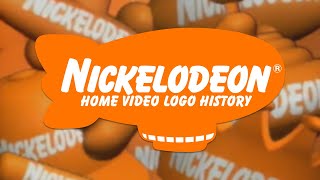
Why The Nickelodeon Logo is Iconic

Вставка
- Опубліковано 4 сер 2024
- Nickelodeon went through a lot of design flaws before getting to the famous orange splat.
Don't forget to check us out on social!
Facebook: bit.ly/2FFusZe
Instagram: bit.ly/2riPqYI
Twitter: bit.ly/2jqpWVG
Twitch: bit.ly/2Gpu7tN
Follow Sapphire:
Twitch: / sapphiresandalo
UA-cam: / sapphiresandalo
Facebook: / sapphiresand. .
Twitter: / awkwardsapphire
Instagram: / awkwardsapp. .
Website: www.sapphiresandalo.com - Розваги


Adventure Time just ended
Gravity falls ended in 2016
The amazing world of gumball ending in 2019
SpongeBob: you fools can't kill me!
Nickelodeon: directv will drop me spongebob
*surprise pikachu face*
Spongebob is a god. He’ll out live us mortals
@@demon1ckn1ght39 He has taken the power of god for too long, Time to give other shows a chance
PickleBetard A.K.A Pickle Rick's Fatass Cousin no
It’s weird not to hear her talking about demons and serial killers
i'm a multidimensional human being baby
lol the next ICONIC you kinda will be though
Why do I want to hear her talk about demons and serial killers?
@@Mecabuyte I'm guessing you don't know about her first channel, Snarled?
Agree HAHAHA
The Nick logo _was_ iconic. It was the greatest logo of all time. It was able to be anything. It could be a dinosaur, or a rocket ship, or a blimp. That's what make it great. But not anymore. Ever since they changed to the logo, nick had died. The new logo is so disgusting. It uses that ugly minions font. Not the icon balloon font. It's the ugliest logo I've ever seen. It just looks gross. They had a beautiful logo. The most iconic logo in the history of television. And then changed it for no good reason. The current logo is a disgrace, and it's the perfect representation of everything wrong with Nick today.
Oh my god, get over it. It's basically still the same thing, it's still orange and it still says "Nickelodeon" on it.
The only thing it just hasn't got is the splat thing, which honestly isn't that big of a difference.
And really, calling it disgusting and gross?? How does it look gross? It looks good imo.
Get over it.
@@userlollol the logo wasn't just a splat. That was just the main one they used. The logo was a shapeshifter, and was able to transform into anything. That's what made it great. It was the most genious, creative, ambitious logo of all time. The balloon extra bold font was fun. The logo was beautiful. And then they seeped out all the fun, and creativity, and gave us the disgusting awful logo we have today, the video even says this. They were trying to blend in with everyone else, when the original logo was meant to stand out from the croud. That's actually the reason why the Nickelodeon logo was orange. It was specifically chosen to be a color that clashes with every other color. That was the genious behind the Nickelodeon logo. And the idiots in charge went and stripped it of all of its genious. And if you can't understand why the new logo is ugly and gross, then you don't understand genious.
I agree 100%
@JBensieD9 True even spongebob died itself after S3 before the nickelodeon rebrand in 2009, Also blame viacom for that dumb idea........
I miss the old days man
The new Nickelodeon logo isn’t bad, but it doesn’t feel timeless like the old splat logo.
It's back. Well, sort of.
The Nickelodeon logo the old one is so iconic I grew up with this in the 200os and I love the old shows they had
It's back.
I miss the old pre-2009 screenbug
Wanna see something scary 😏😏😏😏
You’ll never 2 2 know: It’s actually; Wanna HEAR something scary?
Hear*
Bindu GamerYT yeah that’s what I said and implied
daily monicfox17/dmfx/ it’s *wanna hear something scary?
Ayeee ;)
I'm an early 00s kid (02) and I definetly remember the splat logo. I miss it.
The Splat is where it's at.
They should bring it back!
Wow u are 17
It's back. Well, sort of.
4:50 the splat looked like it was chocolate
I rlly miss the splat logo >:(
Same even though I'm 9
so do i. the letter one sucks
It's back. Well, sort of.
4:41 "The Splat was dated." The Splat is timeless!
true, but nick decided the splat wasn't sutible for BUISNESS.
@@thisissaah_3536 That's what they all say.
@@thisissaah_3536 Why does everything have to be about money ? What happened to creativity ?
@@treseancann1261 i have no idea honestly
@@thisissaah_3536 Well, if you ask me, I believe that for the last few decades, creativity has been slowly becoming a lost art. And today, it is a lost art.
it's iconic because it was used for 25 years (1984-2009) which is long ok end of video
Fun fact: Cyma Zarghami (the president of Nickelodeon from 2006 to 2018) changed the Nickelodeon Logo to the Bland Lettering we know of today because "It didn't look good on a Business Card".
Here is a link to an old Nickelodeon Business Card: pbs.twimg.com/media/DfStXDFX0AAhJV1?format=jpg&name=small
She was a terrible President.
Hopefully Brian Robbins care about Nick more than she ever did, so glad she's finally gone.
i get what the 200+ people are saying here, but the main reason why nick made a more simple logo, is because, yes, everyone loves the splat, but they were worried buisness wouldn't like it, which sounds like you wanna shoot yourself with a bleach gun. if you wanna blame anybody for this nick logo, blame buisness.
in my personal opinion, i think not only the old, but the new logos i like. the similaraties that the fred/alin and the eric zim design have are great, as well, but i won't list them here because you know what they are.
Omg this videos so good with explaining and editing. I gotta do something about the lack of views here
The NICKELODEON Orange Splat Logo Is The One I Like The Most.
The old Nickelodeon logo looks better than the new one
It's back. Well, sort of.
Sapph, I love this
I’m a kid and I agree with most of these adults and I wish I saw some of the older shows. At least there will be those TV movies.
in my opinion Nickelodeon is still one of the greatest channles for kids I like this logo but its 2020 maybe nick is going to change its logo again although that's unlikely but I like when things change its refreshing
I was only 4 when they changed the logo, but I remember seeing the splat at a very early age. The splat always stayed with me. Most of my early memories have always stuck with me. I may grew up on the current logo, but I don't find as cool as the logo I first saw in my life.
R.I.P
Hey Arnold
At least we still have our boy Aronld from the magic school bus but he's not the same couse he just looks like hey aronld now
I'm only 13, almost 14, and I miss this logo so dearly, I cherish this logo so much. And it's sad to say that the modern era kids are watching this, but I was born in the 2000's. I don't necessarily see how this represents a children's programming network. With this logo, the orange could be slowly dying out. It's not the same logo we have, and it makes me want to look back, but I only remember a little of it. I don't know if it's my memory fading away, or if I never got to see it enough. I always wanted this to be a good channel, and I miss it dearly. As of 2009, the good old Nickelodeon died. It's no longer what it is anymore. Nickelodeon has slowly faded away, and it's sad to say that I'm currently almost 14, but I was 4 when they changed it. i was still pretty young when they had changed it.
I feel you. I was born in 1994. What a time to be a Nickelodeon fan.
I liked the splat
It's back. Well, sort of.
This channel is smaller than I expected
Wanna see something scary
5:50 yup I am afraid of that 😬😬😬😂
Where is the clip of the kid crying at 5:36 from?
All the backlash against the current logo comes from those who grew up in the 90s. I grew up in the 2000s. I was there when Nick did the logo transition (down here in Brazil, it was in 2010). I have fond memories of both the splat and the current logos.
The splat brings Drake & Josh to my mind. The new one brings iCarly and Victorious.
The promos with the splat were much more colorful, and the ones with the new logo were way more filled with plain orange and slime.
Different styles for different generations, but I love both of them.
One of these days they will change again, and guess what? We may hate the changes, but another generation will love them.
The Splat is back!
The iconic logo I remember more is definitely UA-cam. But hey, the 1984 logo is always been my 3rd favorite logo, behind the CBS and 20th Century Fox logos.
The Nickelodeon Splat logo is back!
I miss the splat
It's back. Well, sort of.
The bright the splat back with a white Nickelodeon text as a homage to the past
They should probably change the Nickelodeon logo to something more nostalgic
Maybe the splat with the same modern font can work brilliantly.
@@APPictures9 i agree
I could do a video redesign it and show you
It's back. Well, sort of.
I remember i grow up with that. Damm i miss some old show when i was little
Me too.
Nickelodeon *used* to be good... Now I'm getting nightmares about Nick
Sapphire💙
Honestly, that new one is the epitome of boring, I don’t get why they think that one is cool, it’s really not, the splat was like, LITERALLY everything at will, it shapeshifted every time you see it, now it’s like...text, and that’s it.
I was born when they had the splat logo.
Sure
I was born during the Splat Era as well.
I was born in 2007
Me too, but they changed it when I was like 4. I remember watching a bit of Nickelodeon back when I was a toddler and they had the splat logo because I had older cousins.
I was born in 2005, and I'm so glad I grew up with the splat logo
CUZ ITS THE SPLAT
good news to nick-splat fans
they heard y’all
yeah the splat is simple, but they made it work
It's like a mix of old and new. Either way, I'll take it. I just hope that Nickelodeon will also make some nostalgic bumpers.
Now that's why I want to see
Video: what about these two Golden Arches
Me: I’m literally at McDonald’s watching this
Orange you glad you got your NICKELODEON!
I want the splat logo back, please. Zarghami was a LOUSY president!
Thank goodness she stepped down. I hope whoever the new president is will hear our demands.
It's back. Well, sort of.
@@treseancann1261 I saw, and I'm very happy. :)
I Love The New Nickelodeon Logo!
So I clicked on this and it said it was an ad. Am I looking at an ad or an actual video on a channel?
Took the words straight out of my mouth 5:50
The logo today it perfect the way it is and the past logos were awsome and creative and I'm glad Nickelodeon exists
To each their own, but the Splat logo is timeless.
I have 3 Nickelodeon crushes:
My first crush is Sandy from SpongeBob because I am always curious about her native background and it would be nice to see all of her background in 2d Animation but mostly I didn't see it happen because the guys who make SpongeBob always want to focus on the background Spongebob is native to a long with a lot of sea based characters and they always decide for the surface part of the world Spongebob lives in appear in live action and it drives me crazy that way but I won't tell the guys who make Spongebob to do anything to make sense for Sandy's background but sometimes it would be nice if they did a show taking place in where Sandy's from originally and it would appear in 2d Animation.
My second crush is Marlene from the Madagascar Penguins show because I am always wanting Marlene to be in a movie since after Madagascar 3 came out and I was hoping for her to be in the Penguins of Madagascar film but it couldn't be based on the show and none of the characters who are only in the show got to appear it. Then, I was hoping Marlene would appear in Madagascar 4 but the movie never happened and I couldn't get to see Marlene into a movie at all but I am not giving up hoping for her to be in a film and right now I have decided to anticipate her to be in Kung Fu Panda 4 since the KFP franchise seems to make more sense for Marlene's species than Madagascar. But since Marlene might appear in Kung Fu Panda 4, she will have to wear clothes, have an indigenous name and be designed by the KFP designer so she won't be too out of place to be in this film. Also, I hope in this film, she will have something in common with Po and we'll be a fanatic of Po and join him on a quest he might be in and then maybe she'll become one of Po's new students [By the way, no spoilers for when a trailer of KFP4 comes out or when the film will come out.]
My third crush is Toph from Avatar: Last Airbender because somehow I always find Toph's blind eyes pretty and I always wanted to see her appear with her hair down and see her have close relationships with the characters she's met in the ATLA series at least from outside the show.
So, that's all I want to share about this and even though when you watch Nickelodeon cartoons that can get you to have interest in certain characters, just remember that you can't always rely on something to do better for those characters than what's only happened for them and sometimes you can try your best to move on without begging for something better to happen to the characters than what has. For one example, if you can't get to see any characters you like in what you want them to be in, you can make up stuff of your own that can get your characters to be able to do something in which they can't do in where they appear in officially and sometimes share about it with other people you know and not for everybody in the world. But when something new will happen in the future and will have something to do with the media your favorite characters are in then you can anticipate your favorite characters to be in them as much as you want and hopefully it will be decided for your favorite characters to be in it.
plz make more of these vids
And also, I want the old splat logo back.
It's back. Well, sort of.
why hasn't no one signed a petition to bring back the old logo yet
It's back. Well, sort of.
Im amazed first scary story then gaming now this
I wasn't born in the 90's and I still remember the splat. I think they need to update the logo in 2019
It's back. Well, sort of.
You forgot that Craig Bartlett made dinosaur train and ready jet go from pbs kids
Hi Sapphire!
I Just think,no one should
hate this new change.
This logo represents that,
Being the best isn't the best;
And....
That shows children,
Everyone is equall.
no one is either the best or
The worst.
To each their own, but the 1984 Splat logo is timeless.
SNARLED OMGGGGGGGG
5:03 *the entire something scary fandbase*
The new logo is disgusting. And it's everything wrong with corporate, and how little they understand the consumer.
@@Spindlepegasus To each their own, but the 1984 Splat logo is timeless.
Evolution of the CN Logo
Sapphire- Wanna hear something scar-
Nickelodeon- Oh hey want to work at our company?
Sapphire- *in a satanic voice* IT IS SAID THAT IF YOU CUT SOMEONE'S LINE... THE WENDIGO WILL COME LOOKING FOR YOU.
Nickelodeon- I'll take that as a no ....
3:25
What about pinweel?
I still think it’s horrible. The 90’s logo looks fun, but the 2009 logo looks plain.
Oooooo❗Sweet❗
YAY!!! I LOVE NICKELODEON!!!And also i REALLY LOVE I AM FRANKIE
I like the second one the most
Do why nelvana is iconic
That's how
Can you do Nintendo logo iconic?
Pinwheel not Nickelodeon in 1979
4:35
"Dated." Yeah right 😠
Meep moop
I like the old ones better and I am still a kid why do they change it?, Looks like adults for adults why did they change it!!!! Luckily we can still remember, and for me be sad 😭😞
And Nickelodeon wonders why people turn to UA-cam.
I really don't like the one today. I like the splat one
It's back. Well, sort of.
A 1999 thing like SpongeBob
And now... It's blue.
Woo
Hai Sapphire
What about pinwheel? It was called pinwheel before nickelodeon
The latest Nickelodeon Logo Sucks
@Eugene Krabs Mr Krabs, Since when you was a fan of the new logo?.......
We did it nickrewind is here.
Hey i love Nickelodeon in general
iM NOT A NINTYS KID AND THAT SPLAT REMINDS ME ABOUT IT
The last 7 years of Nick sure gave us a splat. By that I mean mess.
I get what you mean. We probably must not be providing enough demand.
I think the logo is outdated. At least still use either the Balloon font or the splat! My childhood will never be the same. Could Fred Seibert convince Nick to go back?
excidental yeah the new one is boring to common
It's back. Well, sort of.
My childhood is goner because all I think is silly
Well Some People dislike the 2OO9 logo and They Commet the same Thing
and then dan schneider came along and made it turn into a foot
Do a video about the Disney Channel logo lol. Please. 😊
I'm your 838 sub 😍
today nickelodeon stank
Why is this an ad
Nick is in downhill since 2014 after cancelling all their iconic shows like victorious icarly ....
It’s should went back the the splat logo
Dat one looksbetter
Because it's logo is a Jizz Stain but Orange and it says Nickelodeon
Ok
Do sponge bob
School of rock,Victorious,spongebob and the thunder mans were most good or wtw