Leila I am a big fan of your videos. I have subscribed to your Udemy course on management dashboarding and I regularly follow all your videos on UA-cam. Thank you so much for making these wonderful videos. Cannot tell you how grateful I am to you. It's as if every query on Excel I ever had , Leila already have them answered. Thank you very much :)
There was once a trend when high subscribers and viewership on youtube were only for creative content (tiktok type) and not educational ones like Leila's videos. You saw actor's channels having millions but educator's channels having thousands odd. Then came internet revolution in India and educators on social media got their due. Indians around the world are known for their tech expertise. It is thanks to educators like Leila whose videos are such a boon acting as a pioneer for that expertise. Without Leila and others we would for sure achieve less compared to now. GRATITUDE for sharing your knowledge and taking efforts Leila. Hope your channel grown even more.
Hi, your excel class is very helpful and the way you teach us is simply awesome. I would like to request you to please make a video on what if analysis for advance user. Please cover every aspect of scenario, Goal seek and Data table. Thank you.
Leila Gharani No problem, I speak English! Your channel is excellent about Excel, in my opinion, your spreadsheets are so beauty and accurate inwhile data and information! Congratullations!
Great Video! I have worked through all the series on Gantt Charts, I am no expert but this makes for a nice Project Management Dashboard! If you crawl around all the MVPs channels its amazing the knowledge you all give away... That alone is what would make me consider buying for additional support (Besides the Views, the fact I like all videos and watch them at 50% Speed giving you some killer run time :) )
Hi. I use gantt charts almost daily. It is however important to show if an action is late and which is completed by means of color. So cell conditional formatting by means of numbers such as -1 for late, 1 for planned and 2 for completed, has always worked for me. I really like however the dynamic of your charts but it would come in very handy if you find out how to add three comparison, or more if possible cos sometimes managers want to see what was postponed or rescheduled. Overall, great great videos. The match-index function works like a charm, thank you very much for that one.
Thank you Trevor. I fully agree. On my site I have a free Gantt chart template that shows different views (plan vs actual) and also % completion of each task. It's a more complete Gantt chart, but not as quick to create. It doesn't have the conditional formatting part, but that sounds like a good challenge :). I'll add a video in the next weeks to show a more complete version and try to implement some of your points as well.
To add the task names to the chart, you could add a fake series with the task numbers at y-values and zeroes at x-values. Using that series, you'd hide the markers and use custom data labels located at left of the series and pointed to the range with the task names.
i agree to the fact that excel is much more user friendly than the Microsoft Project .... and it can function in all ways as the Project Management software!
Thank you very much for your beautiful explanation. I am very happy with it and I am happy that you share it! Is it also possible to adapt it in such a way that the weekends are not regarded as a working day? For example, if an activity lasts 9 days from the start day, that the weekend is not automatically filled in?
Always good to see what methods people use. Can we group the two columns on the left with the chart somehow? Maybe paste your design as a picture/image so that it everything is grouped as one entity?
You can use the camera tool to do that - take a camera picture of the tasks (that way at least it's linked) and then like you mention, group with chart. In the upcoming video (hopefully later today), I'll upload a version where the tasks are a part of your chart, so you don't have a grouping problem....It's also a more complete Gantt chart that shows % completed etc...
Design Completed #days you mentioned 11. But when calculating date you need to have (End date - Start date)+1. Where 1 is for the Start day. So that will make it total of 12 days.
Hi thanks for the tutorial. Amazing and simple. Do you know of a simple way to add more lines to the Gantt or you would have to delete the chart and repeat the process to add more tasks to the project for those to appear in the chart.
Leila Gharani Hi Leila, A big fan of your lectures and use many of your techniques regularly. I was wondering if you had any luck on the thinking of Sonia’s question. It would certainly expand my intended use for this gantt (which is awesome by the way)
Will be difficult to add/remove tasks cos then have to change entire chart positioning, etc. Nonetheless, still handy for smaller number of tasks. Else just use MS Project
What am I missing, here? All my error lines have the exact same length. One should think you need to add the number of days to the graph data, right? Still, I don't see you do that, Leila. So how is it possible that your error lines do differ in length whereas mine don't?! I'm clueless.
Hi Pham, to get different colors, for example to get the design phase different to the implementation phase, you'll have to use different series for those - that way you can pick the color you want for each of the phases.
Hi Leila, thanks for the video. I’m wondering if we can export data from Gantt chart onto another excel sheet so I can use Gantt chart as a data connection and use that data into my report ? I’ve been trying to look for solutions. Thank you!
Leila, have you tried Stacked Bar? If you remove fill from the fist bar part (start date) and in axis option change minimum (increase), you get the same result. I would also use task description on the chart (axis).
Thanks Vida for your comment. Yes - on my site I offer a free Gantt chart template that uses a mix of your version any my version. It has stacked bars for the length of each task and error bars for % completion. It's no longer a quick gantt chart but a more complete one. I'll make sure to add this in the future videos.
Amazing tutorials! Is there any way I can modify colors of the individual bar? I tried double clicking on the bar (like what you did to the caps) but it doesn't allow me to select. Thanks a lot for sharing.
this is cool.... can you please help how this can be changed to dynamic? if there is any revised start or end date, then how that should be presented (both original dates and revised dates) in graph
Good day, may I ask a question? Why when I change the working days that you paste special, theres no changes in the End date & # Days? I hope you guide me.
Hey great video, very helpful. I did make a Gantt chart but How can I completely copy a sheet with all the formulas and the chart to new sheet. I copied the entire sheet but the chart. was still connected to the data sets on the previous sheet.
Best is to copy the tab. So right-mouse click on the tab - select "mover or copy" - select your workbook from the list and put a check mark for "create a copy". This makes sure everything remains intact.
I remember that for a few months I could not move tabs. Cut and paste was losing features. Eventually I found that you have to have two spreadsheets opened and drag the tabs from one to another. After a while I forgot ... had to google it again. What a bugger.
Hi Mrs. Leila I m a big and regular follow of your xl tutorial at you tube I need to solve a problem how can we calculate duration or number of days between dates as mentioned below Example: start date-12-Oct-19 A and Finish date- 20-Oct-19 with IF formula or other method as well and same dates to show horizontal bars as well with condition formation to show progress for scheduling in excel. Kindly help me to solve this issue asap. Bye Munawar
my excel does not give an option to select "date" for axis option. the horizontal axis starts on 1/0/1900. when I try to edit and click under axis option, it gives the bounds, etc. but no option to change the data on the horizontal axis to be on date format. any idea how to go about it? is it because of the excel version?
The excel based Gantt chart in the video doesn't show dependencies. I made vertical/transposed gantt chart that shows dependencies, duration, etc. in more compact way. www.linkedin.com/pulse/vertical-gantt-chart-mochamad-aris-zamroni/
Not sure - a smooth gantt chart? ;-) You can use the same template to create it though, you can just adjust the formulas for start to always equal the end dates.
I am not really sure of the concept but I have to create this type of chart but maybe it is the error bars. Or a second set of bars on top. Not very clear. I will try and find out. Do you have examples of price/volume charts using the 2nd x-axis to get the correct dates in place on the 1st x-axis?


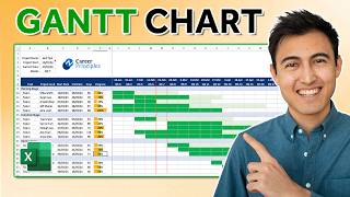


Grab the file I used in the video from here 👉 pages.xelplus.com/quick-gantt-chart-file
I am loving it and remain very grateful. I watched all 3 gant videos. I reused this one. Most useful to me. Managed all in one day.
Leila I am a big fan of your videos. I have subscribed to your Udemy course on management dashboarding and I regularly follow all your videos on UA-cam. Thank you so much for making these wonderful videos. Cannot tell you how grateful I am to you. It's as if every query on Excel I ever had , Leila already have them answered. Thank you very much :)
There was once a trend when high subscribers and viewership on youtube were only for creative content (tiktok type) and not educational ones like Leila's videos. You saw actor's channels having millions but educator's channels having thousands odd.
Then came internet revolution in India and educators on social media got their due. Indians around the world are known for their tech expertise. It is thanks to educators like Leila whose videos are such a boon acting as a pioneer for that expertise. Without Leila and others we would for sure achieve less compared to now. GRATITUDE for sharing your knowledge and taking efforts Leila. Hope your channel grown even more.
I love the way you say "Eeks" for X :)
Sounds like french
Unusual allright! We all learned something! Thanks very much!
Our pleasure!
Thank you very much. My report was due and you saved me.
Glad I could help
Allah bless you ma'am...its very informative....
Quick for the excel EXPERTS! 😄
I hope you will show a lot of video about these knowldge of excel more. This gantt chart is so useful for me
I love this channel
Very good explanation! Useful for project management.
Fantastic channel! You have helped me so much in my business
I'm very happy to hear that Adam! Glad the videos are useful.
Smart, simple & professional
Thanks. Glad you like it.
Well explained 🫶🏻
Thank you, very helpful...
thanks
Supercool... how come I never saw your channel earlier? my life would have been better :)
Another great support, Thank you Leila.
This was super helpful! You are magnificent! Thank you!
Hi, your excel class is very helpful and the way you teach us is simply awesome. I would like to request you to please make a video on what if analysis for advance user. Please cover every aspect of scenario, Goal seek and Data table. Thank you.
Glad to hear that. Sure. I have them to my list :)
Thanks for the helpful video!
Excellent, done with lot of understanding and ease Leila
Thank you. Glad you like it.
Really helpful
Hi Leila, I'm from Brazil, I would like to say: your channel is very good!! Excellent video about Gantt Chart!
Glad you like it :) Your videos look great too! Unfortunately I can't speak Portuguese....
Leila Gharani No problem, I speak English! Your channel is excellent about Excel, in my opinion, your spreadsheets are so beauty and accurate inwhile data and information!
Congratullations!
Thanks for the kind words :)
great tutorial
Great Video! I have worked through all the series on Gantt Charts, I am no expert but this makes for a nice Project Management Dashboard! If you crawl around all the MVPs channels its amazing the knowledge you all give away... That alone is what would make me consider buying for additional support (Besides the Views, the fact I like all videos and watch them at 50% Speed giving you some killer run time :) )
Brilliant! Thank you so very much!
Impressive!
Great and easy
Hi. I use gantt charts almost daily. It is however important to show if an action is late and which is completed by means of color. So cell conditional formatting by means of numbers such as -1 for late, 1 for planned and 2 for completed, has always worked for me. I really like however the dynamic of your charts but it would come in very handy if you find out how to add three comparison, or more if possible cos sometimes managers want to see what was postponed or rescheduled. Overall, great great videos. The match-index function works like a charm, thank you very much for that one.
Thank you Trevor. I fully agree. On my site I have a free Gantt chart template that shows different views (plan vs actual) and also % completion of each task. It's a more complete Gantt chart, but not as quick to create. It doesn't have the conditional formatting part, but that sounds like a good challenge :). I'll add a video in the next weeks to show a more complete version and try to implement some of your points as well.
To add the task names to the chart, you could add a fake series with the task numbers at y-values and zeroes at x-values. Using that series, you'd hide the markers and use custom data labels located at left of the series and pointed to the range with the task names.
Awesome!!
This is nice.. It helps a lot. I can now make a template and use it when my boss ask me... 😊😊😊
Always good to have something prepared in case the boss asks :)
Thanks a lot
Thank you very much you are brilliant.
You're welcome.
I actually got this... thank you!
Perfect! You're very welcome.
i agree to the fact that excel is much more user friendly than the Microsoft Project .... and it can function in all ways as the Project Management software!
Very useful. Much skill. So chart.
Thank you. Appreciate the comment & support.
This video encourage me to take your udemy course.
:) I do try to share a lot on UA-cam as well. The courses are more structured though...
this is creative!
Thanks.
thanks leila
It was quite refreshing ! How about the holidays ? The figures were mentioned but I did not hear about it on the video I think, maybe.
You are amazing....
Great stuff, thank you!
You're welcome Jimmyco1.
this is great, thank you!
Great video, great pace, and voice. There should have been or should be a way to flip the numbers with the labels on the Y-axis.
You are amazing. Thank you for sharing. This is very useful for my work.
Thank you! I'm glad to hear you can use it at work.
Good
your are pretty and
your videos are awesome
Thanks
You're welcome. Glad you like the videos.
It is useful , thank Leila :)
You're very welcome Peter. Glad you find it useful.
Usefull
Thank you very much for your beautiful explanation. I am very happy with it and I am happy that you share it! Is it also possible to adapt it in such a way that the weekends are not regarded as a working day? For example, if an activity lasts 9 days from the start day, that the weekend is not automatically filled in?
Hi, share spread sheets for practice as well, thanks.
Always good to see what methods people use. Can we group the two columns on the left with the chart somehow? Maybe paste your design as a picture/image so that it everything is grouped as one entity?
You can use the camera tool to do that - take a camera picture of the tasks (that way at least it's linked) and then like you mention, group with chart. In the upcoming video (hopefully later today), I'll upload a version where the tasks are a part of your chart, so you don't have a grouping problem....It's also a more complete Gantt chart that shows % completed etc...
Would be great if you can cover a video on how to scale multiple column/bar charts in a sheet to a common minimum (Common scale).
I'll add this to my list.
Neat!
Design Completed #days you mentioned 11. But when calculating date you need to have (End date - Start date)+1. Where 1 is for the Start day. So that will make it total of 12 days.
I love you. Just saying.
:)
its keeps putting 2 day intervals between the days. also the graph doesnt end at the end date. it just has the start dates with 2 day intervals
Can I prepare a chart with oustanding ageing where amount as well as aging days could be shown?
do you see there is "12/16" on the x-axis? how to remove it? should change the x-axis min. value
Hi thanks for the tutorial. Amazing and simple. Do you know of a simple way to add more lines to the Gantt or you would have to delete the chart and repeat the process to add more tasks to the project for those to appear in the chart.
Thank you Leila for this tutorial. Is there a way to add Task dependencies?
You're welcome Sonia --- hmmm let me think about that....
Leila Gharani Hi Leila, A big fan of your lectures and use many of your techniques regularly. I was wondering if you had any luck on the thinking of Sonia’s question. It would certainly expand my intended use for this gantt (which is awesome by the way)
Will be difficult to add/remove tasks cos then have to change entire chart positioning, etc. Nonetheless, still handy for smaller number of tasks. Else just use MS Project
Yes, this is best for smaller projects.
What am I missing, here? All my error lines have the exact same length. One should think you need to add the number of days to the graph data, right? Still, I don't see you do that, Leila. So how is it possible that your error lines do differ in length whereas mine don't?! I'm clueless.
How to draw timeline schedule in excel, using Gann chart?
Great way teacher! Could we distinguish by hightlight these bar charts of task with different colors?
Hi Pham, to get different colors, for example to get the design phase different to the implementation phase, you'll have to use different series for those - that way you can pick the color you want for each of the phases.
Mrs. Leila,
Why this 12/16 in dates should appear and the same for ending. anyway to get rid of them?
i can't see inside the chart after taking off the grid lines
Can we use a scroller to select days from a range of days (1 to 30) for each rows??Or by anyhow can we link our scroll to a data validation table ?
Can this be done in Power BI?
Hi Leila, thanks for the video. I’m wondering if we can export data from Gantt chart onto another excel sheet so I can use Gantt chart as a data connection and use that data into my report ? I’ve been trying to look for solutions.
Thank you!
Leila, have you tried Stacked Bar? If you remove fill from the fist bar part (start date) and in axis option change minimum (increase), you get the same result. I would also use task description on the chart (axis).
Thanks Vida for your comment. Yes - on my site I offer a free Gantt chart template that uses a mix of your version any my version. It has stacked bars for the length of each task and error bars for % completion. It's no longer a quick gantt chart but a more complete one. I'll make sure to add this in the future videos.
This can actually help in getting different views of plan vs actual. Use "if" formulas to determine planned and actuals
Dear Leila, do you have any video about Monte Carlo Simulation and other statistical analysis?
Hi Hassan, No - not yet...
Amazing tutorials! Is there any way I can modify colors of the individual bar? I tried double clicking on the bar (like what you did to the caps) but it doesn't allow me to select. Thanks a lot for sharing.
I had same problem. I clicked on bars and then formatted error bar feature. I could change color.
Good one. I do have a query
Can I have the dates as = Start date plus + Duration = End Date (here the end date must exclude weekend and holidays)
You can use the workday function: ua-cam.com/video/76BRqJHH4Mk/v-deo.html
help me which ghant chrt is use in education project
Can I use it for my nifty nse index ?
No fill, no line, and yet my chart remains not transparent so I cannot see the gray lines underneath. Help here please
I done know how to hold and put chart, is there any shortcut . Plz help me
this is cool.... can you please help how this can be changed to dynamic? if there is any revised start or end date, then how that should be presented (both original dates and revised dates) in graph
I think you mean to be able to switch views between original planned days and actual days? I'll add a video in the next weeks on that....
yes exactly.... Thank you so much.... looking forward for dynamic video...
How do you get the data set up, like calculate the actual days?
Hi, how can I create gantt chart with multiple subtasks under each main task? Thanks
Hi Leila,
How can I apply this concept to a chart in which the products are planned to be released by the quarters of the fiscal year?
Axis option doesn't show me the date option and only take dates as numbers can anyone help me with that!!
Good day, may I ask a question? Why when I change the working days that you paste special, theres no changes in the End date & # Days? I hope you guide me.
thank you so much MS/Leila but can you download the workbook of this video
You're welcome Amr. I added the link to the workbook in the descriptions.
Hey great video, very helpful. I did make a Gantt chart but How can I completely copy a sheet with all the formulas and the chart to new sheet. I copied the entire sheet but the chart. was still connected to the data sets on the previous sheet.
Best is to copy the tab. So right-mouse click on the tab - select "mover or copy" - select your workbook from the list and put a check mark for "create a copy". This makes sure everything remains intact.
I remember that for a few months I could not move tabs. Cut and paste was losing features. Eventually I found that you have to have two spreadsheets opened and drag the tabs from one to another. After a while I forgot ... had to google it again. What a bugger.
Hi Mrs. Leila I m a big and regular follow of your xl tutorial at you tube I need to solve a problem how can we calculate duration or number of days between dates as mentioned below
Example: start date-12-Oct-19 A and Finish date- 20-Oct-19 with IF formula or other method as well and same dates to show horizontal bars as well with condition formation to show progress for scheduling in excel.
Kindly help me to solve this issue asap.
Bye
Munawar
I am having trouble modifying a chart ... how can you help ... is there anywhwere i can send it for you to help!??
my excel does not give an option to select "date" for axis option. the horizontal axis starts on 1/0/1900. when I try to edit and click under axis option, it gives the bounds, etc. but no option to change the data on the horizontal axis to be on date format. any idea how to go about it? is it because of the excel version?
is it possible we include the "task details' on the chart?
Yes, you select add data labels, then select "value from cells", then select the data labels range, and drop the y- and x-axis from the labels.
The excel based Gantt chart in the video doesn't show dependencies.
I made vertical/transposed gantt chart that shows dependencies, duration, etc. in more compact way.
www.linkedin.com/pulse/vertical-gantt-chart-mochamad-aris-zamroni/
Me after watching her turn scatter plot into a grant chart: Will you marry me??
madam can u please load some videos for macros
Yes....On my list....will do in the next months..
I appreciate your labour but it looks so cumbersome. (It's not "you" but Ecxel)
what is difference between a Quick Gantt Chart and normal Gantt Chart ?
The Quick Gantt chart doesn't switch views between budget and actual. Also it doesn't show percentage completion...
Not sure - a smooth gantt chart? ;-) You can use the same template to create it though, you can just adjust the formulas for start to always equal the end dates.
Is this considered a Football or Bar Bell and if so how can I add second bar on top with example 10.5x as data?
Hi Stacy - yes the idea is the same. I am not sure what you mean with the second bar on top though....
I am not really sure of the concept but I have to create this type of chart but maybe it is the error bars. Or a second set of bars on top. Not very clear. I will try and find out. Do you have examples of price/volume charts using the 2nd x-axis to get the correct dates in place on the 1st x-axis?
how to substract the dates? i got error value
Type the formula "=[date one] - [date two]". Make sure your target cell (where you want the number of days) is formatted as number.