Download the file I used in the video from here: pages.xelplus.com/economist-charts-file 👉 Join Business Charts in Excel course 👉 link.xelplus.com/yt-c-eco-bizcharts-course
Creating these awesome charts in Excel is great! But, I often find they lose their luster when I transfer to Word, especially tables. How can we successfully transfer tables, especially large ones, from Excel to word without having to reformat them to better fit the page?
Dear Ms. Gharani, Good day! I have a question. Is it possible in excel to view data using a drip down list, then edit that data? Example is: Student A has a quiz score of 5 for his first quiz, 10 for his second quiz, then let's say i mistakenly entered 10 but actually it was 9. I hope I said it correctly. English is not my first language. Hoping for a video tutorial reply. Thank you!
30 years as of Feb 1 that I'm using Excel at work. Again, again and again you're bringing new ways of doing things in professional manner and with smart ideas. Stunning. 👍😎
Honestly! The Economist for me is the THE best on creating charts, communicating lots of information in a compact way. I'm right now trying to change how we report end of q budgets and variances. This will come in handy.
@@LeilaGharani I kindly suggest also checking out graphics from The Financial Times + Five Thirty Eight + Washington Post + Wall Street Journal + New York Times....
I looked at those Economist charts when I was in school and it does look professional and elegant. Thanks for showing how its done. Long live Aptos Narrow , unrolling the shame brought by Calibri
I paused a couple of times and followed for the 1st chart; paused many times and followed for the 2nd chart; watched 3rd chart and appreciated how well it was done.. Good tutorial!
Love it! This is one of my favorite ways to make horizontal dumbbells. One thing to mind is If your series have points of switching - blue dots lower and vice versa - I’ve found if you point the difference column to both pos and neg error bars this does the trick! 🎉
It’s really understated in college at every level how needed data visualization skills are across nearly all fields of work. I wish I learned more about excel tools in school and I’m working on my third graduate degree at this point with little to no excel skills taught outside of what I taught myself off UA-cam. And I’m in a STEM field.
The method used for designing charts to those seen in The Economist impressed me greatly. These types of charts professionalism and simplicity that highlight the data without unnecessary decorations. The advice, on color selection and font choice was particularly helpful. Now I see how intricate data can be presented in a comprehensible way. I will incorporate these techniques into my projects! Thank you for the valuable insights! )
That’s amazing what you showed us, ways to work with Excel to get really good looking visuals! Sometimes you don’t know whether you do this in Excel, or you do this in PowerPoint and add objects, etc to make it look nicer, which is a lot manual! Thanks for sharing Leila
Thanks Leila I liked the first bar chart but really wanted the category labels automatically/dynamically added if new row(s) were added. My solution was similar to prior content from you, "Excel Clustered Column AND Stacked Combination Chart". The basic idea is to add an additional invisible series that displays the Category labels. Firstly, make the data a proper Table, then create the Bar Chart Copy and Paste the data values a second time to the chart, so there are 4 'segments". Set the original series on the secondary Axis, new series on the primary. Update the (reverse) order for both Primary and Secondary vertical axes. Set the secondary Series Overlap to -100% and Gap Width to 0% Add a label to the series/bar that has been split. Set the Label to show Category Name and position as Inside Base, also you turn off "Wrap text in shape". Change the Fill to No Fill for the secondary axis bars. Thats it, try adding a new row to the table. Hopefully, you'll see the bars and Category labels just add themselves.
Hi Leila! Today’s sponsor, Think-Cell, is a powerful tool. It would be great to see you showcasing some examples connecting Excel with Think-Cell for more systematic approaches… from number crunching to executive level presentations, just like the graphs you showed today. Thank you for your amazing content! You have certainly made my insights a lot better and nicer over these years. Warm regards!
Amazing as always! I've been using mostly Power BI now for visualization; however, I still keep on checking your channel for new videos/tutorials so I have tricks up my sleeve I can use just in case. 😀 Thank you, Leila! ⭐
Leilani I have to congratulate you. It's been a LOOONG while since I last learned something entirely new in Excel. Your dumbell chart was exactly that, and I'm able to implement it basically as is in my recurrent reporting on a monthly basis. Love it. Props to you for a professional video and have my like.
One of the best videos I have recently watched. I wanted to make a lollypop chart but could never do it. Thanks to your simple style of teaching I did it.
I loved the lesson on charts Leila thank you. Can't wait for the business charts course. The Excel Visualization course in Udemy is one of my favorites. I go back to it all the time when I need to do some charting.
Fantastic content, as always! Your videos never fail to impress me, and I particularly enjoyed this segment. Looking forward to seeing more content like this in the future. Keep up the great work!
Leila - another GREAT video... but you make it look so easy, which means I will need to watch this like 50 times before I get it right! Thank you so much for posting this!
This is superb, the way you explain is clear to understand and replicate, you have a gift, and it's been years since I've been following your work on UA-cam, and getting better at my job by applying all the knowledge you shared, thank you so much! Keep it up with this amazing work.
I would like to add that if you hold down Shift while clicking and dragging an object, it will lock movement to the orthogonal directions only. You can use this in combination with holding Ctrl as shown in the video (3:35) to make a copy of the object that is strictly aligned with the original, to keep them all in line. Alternatively, you can use the Align objects feature from the Shape Format ribbon tab.
Thanks, just leaned new ways to manipulate cells in Excel, not that I’m going to manipulate any Excel cells anytime soon, the information does come in handy! 😊😺🥰👩💻⭐️💎
Xlookup with pictures? This is awesome. I need to try this asap. In the past I've used the camera tool in combination wit offset() but that makes the quality of the image worse somehow. Recently I've used Emojis because there is still no way to add your own icons in conditional formatting. This might be a game changer. Thanks for the tip! 😊
Beautiful charts 😊 However, if the table source for the first chart gets a new category the text box approach would not be dynamic. Could you show us, how you would make that chart dynamic instead of using text boxes? Love your work btw!
I also wanted Chart 1 to be dynamic. Hoped I'd find a solution in the comments, but no solution found. So decided to solve for a dynamic Chart 1 and share my solution. Please find key steps in my comments above.
On the first chart, the thing that isn't being captured (though just a case of adding a border to the bars) is the thin white dividing line between the bars which is a nice style element of the original.


Download the file I used in the video from here: pages.xelplus.com/economist-charts-file
👉 Join Business Charts in Excel course 👉 link.xelplus.com/yt-c-eco-bizcharts-course
Creating these awesome charts in Excel is great! But, I often find they lose their luster when I transfer to Word, especially tables. How can we successfully transfer tables, especially large ones, from Excel to word without having to reformat them to better fit the page?
what about the snake called python
I mean the python langauge?
Dear Ms. Gharani,
Good day! I have a question. Is it possible in excel to view data using a drip down list, then edit that data?
Example is: Student A has a quiz score of 5 for his first quiz, 10 for his second quiz, then let's say i mistakenly entered 10 but actually it was 9.
I hope I said it correctly. English is not my first language.
Hoping for a video tutorial reply. Thank you!
Leila, I'm getting an error message when I try to download the workbook. Is it still available?
@@andrewbgray yes. It's still available.
It's good to see these videos after solving all my problems in Excel. I'm finally going to learn how to use all this data.
I also have problems and I can't find a way to solve them all because a new one always comes out hahaha
Nothing, I got so desperate that I had to look for an office key and that was what helped
That was what I wanted to avoid but where did you get it?
There are many sites but I used BNH Software because I did not want to risk or waste more time.
I'm going to review it and well I'll have to give in to be able to solve the problems.
Never thought I'd be mind-blown by an Excel tutorial, but this is what you just did. Kudos!
she does this with every tutorial I watched..
Wait until you see the LAMBDA function...
The pinnacle of professionalism and creativity ❤❤
30 years as of Feb 1 that I'm using Excel at work. Again, again and again you're bringing new ways of doing things in professional manner and with smart ideas. Stunning. 👍😎
Honestly! The Economist for me is the THE best on creating charts, communicating lots of information in a compact way.
I'm right now trying to change how we report end of q budgets and variances. This will come in handy.
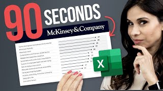
I agree. I'm also a fan of McKinsey charts.
@@LeilaGharani I kindly suggest also checking out graphics from The Financial Times + Five Thirty Eight + Washington Post + Wall Street Journal + New York Times....
I will give it to McKinsey though.
@@yaxmokwa7612 Entirely possible. I don't read McKinsey's reports nearly as often as I read TE as a subscriber.
These charts will wow the most critical viewers anywhere. Great tutorial with many tricks.
I never regret watching your videos. Every time I learn something practical!
Blown-away with these Excel Skills! Amazing!
I looked at those Economist charts when I was in school and it does look professional and elegant. Thanks for showing how its done. Long live Aptos Narrow , unrolling the shame brought by Calibri
So much content. Had no idea how powerful the array functions have become. Excel has experienced a real rebirth over the past few years.
I've been looking for you my entire professional Excel-user life. This is the content and explanations that suit my learning perfectly. Thank you!
I paused a couple of times and followed for the 1st chart; paused many times and followed for the 2nd chart; watched 3rd chart and appreciated how well it was done.. Good tutorial!
Thank you! 🙏
the way you used Excel in this video completely changes the way i see Excel - it can do so much more.
@Leila Gharani - You blow my mind at least once with EVERY video. Thank you!
The pinnacle of professionalism and mentoring 👍🏻👏🏻
This is one of the most impressive videos I've ever watched 🤯
Love it! This is one of my favorite ways to make horizontal dumbbells. One thing to mind is
If your series have points of switching - blue dots lower and vice versa - I’ve found if you point the difference column to both pos and neg error bars this does the trick! 🎉
Thanks for sharing your tip!
It’s really understated in college at every level how needed data visualization skills are across nearly all fields of work. I wish I learned more about excel tools in school and I’m working on my third graduate degree at this point with little to no excel skills taught outside of what I taught myself off UA-cam. And I’m in a STEM field.
You are simply amazing. I've learnt so much from you and I still am. God bless you.
The method used for designing charts to those seen in The Economist impressed me greatly. These types of charts professionalism and simplicity that highlight the data without unnecessary decorations. The advice, on color selection and font choice was particularly helpful. Now I see how intricate data can be presented in a comprehensible way. I will incorporate these techniques into my projects! Thank you for the valuable insights! )
That’s amazing what you showed us, ways to work with Excel to get really good looking visuals! Sometimes you don’t know whether you do this in Excel, or you do this in PowerPoint and add objects, etc to make it look nicer, which is a lot manual! Thanks for sharing Leila
Of course we watch your videos till the end Leila.... We learn so much from them.... Thank you for sharing this!
This is pure gold! thank you so much
Thanks Leila
I liked the first bar chart but really wanted the category labels automatically/dynamically added if new row(s) were added.
My solution was similar to prior content from you, "Excel Clustered Column AND Stacked Combination Chart".
The basic idea is to add an additional invisible series that displays the Category labels.
Firstly, make the data a proper Table, then create the Bar Chart
Copy and Paste the data values a second time to the chart, so there are 4 'segments".
Set the original series on the secondary Axis, new series on the primary.
Update the (reverse) order for both Primary and Secondary vertical axes.
Set the secondary Series Overlap to -100% and Gap Width to 0%
Add a label to the series/bar that has been split.
Set the Label to show Category Name and position as Inside Base, also you turn off "Wrap text in shape".
Change the Fill to No Fill for the secondary axis bars.
Thats it, try adding a new row to the table. Hopefully, you'll see the bars and Category labels just add themselves.
Hi Leila!
Today’s sponsor, Think-Cell, is a powerful tool. It would be great to see you showcasing some examples connecting Excel with Think-Cell for more systematic approaches… from number crunching to executive level presentations, just like the graphs you showed today.
Thank you for your amazing content! You have certainly made my insights a lot better and nicer over these years. Warm regards!
You could check out this video we did some time ago: ua-cam.com/video/gAGIVfL-i8Q/v-deo.html
Leila, you are so smart, so concise. You're awesome.
Words fail to capture the depth of my enthusiasm for this content. Thank you immensely.
The pinnacle of professionalism 🚀
Amazing as always! I've been using mostly Power BI now for visualization; however, I still keep on checking your channel for new videos/tutorials so I have tricks up my sleeve I can use just in case. 😀 Thank you, Leila! ⭐
Thanks for watching! Hope you found something useful.
Mind blown by 3rd chart lookup values ! Amazing
Leilani I have to congratulate you. It's been a LOOONG while since I last learned something entirely new in Excel. Your dumbell chart was exactly that, and I'm able to implement it basically as is in my recurrent reporting on a monthly basis. Love it. Props to you for a professional video and have my like.
You're so welcome! Glad you found something new.
This is the best excel graph and chart tutorial so far. Thanks Ms Excel Professor 😊
That is how expertise and creativity work together 🤝🤝🤝
I am screaming. Long time follower of this channel and long time subscriber of the economist.
Gonna use this for my exams to analyse previous year papers based on subjects/topics , thanks 🤙
I tried 2 of the 3 excel charts and they came out so beautiful. Thanks Leila.
Glad you like them!
Last chart was amazing especially picture in cell.
This is mind blowing. Wow loved these templates. Thank you.
This is great lesson. I like your teaching very much and your didactic voice. Thanks
Thank you! 😃
Awesome course (as always)! Just finished. Charts are so much easier now! Thanks so much!
One of the best videos I have recently watched. I wanted to make a lollypop chart but could never do it. Thanks to your simple style of teaching I did it.
Great video. Its fun to learn new techniques with charts.
I loved the lesson on charts Leila thank you. Can't wait for the business charts course. The Excel Visualization course in Udemy is one of my favorites. I go back to it all the time when I need to do some charting.
Leila sensei is the best. Actually, a very impressive illustration. I couldn't even think of it. Thank you so much 😊
Thank you so much 😀
This video was perfectly timed and excellent😊! I was working on some new charts today and thinking about how to make them nicer. Thank you!
Perfect! Hope we could inspire you. :)
Fantastic content, as always! Your videos never fail to impress me, and I particularly enjoyed this segment. Looking forward to seeing more content like this in the future. Keep up the great work!
Thank you for the feedback. I'm glad to hear that.
I am following you from al most 3 years, always found very quick and help Full Excel tips, which always help me in my daily reporting.
That's great to hear! Thanks for your ongoing support.
I think I was one of the people who asked for this and as ever Leila smashes it! You make it look so easy, and your videos are a great way to learn!
Spilled range is a big game changer🎉
I recently had to create a matrix for some qc and just ended up creating a couple of helper columns. But spilled range is definitely so much better!
It sure is!
Leila - another GREAT video... but you make it look so easy, which means I will need to watch this like 50 times before I get it right! Thank you so much for posting this!
Thanks for tuning in!
This is superb, the way you explain is clear to understand and replicate, you have a gift, and it's been years since I've been following your work on UA-cam, and getting better at my job by applying all the knowledge you shared, thank you so much! Keep it up with this amazing work.
I really appreciate the kind words. Thank you for your support over the years!
It's always great to learn from @LeilaGharani Thankful!
impressed!!! more vids like this please, it's so unique and inspirational!
I would like to add that if you hold down Shift while clicking and dragging an object, it will lock movement to the orthogonal directions only. You can use this in combination with holding Ctrl as shown in the video (3:35) to make a copy of the object that is strictly aligned with the original, to keep them all in line.
Alternatively, you can use the Align objects feature from the Shape Format ribbon tab.
Thanks for sharing this!
I learn from this video for my pitching slides.. thank you so much Leila!
Glad to hear it. All be best for your pitches. 😊
This is amazing! - beautiful looking charts and really easy to make - thank you once more!
Glad you like them!
Awesome visual presentation though....highly professional and well designed and structured 😊
Thank you so much 😀
You are such a great person ... true respects for you personally ..
This is terrific. I loved how you used xlookup instead of index and match. Thanks for this video.
Super-useful, thanks Leila! Those charts are great, very clear to understand.
Yay, thanks Chris!
Lovely, I didn't know I can bend excel charts like this.
truly mindblowing ... i hope one day i can transform this into my work as production controller.
Leila, muchas gracias por compartir tu conocimiento, una forma muy creativa e inteligente de utilizar el excel
You are so amazing the explanation you provide is super easy to understand
Can’t express how great this is! 😍📊
Clear, concise and well explained. Thank you.
Very clear, concise and easy to follow tutorial. Well done. I can see why you have many followers. I'm a new one. Greetings from Prague. CZ
Good
14:00 onward ..Wao..Xlookup can return objects...and it can spill down and across. Amazing
Great video! When you do it, it looks so simple and obvious, but I know it isn't when I try. I love the less is more charts.
Thanks, just leaned new ways to manipulate cells in Excel, not that I’m going to manipulate any Excel cells anytime soon, the information does come in handy! 😊😺🥰👩💻⭐️💎
Wow ! The dumbbel chart though ! Impressive. Thanks so much for sharing such great tips. Such great reportings ahead ;)
Glad you enjoyed it!
Amazing as alwaysz thank you Leila! ❤
Glad you like it!
Thank you Leila, I m always excited to discover the way you trick Excel to get your goal.
Thank you for sharing amazing knowledge, really really very nice
Xlookup with pictures? This is awesome. I need to try this asap. In the past I've used the camera tool in combination wit offset() but that makes the quality of the image worse somehow.
Recently I've used Emojis because there is still no way to add your own icons in conditional formatting. This might be a game changer. Thanks for the tip! 😊
Another thumb up excel tutorial! Thank you Leila
Excellent Video Leila. I am learning a lot from your videos. Thanks for sharing your knowledge.
Beautiful charts 😊 However, if the table source for the first chart gets a new category the text box approach would not be dynamic. Could you show us, how you would make that chart dynamic instead of using text boxes? Love your work btw!
I also wanted Chart 1 to be dynamic.
Hoped I'd find a solution in the comments, but no solution found.
So decided to solve for a dynamic Chart 1 and share my solution. Please find key steps in my comments above.
On the first chart, the thing that isn't being captured (though just a case of adding a border to the bars) is the thin white dividing line between the bars which is a nice style element of the original.
👍
Awesome content, been learning so much with your content!
Excellent as always.... Nice, specially the last one.. Thanks for sharing this valuable tips and tricks..
Great presentation - and thinkcell is indeed a relevant recommendation. Saved me so many hours (read : days) when I was a consultant…
Thanks for sharing!
Wow, it was extremely amazing! ❤🎉
Thank you so much!!
Today I learnt, we can lookup picture in cell and the use of & instead of creating a column and use concat function for lookup.
Super amazing. Always mind-blowing tutorials and I learn a lot from these. KUDOS
Thanks for watching!
Loving this chart explainer - goodbye dull Excel charts hello awesome ones :-)
Very nice!! Could you make a story telling series of videos please?
Great video as usual Leila. This ciuld be a very interesting series (the most famous charts)
Wish I could give you more than just 1 like. This is amazing!
Ramadan Mubarak Leila and happy to see you back.
عالی بود خانم قرنی👌👌
Wow, you make it look so easy!
always new magic and wonder in every video !!!!!!!!!!!!!!!!!!!!!!!!!!!
In my blank, i've made category labels like list from a range, and stretched it along chart.😊
Thank you. Just what I need
Seriously super cool, thanks Leila
Okay, I followed the first chart without a problem, but that second chart was just plain frikkin' sorcery!
Wow! So Awesome! ❤ I have been trying to figure workaround to do this!
Glad it was helpful!