classroom speak basic symbol motivation presentasi room speak english year 2022 / 2023 sys data com master quality utility 2022 / 2023 the internet.com 🏛🌍🌎🌏
Hey Kenji saw your frequency asked questions video for finance , it was amazing. Could you make a separate video for questions asked for different profiles like financial analyst, investment banker, fp&a, credit analyst etc.
You should use difference instead of variance. Variance is used to obtain standard deviation which shows the variation interval of your data. Variance is a statistical parameter of dispersion of your population/data.
Hi Kenji, great video on how I can enhance my reports however when I tried the Progress Column Chart my secondary data was sometimes greater than my primary yet it should be a subset of it. So I went back to your video and your data does the same. If you look at Transport Budget is greater than Actual but when you combine Actual is greater than Budget. Is this a bug with Excel?
Hi Kenji great stuff! I am already using a forecast chart for my assignment. I am thinking of ways to create a forecast vs actual dashboard (incorporating the forecast chat and elements from your video on budget vs actual video.) Any advice. Thanks
another great video! have a question: for the doughnut graph how can i properly add to it the average satisfaction of the last 6 months for instance? thanks a lot!!
Perfect stuff. You did not show how the Y axis label which is not merged with 2 columns and is not under the data column. Please show it as it is visually bugging me. 13:32
Hi Kenji, I trust that you are well. I had a small question regarding the Column chart with % change. If you don’t take a month-by-month flows (let’s, say 6 month every new data point) the graph will look very thin as if excel wants to add the missing months. This makes the graph look weird and not pleasing to the eye. Do you have a way around that? Thanks in advance!
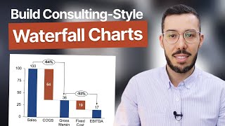
regarding the waterfall chart, it seems to be inaccurate, don't you think? When you promote and demote people, they are, technically, already within the organization; therefore changes in the positions of existing employees shouldn't influence the total number of employees.


👉 Sign up to Morning Brew: morningbrewdaily.com/kenjiexplains
classroom speak basic symbol motivation presentasi room speak english year 2022 / 2023 sys data com master quality utility 2022 / 2023 the internet.com 🏛🌍🌎🌏
Your excel content is 5 stars every time, thank you for sharing your knowledge!!!
Your channel appears to be blessing for us as the time goes. Thanks.
Your voice is calming for me. deep and comforting which make me follow your instructions more easily 😊
Kenji is by far the best in regards to excel and overall ease of explanation
I'm making myself a 'cheat sheet' and decided to just link here for that last one because of how many steps it has lol. Thanks Kenji!
Wow truly amazing, just knew 1 but the last one was outstanding need to practice more on it.. Excellent way of teaching skills
The progress column chart is a new favorite!
Awesome!
Thanks for that last one! It will be super useful for collage assignments
Glad to hear that!
Great tutorial
Fantabulous! Love this video💖
This was a great and very useful tutorial! Thank you.
Really great stuff! Thank you for sharing
Really comprehensive guide!!! Thanks
Glad you enjoyed it!
Thats great! I specially liked the last one. Thanks 🤜🤛
Great video, right to the point!
Tremendous! Keep it up boss 👊🏻👊🏻👊🏻 We want more videos like this one
Thanks! Will do!
Awesome stuff Kenji!
Thank you!
Keep it up with the great job 💪 Here since day 1
Pietro! Great to hear from you man hope all is well :)
Hey Kenji saw your frequency asked questions video for finance , it was amazing. Could you make a separate video for questions asked for different profiles like financial analyst, investment banker, fp&a, credit analyst etc.
Thanks for the idea!
Thanks!
Thanks for another great video Kenji!
Thank you for watching! :)
Really, thank you very much for your work!
Cheers Daniel thanks for always commenting 🙌
Yoooo! The most complex one in excel, I just did that today. :D
Great content as always!
Glad you think so!
Great vid!
Hi Kenji, great contents as usual. Just a request if possible. Could you slow down the presentation. My mind is not as sharp as it was before.
Good comment
You can change play back speed to less than 1
Excellent!
Really helpful!!
Thank you
thank you very much
Level 2 is awesome for one of my scenarios. Can you get the same effect in Power BI?
You should use difference instead of variance. Variance is used to obtain standard deviation which shows the variation interval of your data. Variance is a statistical parameter of dispersion of your population/data.
GREAT
make more of this please sir
Coming!
awesome!
Hi Kenji, great video on how I can enhance my reports however when I tried the Progress Column Chart my secondary data was sometimes greater than my primary yet it should be a subset of it. So I went back to your video and your data does the same. If you look at Transport Budget is greater than Actual but when you combine Actual is greater than Budget. Is this a bug with Excel?
how did you bring the customer satisfaction as a single header ?
thanks!
Hi Kenji great stuff! I am already using a forecast chart for my assignment. I am thinking of ways to create a forecast vs actual dashboard (incorporating the forecast chat and elements from your video on budget vs actual video.) Any advice. Thanks
another great video! have a question:
for the doughnut graph how can i properly add to it the average satisfaction of the last 6 months for instance?
thanks a lot!!
Hi all and everyone, just a real quick query, does anyone know if it is possible to make a chart transparent on iOS device? Thank you in advance👌
Perfect stuff. You did not show how the Y axis label which is not merged with 2 columns and is not under the data column. Please show it as it is visually bugging me. 13:32
Nice tutorial.
How did you clear those difficult borders that come with Excel?
Is there a way to make the text box work to a formula to bring back the top result in the Pivot?
Hey Kenji, I'm planning to take the course, but I'm a bit confused, are the contents with Financial Edge and from your website the same?
Hey, no they're not the same. Financial edge just sometimes sponsors our UA-cam videos but that's it!
Awesome
Thank you!
Do one with a cashflow forecast for one year using different scenarios.
Hello there, kindly guide, "in Data Lables, Value from cells is missing in my Excel worksheet 2021" plz guide.
Hi Kenji, I trust that you are well. I had a small question regarding the Column chart with % change. If you don’t take a month-by-month flows (let’s, say 6 month every new data point) the graph will look very thin as if excel wants to add the missing months. This makes the graph look weird and not pleasing to the eye. Do you have a way around that? Thanks in advance!
Hi kenji,
How can we buy financial modelling and valuation cource from you
Hey! You can get it here: www.careerprinciples.com/courses/finance-valuation-course
The doughnut and forecast chart
I had problem with the forecast
I'm 13 why am I watching this :skull: But this is good general knowledge for not only professionals but students as well. Good video.
Great to hear!
Wow
hi.....explain is good....but subtitles pls move on below
regarding the waterfall chart, it seems to be inaccurate, don't you think? When you promote and demote people, they are, technically, already within the organization; therefore changes in the positions of existing employees shouldn't influence the total number of employees.
Literally many people don't use gms
You're so handsome
0
Your name sounds like Japanese, but why do you have Filipinos accent?
ahaha no idea lol