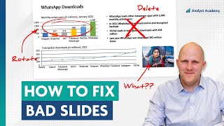
How The Economist makes the best charts on the internet

Вставка
- Опубліковано 14 гру 2022
- There are a lot of good charts on the internet, but there’s something special about charts from The Economist. Not only are they beautiful and well-designed, but they are crafted in a way that makes for effective data storytelling.
In this video Paul breaks down exactly why these charts are so good, and how you can follow these exact same techniques to build your own high-quality charts.
If you're interested in learning to create your own high-quality charts and presentations, make sure you check out our advanced courses!
Data Visualization ☞ bit.ly/3TKt11s
Presentation Design ☞ bit.ly/3UJJi88
PowerPoint Speed ☞ bit.ly/3hOxjaM
CHARTS FROM THIS VIDEO:
Covid-19 in China: / clgrwokosjh
World Cup: / clrtk3tsibq
Snap, Netflix, and Uber: / ckhdcvoms67
Homicides in the US: / cipistkua1y
European Recession: / cjnjjhdodfb
Reign of Queen Elizabeth II: / cirm_kyoedi
Thanksgiving Turkeys: / clv8wwxujbf
Revenge Tourism: / clopyuhoixx
Taiwanese Identity: / cj5yalstol0
Nuclear Power: / cgnle-goik8
Food-Price Inflation: / cdwxfpttve-
Charts from Website: www.economist.com/graphic-detail
English
This video has been dubbed using an artificial voice via aloud.area120.google.com to increase accessibility. You can change the audio track language in the Settings menu.
Spanish
Este video ha sido doblado al español con voz artificial con aloud.area120.google.com para aumentar la accesibilidad. Puede cambiar el idioma de la pista de audio en el menú Configuración.
Portuguese
Este vídeo foi dublado para o português usando uma voz artificial via aloud.area120.google.com para melhorar sua acessibilidade. Você pode alterar o idioma do áudio no menu Configurações.
=============================================
🚀 FOLLOW US
We regularly post high-quality content (that's actually helpful)
☞ Instagram: / theanalystacademy
☞ Linkedin: / the-analyst-academy-llc
☞ UA-cam: / @analystacademy
🏆 COURSES
Join thousands of people all around the world who have enrolled in our courses
☞ FREE 5-Day Course: www.theanalystacademy.com/fre...
☞ Data Visualization Course:
www.theanalystacademy.com/dat...
☞ Advanced Presentations Course: www.theanalystacademy.com/adv...
☞ Advanced PowerPoint Course: www.theanalystacademy.com/adv...
☞ Courses for Teams: www.theanalystacademy.com/teams/
📣 DOWNLOADS
Use our most popular downloads to improve your slide-making skills
☞ 100+ Real Consulting Presentations: www.theanalystacademy.com/con...
☞ Top 50 PowerPoint Shortcuts (PDF): www.theanalystacademy.com/top...
🎬 MORE POPULAR VIDEOS
Check out some of our latest and greatest here on UA-cam
☞ Redesigning McKinsey Slides: • How I redesigned 3 McK...
☞ Fixing Data-Heavy Slides: • How I fixed these data...
☞ PowerPoint Storytelling: • How McKinsey creates m...
☞ Top 8 PowerPoint Hacks for Consultants: • Top 8 PowerPoint Hacks...
☞ Consultant Explains the Pyramid Principle: • Consultant Explains th...
☞ How to Design Effective Presentations: • How to Design Effectiv...
ABOUT US
At Analyst Academy, we teach high-value consulting skills found at the world's top consulting firms. Our clients include small businesses, Fortune 500 companies, universities, and individual students in 100+ countries around the world. Each of our courses combine years of knowledge from high-performing consultants into highly engaging lessons packed full of best practices, time-saving tricks, and some of the industry's best kept secrets. Our downloads, courses, and articles are all inspired by best practices from the consulting industry. Learn more at www.theanalystacademy.com
All views expressed on this channel are that of The Analyst Academy LLC and its employees. Any materials mentioned or shown have been obtained through publicly available sources (e.g. firm or client website).
#powerpoint #presentations #consulting #datavisualization #theeconomist #dubbedwithaloud


Thanks for watching! What video would you like to see next?
Maybe a video on examples of unconventional charts that break the generally accepted principles of design but still are successful at conveying meaning in an efficient manner
Hi! Maybe a case study on a designated assignment from data collection, passing by data analysis and ending with the presentation or data visualization proposed to the client in order to share a bit the work done in between data collection and final visualization.
Could you do a Video of converting a poor Excel spread sheet into a really professional one. I mean pure numbers, no graphics.
Just found your channel and i love what you’re doing. I’m a CFP, CFA, and have personally built dozens of charts to teach financial education of tens of thousands of people. I only wish I found your channel while in that role!! Keep up the good work and I will look forward to every new video you put out!
Amazing that being an The Economist reader myself and having in hands a task to develop a new report I was also looking at their visualizations exactly thinking why I find them so interesting, informative and compelling. Top! Thanks!
I am so happy you made this video. I have been a subscriber to the economist ever since my undergraduate degree. I learned so much from their stories and their charts. I like you are spreading the message about their incredible work.
The title color block is a common tool for designers. Even though titles are generally larger and bolded, a block of color helps readers quickly understand the following is a new and distinctive section, by engaging primal sense of shapes and colors instead of language. You can even use different colors to signify different themes in the same page. Although you can apply the colors to the titles themselves, it can adversely affect text readability and visual consistency of the page.
splendid explanation! kinda wonder why it fits so well
yeah as a graphic designer, this is not unique at all. very common place. i do this a lot, i personally think titles look better underneath a line. but still, great video
good chart source: wallstreet journal, chartr, and consulting firms, the economist.
0:15 took detailed notes and compared them with some of the best chart makers in the business.
0:25 4 main reasons.
1:40 reason 1: simplicity. basic title, basic subtitle, and basic bar chart.
2:00 number 1 goal with charts: readability, not trying to impress the audience. if you scroll along their website and instagram page. compared to some consulting firm.
2:40 reason 2: they match the chart to the message.
3:15 expressed with a year over year percentage.
3:45 you can think of as a combination of line chart and column chart together.
3:50 reason 3: they guide you to the insight, and often they do it subtly.
4:15 the grey line fades into background.
4:45 the information actually shown on the chart all the way there.
5:30 reason 4: consistency:
5:10 the red line here is interesting.
6:30 take a mess of data and turn into a compelling story for anyone to understand in a few seconds.
One thing I noticed is that they put scale on the right. The "default" chart is one in the first quadrant of the XY frame (so data is above the horizontal axis and to the right of the vertical one). The Economist moved that into the second quadrant, meaning you get the scale at the end, where they wanted to get to.
"something something reached X level" is easier to read if you have the graph there then the X value right at the end of the line.
Mocing bar charts to the fourth quadrant is a similar effect.
great insight
I used to be a subscriber, and my favorite of their charts were the complex ones, where they found three or even four data sets or relationships they wanted to bring together in one place. It would take time to process, but at the end I always had to admire how neatly and creatively they solved the design problem. Tufte would approve.
I really like the content of this channel, and the Spanish dubbing gives it a particular and fun touch that helps me learn faster.
Another great video. Their simplicity is out of this world.
Great video. Also note how often they use color (of line series, bar, etc) to point out the data/trend of interest-- and they label series directly, as opposed to having a legend where one needs to look up which color line represents what. This dramatically increases rapid understanding by readers.
Thanks for this video!
I started my first work at Nestle, and the entry position is doing reports and charts.
This will help me to be better with my charts!
Thanks!
It's the tasteful thickness of it, that subtle off-white coloring. Oh my god, its even got a source.
Paul Allen's charts are the best!
Amazing content and straight to the point, liked & subscribed
It’s notable that you did not mention the Graphic Detail feature whose charts vary from confusing to incomprehensible. The readership hours chart in the 24th Dec edition is a moderate example. I still love The Economist.
Takeaways:
Simplicity: Choosing simple yet effective visuals with correct and minimal labels
Matching the Chart to the message: Choosing the right visual
Helping the audience to focus on the message: Highlighting the key category or value in the same colour as the colour above the chart title or bolding the value or highlighting the line/column of concern and subduing the colours of the rest
Great breakdown, super useful
Hi! I'm really enjoying your videos. Two things you could perhaps cover (or point me towards...): 1. slide animation and 2. a discussion of the trend to replace traditional "written" reports (e.g. in MS Word) with PPT slides that also serve as the "close-out presentation" and are therefore FAR to wordy.
great video, financial times is a bit similar too (i feel they often have more complex data charts though that are beyond my capability).
thanks for the clear explanation
Hi Paul , your videos are really awesome and helping design ppt better, i have a question like if we are showing limited information then it's manageable, however if company having multiple business lines , let say 5 business verticals and even if we show only sales and profit and then comparison with last year and budget, its come too much information. Can u suggest any better way to show other than Excel grid. Thank you!
While this is interesting, a point you make several times quite correctly is that these charts exist to communicate the message in the Economist's analysis. However I would point out that this leads to a 'garbage in, garbage out' situation. Without critical analysis of the messaging communicated by the charts, is there not a risk of saying misleading charts are 'good' just because they communicate the distortion well?
I think this dimension is important because you're critical of more complex charts and presentations while these may be necessary to communicate a more nuanced analysis than 'A goes up, B goes up'. Is a good chart not one which communicates truth transparently, tells an angle to the story you might not have considered, or one which is difficult to communicate in words? I'm not saying the Economist does low-quality analysis (I think in general they do quite well), but I think this is an important part of a conversation about presentation of data.
I also say this because you frequently praised the skill of journalists telling a story with the data, but I disagree - I don't think it takes skill to pick a data trend that fits your narrative and graph it using a standard template. I think the skill we should value is using data transparently, consistently, and without agenda. I also think to some extent there is a risk of putting the cart before the horse here - maybe sometimes the journalist was handed new data and told to create a written narrative around it, in which case the skill is in the article - but again is this something worthy of praise if the data itself only tells one side of the story? We can manipulate data to tell whatever story we want; is it ethical to praise and platform it uncritically, without a deeper dive into the merit of the analysis?
Great comment!
Just as a journalist is not going to spend 20000 words debunking flat earth in order to get to the meat of a story on satellites, dataviz is always going to be a small slice of the story. The job of these charts is to illustrate the evidence and conclusions drawn upon in the article - of course there are going to be additional complexities and concerns outside of this but that's not the chart's job to communicate those.
Data visualisation is very different within journalism vs a primary source with a null hypothesis and much more space for complexity. A chart that doesn't serve the "agenda" of illustrating the story doesn't deserve to be there, and the accuracy and efficacy of the reporting itself is where your criticisms rightly apply, not in the visualisations used. If the story is deceptive, the story is deceptive - that speaks nothing to the quality or lack thereof of the data visualization quality.
Seems like you read How to Lie with Statistics.
Great video!
The Guardian in the UK has the best charts IMO. They invested heavily into data viz many years ago and it's paid dividends IMO.
Can you share slide examples for operating model redesigns in the IT sector?
What kind of graphic tablet are you using in this video?
Could you do more videos on how to create and format these types of charts please? Do you primarily use Excel or PP?
Excel is the best way to initially create it. Once you export it to PowerPoint, you can continue to simplify to align with your story
Two ways the pros use: Code it in R and make the chart with ggplot, or make it anywhere and redraw it by hand with Adobe Illustrator for complete control.
@@zachpw I highly doubt that in consulting context.
@@definitelynosebreather but it's cool
That time is better spent in other work
Love this channel.
The chart on Taiwanese identity is only a slightly simplified version of the chart that the NCU uses to present this data.
They do it a bit more colorful, with another category (no response) and points/small circles for the individual data points of the surveys.
The version of the Economist is good, though, to boil it down to the essentials and present it to a new audience.
Out of interest, you should have a quick critique of the very complex Economist charts, because when they go complex they go extremely complex. They can get 4 or 5 dimensions on a chart. Sometimes I spend minutes trying to find the trend before realising should have just looked at the title.
One thing they often do poorly is not use enough colour. They will have 3 different shades of red and three different shades of grey and the chart legend doesn’t help at all.
FT has the best charts of any newspaper globally
Serious Question : Do you have to pay The Economist to feature their charts in your videos? I think they have a rights management department that requires this.
How are those charts built? What software do they use?
wondering same thing here...
@analystacademy, can you help here?
they have a cool newsletter about their data viz techniques!
💯
What I don't like about them is the fact, that they just give as numbers next to line charts. Without telling us what they actually are. It's confusing, because my eyes read pictures way faster and than I have to go back to the text to actually follow up on what they represent. Ist it %? Is it amount? Just write the "%" symbol above the Y Axis. :/
A picture instead 1000 words.
Old joke - an economist is the guy who, if you forgot your phone number, can estimate it for you
So, how do they make it? I watched the vid without sound.
If there’s no sound try checking your settings in the video player. You should be able to select English under the Audio Track option. Let us know if that does the trick or if it’s something else!
2:22 That's an ugly one. It's hard to work out which line is which country. Which tick marks are for starts of years? Marking them using full vertical lines would make this clearer. And having a horizontal line every 3% is bizarre.
3:10 Another confusing tangle of lines.
2:41 Why not a top 10?
Its kinda weird seeing this big dude being voiced by a teenager girl with the Portuguese dub option
That longest reigning monarchs chart is actually really confusing. The y-axis is centuries? Why isn't it just a chart of the longest reigning monarchs in descending number of years reigned?
A purely rank-based chart of reign length would place reigns from disparate historical periods immediately adjacent. This makes it just a bit harder to connect the names and historical period of each entrant with one's historical knowledge.
By instead presenting the "running maximum" entry for each birth century, we get a more recognizable list because names appear in chronological order, and we _gain_ the trend over time. You can think of this chart as having been distilled from a straightforward sequential bar chart of _all_ reigns by editing out short reigns. Alternatively, think of this chart as a purely rank-based chart that has been sorted by birth century, and again showing only the longest entry of each century.
This chart is indeed really well thought-through, showing long reigns across a millennium. Thank you for highlighting this example!
I don’t agree at all. Most people don’t know all the protons monarchs by just their name. Putting them in their historical context is very helpful to show through centuries how long the reigns have been.
I do not what happened with my UA-cam channel, but the video is in Portuguese. Please, correct it for English.
The video is dubbed into multiple languages actually! You can switch to English in the settings menu (on the playbar).
@@AnalystAcademy thank you
O homem tá com uma voz de mocinha entojada!
Haha I know... made a mistake with the translation file!
Their charts are too simple, time series usually show only short period of time which can be often misleading (or easily manipulated).
Highly subjective. From the point of view of a statisticians, the graphs are primitive and often misleading. From the point of view of a propagandist, these are perfect. They tell you what to think, even if it's utter garbage. They leave out important aspects and context so they can promote their message.
These charts don't convey information, they convey messages.
You don't give these charts to someone who's supposed to make an informed decision, you give them to someone you want to make the decision you'd like to hear.
And it doesn't require a degree in statistics to see through the ruse, you can only fool fools with that. Really unprofessional.
Nice video. My takeaway from these charts is that this administration sucks.
Guy makes linear estimation of food price inflation and you call it good graph because it is appealing? Who cares when it's wrong
The Economist's charts are nice, but it's a shame how their reporting has lurched to the left in recent years. I subscribed for many years but I'll never give them my money again.
Literally always been like that. At least what we would call the left now (which they wouldn’t have then). They’re a self-described ‘Liberal’ (capital L) newspaper. They’re progressive. What did you expect?
how dare they make progress
Lost me at "Russia climbing out of the recension" - that dump will cease to exist soon