Hi Shalini, you can just add a row with records, copy your formulas down and extend the range of the series in your chart. I'm not sure but I think if you format your complete table including the formulas as an official Excel table this goes automatically.
Excellent video, clear steps and explanations. Thanks a lot. This is exactly what I needed for my upcoming presentation. I'll look into your back catalogue of videos and look forward to improve some other things I need to present.
This is an excellent video, thank you. I have a question for you… how would you recommend I adjust this when a lower bar is better? I’m looking at comp to revenue ratios (not sales), and using actuals vs budget, so the “smaller” bar is better. Is that an actual change to the calculated diff columns or so I adjust the error bar custom series from positive to negative?
Three columns is possible in the same way like two columns but you need to determine which columns are compared. Although it will require a lot of helper columns 😁
great video thanks :-) How to get to add labels for the actual visible bars when the "max" bars are in the way? Is it possible to toggle bars - or put those in front to the back?
Hi, data labels still had to be manually adjusted even when I use the max bars. Any tip? Happy new year and best wishes. With this video I can tell you have a great eye for design and I wish you more similar videos as they look so distinguished. 🙏
@@rbxexcelvideos I will definitely watch more videos and try to replicate them. I saw your charts playlist and it made me excited to keep on learning. Thanks!
could you answer me on this question plz: i want to highlight top 3 in pivot chart with every drill down is that possible ? thank you for all your information you sharing🤗
Hi Mostafahwafy, i dont know how this can be done in a pivot chart but in normal charts you can apply conditional formatting by adding a second data series on top of the first. See my other videos about charts with conditional formatting for more info.
Dear just one question, i am seeing in data label, after applying formula values are 2 numbers/digits: 1. Number and 2. percentage. how did it happen, Can you please describe what does it imply
Thnx for your question, Sarang! You need select the data labels, press ctrl+1 for chart option, go to the label options and check the right boxes. I think there are two boxes checked at the moment.
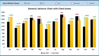
Great technique for the charts; thank you. Just one observation, I think the % calculations for the two columns are the wrong way round? Eg Feb increase by 90 on a basis of 630 in 2020 should show a 14.3% increase not 12.5% (which is based on the 720).
I really liked the variance lines ;-) but sorry bro, the calculation for labeling isn't correct, we always have to divide by the base number: actual/previous-1 - so the first variance is 39% cuz we plotted here the change from previous period to actual.
Well, that is possible but you need two different comparisons which require a lot of extra helper columns. You need to create extra columns for the error bars of the second comparison.
For that you need extra error bars. I can't tell you exactly what to do while I did not try this myself before and I don't have the time at the moment to try this myself.
Hey, this is amazing tutorial, but is it possible to do this for more than 2 years, because I am assuming this approach for months, is there a way that I could just keep adding months and see the change?
Thank you, Diana! Yes, it is possible to add an unlimited number of bars to this chart. Using the OFFSET function you can use dynamic number for e.g. allways the last 6 months from now. Is this an answer to your question?
Hi Adam, I'm not using a pivot table for this. You need some helper columns so this would be not that easy to create from a pivot table. Thnx for your comment, Adam!
@@rbxexcelvideos I created a % change column in my pivot with arrows green/red (Conditional formatting) to show trends. I was hoping I could get those same arrows on the chart...so far I can only get the percent change.
Well, the arrows are two series of error bars which needs columns for positive and negative change. If you can get these in your pivot table it should work but I think thats not easy


Amazing video, it is very helpful and it is explained in detail. Thank you for your effort.
Thnx Rebellious!
this is the best chart i've seen, normally i have to combine 2 charts (scatter with error bar) and clustered column. Here is just 1. Thank you alot
Thnx!
This is very helpful in identifying trends and visualizing where gaps and wins are for KPIs. Nice !!!
Thnx Scott!
@@rbxexcelvideos: Hello, can this chart be refreshed quickly, for July and onwards - without building it from scratch?
Hi Shalini, you can just add a row with records, copy your formulas down and extend the range of the series in your chart. I'm not sure but I think if you format your complete table including the formulas as an official Excel table this goes automatically.
This is so helpful. You are amazing.
Thnx, Michael!
Excellent video, clear steps and explanations. Thanks a lot.
This is exactly what I needed for my upcoming presentation. I'll look into your back catalogue of videos and look forward to improve some other things I need to present.
Thnx Jullesz!
the chart looks amazing,thanks!
Thnx!
yeah amazing - i have used this in so many of my presentations - Thanks for sharing this beautiful chart🙏
Thnx!
Pretty cool video. Earned a subscription.
Thanks a lot!
thank you for this trick, it really helped me with my thesis!
Thnx!
I felt like I learnt one new good thing today. Thank you sir
Thnx!
excellent, great information plus a beautiful graphic, thank you
Thanks, Alvaro!
Thank you so much, well explained!
Thnx, you're welcome!
thank you very much, that help me a lot. Wish you have a great day
Thnx!
You have beautiful imagination, sir !
Thank you so much !
Thank you!
This is magnificent!!!! Thank you!!
Thnx, Niki!
Greit!!! Thank You. Expecting for more videos!
Thanks a lot! More video's are coming...
This is an excellent video, thank you. I have a question for you… how would you recommend I adjust this when a lower bar is better? I’m looking at comp to revenue ratios (not sales), and using actuals vs budget, so the “smaller” bar is better. Is that an actual change to the calculated diff columns or so I adjust the error bar custom series from positive to negative?
Thnx, Majeed! I think when lower is better you can just switch the red and green colors?
amazing and very well presented
Thnx!
Very helpful!
Thnx!
Man, what a beautiful chart!
Thnx Alexandre!
Thank you for your help :)
Thnx!
Is there a way you could do this against two comparaters? for example, comparing 2025 with 2024 and Budget, so 3 columns?
Three columns is possible in the same way like two columns but you need to determine which columns are compared. Although it will require a lot of helper columns 😁
Awesome video
Thanks
Thnx Luke!
Awesome
Thnx!
Thank you sir great information for excel user
Thank you, Sudhakar!
Niceeeeee❤❤❤❤
Thnx!
great video thanks :-) How to get to add labels for the actual visible bars when the "max" bars are in the way? Is it possible to toggle bars - or put those in front to the back?
Thnx Lena, i dont know what that problem is but the same can be done with a horizontal bar chart.
@@rbxexcelvideos thanx - I found out how to use the camera function to tilt the whole chart
Thnx Lena!
Lovely from 2023. Thank you.
Thnx, s w
Hi, data labels still had to be manually adjusted even when I use the max bars. Any tip? Happy new year and best wishes. With this video I can tell you have a great eye for design and I wish you more similar videos as they look so distinguished. 🙏
Thnx Tina! It should be automatic. I think you should check if you selected the right range for data labels and used the right data series.
@@rbxexcelvideos thank you! I selected max series without the label Max1 and that fixed it
Super!
When data is added for next month. The line bar is not reflecting
Ok, i dont know what the problem is there without seeing your sheet...
amazing! What a legend!
Thnx Peter!
Can we automate or conditional format the color arrow dependent on excel cube if minus than red if plus then green?
Thnx George, as far as I know conditional formatting in Excel charts is only possible by using multiple data series like I did in this video.
Never subscribed faster thanks bud
Great, thank you
Thnx!
lmao i was tNice tutorialnking the sa but don't give up! We got tNice tutorials!
Thank you, Donia!
Thank you, love it❤
Thank you!
error occured in excel when i follow you formula in diff + diff - and data label + datablabel -
i think it has something with my excel version.
Ah ok, well succes figuring out what causes the error and let me know when you need any help with that!
the best from thailand
Thnx!
Great niche!
Thnx!
@@rbxexcelvideos I will definitely watch more videos and try to replicate them. I saw your charts playlist and it made me excited to keep on learning. Thanks!
Great! Thank You
Thanks Vivek!
can we do it with the pivot table? When we change the 1 year to other year, will it can automatically too? Thank you
Never tried this with a pivot table. Formatting options are limited for pivot charts so i dont know. What do you mean by automatically?
could you answer me on this question plz:
i want to highlight top 3 in pivot chart with every drill down is that possible ?
thank you for all your information you sharing🤗
Hi Mostafahwafy, i dont know how this can be done in a pivot chart but in normal charts you can apply conditional formatting by adding a second data series on top of the first. See my other videos about charts with conditional formatting for more info.
Beautiful chart, thank you
Thank you, Alexandru
If you wanted to add data for July how would you update the graph?
To extend the graph you can just add data undernauth the table and extend the ranges of the chart. Dont forget to extend all data series of the chart.
Dear just one question, i am seeing in data label, after applying formula values are 2 numbers/digits: 1. Number and 2. percentage.
how did it happen, Can you please describe what does it imply
Thnx for your question, Sarang! You need select the data labels, press ctrl+1 for chart option, go to the label options and check the right boxes. I think there are two boxes checked at the moment.
@@rbxexcelvideos very well understood. So kind of you for your explanation and prompt response.
No problem, you're welcome!
Great technique for the charts; thank you. Just one observation, I think the % calculations for the two columns are the wrong way round? Eg Feb increase by 90 on a basis of 630 in 2020 should show a 14.3% increase not 12.5% (which is based on the 720).
Thanks David! You're right, it needs to be devided by the 2020 value. Thanks for your observation and positive feedback!
yo this is fire!
Thnx, Yao!
Excellent
Thnx!
Thanks bro
Thnx Padraigin!
I really liked the variance lines ;-) but sorry bro, the calculation for labeling isn't correct, we always have to divide by the base number: actual/previous-1 - so the first variance is 39% cuz we plotted here the change from previous period to actual.
Thnx Tibibari, your totally right! I already knew but can't change the video anymore.
I keep getting an error message when trying to use the formula for the "Diff +" column
That's not good. Maybe you can share you're formula.
This is great learning. But why did we choose diff+ for 2020 error bars and diff - for 2021?
Thnx Shailender! The plus and minus error bars are because the arrow needs to go up in case of an increase and down in case of a decrease.
This is good, but have one query, if add more months then data is not expending and gives some errors
Thnx! If you add more months the same way as the originals it should work. At least, it did for me.
idk if your growth rate formula is right. shouldn't it be year 2 - year 1 over year 1? so 2021 - 2020 / 2020?
Hi Tim, yes, that's true. It was also mentioned in a previous reaction.
@@rbxexcelvideos i see didnt see them but thanks
Thnx anyway for your alertness!
How to do the same if I have to include another year in the data?
Well, that is possible but you need two different comparisons which require a lot of extra helper columns. You need to create extra columns for the error bars of the second comparison.
@@rbxexcelvideos Thanks for the reply. Yes, I have created extra helper columns. Now I am stuck at how to map them in the chart options
For that you need extra error bars. I can't tell you exactly what to do while I did not try this myself before and I don't have the time at the moment to try this myself.
@@rbxexcelvideos Sure. Thanks for the reply. BTW good work
Thnx Pardha!
very good! 엄청나군요.
Thanks!
Hey, this is amazing tutorial, but is it possible to do this for more than 2 years, because I am assuming this approach for months, is there a way that I could just keep adding months and see the change?
Thank you, Diana! Yes, it is possible to add an unlimited number of bars to this chart. Using the OFFSET function you can use dynamic number for e.g. allways the last 6 months from now. Is this an answer to your question?
How do you do this using a pivot table expressing % Change?
Hi Adam, I'm not using a pivot table for this. You need some helper columns so this would be not that easy to create from a pivot table. Thnx for your comment, Adam!
@@rbxexcelvideos Got it. I was wondering if this could be done or not in a pivot table. Thanks!
Hi Adam, thnx for your comment. I think that would be difficult because of the helper columns this chart needs.
@@rbxexcelvideos I created a % change column in my pivot with arrows green/red (Conditional formatting) to show trends. I was hoping I could get those same arrows on the chart...so far I can only get the percent change.
Well, the arrows are two series of error bars which needs columns for positive and negative change. If you can get these in your pivot table it should work but I think thats not easy
Can you post a link to the file?
I tried before but it didn't work. I will try again soon.
Great video Sir
Please provide exercise file also. Thank You
Thank you! I will try but last time it did not work...
would you please share with me the excel file with regards?
Hi Ahmed, I tried before but it did not work. I will try again soon.
Tq sir
Thnx KD!