How to Create Sales Dashboard in Tableau in 30 minutes

Вставка
- Опубліковано 21 лип 2024
- Tableau how to create sales dashboard in 30 minutes | video games sales
Create an interactive sales dashboard in tableau using different parameters and filters
Link to download the dataset: www.kaggle.com/datasets/grego...
(00:00) introduction
(01:10) Create Area Chart
(11:35) Create horizontal bar chart
(16:51) Create bubble chart
(21:07) Create Text sheets
(24:25) Create bar chart
(26:40) Create dashboard
Tableau dashboard
Sales dashboard
Interactive dashboard
Data analysis
Data analyst
Business analysis
Business analyst
Video games
Xbox
Data Science Road Map
Coursera plus - with Coursera plus, you will have unlimited access to 7,000+ world-class courses, hands-on projects, and job-ready certificate programs-all included in your subscription including popular Professional Certificates from Google and Meta : imp.i384100.net/Or95Yn
Data Science Path:
1. Data Science Math skills - Duke University: imp.i384100.net/3e9Okd
2. Inferential Statistics - Duke University: imp.i384100.net/4PrKao
3. IBM Data Analyst: imp.i384100.net/NkQPG2
4. Python for Everybody: imp.i384100.net/y2eLZW
5. Data Science Specialization - Johns Hopkins University: imp.i384100.net/9gM2D0
6. IBM Data Science: imp.i384100.net/LXxgBL
7. Machine Learning Specialization: imp.i384100.net/NkQPJv
8. Deep Learning Specialization: imp.i384100.net/Kjq9GA
9. MLOps Specialization: imp.i384100.net/q4ENvj
10. DeepLearning.AI TensorFlow Developer: imp.i384100.net/9gMQZ0
11. TensorFlow Advanced Techniques: imp.i384100.net/rQzby5
13. TensorFlow Data & Deployment Specialization: imp.i384100.net/PyrkgX
14. Natural Language Processing Specialization: imp.i384100.net/k0abvn
15. AWS Fundamentals: imp.i384100.net/eKrB2D
16. Practical Data Science on AWS: imp.i384100.net/q4ENv5
Get certified from Google:
1. Google Data Analytics: imp.i384100.net/xk2bvA
2. Google Business Intelligence: imp.i384100.net/QyNedP
3. Google Advanced Data Analytics: imp.i384100.net/rQzbNQ
Get certified from Meta:
Meta Database Engineer: imp.i384100.net/jrn26e
Disclosure:
I may receive a commission if you click on and purchase from one of the links above.


This was great learning! I can now add interactivity to my projects! Thank You!!!
Great content! This is where I come for anything Tableau. Thanks for sharing your knowledge!
Hello Kayode! thanks a lot! can you please tell me what other dashboards types are you looking for to create?
Great Content! Need more similar advanced Tableau lectures.
Hi Jinqi! Glad to hear that! do you use other data visualization tools than Tableau?
Thanks for sharing this dashboard!! This is a great lesson on the power of parameters and calculated fields
Thanks a lot ❤️! I am really glad you like it!
@@DataScienceRoadMap Question: When I adjust the parameters related to the years, the Top 10 visuals do not always reflect the top 10. Sometimes, it only shows 3 or even 1. What is the explanation for this?
Great tutorial!! Helped alot. Thank you ☺️
Thank you Aditi! Are you a fan of breaking bad series? I am going to publish a video on how to create a breaking bad dashboard soon, I hope you will like it!
Loved this video and the content!
Hello Tanya! thanks a lot! actually I want to ask you if possible to tell me how many years of experience you have with Tableau :) ?
This is a great content. that's helpfully to improve my skill. Thank you
Most welcome, so glad to help! :)
Lovely work!!! Thank you!
Thanks a lot Tahmid!!! and you're welcome!
your videos are really helpful. thanks n god bless you :)
Most welcome! Thanks a lot!
Hi Thank you for those great dashboard , those are very helpful to do practice
Hello!! Most welcome!
thanks! it is really useful! 感谢
Thanks a lot for you comment! I hope you will also like the other dashboards, please check this playlist for more such videos: ua-cam.com/video/BTArwS4ljC4/v-deo.html
Excellent Job!
Thanks a lot!! Happy to help :)
Thanks a lot!!!
Most welcome! so glad to help! :)
Great job
Thanks a lot Hamid!
Hello, please why do you need to create a calculated column (study year) whereby you checked if year is >= start date and year
Hello, actually so that we can create a filter than we can use for all the sheets and have an interactive dashboard :)
Amazing👍
Thank youu Siraj Shaikh!
Great video! What is "Study period: 1" supposed to represent? Still unclear what that does. Thanks!
Thank you! Actually it means that the date is within the study period, you can for example change it to 'in', because we want only the dates within the range defined from start date to end date. I hope I answered your question :)
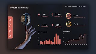
Could you please also advice, waht sales these are, is it thousands of units, millions? Or is it in currency (millions, thousands...)
Hello, it is in millions :)
WOW bro amaizing❤❤❤❤❤❤❤❤❤❤❤❤😋😋😋😋😍😍
Thank youu so much!!! So glad to help
Hi,
Instead of start and end year, you can use year in show filter, we can see particular range of years, i didn't understand, can anyone explain
Hello, yes, but it is better to use parameters
thanks a lot
Most welcome!!
hello, i am recreating this but in my dashboard i m not able to see global sales and other sales chart,why it is? pls help
Hello, please check the dataset and make sure you created the used the correct calculated fields :)
thanks from india
Most welcome!!
I am getting error of Circular reference for Zone sales in calculated field. Any idea what is the problem?
Hello, please check the data type or the formula within the calculated field :)
Thanks for your video it is helping me a lot to build a portafolio, i have a question, when i upload the csv file to tableu public app all numeric fields are read as a string, and when i tried to converted they convert as null values, any idea what is happening? thx again
I did a Calculated Field, with FLOAT()
Hello! Thank you! Is it working with the new calculated field?
@@DataScienceRoadMap Hi, It didn't work, because it was creating a circular reference when I tried to create a parameter. What I did instead was changing the regional configuration, the problem was that my version of tableu was working in the spanish region (in europe, the decimal separator is different), so I changed it to the mexican region which uses the same system as the US.
I can't get the line chart to display after creating a calculated field from the parameter. I have no idea what I did wrong.
Hello @kayode oyeniran, sorry for this late answer, I disconnected for a while, did you choose the right names for your parameter and calculated field? Because as you can see the name of both the parameter and the calculated field is the same, for the calculated field we took "Zone Sales" which is the parameter and used it in the case statement with the different sales. Normally it should work if you followed these steps.
I was having the same issue. Check your calculated field. It needs to be written in string format so type WHEN "EU Sales" THEN [EU Sales] repeat and it should work. If you auto populate WHEN [EU Sales] THEN [EU Sales] it won't work because that isn't string format. Makes sense?
@@kitch1186
Hello Kitch,
I experienced a similar problem as well. To resolve it, I found that using the exact name as it appears in the data, including spaces and ensuring that the upper and lower cases of the letters match, was effective.
Thanks
Thanks you guys for your answers! ❤
I am having difficulty with the top 10 filters. When I change the study period, it drops to only top 5, or 4. I don't have the full 10. Any advice?
I created INDEX()
Hello, did you use 'add to context' for the filter?
Can you demonstrate a dashboard for music data analysis like with Spotify or Apple music ?
Yes absolutely!
Can I recreate it
Hello, yes sure! It will be good if you share also the reference
@@DataScienceRoadMap thank you so much 😀