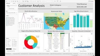
This is very well done, thank you! Is there a way to make the experience level ordinal so that it displays on the chart as entry, intermediate, senior, executive? Right now it's displaying alphabetically, and it makes the circle charts that display average salary feel very random instead of showing the relationship between experience level and average salary.
Hello Shae!! Thanks a lot for your comment! Actually for the experience level, it depends on the percentage of employees in each category, but for example we can also make it depend on the seniority level as a dimension
Hi! I love your tutorials - they are so easy to follow and they are all so different!! I was wondering if you could help me figure out why when I save from Tableau Desktop Public up to Tableau Public, my grid lines and zero lines for 4 parts of this dashboard come back. :( Should I share the link to my public dashboard here?
Hello! Thanks a lot!! Yes, when we created the worksheets, we removed the grids either for the rows or the columns, we did not select 'none' for sheet section. So if you click on sheet in the grid section and select 'none' normally all grid lines will be removed, thus you can put it on Tableau Public as it is :)
Amazing tutorial. However I had a ton of trouble resizing the filters and placing them side by side atop the Dashboard. And even the different charts, unless I enable the floating option. For me when it comes down to UI, Power BI is less complex compared to Tableau.
glad to help, We can also create the same dashboard using Power BI, sure! The best option is to know the two tools as it will help you understand better the data analysis process :)
Hi Lavisha, yes, this is the right way, first you put it in color, then you press control key again, drag and drop company size into label, normally it should work :)


another great video and thank you again ! I had such a hard time following some of the formatting and realized i had to download the app 😂
You're welcome Christopher!! Thanks for your comments!
This is very well done, thank you!
Is there a way to make the experience level ordinal so that it displays on the chart as entry, intermediate, senior, executive? Right now it's displaying alphabetically, and it makes the circle charts that display average salary feel very random instead of showing the relationship between experience level and average salary.
Hello Shae!! Thanks a lot for your comment! Actually for the experience level, it depends on the percentage of employees in each category, but for example we can also make it depend on the seniority level as a dimension
Hi! I love your tutorials - they are so easy to follow and they are all so different!! I was wondering if you could help me figure out why when I save from Tableau Desktop Public up to Tableau Public, my grid lines and zero lines for 4 parts of this dashboard come back. :( Should I share the link to my public dashboard here?
Hello! Thanks a lot!! Yes, when we created the worksheets, we removed the grids either for the rows or the columns, we did not select 'none' for sheet section. So if you click on sheet in the grid section and select 'none' normally all grid lines will be removed, thus you can put it on Tableau Public as it is :)
Thank you so much for the fruitful content and the amazing idea. One of my new favorite tutors :D
Thanks a lot Manar!! Really glad to help and also thanks for your comments !
Amazing tutorial. However I had a ton of trouble resizing the filters and placing them side by side atop the Dashboard. And even the different charts, unless I enable the floating option. For me when it comes down to UI, Power BI is less complex compared to Tableau.
glad to help, We can also create the same dashboard using Power BI, sure! The best option is to know the two tools as it will help you understand better the data analysis process :)
How u have put company size to label in donut chart.. i am puting so the pie chart has gone ... ctrl + which key you have used
Hi Lavisha, yes, this is the right way, first you put it in color, then you press control key again, drag and drop company size into label, normally it should work :)
Hello, can you please next time show when you download the Kaggle dataset? Thanks
Yes! Absolutely
Thanks for the video bro.we did a good job behalf of youu ❤
Most welcome! So happy to help ❤
Thank you, great work!
Thanks a lot Kit!! Glad to hear that!
Big up man, best content
Love from MCKVIE
Thank You!!
Most welcome!!
tq
Welcome!