Spring Colors with Deep Deep Light! 🌸🌹🪻🎨

Вставка
- Опубліковано 30 вер 2024
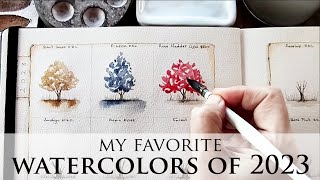
- Hello everyone!👋🥰 In today's video I'll be swatching a Spring color selection from the lovely watercolor artisans at Deep Deep Light. 🥰
I am in the midst of building a spring-themed palette for Deep Deep Light, that will be coming out in a couple of months, and the colors that I am swatching today are candidates for that palette. If you can, I would LOVE to hear which colors from the video you would like to see in a Spring palette!
If you would like to check out the colors from the video here is the link to Deep Deep Light's online store:
deepdeeplight.... You can use our channel's code for 15% off : mooncolors
The sketchbook I am using in the video is an A5 Baohong 100% cotton CP and I purchased it from the website Temu
......................................
My Patreon page😊: / lilymoon
My Instagram page: / lilymoon3
My Etsy shop: www.etsy.com/u...
xoxo
Lily


Dear Lily, I really love the Deep deep Light Colours and the way you swatch them. For a spring palette I would choose Cowsip, Mirabelle, Ultram. rose, Lavender, Cherry blossom, peach blossom, Mashas Green, Green Woodpecker or Chrome oxid, Forget me not. I miss a vibrant yellow with orange (daffodils!) and a fresh juicy green. Warm greetings from Northern Germany!
Thank you for the recommendations Tine! Masha's Green, Cowslip Chrome Oxide are very likely going to be in the Speing Palette, when curated! 🥰❤️
Yes, Mirabelle Plum is perfect for daffodils and crocuses!
Thank you so much for your soothing way of swatching! I also adore the deep deep light colours - I’ve just received some as a Christmas present and they are gorgeous! As you say, they have character and they inspire! I love bat as an example, although I usually prefer brighter and clearer colours. Have fun choosing your favourites for the spring palette!🎨 Greetings to you and all your followers from Munich in Germany!
Thank you so much MsFrehel!! ❤️❤️❤️
Cowslip or Cloudberry, and Masha's Green might be nice to consider as well
So delicious! The first 4 colours are wonderful and I'm a little like you with the Lavender but it is so reminiscent of Wisteria, would it really matter to have both?! The French Ultramarine is a must for bright blue spring skies and mixing...but definitely needs a stronger yellow for greens and daffadowndillies. I also love the last three colours too. Infact...it would all be perfect with a change out of the Daylilly orange for a yellow? I also think that between the River and UMB it would be such fun to make up ALL the greens, so maybe doesn't need a convenience green? Good luck with so much deliciousness to choose from! Thanks for sharing! :-)
Thank you so much for your thoughts and your recommendations! P.S. I love the word daffadowndillies!❤️🤗
if i were choosing for a spring pallet from these i would go with; reed buff, butterfly, peach blossom, cherry blossom, daylilly orange (though it feels a bit out of place), ultramarine rose, lavender, forget-me-not, french ultramarine (if we are looking at a pallet of 12), ultramarine violet (though i would drop it if looking for a smaller pallet), fly, and bat. i absolutely love river but it feels too dark for a spring and grey ocher just feels a bit flat and dark compared to the other choices. just my opinion.
ohhh i love this color spread
such stunnings colours! my favourites were butterfly, fly, bat and grey ochre. I've not had a chance to try DDL yet as the price point is too high for my liking and it would be dangerous to become a die hard fan of yet another brand😊 where are the greens for spring?💚
I absolutely love these colors- does anyone know of a US alternative that is similar to deep deep light? Their website is dreamy and I love that they use essential oils as preservatives. Might just have to have them shipped overseas for me 😊 thank you for sharing.
These are lovely. I received a sample of Fly with my order- it’s so uniquely and subtly beautiful!
It is!! Gorgeous watercolor! 🥰❤️
Lovely colors! 🤩 River and Fly are my favourites! Want to paint bird eggs with Fly🤩
Yes!! Excellent idea! 🥰❤️
It’s a lovely idea to think about spring, most of all now when it’s freezing cold in Ireland! From the ones you swatched I’d chose ultramarine pink and ultramarine violet, as they’re single pigments and will be great mixers, on top of being very suited for botanicals. River is one of my favourite DDL watercolours, but I find it too rich and moody for spring, I see it more as a winter type of colour. And I’d definitely add Masha’s Green to the palette as it’s the perfect new shoot kind of green.
Thank you so much Carol for your thoughts and recommendation! ❤️🥰🌸
And butterfly, for spring buds!
I love fly and bat as well! They've been on my list! I would consider Mint to go with the pastels, Jay because it is gorgeous and mixes beautifully with Day Lily. I prefer the Lavender and the Ultramarine Rose over the Ultramarine Violet. Dragonfly is an interesting muted blue/teal to consider as well. River is a keeper. Forget Me Not is very beautiful in person, more so than what the camera shows. 😍
Thank you so much for your feedback and recommendations vati!☺️❤️
@@lilymoonartyou're welcome! It will be beautiful no matter what you choose! I love the Whispered Season palettes! ❤
@@vatiammatri2660 🥰❤❤
I think Forget-me-not, Ultramarine Rose and Ultramarine Violet, along with Mirabelle Plum , would work mixed and singly for all the spring bloomers here - phlox, crocuses, daffodils, hyacinths, etc.
And I'll bet River with Reed Buff and Butterfly will give all sorts of lovely spring greens, but Masha's Green is perfect for a Spring palette, as others have already noted.
I choose Fly, Bat, Butterfly and Reed Buff…. I would use these all the time! ❤❤
Thank you so much for your feedback Jana!❤️🤗
Amen!!!
OK. Please excuse my language, but those colors are literal PORN to me! Those first four????? That red, those blues!!! And RIVER?????? THAT one is my absolute favorite. I am on a no buy to get my credit cards in order but I have an idea on how to mix those so until the no buy is over I am spending the day playing with the paints I have and having some fun!!
haha, enjoy your color mixing time! 🥰🥰
Such a treat to watch your videos. It’s my meditation!😊 You also make circles seem like the most beautiful subject one can paint. ❤
Thank you so much for your lovely comment! ❤❤
So true!
❤
River and fly looks like you can make bat with fly and cherry blossom and you get granulation. Butterfly is perfect.
Thank you for your recommendations Aleida!❤️🤗
I've been thinking about trying to make Bat with cherry blossom and grey ochre and fly. Or even starting from scratch with potters pink. Fly is to die for. I can't wait for mine to come.
I love the neutral tones in this palette, they're so unique 😊
Thank you Chantelle! ❤️
Did you have any trouble wetting the Ultramarine Rose? My dot sample wouldn't release color, even after I removed it from the card and put it in a small pan with several drops of water and let it sit for 30 minutes! All my other colors release very beautifully after a drop or two and 3 minutes. The Jay Blue releases loads of color immediately, like it's just bursting to get out.
I love a good granulation rose, too, for mixing, but I'm nervous now, about ordering this one.
Every other ddl color I've used has been heavenly.
Hi Carla!☺ I read your comment and tested my half pan of the colour, and it rewetted normally.
I know that all of the Ultramarine Rose colours I have tried so far, even from other brands don't release much pigment like a Cadmium colour would, for example.
I guess this is because the Ultramarine Rose pigment is a weaker pigment, comparable perhaps to Terra Verde (although I do find Terra Verde somewhat weaker).
I do hope you find this information helpful! ❤
@lilymoonart Thank you! Yes! My Earth Green is that way, too, I've discovered. I don't use any cadmium colors, so I've no experience there. I love that none of the deepdeeplight colors are toxic in any way! I agree that flower colors that granulate are more natural. A close look at flowers themselves reveal that very few of them are solidly one color, and certainly no wildflowers are. And maybe my little sample dot was just off, somehow. Thank you so much for taking the time to test the Ultramarine Rose and respond. So kind of you!
I got a DDL gift certificate for Christmas, from Darling Mister, and I've been dithering, trying to narrow down my choices!!! 😆😭😆 Trying to commit to ordering today, so the timing of your response was very much appreciated!! 🙏🏻💙
@@carlaeskelsen I am so glad the info was helpful! ☺ I am with you, I don't usually use Cadmiums myself, but the ones I have tried have been so pigmented and easy to lift :) I know the feeling of contemplating what new paints to buy, haha, enjoy!! ❤
Lovely vídeo,as usual!I vote for cherry blossom ❤
Hard to chose as they are all so beautiful! Great video as always!
With exeption of the daylily orange, I love the toprow. I very much like the forget me not and the ultr.viol.
I do miss bright greens, a cool red, a bright yellow (mixing with the forget me not❤)
The fly for branches (or bat)...
Can't wait for the spring to come🌸
(And to be honest, there are not many DDL colours I don't love😂)
I am right there with you Ilona, haha, it's so difficult to single out colors for a palette with DDL, as they are all so gorgeous and unique!😄 Thank you so much for your thoughts and recommendations for the forthcoming palette! ❤️🤗
I am influenced by where I live in spring (Northwest Washington State). The Ultramarine Rose, Lavender, and Peach blossom feel very springy to me. Fly or bat would be beautiful for the growing branches. I do feel like there is a pale, transparent, spring green missing. I don't know if mixing butterfly and forget me not might produce something like a spring green, but I don't think it would be transparent enough. Such beautiful colors.
Thank you so much for your suggestions Jen! ❤️ The Spring green I am thinking of adding to the palette, is Masha's Green or something similar from their line 😊I didn't add it today, as these are the colors that I haven't tried yet and wanted to swatch for you all to see with me ❤️
Hello, Lily. As others have commented, a yellow to mix a brighter green for new spring growth would be nice. I also feel like the daylily orange is more of a summer/ fall color - although it is beautiful. Maybe a cooler red or magenta? If I had to pick one purple color, the deeper violet would be more versatile for mixing. The grey ochre seems like it would be a great addition to an urban sketching palette more than a spring palette, but would work nicely for tree bark that is wet from spring rain. I am looking forward to your final choices, as you have such a good eye for these things. Your collaboration with DDL is one of the best things to come from 2023/2024💕
Ms.rocketscience thank you for your thoughts and recommendations! And thank you so much for your kind words, it means the world to me! 🥰🌸❤️
Patty-I think you should keep them all. I can see all of these colors in a mixed bouquet of wild flowers . Nice group of colors.
Thank you for your feedback, Patti! ☺️❤️
Hi Lily, thanks for showing us these beautiful paints. I’ve been thinking about the colours for spring… all of them! I hope things with you are good, I always look for your videos ❤
Thank you! Hope you are well too! ❤️ Thank you for looking out for my videos, that means so much! 🥰
Very beautiful! For the Spring palette I was drawn to Peach Blossom, Cherry Blossom, Ultramarine Rose and Lavender (those two because I was also thinking that they would be so beautiful combined together!), Forget Me Not as it really does look like the flower, River (as I also love greens) and Fly and Bat for the reasons you mentioned. As a side note I felt almost emotional (that sounds too dramatic lol but not sure what other word to use) when you mentioned the rain and the rainbow because where I live in Canada I will not see a rainbow for 6 months or more out of the year. Although with our cold temperatures I do get to see northern lights and sun dogs so I shouldn't complain.
Dearest Francine, i had to look up what sun dogs look like and oh my word, how beautiful! And you get to witness the Northern Lights too, how amazing is that! 🤗❤️
I'm also a sucker for granulating colors 😍 i think the forget me not reminds me more of winter somehow, and also that i would pick the lavender over the violet, just for the aesthetic lol. As you said, the violet is probably better for mixing though😂
Thank you for your suggestions Papership!!☺️❤️
Lily, these colours are beautiful and I can see them working well for spring 😊 (wouldn't want to bother with more a predictable palette). The addition of a transparent, brighter yellow might be a good idea for daffodils or for mixing more vibrant greens, but I'd imagine we've all got something that would do the trick already. I've never really gone for pastels or very opaque colours before, and it's wonderful seeing them here and daring to consider something different. By the way, how do you paint such perfect circles?!
Oh Sue, my circles are so wonky sometimes! But thank you for saying they are perfect!❤️🤗 Thank you also so much for your thoughts on the palette and your recommendations!☺️
I would definitely agree with the commenter who suggested a yellow that would work for something like daffodils, as something I really loved about this set as you went through the colors was how it seemed like in a lot of ways like it could double as a floral palette, or even moreso maybe a botanical palette, given the Earth tones as well as the really blossom-y ones (which I LOVED). I could picture a landscape dotted with reeds, grasses, wildflowers, and/or a combination of the three, as well as lovely earthenware vases filled with Spring blooms, trees with leaves just unfurling and still in the bright spring green that does not yet reveal the verdant hues that will develop into summer or hues as they mature before painting themselves in the deep yellow, orange, and red of Fall (which also brings to mind a bright yellow for the spring, to really show off the budding leaves in the brightness of their youth), and other things along those lines.
And I admit that I am biased, as I do really love daffodils, as well as other flowers that either bring out their fullest yellows for spring, and of course the ones that dress themselves in splendor with multiple hues, among them the bright, pure yellows that make them look as though they’re wrapping themselves in sunlight, or even things like the sorts of roses which can’t limit themselves to just one color even on a given blossom, and instead have pinks that give way to corals, and then further to the soft, sweet, pale yellows in the centers of their petals, which I think would be perfect in diluted tones of the hypothetical daffodil yellow, its delicate counterpart, as so many of the hues on your bottom row of swatches were to their upstairs neighors. So I imagine it’s obvious, but as soon as I saw the other comment, my heart just cried out, “yes!“
I really love all of the colors that seem perfect for flowers and things, including those early ones perfect for the shyness of buds that are not quite ready to open yet. And I think that between the masstones and their diluted counterparts really give you a lot of options, for different flowers, for different points in the spring, and even for the way that things look as the light on them changes over the course of the day.
Otherwise, while I would be ecstatic to receive this palette as is, if I needed to narrow it down a bit, I think I would probably leave out the French ultramarine, just because ultramarines (French and otherwise) are in so many palettes that most people buying special sets like these likely already have them, and this is more of a special curated experience than a standard mixing palette, where I’d want to make sure to have a good split primary and whatever else. So I think another unique color would definitely bring up the excitement for me even more (just subbing in the yellow would do it some, I think). It’s not that it’s not a lovely version of that color, and I do like to have multiple versions of the same color from different makers, certainly, but I think that the other blue feels a little brighter and fresher, maybe like brooke or stream, or a puddle reflecting the sky after an April shower? Whereas the ultramarine feels deeper and richer, which is certainly desirable in some circumstances, but not really what I’m freaking out for spring, generally, personally. Although, of course, that’s just my random personal opinion, and may not be something that everyone else echoes at all.
I probably wouldn’t even have thought of it if it weren’t that I have thusfar not able to bring myself to spend what I would need to to get any of Deep Deep Light’s paints, even though they’re so lovely, given the cost and how many other paints I want to get (and how very not enough money I have with which to get them). So I found myself wondering if they might sell a smaller version of the set as well, and if so, which colors I thought would be easier for me to go, without, if it were a choice between that and not getting the palette, you know? And I thought of the ultramarine, because of the reasons above, and then the grey ochre, which I actually really like in general, but somehow just doesn’t make me think of Spring, or at least not enough that I wouldn’t feel fine bringing in a similar color from another palette as needed. And I think I’m in the minority here, but I will go to the lavender overthrow to rain, violet color, just because the top room altogether is so very special. I don’t want to get rid of even one color. I suppose part is what’s making me think this way is how very special so many of the colors are, especially along the top line, as well as that incredible river color, which may not make me think of spring in any clear way, but which I like enough that I just want it very, very badly. So, really, I think the bar is just set very high. ❤
On the flipside of my desire to see if things could be downside a bit downsized a bit to keep the cost lower, I also agree with a few other comments or is that some sort of spring green would be nice, since this seems like it would be such a peaceful pallet to paint out of without having to worry too much about mixing, given all the convenience colors. Otherwise I want to be very sure that I had a blue and the yellow I could use to paint leaves, and other foliage.
Dear Cello, thank you so much for sharing your thoughts and recommendations - especially your thoughts on the ultramarine, as I wouldn't have considered that myself but it makes sense now you have
pointed it out! Thank you!!❤️☺️🌟
@cellosubmarine @lilymoonart I think Mirabelle Plum would be lovely for daffodils, crocuses and other lovely yellow early girls. Just a thought...
I like them for the colors; I might skip Gray Ochre. The way the first four are so pastel, there isn’t any bright yellow to mix a bright spring green. They are beautiful colors for sure! Happy choosing.
Lorraine, thank you! ❤️ The final palette will have bright yellows and greens for sure :) These colors are just the ones I haven't tried before and wanted to sample to see if they would fit the Spring theme. 🥰🌸
Ok. That makes sense. These colors are so lovely for sure.
A beautiful palette, but for spring I think we need some yellows and definitely some greens. Maybe even a few pinks and I agree with you some more violets but there definitely needs to be some green in there or at least yellow so you can mix your own.
These are lovely. Dee
🤗❤️🎨
Hi Lily! I agree with the Ultramarine Violet over the Lavender. I would be curious to see Ultramarine Violet mixed with Ultramarine Rose to see if it would be a good dupe. Ultra Vio, Ultra Rose, and Fly are very spring for me. However, I'm not a pastel fan in general. Punchy pinks, sweet greens, vivid yellows, and soft cool blues always scream spring to me. Butterfly and peach blossom are stunning, though, and I would definitely add them to any palette I have. I can't wait to see what you decide on! ~ Love and gentle days
Thank you so much Rhanwen for the suggestions! The more I look at the pastels the more I think they would suit a sun-bleached Summer palette, rathen than a Spring one! I love your description of Spring colors, I'll keep it close as inspiration for the forthcoming palette, thank you! 🥰🌸
@@lilymoonart Oooooo... a sun bleached summer palette would be incredible. I don't know if I've ever seen such a thing. 😍
@@Rhanwen *whispers*: it's an idea I have for a potential summer palette, as I always have wanted to create one ❤❤
@@lilymoonart
There are only a few springy colors here for me. Fly, certainly for branches, and gray ochre for tree branches. The UM Rose is too blue for peonies, the Cherry Blossom is too sad for our flowers, the day lily is wrong, too--Our day lilies are lighter and way brighter. I would choose UM Violet for our buddelias...but an iris color is missing. I know greens and yellows will follow, but I am kinda disappointed overall. But spring flowers vary so much....I shouldn't take it to heart.
Not to worry, 😊these are only candidates, and the final palette, when curated will look very different! ❤️
@@lilymoonartI have no worries where you are concerned, my dear. I am sure the final palette will be spectacular.
I do feel sorry about their Butterfly, though. Here butterflies are brighter--yellows and golds mostly. That color should be called Moth, not Butterfly. But maybe their butterflies are subdued--ours are rather gaudy.
@@Sglinert ❤❤❤! I love moths, now I'll have to try the Butterfly color for my moths, excellent idea! 😊
@@lilymoonartWe had a luna moth living in our house for a few weeks. He/She was beautiful....pale, pale green.
I love to make special pallets but have never done seasonal themes before!
Off the top of my head. I’d get neon yellow, orange and pink a marine blue (such as shinhan pwc), buff titanium and a white gouache, nickle quinacridone gold (m graham) a good pg 7 Pthalo green (that and the previous are the perfect green base for all plants!), some good pinks/cool reds, a bright greenish vibrant Pthalo blue, a nice warm or neutral brown (such as mummy bauxite by Daniel smith) and maybe a very dark such as a neutral tint/indigo/Payne’s grey etc.
Now if the pallet was needing to be more lightfast I’d not include the neon and focus on pv19 more for pinks and I’d need a bright cool yellow.
Then again it depends on if we are using the pallet for spring themed art or are we painting plein air, etc.
Also unless it mixes incredibly I’d not want to be limited a whole season.
Anyways fun to think about.
Thank you so much for sharing your insight and recommendations Valasa! ❤️🤗