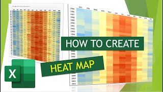
Creating a Heatmap in Excel

Вставка
- Опубліковано 22 вер 2023
- in this video, you will see how to create a heat map in excel, to visualize and the know the distribution of your data.
A heat map is a two-dimensional representation of data in which various values are represented by colors. A simple heat map provides an immediate visual summary of information across two axes, allowing users to quickly grasp the most important or relevant data points.


thanks
Please, I want the content of the work, I mean the Excel sheet data for this video
Cn you share content for this video