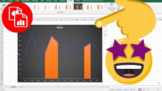
Highlight a Section of a Chart

Вставка
- Опубліковано 11 вер 2024
- When you create charts, sometimes there are area you want to point out or put some focus on....or maybe just highlight! In this video, I'll show you how to highlight a section of a line chart by adding another series of data and using the area chart type.
🔔 SUBSCRIBE to my channel ➜ goo.gl/wN3c3p
🏫 Excel Training ➜ www.exceltrain...
📚 Excel Books & Tech Gear ➜ www.amazon.com...
⚙️ Tools: Screencasting ➜ techsmith.z6rj...
⚙️ Tools: Microsoft Office ➜ microsoft.msaf...
⚙️ Tools: TubeBuddy ➜ www.tubebuddy....
📝 This description may contain affiliate links and we'll receive a small commission if a purchased is made using the links (but at no additional cost to you). It'll support the channel and so more videos like this can be made. Thanks for your support!
🎁 If you find these videos useful and want to support my channel go to www.buymeacoff...
#excel
#msexcel
#doughexcel
~-~~-~~~-~~-~
Please watch: "Convert Table in a PDF File to Excel"
• Convert Table in a PDF...
~-~~-~~~-~~-~


Thank you 😊
You're welcome 😊
Doug this is phenomenal. Thank you thank you thank you.
Glad you enjoyed it!
Thankx Doug for keep this video simple, Today I am going to use this same tips in my chart for presentation.
Thanks Santosh Mekale, glad it helped!
8 years later and THANK YOU!!!!!!!!!
Hi Alex Invisible, you're welcome!
Appreciate the help buddy, hope you are doing well
Thanks, you too!
How to highlight the section of chart both in Vertical(as shown in this video) and Horizontal?
Thank you!!!!!
You're welcome!
Cool!
I need this, thank you very much~
this is really awesome. thank you.
Hi saravanan ganesan, thanks for the comment!
thank you
You're Welcome!
I know this is an extremely old video and you probably won't answer, but when i try to copy and paste a column of data to a chart, it shows up when i hover over paste but disappears from the chart when i click it. When i try adding it by right clicking add data my first set of data gets all messed up and shoved on 1 vertical line. Any ideas?
Thank you doug
If my x axis is time in hours and minutes how would i highlight the region between two times. For example highlighting the region between 03:43 and 07:51 for example?
Perfect. Thanks!
Thanks!
Is it possible to also make a dashboard tutorial?
Thanks a lot Doug. Does it work if I have multiple lines(data) in the chart e.g. sales, expenses and Profit by months? For some reasons I am not able to do it..
maybe something like this? ua-cam.com/video/IPHbWUApFhk/v-deo.html
My second chat does not line up correctly on the x-axis. and when I change it to an area chart, it changes both the original line chart and the new data points to an area chart. Any suggestions are appreciated.
Hi CVideos, thanks for the comment! Check if the 2nd Y axis min and max values are the same as the 1st Y axis.
Slightly different in Office 365. Need to setup as a combo. Change the selected Series # to area
Hi Market Matters, thanks for the comment!
This does not work on large data sets
You lost me when you changed the sales to 900. I don't see how a reader would know what the 900 stood for since the sales don't go that high. I think they would be confused unless you meant to change the sales data as well
grazie
prego!