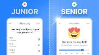
Amateur vs Pro UI Design | with examples

Поділитися
Вставка
  • Опубліковано 29 лют 2024
  • In this video, we explore what separates top-tier UI design that attracts clients and lucrative positions from junior-level designs that struggle to gain traction. We'll examine a range of UI design samples, crafted by both novices and professionals, to guide you on your journey towards becoming a first-rate designer. From login & signup interfaces to dashboards and web apps, join us as we delve into color usage, hierarchy, contrast, spacing and more. This is the perfect resource for those looking to elevate their UI design skills!... Remember to Subscribe goo.gl/6vCw64
    3 Month free trial with NordPass: nordpass.com/jesse
    Code: JESSE
    ------------------------------------------------------------------------------------
    🤝 //////////// Become a UI Designer in 30 Days:
    30dayui.com
    🏆 //////////// Join my free member's community to get access to perks:
    designchamps.io/
    ------------------------------------------------------------------------------------
    🎨 ////////// I Design in Figma
    psxid.figma.com/ixbomhqzoiy0
    🖥️ ////////// I Prototype Magic in ProtoPie
    www.protopie.io/plans?ref=jesse
    🖥️ ////////// I Build websites in Framer
    framer.link/jesse
    📅 ////////// I run my life with Notion
    affiliate.notion.so/tokendsfahjf
    🎵 ////////// Take your films to the next level with music from Musicbed. Sign up for a free account to listen for yourself: fm.pxf.io/c/1372011/1347628/1...

КОМЕНТАРІ • 75

  • @humairanaeempasha2362
    @humairanaeempasha2362 2 місяці тому +27

    Would really appreciate if you'd show your version next to the version being critiqued. Good content! 👍🏽

  • @Loggerr
    @Loggerr 2 місяці тому +15

    We'll need a part 2 of this. Its super useful to see! Good stuff Jesse!!

    • @JesseShowalter
      @JesseShowalter  2 місяці тому +3

      Coming soon! While you wait, check out my new UI Design training program. It will help take you from Noob to Pro in 30-Days! www.30dayui.com/

  • @GoddessofWarr
    @GoddessofWarr 2 місяці тому +8

    I agree we need a part 2 !! This is so interesting !

  • @ogunsolajulius5424
    @ogunsolajulius5424 2 місяці тому +3

    This is so good and helpful Jesse, we`ll need a part 2. Thanks for all you do 😊

  • @tictac_oe4590
    @tictac_oe4590 12 днів тому

    Loved this one Jesse! We need more of these

  • @raquelgarcialeyva9682
    @raquelgarcialeyva9682 2 місяці тому

    Wow, Your 👀keen eye for detail is incredible; it really helps me pinpoint the issues in some of my designs. This video has been very helpful to me.

    • @JesseShowalter
      @JesseShowalter  2 місяці тому

      Glad it helped! If you want Learn more about UI design check out my new course www.30dayui.com/

  • @jennacorre8084
    @jennacorre8084 2 місяці тому

    Super helpful video, thank you! Rad 'burn the ships' cap too!👊

  • @Mariamadk
    @Mariamadk 2 місяці тому

    Very informative thank you so much! i was hoping for a part two with your guidance in redesigning a junior interface design while explaining more about the details to practice it with you.

    • @JesseShowalter
      @JesseShowalter  2 місяці тому +1

      Great suggestion! I’m the meantime If you want Learn more about UI design check out my new course www.30dayui.com/

  • @vineetboyle
    @vineetboyle 2 місяці тому +1

    Broken down really well for us. Thanks Jesse.

    • @JesseShowalter
      @JesseShowalter  Місяць тому

      If you like this you’d love my full UI course www.30dayui.com/

  • @viktorskarlatov8227
    @viktorskarlatov8227 2 місяці тому +1

    That was super informative. Thanks!

  • @cyberhrc
    @cyberhrc 2 місяці тому +3

    On last example, i do agree that colors 'might' be better but at the same time we cannot ignore that some clients DEMANDS usage of 'their' colors [ purpose of branding etc ] in the design. Setting good color itself is always required but on showed examples, last one is 'too perfect' with usage of photos that perfectly matches design while the previous one had more ' real life ' photos. I am personally tired of 'blue' for business, money, and corporate stigma. Colors should have purpose for a user and for a client as the same value [ tho that is hardest part ] :) Overall good video, keep it up !

    • @healthadvice3091
      @healthadvice3091 2 місяці тому +1

      I agree on clients say "can you make it pop?" at the end of the day whatever argument we say they just pay us money and follow what they want 😅. At least for small businesses

    • @JesseShowalter
      @JesseShowalter  Місяць тому

      Thanks

  • @Lisa-vh3uh
    @Lisa-vh3uh 2 місяці тому

    Great video for me as a junior 😊 Thank you!!

    • @JesseShowalter
      @JesseShowalter  2 місяці тому +1

      I'm so glad! If you want Learn more about UI design check out my new course www.30dayui.com/

  • @prmcabrita
    @prmcabrita Місяць тому

    Thanks Jesse!

  • @Erwin_t
    @Erwin_t 2 місяці тому +1

    Great advice as always! could you do a video where you do a client project?

  • @sofihakobyan7223
    @sofihakobyan7223 2 місяці тому

    Very helpful ideas, thank you. I hope, you’ll do other similar videos 😊

    • @JesseShowalter
      @JesseShowalter  2 місяці тому

      I’ll do more like. this If you want Learn more about UI design check out my new course www.30dayui.com/

  • @osasoyara
    @osasoyara 2 місяці тому

    Hello Jesse, great work! I'm looking to improve in the area of the design critique, and I need more reps. What website would you recommend to gather examples for critique?

    • @JesseShowalter
      @JesseShowalter  2 місяці тому

      We do design criteria in my free community designchamps.io/

  • @user-ck7pf7ve1l
    @user-ck7pf7ve1l 16 днів тому

    I have to mention that I like your outro ❤

  • @grafartist
    @grafartist 2 місяці тому +1

    Does this mean you'll bring back the rework series? I can see that being super beneficial for someone who is junior level like myself. I'm currently doing the course and I'll be honest, I thought some of those designs were good until you offered insight into what makes them appear less than senior level, so it would be cool to see you make edits in real time to do a before and after comparison.

    • @JesseShowalter
      @JesseShowalter  2 місяці тому +1

      I will bring that back, I’ll ask for designs from my designchamps.io/

  • @fareed_adam
    @fareed_adam 2 місяці тому

    Very useful. Thanks for sharing!

  • @kasforai
    @kasforai 4 дні тому

    How will the graph changes when imported into Bubble ?

  • @jdaniels4055
    @jdaniels4055 2 місяці тому

    Hey, this was really helpful!

    • @JesseShowalter
      @JesseShowalter  2 місяці тому

      Thanks. If you want Learn more about UI design check out my new course www.30dayui.com/

  • @domvial
    @domvial 2 місяці тому +1

    On the sign-up screens, the primary CTA state should be displayed as disabled since the mandatory info is not entered yet.
    Also, on that last map screen, should be “Satellite”, not “Sattelite” 😉

  • @kiddgamer2940
    @kiddgamer2940 2 місяці тому

    great vids! a nit pick maybe would be on the design showcased at 10:36, the Belgium Flag is wrong. I know that was not the point of the video and it was probably just placeholder stuff, but I think it's important if we are trying to get taken seriously :)

    • @JesseShowalter
      @JesseShowalter  Місяць тому +1

      Not really the focus of the video but good eye

  • @andrescastillo07
    @andrescastillo07 Місяць тому

    thank you!!

  • @WadeMurley
    @WadeMurley 2 місяці тому +1

    Do you use Tella for screen recording?

    • @JesseShowalter
      @JesseShowalter  2 місяці тому

      No I use a custom live streaming setup

  • @AxsRock
    @AxsRock 2 місяці тому +1

    In apple's third Sign Up design, if it is a registration screen it should have a field to confirm the password.

    • @JesseShowalter
      @JesseShowalter  2 місяці тому

      True these are not perfect screens just examples to start the conversation

  • @kruzader
    @kruzader 2 місяці тому

    Thank you

  • @ladybubble82
    @ladybubble82 2 місяці тому

    Excellent video!!

  • @UnKnown-hs3ic
    @UnKnown-hs3ic День тому +1

    Kindly make part 2 of this video.

  • @braidedwire
    @braidedwire Місяць тому +1

    Could anyone recommend some good UI design courses? Most stuff i see on Udemy for instance is all-in-one courses including graphic design basics (which as graphic designer i don't care for) or full Figma/XD instructions. I wish to learn good practices on UI design, based on real knowledge, analysis and so on.

    • @JesseShowalter
      @JesseShowalter  Місяць тому

      I just released the best UI course on the market. www.30dayui.com/

  • @adyme9420
    @adyme9420 4 дні тому +1

    Great Jesse. Thanks for this video. But I cannot find the link to your 3 days program. Please send it to me.

  • @Naam_Karan
    @Naam_Karan 2 місяці тому +1

    4:21 Can someone please tell me the icon and font name?

  • @vamboo8918
    @vamboo8918 2 місяці тому +1

    Tq

  • @davidpsbn
    @davidpsbn 2 місяці тому +1

    The last dashboard although it is everything good thing you said about it it’s also a fail UX wise. if used for a every day tool its just too much. Users and their eyes would be fatigued after 10 min of usage

    • @JesseShowalter
      @JesseShowalter  Місяць тому

      Just a UI design video

    • @brycelee1529
      @brycelee1529 4 дні тому

      UI and UX should go hand-in-hand though… if you’re teaching designers this content to get hired, I think David has a valid point in saying that the last example is not the best. I personally don’t like it either because the spacing seems a bit off, and it’s not conventional to have nav bars on the bottom. I also think the colors are a bit distracting, but then again, I’m not a fan of neobrutalism.

  • @KieRej
    @KieRej 2 місяці тому

    You as a designer should be creative not a copy paster from DesignSpo

    • @JesseShowalter
      @JesseShowalter  2 місяці тому +1

      It's a saturated space so there may be overlap with lot's of other content. For example here's a quick search ua-cam.com/users/results?search_query=pro+vs+amateur+design See what I mean, lot's of examples 🤣

    • @KieRej
      @KieRej 2 місяці тому

      I've learnt a lot from your content tho! I appreciate @@JesseShowalter

  • @8BitSlaya
    @8BitSlaya 20 днів тому

    someone needs to @ fortnite for this

  • @Larasjo
    @Larasjo 2 місяці тому +1

    5:33 Senior wrote forgot password at the top and you found it right? I laughed, thinking about heatmap, why should I try to touch the top right with my finger? forgot password should not be there. If senior is doing this, I laugh a lot.
    When a user forgets their password, they should naturally look for forgot password on the login screen. He will not see what he is familiar with and will look in the upper right hand side. why is it not next to the familiar remember me?