02/01/2025 - Sign up and join the waitlist ⭐ Launching soon - www.powerbischool.com/ ✅Real world datasets ✅ Datasets found in all videos ✅ Potfolio/dashboard review & feedback ✅ Power BI Training - DAX, Design, Story Telling ✅ Open Community
Great video from you, and i am doing my own project based on your design but i am being stuck at the page navigation buttons. I don't know why mine is not working. Can you help me with it?
Hey, Bautiful explaination but I am struck at 8:10 sec. The navigator option under Buttons is not showing up in my powerbi. Could you help me out with what might be the reason?
How he inserted left side fields ? like calendar year, Category, state category etc.... Skipped in this video.. Finally, build a Wonderful Visual dashboard with incomplete tutorial.
Interesting in regards to creating the sizes before hand. I often create the visuals first before sizing them as I don't know before hand which visuals look best and the data sometimes changes which requires a resize but I'm assuming you could do it afterwards.
Late reply. But it’s project to project. Generally I gather requirements and whiteboard the report with the users prior to the build for UI, navigation etc.. If not would create the visuals first 👍🏼
Wonderful tutorial! Esp the snipping tool background and the way to hop from one page to another. The tutorial wasnt complete though. Please give me the link of full video and also the data to practice.
May I suggest, instead of making a photo of your layout, you instead place one large transparent box over all of it? Does this approach have any disadvantages relative to what you did?
Ok video. The ideas behind the visuals are great but the disregard of data doesn't help you complete the report. At best this video is just a walkthrough of someone's idea & visualization tips. Either way the posting is appreciated, I learned something new. Thank you for sharing.
Hi thanks for the great video :D How can I make the 'Overview' in navigator page on Total sales page become also Black( Like in a Net sale page) when click on it?
Hey man! Thanks for the video but i have an issue and maybe you can help! How do you remove the dottes lines when you ajust the page size? You have them too but after you changed the colors of the theme they're not there anymore! How did you removed them? Thanks again!
Thank you, I will be posting more DAX. My previous video covers understanding Calculate, and have a DAX playlist which is theory heavy in understanding concepts. This year I will be creating a lot more videos.
Hi sir I have one question. I make one sales report everyone with one excel as data source. How can I save all these weekly report in the same power BI report so I could look back previous report by clicking the filter.
If they are seperate files, look into the combine and load from folder. PBI will pick up any CSV added to the folder and append them given the files have the same columns, header names etc. Then proceed to make a date slicer from the date column in the CSV. I'll make a video on the topic. Hope you like and subscribe 🙏
Hello I am having trouble with navigating through pages, cant really get hold of it. When I touch it I cant navigate through pages. Can you help me? Make a more detailed video about it if possible?
There’s an inbuilt navigator button now. In PBI desktop you have to press ctrl while you click to navigate. In the PBI service just clicking will. hope that helps
Hello, Is there way to find whether a column is based on another column in power bi desktop or service ? Example- If database has two columns 'FirstName' and 'LastName'. They're concatenated to 'FullName'. Is there way to find in power bi that 'FullName' is made of two columns.
The anwser to this question depends on where the new column was created. If this was done at a database level then you would only be able to see this within the original database / query that's creating the columns. If the column was created at a Power query level you will be able to see this in Power query. If the column was created by a calculated column outside of Power Query the calculated column symbol will appear next to the column in Power BI which would immediately showcase that this column was created using a calculation, you could then click the column and see what was used to create the calculation. I've linked a google image of the calculated column symbol below. I'm curious to know what the requirements /need behind this question is, documentation purposes? www.google.com/search?q=calculated+column+power+bi&tbm=isch&ved=2ahUKEwjcrNDPr5_1AhUPdxoKHb9-DvkQ2-cCegQIABAA&oq=calculated+column+powe&gs_lcp=CgNpbWcQARgAMgcIIxDvAxAnMgYIABAIEB4yBggAEAgQHjIGCAAQCBAeMgQIABAYMgQIABAYMgQIABAYMgQIABAYMgQIABAYMgQIABAYOgUIABCABDoECAAQHjoGCAAQBRAeUABY0wNg0Q5oAHAAeACAAYoBiAGaA5IBAzQuMZgBAKABAaoBC2d3cy13aXotaW1nwAEB&sclient=img&ei=4w3YYZyvPI_uab_9ucgP&bih=954&biw=1920&client=firefox-b-d&hl=en#imgrc=7FMpf3yLi3Iz1M
@@Transformita Thank you so much for your response. I got this question in an interview and I was completely unware whether the column concatenated in database can be visible in power bi desktop or service.
Hey Power BI Guy, power to you. Did video abruptly cut off ? Is there a second part to this ? Truly amazing to learn. I am collecting requirements, Where I work I get data requirements as they are SME but they are asking me show me the designs and mock up and I am learning with UI/UX expert more into GUI user interface on web side not much on data. Now I have ocean to swim, to create these mock ups and wonder what charts are best for what data types and show some mock ups.. Any advice will be appreciated, Any one here too can help me ?
Hi bro I have column name reopen. In that column i have three data that 0,1,2 numbers. Is that posssible to split the column that one column have 1 numbers and another column have 2 numbers and another column have 3 numbers
Hm... Not sure if it's OK to have a black item on a chart which resides on a dark (almost black) background. I think this goes very much against Best Practices. The black bar is hardly visible, making it hard on the eyes. By the way, the black color really does seem to be out of sync with the rest of the colors that you use for your other items. I'm sure people would find it hard to read white text on a white background... or black text on a black background.
Not for this specific report. I have a DAX series which goes over DAX and the theory behind it. The reason I left the DAX out of this is due to the fact this is only relevant to the data you are working with and this is more of a report design video. I will have other report building videos where you can download the dataset and build calculations with me etc..
beautiful work but you need to take care of the channel a bit more, you wanna create more playlist and also filter your current ones, make an overview video and also do some nice edits to your videos


02/01/2025 - Sign up and join the waitlist
⭐ Launching soon - www.powerbischool.com/
✅Real world datasets
✅ Datasets found in all videos
✅ Potfolio/dashboard review & feedback
✅ Power BI Training - DAX, Design, Story Telling
✅ Open Community
Great Video! Kindly consider sharing the dataset, so people can practice along.
Great Job! Thank you soo much for sharing your knowledge, And Small request please share your data sets for our practice purpose..
Superb tutorial, I've seen the best "how to style pbi" for my reports! Thanks.
Loved the design. The dashboard looks amazing.
Thanks. I've got something dropping which blows this out of the water.
This one is sooo good! Please make more such videos..I will make a playlist of them to use.
More coming! Glad you enjoyed the video
Any more such design videos you have made?@@Transformita
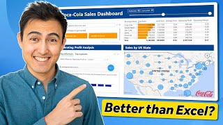
Beautiful dashboard. Not too cluttered delivering key insights.
Can you give the link of data that you have been using
Did you get that data link?
You deserve millions of followers , keep it up 🎉
I love this design! good idea with the sniping tool to create the background instead of shapes, never thought of doing that
Glad you like it!
@@Transformita can u pls give us the data
We can also create the same visual in Power point presentation and save it in .SVG format. In this format, image pixels don't stretch.
Excellent work! Loved the video and how you explained it all!
Thanks.
I've released a similar video with another design. Subscribe for future updates and content!, it's appreciated.
Can you provide sample data so that we can try this as well on our end?
Great!.
Hope you could do more videos about this topic.
wow, what a stunning dashboard! any chance of getting the PBI file? Id love to take a closer look at the measures
Excellent video. thank you , it helped me a lot ( Micael from France)
Glad it helped Micael 👍🏼
I’m releasing another video like this very soon
Great video from you, and i am doing my own project based on your design but i am being stuck at the page navigation buttons. I don't know why mine is not working. Can you help me with it?
Amazing! Thank you!
havent seen this ambiguous video before
Nice Dashboard... How can i get the datasets
Thanks
Hey, Bautiful explaination but I am struck at 8:10 sec. The navigator option under Buttons is not showing up in my powerbi. Could you help me out with what might be the reason?
How he inserted left side fields ? like calendar year, Category, state category etc.... Skipped in this video.. Finally, build a Wonderful Visual dashboard with incomplete tutorial.
Using slicers
Great work❤
hi, nice dashboard, where can i find this dataset?
How about the left sides filter???
Interesting in regards to creating the sizes before hand. I often create the visuals first before sizing them as I don't know before hand which visuals look best and the data sometimes changes which requires a resize but I'm assuming you could do it afterwards.
Late reply. But it’s project to project.
Generally I gather requirements and whiteboard the report with the users prior to the build for UI, navigation etc..
If not would create the visuals first 👍🏼
Looks great, thanks for the tutorial!
I got new ideas from your video . Thank you so much for creating this type video it would be very helpful for intern students and freshers
Glad it helped :)
Coul you put cc subtitles please? beautiful dashboard
hey,
can we have this dashboard template, please?
it looks fabulous!
Great!
Wonderful tutorial! Esp the snipping tool background and the way to hop from one page to another. The tutorial wasnt complete though. Please give me the link of full video and also the data to practice.
Impressive, good one
May I suggest, instead of making a photo of your layout, you instead place one large transparent box over all of it? Does this approach have any disadvantages relative to what you did?
I did so @6:16 🙂
No disadvantage beyond having to take another image if your requirements ever change.
Ok video. The ideas behind the visuals are great but the disregard of data doesn't help you complete the report. At best this video is just a walkthrough of someone's idea & visualization tips. Either way the posting is appreciated, I learned something new. Thank you for sharing.
Hi thanks for the great video :D How can I make the 'Overview' in navigator page on Total sales page become also Black( Like in a Net sale page) when click on it?
Hey man! Thanks for the video but i have an issue and maybe you can help! How do you remove the dottes lines when you ajust the page size? You have them too but after you changed the colors of the theme they're not there anymore! How did you removed them? Thanks again!
Format the visuals and go to gridlines and off it
Good job on this report, really simple and clean layout. Are you okay if I share this video on my lindklen and tag your channel?
Please can you share the dataset so we can practice along
Thanks
This is true. Kindly share the dataset, so we can practice. Nice tutorial!
Thank you.
I learned so much
GREAT
Great design. Please do some videos on dax too.
Thank you, I will be posting more DAX.
My previous video covers understanding Calculate, and have a DAX playlist which is theory heavy in understanding concepts.
This year I will be creating a lot more videos.
Thank you
Terrific
nice. How can one get the dataset?
Hi sir I have one question. I make one sales report everyone with one excel as data source. How can I save all these weekly report in the same power BI report so I could look back previous report by clicking the filter.
If they are seperate files, look into the combine and load from folder. PBI will pick up any CSV added to the folder and append them given the files have the same columns, header names etc.
Then proceed to make a date slicer from the date column in the CSV.
I'll make a video on the topic.
Hope you like and subscribe 🙏
Hello I am having trouble with navigating through pages, cant really get hold of it. When I touch it I cant navigate through pages. Can you help me? Make a more detailed video about it if possible?
There’s an inbuilt navigator button now. In PBI desktop you have to press ctrl while you click to navigate. In the PBI service just clicking will.
hope that helps
I need to learn this course, how can i connect with you?
Kindly provide me the power bi version that your using , seems mine is a different older version that lacks settings like on hover and others
Hi, Where can I get this data from?
Hello, Is there way to find whether a column is based on another column in power bi desktop or service ?
Example- If database has two columns 'FirstName' and 'LastName'. They're concatenated to 'FullName'. Is there way to find in power bi that 'FullName' is made of two columns.
The anwser to this question depends on where the new column was created.
If this was done at a database level then you would only be able to see this within the original database / query that's creating the columns. If the column was created at a Power query level you will be able to see this in Power query.
If the column was created by a calculated column outside of Power Query the calculated column symbol will appear next to the column in Power BI which would immediately showcase that this column was created using a calculation, you could then click the column and see what was used to create the calculation. I've linked a google image of the calculated column symbol below.
I'm curious to know what the requirements /need behind this question is, documentation purposes?
www.google.com/search?q=calculated+column+power+bi&tbm=isch&ved=2ahUKEwjcrNDPr5_1AhUPdxoKHb9-DvkQ2-cCegQIABAA&oq=calculated+column+powe&gs_lcp=CgNpbWcQARgAMgcIIxDvAxAnMgYIABAIEB4yBggAEAgQHjIGCAAQCBAeMgQIABAYMgQIABAYMgQIABAYMgQIABAYMgQIABAYMgQIABAYOgUIABCABDoECAAQHjoGCAAQBRAeUABY0wNg0Q5oAHAAeACAAYoBiAGaA5IBAzQuMZgBAKABAaoBC2d3cy13aXotaW1nwAEB&sclient=img&ei=4w3YYZyvPI_uab_9ucgP&bih=954&biw=1920&client=firefox-b-d&hl=en#imgrc=7FMpf3yLi3Iz1M
@@Transformita Thank you so much for your response. I got this question in an interview and I was completely unware whether the column concatenated in database can be visible in power bi desktop or service.
Hey Power BI Guy, power to you. Did video abruptly cut off ? Is there a second part to this ? Truly amazing to learn. I am collecting requirements, Where I work I get data requirements as they are SME but they are asking me show me the designs and mock up and I am learning with UI/UX expert more into GUI user interface on web side not much on data. Now I have ocean to swim, to create these mock ups and wonder what charts are best for what data types and show some mock ups.. Any advice will be appreciated, Any one here too can help me ?
Same question. Lots of stuff seems to be cut off.
Can you do this on notion?
Not heard of notion before
oh really?! @@Transformitacheck it out! :) You can link it with other apps for automation which is whats quite cool!
hi, can you provide the dataset for us to practice? Thanks
Please share the dataset , so that we can do exactly as you're saying. It would be more helpful
whats the quality sold by product cost chart is? i cant find one please anyone
All the background and Panel stuff can just be done in Power Point and pasted in btw.
I prefer photoshop but indeed it can be!
Hi bro
I have column name reopen. In that column i have three data that 0,1,2 numbers. Is that posssible to split the column that one column have 1 numbers and another column have 2 numbers and another column have 3 numbers
Wow.
How you cooy the text box and paste it?
Where can I download the power BI exercise attachment
what kind of slicer on the left of this report ?
Standard slicers, nothing different just formatted differently.
Standard slicers, nothing new 🙏🏼
@@Transformita thank you so much
Wellness dashboard, I will be learning a few tips, so kindly enclose the practice for Excel file.
Sorry, no longer have the files anymore 👍🏼
Good Morning
This video is very helpful,
please could you help with the data you used to create this Dashboard ? please
Hm... Not sure if it's OK to have a black item on a chart which resides on a dark (almost black) background. I think this goes very much against Best Practices. The black bar is hardly visible, making it hard on the eyes. By the way, the black color really does seem to be out of sync with the rest of the colors that you use for your other items. I'm sure people would find it hard to read white text on a white background... or black text on a black background.
can you provide the data set plz ?
Where did you get the data from
Can you provide the dataset?
how can i get the data set so i can play with it
Apologies, this is quite an old video now and I don't have the dataset.
I just released a new build and the datasets there.
Any one has any idea where to find the dataset used?
adventureworksdw
where do i get the data set ? can anyone send me the the link of data set ?
Hey apologies. I don’t have the dataset for this one anymore. I’m releasing a similar video this week which will include the dataset.
@@Transformita when we will get that vdo ?
Do you have tutorial for the DAX part?
Not for this specific report. I have a DAX series which goes over DAX and the theory behind it.
The reason I left the DAX out of this is due to the fact this is only relevant to the data you are working with and this is more of a report design video. I will have other report building videos where you can download the dataset and build calculations with me etc..
Can I get the dataset which you used please
beautiful work but you need to take care of the channel a bit more, you wanna create more playlist and also filter your current ones, make an overview video and also do some nice edits to your videos
when u will complete this design?
can you share your github link where was upload pbix file
Can I get this exercise file?
thanks man could i get that data please
Why are u not providing the link of datasets !
Please man help us
can i get dataset of this dashboarf
where is the dataset please
Where is the full video?
Buen trabajo , podrias compartir, solo los datos , para replicar el ejercicio . Saludos
Good design, but leaving the technology data label in black is not a good idea.
Can you please provide the data link which you are using??
CAN YOU SHARE THE DATASET ??
Can you please send me PBIX file of this report .
please provide Dataset??
the video is incomplete bro
Can you give me data link
could you please provide the Dataset being use??
My next video is going to include the dataset.
It will be similar to this reports dataset. Apologies, I won’t know where this one is anymore.
@@Transformita Thanks for sharing great content. Maybe, your response above could be pinned, as there are and there will be more folks after the data.
Brother how i can contact you please give me any contact source....I have some doubts to ask.
you forgot to load data buddy
after watching this video, It is clear that why you named your channel "power bi guy'
It's urgent
Please reply
You focus to much on design instead on the data itself
Given this is a report design video
262A2D
Nice Dashboard... How can i get the datasets
Thanks
Please share the dataset , so that we can do exactly as you're saying. It would be more helpful