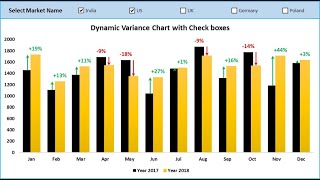
Part-2: Dynamic Variance Arrows Chart with Slicers

Вставка
- Опубліковано 21 сер 2024
- #DynamicChart #Slicers
Hello Friends, This is the second part of Dynamic Variance Arrows Chart. In the first part of this video have displayed how to create a Dynamic Variance Arrows Chart and connect it will multiple Form control check boxes. In this video you will learn how to connect the similar chart with a stylish slicer.
You must watch the first part of this video (link is given below) to understand it better-
• Dynamic Variance Arrow...
Click here to download the practice file:
www.pk-anexcel...
Download our free Excel utility Tool and improve your productivity:
www.pk-anexcel...
See our Excel Products:
www.pk-anexcel...
Visit to learn more:
Chart and Visualizations: www.pk-anexcel...
VBA Course: www.pk-anexcel...
Download useful Templates: www.pk-anexcel...
Dashboards: www.pk-anexcel...
Watch the best info-graphics and dynamic charts from below link:
• Dynamic Graphs
Learn and free download best excel Dashboard template:
• Excel Dashboards
Learn Step by Step VBA:
• VBA Tutorial
Website:
www.PK-AnExcel...
Facebook:
/ pkanexcelexpert
Telegram:
t.me/joinchat/...
Pinterest:
/ pkanexcelexpert
************ Suggested Books ********
VBA: amzn.to/2TMMikX
Excel Dashboard: amzn.to/2WZi2Fj
Power Query: amzn.to/2Ibd7xR
Power Pivot and Power BI: amzn.to/2DCg8BB
Exam Ref 70-778 (Power BI): amzn.to/2GnWYTN
************ My Stuff ***************
Mic : amzn.to/2TLnF88
Video Editor: screencast-o-m...
Laptop: amzn.to/2PlFFFz


Great idea to combine VLOOKUP to a pivot table with the slicer for this....a simpler and more elegant solution too.
Thanks for your valuable feedback
Another break through in excel chart from PK Guru ji.
Thanks for your valuable feedback
Wow todos los días aprendo algo nuevo con tus videos... Gracias
This channel is probably the best channel for excel custom charts, i am looking for the same kind of custom visuals in power BI, i mean not only for this visual but how you customize charts in excel,
Thanks for your valuable feedback
Genius! Excelent tutorial. Thanks
Thanks for your valuable feedback
Awesome guidance ... Thank you PK Sir
Thanks for your valuable feedback
Thanking you so much your effort
It's my pleasure
Thanks a lot Professor
Most welcome
Excellent job. Thanks
Thanks for your valuable feedback
Wonderful Pk
Thanks
Thanks for your valuable feedback
Thanks for more one...
Thanks for your valuable feedback
Well done! Thanks!
Thanks for your valuable feedback
Superb 👌🏻
Thanks for your valuable feedback
Good job sir
Thanks for your valuable feedback
Perfect :)
Thanks for your valuable feedback
👏🏼👏🏼👏🏼👏🏼
Thanks for your valuable feedback
Thanks for the video! How can I copy the whole graphic to powerpoint without losing the dymanic function? Thanks!
Great !! i have a question , how do you add the arrows on the top of the columns?
Very good.
One question. Can i add one more of products just after the month
And can i make 2 type of slicer 1 for month and 2nd for products...
Thanks for your valuable feedback. Yes Pawan, you can use multiple slicers also.
Dear sir, how can we compare multiple regions on the same chart?
Hi Sir please help me I want to know how I can found the day or month through formula with number like 33 means 2nd Feb
Then 125 means ???
I will definitely try to make such video very soon
How to take this in ppt... please share