How to make and enahnce nice labeled barplot using base R plotting
Вставка
- Опубліковано 24 лип 2022
- #rprogramming #datavisualization #barplot #barcharts #dplyr #barcharts
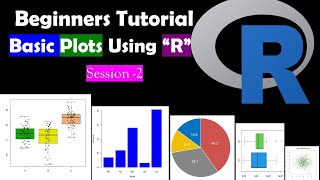
In this video I have described how to get barplot and label the bars with the values. I have discussed also how to summarize data to get barplots.
facebook page:
/ rajendrachoureisc
Mail Id:
rajuchoure@gmail.com
youtube playlist:
• Barplot using R
#script
a= c(24, 27,29,15)
b = letters[1:4]
bp = barplot(a,names.arg = b, ylim=c(0, 33), col= terrain.colors(4))
text(x=bp,y=a+2, labels = b)
bp
Orange
Orange$age=factor(Orange$age)
str(Orange)
library(dplyr)
Orange_sum = group_by(Orange ,age )
Orange_sum= summarise(Orange_sum, mean_circ = mean(circumference))
obp = barplot(Orange_sum$mean_circ,names.arg = Orange_sum$age,ylim=c(0,190), las=2,col=terrain.colors(7))
text(x=obp, y=Orange_sum$mean_circ+10,labels =Orange_sum$mean_circ )
obp


Dude, it helped me a lot in my Job... God bless you
Glad it helped. Please spread word about my channel.
You are the best
Thanks for appreciation.
how to font change (Times new roman and size) in r base plot