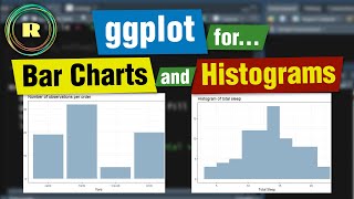
Bar Charts using ggplot geom_bar - R Lesson 16

Вставка
- Опубліковано 5 вер 2024
- In this lesson, I show you how to use ggplot to create bar plots. Specially, we use ggplot geom_bar to create a plot. First, we construct our data using the data.frame function to return a data frame object. Then we explore this data using some plots.
My name is Mark Gingrass, and welcome to my channel.
Home..........► cradletograver...
I will show you how to use the stat=identity as well as the stat=count parameters as well. Finally, we include a fill value to create a stacked bar plot.
Other playlists you may be interested in:
www.youtube.co....
www.youtube.co....
www.youtube.co....
www.youtube.co....
www.youtube.co....
www.youtube.co....
SUPPORT:
Home..........► markgingrass.com
Patreon.......► / markgingrass
2 FREE MONTHS:
Skillshare....►www.skillshare...
SOCIAL:
Twitter.........► / markgingrass
👇SUBSCRIBE & HIT THE 👍 BUTTON 👇
R Channel: bit.ly/38yfFP9
How I Create Videos: bit.ly/sub_to_chan
➔ TubeBuddy: bit.ly/t_buddy
➔ Blue Yeti Mic: amzn.to/2IheZTG
➔ 2 Months SkillShare Free ➔ www.skillshare...
Do you have more to add? Let me know how you liked the video or if I need anything corrected in the comments below.
- - - - - - - - - - - - - - - - - - - - - - - - - - - - - - - - -
TECH GEAR I USE DAILY
➔ MacBook Pro: amzn.to/2XxeBsG
➔ Blue Yeti Mic: amzn.to/2IheZTG
➔ Swissgear Backpack: • ✅SwissGear Travel Scan...
➔ Canon EOS 90D Camera: amzn.to/2u0o52K
➔ Apple Magic Trackpad 2: amzn.to/31XDugG
➔ mTuber for Title Effects : motionvfx.sjv....
➔ mArrows for animated arrows: motionvfx.sjv....
➔ Microphone - amzn.to/2LYfJkr
➔ Backpack - amzn.to/2Ep4uez
➔ Green Screen - amzn.to/2JVzMgP
➔ Tripod Neewer: amzn.to/2uF275X
➔ Tripod (cheap) - amzn.to/2Eo2wv4
HOMEPAGE - www.markgingra...
REVIEWS/BLOG - www.markgingra....
OTHER COURSES I CURRENTLY TEACH
➔ C++ Course: bit.ly/cpp_course
➔ Supply Chain Management: bit.ly/scm_course
Let's chat
/ markgingrass
#CommissionsEarned
“As an Amazon Associate I earn from qualifying purchases.”
I've started a blog about IT and software development projects along with some sound career advice. Check it out:
www.devgin.com/


Thanks, I always find these videos useful when I need to make a graph
Excellent tutorial--just enough detail to get my plot made. Thanks!
Glad it was helpful! It's been a minute since I played with R so I am due to come back and do some more tutorials.
The best material on barplot in R out there. Thanks a ton!
Thanks for the compliment.
@@CradleToGraveR f
Thank you so much!! thanks to this video, I could finish my assignment!
Glad I could help! Did you get a good grade?
@@CradleToGraveR I read the comments too late. I got an A+ then!!
thank you, had the error after stat = "count", using count = "identity" then worked 😁
Underrated channel! ❤️❤️ Thanks Mark!
I appreciate that!
YOU SAVED MY LIFE SIR
thank you!
Awesome! This is fun.
geom_bar 3:27 thank you
OMG THIS VIDEO SAVED ME
I been looking for what stat = "identity" does. Thanks!
Interesting tutorial. I liked the well done explanations and the extra pointers you give. Thank you. I subbed. :)
Thanks I'll make a few more soon. I think I like them being rather short and to the point.
how do you fix the aggregation when plotting, without removing data?
Muy buen video
Love you mate
This is not working for me. Does this work with Macbook pro.?
I still have errors in my data 😭. I have 1 column date and 2 column of weights (like 0.5 , 0.6 etc). My x axis would be date and my y axis would be stack of the weights (from 2 column). Help please 😭
When you had 3 Marks in the beginning the barchart added up the ages. How do you plot the means, so in this instance the average age of all marks?
You could do df_base
In later tutorials I talk about a function from dplyr package, group_by which would make it easy to group by name, then average the ages if you wanted to.
@@CradleToGraveR Yes, thats exactly what I need. Which tutorials are you talking about exactly? thanks!
@@n0body886 , Look at the tutorials with the word "dplyr" in the title here: ua-cam.com/play/PLuak_bGvcWZO0Da0cDVBpDeTQPEWpuvCD.html
I love you
Gad it helped you out. Ha!
Great tutorial!! Do you know how I'd go about making a grouped bar chart? I've been trying to figure it out for hours but I can't seem to get it and your video has been the closest to helping :)
Did you ever figure it out? I'm just seeing this now.
@@CradleToGraveR Yes I did, I played around with the code till I got it :) Thanks for replying though!
Incredible. CAn you make a video please, how to plot microbial diversity abundance in barplot???
Lol, I can only offer a he basics at the moment. Do you have a link to the data set?
Thank you!
Do you have video lessons № 14 and 15?
Check out the entire playlist, here. ua-cam.com/play/PLuak_bGvcWZO0Da0cDVBpDeTQPEWpuvCD.html
@@CradleToGraveR , sorry, but I can't find video lessons № 14 and 15.
Maybe they were missing?..
P.S. In this list I see a lesson № 13 ggplot (size/alpha...) and next one is № 16 ggplot (geom bar...)