I had one long ago... and I think i overexplained things too much then... i'm HOPING this time i kept it pretty simple.. because really it isn't that hard. You gotta know i cry a little bit every time someone asks.. "how do I mix a skin tone' which is usually followed by.. I dont wanna be accurate i just want to get close. Trust me, you will never accidentally get too close :0 Good to see ya bud :)
to be fair.. everyone owns those.. and they DO have some good information on them.. The grey value scale, is useful.. the fact the backside at least briefly mentions tint tone and shade. (but not enough information) But the "add red' add black" bits are so lacking in variation it renders them just a cursory aid for those not interested in really understanding color. Print a wheel.. Pause the video. Try some of the mixes The RCW is a bit lacking in yellow variations IMO. But you will quickly realize why you cant get a vibrant violet mixing (so called ) Primary blue and primary red colors. They are just too far apart on the wheel... Now Cyan is a very bright color so is true magenta.. so the extra vibrancy allows those two colors to make vibrant violets despite being fairly far apart on the wheel However both those in their purest forms are more an ink than a pigment. Hence why they are used in Printers :) I love color and the science part of it all. So i can definitely geek out and talk WAY too much on the topic. I should probably just go work for a paint manufacturer :0
Hello 👋🏼. Great and very informative videos. How would I go about thinning out Behr Exterior/Interior paint to airbrush it on a wooden sign? Also, what’s a good clear coat to add to the airbrush for a flawless protective finish? Do you clean your projects with mineral spirits? Thank you 😊
Thanks! i sincerely hope to see some put this to good use! Soon ill tie that to how transparents are shifting those same tones. Once you grasp what the colors mix too... it becomes a springboard to mixing on the canvas as well. although I strongly encourage people to get very comfortable with opaques and use transparents sparingly until they are very comfortable with them. Its just much much easier for beginner and intermediate artists to have opaques reliably max out... whereas transparents can quickly become to vibrant )very unrealistic) because you are attempting to control both value and to at least some degree saturation by eyeball while laying paint.
I hope that was easy to understand for everyone. i'm a color junkie, its way too easy for me to go off in the deep woods. :) Ironically I got into color theory because I could not anywhere find an easy tutorial on color mixing.. everyone wants to talk formulas and nobody explained to me how one red and yellow would make a nice orange but another red made a dull orange. until I dug into old old stuff.
Great video and useful airbrush information. All I need to make any color under the sun is cadmium red medium, cadmium yellow, Cerulean blue, Ivory Black, Titanium White, and Burnt Umber. Of course, airbrush paint companies don't make many of the traditional base colors but lots of candies :)
I think even most of the acrylic paints "cad red" is cad red hue" due to the toxicity of real cadmium. I think a true magenta or even a q- magenta would be the only color id add to that. just to get a very vibrant violet.. plus q magenta and white makes a nice pink. I just told Alli Yesterday I should go back to a 6 color and Black and white palette. the less colors I have the less distracted I get and actually do more work. I tried making this video as quick and easy to grasp as possible, because there is a huge reluctance in the community to learn about color. Thanks Tim!
What is a transparent base? It's clear, but can it make paints more transparent. I love illustrations paint for my lures. I find the colors to be transparent and spray awesome. I spray over foil and want the shine of the foil to show off the colors and still shine. And a 2nd question. I got baits that would be to perfect shape for an eye. Would love it to look like an 👁🗨. What paint scratch good and do I us a knife to scratch or a stick..
well you cant make paints "more transparent" however you can reduce their opacity to some degree. For instance the aforementioned shading grey.. its the same pigment as carbon black "pbk 7" which is a fairly opaque high coverage black. But it has a low level of those pigments in the actual binder.. AND no other fillers for opacity added to it im pretty confident. So in effect it sprays and mixes in a more transparent fashion. Adding lots of binder / IE transparent base. does indeed thin out paint pigments.. but never make opaques "transparent" Whereas Tranparent paints can easily be made more opaque with even small amounts of white. (titanium white is the pigment we most come across) Although there IS a tinting white in SOME paint lines. "transparent white" which is sort of misleading... but labeling it "less opaque than other whites" might not fit on a label. Only dyes / candies are truly transparent Even then there is SOME level of opacity to them.. Think candies are like gummy bears. Transparents are translucent and all paints have various degrees of opacity.. Transparents will show very little against a dark background. Opaques will quickly leave coloring over a dark background. the real difference is how deep light penetrates the surface... transparents are made for light to go through and reflect off colors beneath and come back to our eyes "tinted" whereas opaque pigments absorb other light leaving only the color you see. and that reflection happens on the surface of the paint film. Ok enough incoherent rambling.. i just woke up. Any paints scratch illustration very easily. and you can use lots of things to remove paint, erasers, exacto blades.. its all in technique.


![Lp. Сердце Вселенной #60 РОЖДЕНИЕ ЛОЛОЛОШКИ [Финал] • Майнкрафт](http://i.ytimg.com/vi/YoR0pAV9FVQ/mqdefault.jpg)


Nice one Bill 👍
I had one long ago... and I think i overexplained things too much then... i'm HOPING this time i kept it pretty simple.. because really it isn't that hard.
You gotta know i cry a little bit every time someone asks.. "how do I mix a skin tone' which is usually followed by.. I dont wanna be accurate i just want to get close. Trust me, you will never accidentally get too close :0
Good to see ya bud :)
@@TheAIRspaceyes I know what you mean some of the comments I have on the channel 🤯 all the best look forward to your next upload
Both of you guys are great I'm subscribed to both channels and I agree Bill color theory isn't learned overnight but you make it simpler.
Thanks Mike!
Slowly hides my round color wheel.Definitely going to watch this video again maybe a few more times and take notes.
to be fair.. everyone owns those.. and they DO have some good information on them..
The grey value scale, is useful.. the fact the backside at least briefly mentions tint tone and shade. (but not enough information) But the "add red' add black" bits are so lacking in variation it renders them just a cursory aid for those not interested in really understanding color.
Print a wheel.. Pause the video. Try some of the mixes
The RCW is a bit lacking in yellow variations IMO. But you will quickly realize why you cant get a vibrant violet mixing (so called ) Primary blue and primary red colors. They are just too far apart on the wheel... Now Cyan is a very bright color so is true magenta.. so the extra vibrancy allows those two colors to make vibrant violets despite being fairly far apart on the wheel
However both those in their purest forms are more an ink than a pigment. Hence why they are used in Printers :)
I love color and the science part of it all. So i can definitely geek out and talk WAY too much on the topic. I should probably just go work for a paint manufacturer :0
Hello 👋🏼. Great and very informative videos. How would I go about thinning out Behr Exterior/Interior paint to airbrush it on a wooden sign? Also, what’s a good clear coat to add to the airbrush for a flawless protective finish? Do you clean your projects with mineral spirits? Thank you 😊
Superb video thank you Bill.
Thanks! i sincerely hope to see some put this to good use! Soon ill tie that to how transparents are shifting those same tones. Once you grasp what the colors mix too... it becomes a springboard to mixing on the canvas as well. although I strongly encourage people to get very comfortable with opaques and use transparents sparingly until they are very comfortable with them. Its just much much easier for beginner and intermediate artists to have opaques reliably max out... whereas transparents can quickly become to vibrant )very unrealistic) because you are attempting to control both value and to at least some degree saturation by eyeball while laying paint.
Great info... thanks
I hope that was easy to understand for everyone. i'm a color junkie, its way too easy for me to go off in the deep woods. :)
Ironically I got into color theory because I could not anywhere find an easy tutorial on color mixing.. everyone wants to talk formulas and nobody explained to me how one red and yellow would make a nice orange but another red made a dull orange. until I dug into old old stuff.
Great video and useful airbrush information. All I need to make any color under the sun is cadmium red medium, cadmium yellow, Cerulean blue, Ivory Black, Titanium White, and Burnt Umber. Of course, airbrush paint companies don't make many of the traditional base colors but lots of candies :)
I think even most of the acrylic paints "cad red" is cad red hue" due to the toxicity of real cadmium. I think a true magenta or even a q- magenta would be the only color id add to that. just to get a very vibrant violet.. plus q magenta and white makes a nice pink.
I just told Alli Yesterday I should go back to a 6 color and Black and white palette. the less colors I have the less distracted I get and actually do more work.
I tried making this video as quick and easy to grasp as possible, because there is a huge reluctance in the community to learn about color.
Thanks Tim!
@@TheAIRspace Your channel is an excellent resource for the airbrush community!!!
@@TimothyJohnLukeSmithPSA your s too thank you so much!
What is a transparent base? It's clear, but can it make paints more transparent. I love illustrations paint for my lures. I find the colors to be transparent and spray awesome. I spray over foil and want the shine of the foil to show off the colors and still shine. And a 2nd question. I got baits that would be to perfect shape for an eye. Would love it to look like an 👁🗨. What paint scratch good and do I us a knife to scratch or a stick..
well you cant make paints "more transparent" however you can reduce their opacity to some degree.
For instance the aforementioned shading grey.. its the same pigment as carbon black "pbk 7" which is a fairly opaque high coverage black. But it has a low level of those pigments in the actual binder.. AND no other fillers for opacity added to it im pretty confident.
So in effect it sprays and mixes in a more transparent fashion. Adding lots of binder / IE transparent base. does indeed thin out paint pigments.. but never make opaques "transparent" Whereas Tranparent paints can easily be made more opaque with even small amounts of white. (titanium white is the pigment we most come across) Although there IS a tinting white in SOME paint lines. "transparent white" which is sort of misleading... but labeling it "less opaque than other whites" might not fit on a label.
Only dyes / candies are truly transparent Even then there is SOME level of opacity to them.. Think candies are like gummy bears. Transparents are translucent and all paints have various degrees of opacity.. Transparents will show very little against a dark background. Opaques will quickly leave coloring over a dark background. the real difference is how deep light penetrates the surface... transparents are made for light to go through and reflect off colors beneath and come back to our eyes "tinted" whereas opaque pigments absorb other light leaving only the color you see. and that reflection happens on the surface of the paint film.
Ok enough incoherent rambling.. i just woke up.
Any paints scratch illustration very easily. and you can use lots of things to remove paint, erasers, exacto blades.. its all in technique.
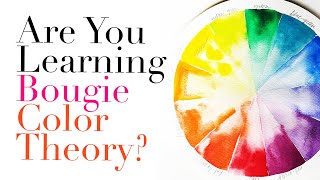
I need that color wheel could add a link to it please?
realcolorwheel.com Its literally the only one Ive used in years. I really don't even need one most of the time.