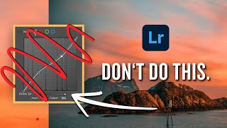
How To Edit Soft Muted Tones In Lightroom (That Still POP!)
Вставка
- Опубліковано 16 лип 2024
- Muted tones consist of desaturated colors, with a bit of added luminance. On paper, this all seems straightforward, but with so many tools to choose from in Lightroom, it might start to get unclear. In this tutorial, you'll see two examples of how to editing soft muted tones in Lightroom, with a simple workflow I like to use. By using these techniques, you'll be left with softer, less saturated colors, without risking washing out your entire photo. When creating this type of editing effect, some people will overdo it and make all the colors in their photo appear bland and lifeless. With some added tricks outlined here, you'll guarantee that your edits will have lots of life, while still having that muted appearance.
-----------------------------------------------------------------------
Find More Tutorials Here: bwillcreative.com/
Come Say Hello: / brnwills
-----------------------------------------------------------------------
Timestamps
0:00 Intro + Overview
0:42 Brightening The Photo
1:23 Adjusting Contrast With Tone Curve
3:56 Creating Muted Colours With HSL
6:40 Final Brightness & WB Adjustment
7:15 Example 1 Before & After
7:56 Starting Example 2
8:24 Example 2 Tone Curve
9:18 HSL Adjustment For Example 2
11:05 Example 2 Before & After
11:38 Wrapping Up


Thank you so much! I've been a fan of this style for a while, but never knew how to do it properly! You're the best Brendan
Wahoo! Glad I could help
so true! :)
This was sooo helpful, thank you! Been wanting an explanation on how to achieve this look for such a long time. I've been finding a lot of filters/presets give this look but I've wanted to know how to do it myself and have better control of the final result.
Thank you!
You're so welcome!
Thank you so much for sharing your insight ! Especially, increasing the smaller, less prodominent colors is quite insightful.
Thank you very much for this crystal clear workflow!
Well done. Thanks for the instructions.
This was outstanding Brendan, great job! Thank you very much. 🤓
Glad you enjoyed it!
This helped me out a lot, thank you for making the video!
Brendan great job, you should have a lot more subscribers. I learned a lot from your channel.
I appreciate that! It will come eventually, just gotta stay consistent with the uploads! I really appreciate the subs I do have such as yourself though and it motivates me to keep making more :)
Excellent tutorial .
This was really informative and I always struggled with it.
Thanks for making this video, I absolutely loved it❤️
Stoked to hear that!
Nice tutorial! Thanks :)
Finding Thie From Long Long Time tysm❤️🙏
Really nice... Loved it
Thank you! Cheers!
Thank you very much
Good stuff B!
Heyo! Didn't expect to see you over on the UA-cams!
oh sir, I am omnipresent!
Thank you for another great clear and concise video. Could you please elaborate why adjusting the shadows in the tone curve panel instead of the basics panel.
Particularly for this effect, the tone curve was mostly used to lift the shadows base for the matte look. You can’t do that quite the same with the sliders in the Basic panel. It’s also easier to get targeted contrast with the tone curve, since you are creating the anchor points and it’s not pre-defined.
@@BrendanWilliamsTutorials thank you.
Can you do a tutorial on how to edit like Monaris please 🙏🏼
I am not familiar with who that is but I shall look into it and see if I could make something around that theme or not.
For those of us who loathe LR with an almost indescribable passion, please would you consider switching to ACR for these kinds of tutorials as they are essentially the same (in terms of the editing 'engine') but without all that complicated and frankly, unnecessary cataloguing stuff in LR. Many thanks.
Well these are the types of edits I would do in Lightroom during my regular workflow, so thats how I share it. Luckily ACR and LR are essentially the same thing, so it’s easily transferrable skill wise. I personally find a lot of value in the cataloging and image sorting options in LR which is why i rarely use ACR. With that said, I understand what you mean and thanks for bringing that to my attention. I’ve never had someone mention this before but if there continues to be interest in ACR I could include it in the same tutorial. Cheers :)