Recreating the Google Homepage with HTML & CSS (Grid, Flexbox)

Вставка
- Опубліковано 26 сер 2024
- Recreating the Facebook Homepage: • Recreating the Faceboo...
Recreating the Twitter Homepage: • Recreating the Twitter...
Recreating the DuckDuckGo Homepage: • Recreating the DuckDuc...
Today I will be trying to recreate the Google Homepage with HTML and CSS only, please give me feedback. Hope you enjoy this video.
Also if you have suggestions for projects that I could build, please tell me in the comments below.
Source Code: github.com/lea...
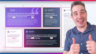


I deeply appreciate you exposing your frustration/confusion and attempts to find solutions; that is an important part of the process that not many other video tutorials show. It's good to know I'm not the only one swearing at my computer! ;p
22:54 that silent moment was so relatable and so funny
For anyone having trouble getting the footer to work without using pixels, you can do so by using a combination of flex and grid. First, split the six footer elements into two divs, with the left three being encapsulated in a #left-footer div, and the right three inside a #right-footer div.
Set the footer class to display: flex, justify-content: space-between, width: 100%, bottom: 0, position: absolute.
Set the #left-footer to display: grid, grid-template-columns: 100px 100px 100px,grid-template-rows: 50px,grid-template-areas: "advertising business hsw",padding-left: 1em.
Set the #right-footer to display: grid,grid-template-columns: 70px 70px 70px, grid-template-rows: 50px, grid-template-areas: "privacy terms settings", padding-right: 1em.
Thanks for posting your solution, its a great way to get the footer to work without using pixels!
@Pawel Adamowicz I think I meant that the footer class would encapsulate the left and right footer elements
Thanks for this. Not only was it helpful, but I found myself laughing at some of your comments as I often talk to myself the same way you talk to yourself in the video when I'm working. :)
To lock the footer in the bottom, try adding the following code! it work for me!! :D
#footer {
position: fixed;
left: 0;
bottom: 0;
width:100%
}
I was getting stuck and frustrated with this task, as my knowledge is so low I find it difficult to even know what to google! This video has helped me learn so much - I basically watch it until I think I understand how the next bit works then implement/experiment with it myself, then resume the vid if I need help with specific bits. Thank you so much mate!
Thanks for commenting, glad I could help you. This is a good strategy to learn, keep going! :)
Great video. First week learning CSS/HTML, found this so helpful!
thank you, glad I could help
Great video. It helped me understand Grid a lot better. It looked like towards the end you must've figured out the footer issue where it wasn't staying at the bottom of the page, but I figured I'd share my solution. I'm not sure exactly why it works, but this is what I did
#footer {
position:absolute;
bottom:0;
left:0;
right:0;
}
I also read about a fix that usually works, but didn't for me this time. You can supposedly usually set height: 100vh; (viewport height) in the body and it should fix issues with the footer not sticking to the bottom of the page.
Thank you for your comment. Im happy that I helped you understand Grid more :). I also ended up using
#footer {
position:absolute;
bottom:0;
}
You only need bottom:0;, it basically sets the element to the bottom of the current container. this link "www.w3schools.com/cssref/pr_pos_bottom.asp" helped me understand it a bit more.
Nice video, man. It explains the logic behind of the grid very well.
Thank you, glad I could help you :)
This was great. Just finished attempting to do this one month into learning development and I learned a lot. Very inspiring. Thank you!
Thanks for commenting and glad that I could help you! :)
Thank you so much. I recommend this video to all beginners!
I think here it is being used css grid on parts where flexbox suits better
The buttons at the end were moving because of the border you added on hover. You should instead have the border normally, but change the color when you hover.
Great video, can't believe someone with 4 subs produces content with this quality. Keep up the good work and you will continue to grow your channel!
ohh, yes you are right, good point. :D
And thank you for the compliment and the sub :)
Hey can you elaborate a bit please? Should I add absolute position for the buttons not to move while hovering? I add a border of 1 px that is the same color as the color of the button in the rand -search-btn and then in the hover i change its color but it still moves:
#random-search-btn{
border: none;
cursor:pointer;
font-size:100%;
padding:5px 10px;
color: #5F6368;
border-radius: 1px;
border:2px #5F6368;
}
#random-search-btn:hover {
border:1px solid black;
Can you help ?Any tips?
Thank you
In the "Footer Section" I couldn't really find any other solution than what you already had. However, instead of the 1330px you inserted, I shortened it to 870px and it worked/looked just fine. When it was at 1330px the remainder of the footer (Privacy, Terms, Settings) was pushed out to the right. In Internet Explorer it looked fine but on Google Chrome it was evident.
For me it looked fine on Google Chrome, but doing it my way is not recommended because of responsibility, if I reduced my window size the remainder of the footer was also pushed out to the right this is probably why it happened to you.
Try to find a solution which is responsive and works for all screen sizes.
Thanks for commenting :)
I found this content soooo usefull man, I already suscribed to your channel. Keep up this type of material and your channel will growth for sure!
Thanks for subscribing! Im glad I could help you
great video. Brazilian greetings, good luck with the channel.
VERY VERY HELPFUL this video literally out of like 10 I found was the most helpful
Great video! Thanks for going through this so clearly and methodically! Very helpful!
Thanks for your comment, glad I could help :)
learn-webdev your comments when you were struggling with the flex-box stuff also made me chuckle 😂
Thank you my guy this video was a big help
it will be great to share your html behind of video!!
Please design full course on CSS
Nice video dude. Helped me out. I will check out your blog.
At 9:02, why do we add height and minimum height while setting them at 100?
I think this is to prevent the browser from making the image smaller if you resize the window.
That was a good video to me to watch, because it gave me a overview of the process of creating a page, but i think you could reduce the use of greed and try to work with position of elements, Great video please continue doing Then
thank you so much for this video, I'm actually learning more from following this than from reading. Quick question though: how do you write several lines at the time? I see you select several lines and write on them all. Thanks
in VS code you press "alt" and then select the lines you want to type the same thing
Very nice! You might have tried footer postion: fixed -- also you didn't add the search icon (spyglass) in the text input...how would you do that using the grid layout?
Great video bro..... I also make this type of videos... #technicalvigyan
At the part when I am making up the grid for the main div, I write 3 columns (1fr 1fr 1fr) and on my webpage 5 grid columns appear and a second smaller empty row also shows up. Anyone have any idea why this is happening? My code is very similar to the one in the video.
Be nice if you told us how to copy and paste multiple lines like that at 11:35. Not everyone knows the hotkeys/tricks but good video so far.
u can look that up, it's a good skill to be able to look things up: 'how to type multiple lines at same time vscode'
...
...
...
...
...
...
...
...
hold alt + left click on each line that u wanna.
Great stuff
Great video, but, what would be the way by recreating the Google Home Page with no grid?
you can create with this course www.udemy.com/course/create-google-homepage-with-html-and-css-in-just-40-mins/learn/lecture/12211076#overview
Tolles video! Vielen Dank! :)
Hi, I am currently loading coding with The Odin Project and one of our assignments was to recreate the google homepage. Everything was going well until got to moving the nav bar to the correct locations. I followed your example meticulously and still have an error doing this. Do you have a discord that I could share my code with you if you've got time?
Thanks man.
Hey, thank you for watching my Video, I don't have a Discord but you could upload your code to codepen.io/ and share your link here, maybe I can help than.
@@CodePhilipYT codepen.io/rayphe/pen/WNbmJZE
This is the code pen link with just the nav bar. Any help would much appreciated.
@@raymondphelan2776 I think your problem was that you seperated the grid template column sizes with a comma.
it should look like this:
grid-template-columns: 50px 50px 1fr 50px 50px 50px;
instead of
grid-template-columns: 50px, 50px, 1fr, 50px, 50px, 50px;
and the spacing between the single elements will be achieved by adding margin.
Hope that solved your problem.
@@CodePhilipYT ahh of course. That's fix the issue of placing the elements on the right side but they are all on top of each other. Not sure what you mean about the margin.
@@raymondphelan2776
This is the whole css code that should work, i just removed the commas, and added the grid areas to the grid-template-areas. Also you forgot the "s" in the id "images" thats why you couldnt position the images link. With this code everything should work, you can set the spacing between the links with margin. (you can read more about margins here developer.mozilla.org/de/docs/Web/CSS/margin). Hope this solved all issues, if not just respond :)
html{
height: 100%;
min-height: 100%;
}
#navbar{
display: grid;
grid-template-columns: 50px 50px 1fr 50px 50px 50px;
grid-template-rows: 50px;
grid-template-areas:
"about . store gmail images sign-in";
}
#about{
grid-area: about;
}
#store{
grid-area: store;
}
#gmail{
grid-area: gmail;
}
#images{
grid-area: images;
}
#sign-in{
grid-area: sign-in;
How can we contact you
It is not necessary use grid system on that kind of layout
Thanks for commenting, yes I know there are many ways to create this kind of layout, but I just chose to do it with Grid.
How would you create this layout?
@@CodePhilipYT Yes, of course we are free to choose! I think for simple layouts it is better to use flexbox, and to use Grid when we need for example to create a complicate gallery (or a section) which will have elements with different width and height values
I agree. There’s no need for grid for this layout.