Enjoyed this video? Then subscribe to the channel right now, and watch the related video that explains what the financial terms EBIT, EBITA and EBITDA mean: ua-cam.com/video/nImp51zYcy4/v-deo.html
Great to hear! It's wonderful to make this type of data "accessible" to executives. I learned to use them while working at General Electric, and have used them in many places since then.
Wonderful to hear that. Waterfall charts are a powerful visual tool, and once you understand how they work, they are great to work with. Enjoy using them.
@@TheFinanceStoryteller I used your tutorial to make a waterfall chart. Showing how pricing will increase over next 2 quarters... with inflation, quarterly increases. He was super impressed. 👌
Great to hear that. Amazing how some people switch off when they see a page full of numbers, but "get it" when there's an attractive visual presentation like a waterfall chart.
Thank you, Sinan! Reason for me to include both ways is that viewers might be on different versions of Excel. And yes, having the second one is delightful.
@@TheFinanceStoryteller Hello, I do seem to have an issue where my "right-hand" side end point keeps changing from "set as total" to "free-floating". I have a dataset that get filtered to hide zero's and I think this is causing it to re-set each time... I may have to go back to "old" method.
Very efficient. Thanks for the video. Question: If the total is negative, the zero line gets diluted. How can I set the horizontal line crossing to be at zero value? Option does not show in the vetical axis formatting options.
Hi, thank you for the helpful video! I have a question with regards to the Total Bars, in your instance EBIT. Is it possible to have multiple sections of the total bar separately colour to demonstrate the composition of that Total? E.g. in your instance 100 EBIT might be 50 EBIT part sales, 50 EBIT services sales. Is it possible to have a single total line with this split out please?
Hello Liam! Yes, I think that should be doable. Use the "Build a waterfall chart in any version of Excel" method that I discuss first in the video, rename column "Final" into "Final A", and insert a column "Final B" to the right of it. Same story with column "Initial": rename to "Initial A", and add/insert column "Initial B". As you are using a stacked column chart to create the waterfall chart in this method, you should be able to stack "Final A" and "Final B" on top of each other, and the same for "Initial A" and "Initial B", if there are values for all those cells. The trick is to add extra columns, not extra rows. Give it a go, and let me know if it works or not, as I have not tried it myself yet in Excel.
Hi! Thanks for the kind words. That initial graph came from an older version of Excel. Right-click the background area (just above or below any of the floating bars), format plot area - solid fill - grey.
This is very helpful waterfall chart tutorial. I follow step and finish easily. Just one area I cannot do as per your guideline. This is the part to adjust the colors for each of legends from 5:38. When I click the legend "Increase" the columns of "Decrease" and "Total" are dim and only the columns of "Increase" are bright, however when I right click to choose color, it is applied to only the Legend area in stead of the columns themselves. Can you please help me? Thank you very much.
Glad it was helpful, Dung! The problem with adjusting the colors probably depends on the way you click on these sections. Have you tried this on different types of computer, and with different devices (mouse versus touchpad on laptop)?
Hi Ryan! I've played around with this as well. It seems to be an "all or nothing": either you show all three data labels (increase/decrease/total), or none at all. Just trying to delete one of the three doesn't seem to work.
You adjusted the y-axis to start from 80. If one does not want to do that, but wants to kind of "cut" the y-axis and then continue it...how can that be done? This in case the difference between EBIT numbers vs plus and minus shifts is larger and I would like to start my Y-axis from zero
Hello Marko! Select the Y-axis in the graph, then right-click with your mouse, and select "Format axis" where you can set the minimum and maximum bounds, the point where the horizontal axis crosses, etcetera.
Thanks for your reply. Yes, I know how to do those basic adjustments, but how to create broken Y-axis and broken bars, if the scale difference is very large between different bars I want to illustrate?
That turns out to be more complicated than I thought. A quick search led me to some examples of breaking the chart axis with adding a secondary axis in the chart, but that seems to be a lot of work. If I can find an easier way, I will make a video about it!
Hi there, it helps! just one quick question, i was not able to save customized new waterfall chart as a template, is this only my issue or anything to do with MS? thanks!
Many thanks! Question- (5:46 inthe video), while cliking on the "increase/ decrease" to change colirs to the green and the red, I only have possibility to change the whole legend, not the small "increase/ decrease buttons.In your example you have three frsmes and I have only one for decr/ incr and total Could you advise please what do I do not correctly? Thanks🤔
Hi Lisinta! I think I have experienced the same issue at first. If I get "stuck" in that step, I always click elsewhere in the Excel sheet (for a "fresh start"), then click (left mouse button) on the chart, then click again on the legend, then click again on individual titles like "increase". It often takes multiple clicks to get there.... Hang in there!
@@tracigriffin4819 Hi Traci! The trick is in the variation of your click speed. Try it preferably on various devices (mouse, buttons on laptop touchpad) to get the "feel" for it.
I had a problem changing the color for increases and decreases because it is changing just then color of the legend... so i change it one by one hahaha
@@TheFinanceStoryteller i have the same problem. i can't change the color of the total/increase/decrease like you show. it is changing the color of the legend and not the bars. I'm using excel 2016. is that the problem?. thanks!
Hi David! As far as I know, the functionality is the same between the Excel 2016 and 2019 versions. Clicking the object can be challenging.... If I get "stuck" in that step, I always click elsewhere in the Excel sheet (for a "fresh start"), then click (left mouse button) on the chart, then click again on the legend, then click again on individual titles like "increase". It often takes multiple clicks to get there.... Hang in there! The trick is in the variation of your click speed. Try it preferably on various devices (mouse, buttons on laptop touchpad) to get the "feel" for it.
@@TheFinanceStoryteller Hi Storyteller. it still doesn't work. I get to click the individual title but when I change the color it is changing the legend area color and not the title color and its related bars for some reason...thanks!
How come you are explaining how to create the waterfall from completed Waterfall !!!! kindly Remake the video with Starting from Zero so we could know how did you do it !


Enjoyed this video? Then subscribe to the channel right now, and watch the related video that explains what the financial terms EBIT, EBITA and EBITDA mean: ua-cam.com/video/nImp51zYcy4/v-deo.html
Excellent little video! Straight to the point, simple explanation and provides two options. Well deserved thumbs up!
Thank you very much! Waterfall charts are awesome, enjoy using them. ;-) Here are some more Excel tutorials: ua-cam.com/video/W791wTdTfbk/v-deo.html
One of the clearest instructions I've seen on Waterfalls. Thanks!
Nice to hear that! Thank you very much. Have a great weekend.
Wonderful presentation! Saved me on a Saturday when my boss called and asked me to do this!
Happy to help!!! Hope you got to enjoy the rest of the weekend.
Super helpful!! Was able to quickly create several charts for executive level presentations. Many thanks for sharing!
Great to hear! It's wonderful to make this type of data "accessible" to executives. I learned to use them while working at General Electric, and have used them in many places since then.
I use these monthly. I wish this video was available when I was just starting out. Great job on the explanation!!
Thank you very much, Erick! Happy to hear that. Yeah, I should have made this video years ago.... ;-)
It was so nice that you showed the older format and the newer format
Thank you very much, Utkarsh! Happy to hear that.
Very nicely explained. Impressive. Never knew waterfall chart can be done so quick and attractive
Thank you! Enjoy using it!!!
Brilliant video - really clear and told in an easy to follow way, thanks for your help!
Wonderful to hear that. Waterfall charts are a powerful visual tool, and once you understand how they work, they are great to work with. Enjoy using them.
@@TheFinanceStoryteller Just use the waterfall chart selection in Excel. Way easier now than maybe what it used to be.
Many thanks for sharing, I could not selected the whole "decrease" or "increase" to brush up new color...
You're welcome! It's not always easy to select the right item by clicking, try it on different devices.
I have same problem
Thanks for this buddy. I encountered some challenges in creating waterfall chart in excel for Mac and this vid has enlightened me. Good job.
Great to hear that!!! Enjoy using the charts. :-)
Thanks alot! I could understand the Set as Total was the part I was missing! Greetings from Mexico
Glad it helped! Greetings back from the Netherlands.
Thank you, i was on a crunch to do this one and your video helped a lot. Thanks again
Happy to hear that, John! Enjoy using these charts, I think they are very nice.
Thank you very much. That was very very helpful and clear.
Great to hear that, Djackie! Enjoy building and using them.
Loved it. Very simple. Thanks for posting and great explaination
Thanks for the kind words, Jagdish! Enjoy using the charts!
Wonderful, thank you. As always, straight to the point and very very useful.
Yep, that's me! 😉 Thanks for the kind words.
Excellent tutorial. Thanks!😊
You're welcome! Enjoy using these wonderful graphs.
thank you so much for this tutorial.... absolutely fantastic. 💯 your the man.
Thank you for the kind words!!!! Enjoy using the charts.
@@TheFinanceStoryteller I used your tutorial to make a waterfall chart. Showing how pricing will increase over next 2 quarters... with inflation, quarterly increases. He was super impressed. 👌
Great to hear that. Amazing how some people switch off when they see a page full of numbers, but "get it" when there's an attractive visual presentation like a waterfall chart.
Brilliant Video Many thanks you make our life easy
Happy to help! Enjoy using the charts.
Clear and concise. Thank you!
Nice to hear that, Kelly! Enjoy using them.
Very Good Video! Definitely prefer the second option.
Good choice! Hope you will use it a lot!
Thanks the latter versions of excel makes it very easy to do
You are welcome! Enjoy using it, Kayode!
Good work! Thanks
Glad you liked it! Enjoy using the graphs.
helped me a lot, thanks man!
Glad to hear it! Enjoy using the charts!
Thanks so much!! Very helpful!
You're welcome! Happy to help!
that was very helpful! thank you for making this video
You are so welcome! I love those charts, and hope you will make frequent use of them.
Thank you!!! EXCELLENT VIDEO!
Glad it was helpful! 😊
Your tutorial is great thank you. second one is easy to build, i prefer it :)
Thank you, Sinan! Reason for me to include both ways is that viewers might be on different versions of Excel. And yes, having the second one is delightful.
Thankyou for sharing fantastic video
You're welcome! Happy to help!
Thank you so much! You’re a life saver.
You're welcome, Jenny! Enjoy using the charts. 🙂
Thank you , this really helped a lot
Glad to hear it!
Super helpful thank you!
Great to hear that, Dane! Enjoy using the charts.
This is very helpful... thanks a lot really
You're welcome, Payong! I think the waterfall charts are an excellent presentation tool, so I am happy to promote them.
Thanks a lot for excellent video.
You are most welcome, Nagesh! Enjoying using the charts!
Fantastic! Thanks for the video!
Glad you liked it, Dan! Enjoy using the charts, and please subscribe to the channel! 🙂
Helpful video, thank you!
You're welcome, Tejas! Enjoy using it.
Awesome.. you’ve made it very easy 👍👍👍
Thanks a lot 😊 Enjoy using the charts!!!
Thank you, man
Happy to help!
Thank You Buddy, you saved me in a Pinch....!!!!
Happy to help! Hope the charts will be well received!
@@TheFinanceStoryteller Hello, I do seem to have an issue where my "right-hand" side end point keeps changing from "set as total" to "free-floating". I have a dataset that get filtered to hide zero's and I think this is causing it to re-set each time... I may have to go back to "old" method.
Very helpful, thanks.
Enjoying using it!!!
Very helpful
Glad to hear that! Enjoy building the charts!!
Helpful. Thank you.
You're welcome! Enjoy using it!!!
Dude, fantastic video. Keep the good work!
Thanks, will do! 😎
Thanks. It is explained very nicely to understand.
Glad it was helpful, Anil! Enjoy using it!
Wow different type of vids. Love it
Thank you, John! Had this topic on the list for a while, and suddenly felt the urge to make the video. :-)
Excelent! Thank you very much for this.
Glad it was helpful! Enjoying using it!
Thank you!
You're welcome!
Thank you!!! :)
You're welcome! Happy to help.
Thanks a lot.
Glad to help! Enjoy using the charts.
Very efficient. Thanks for the video. Question: If the total is negative, the zero line gets diluted. How can I set the horizontal line crossing to be at zero value? Option does not show in the vetical axis formatting options.
Thanks for the kind words! Did you try Format Axis - Axis Options - Reset?
Thank you for saving me :)
Happy to help!
Hi, thank you for the helpful video!
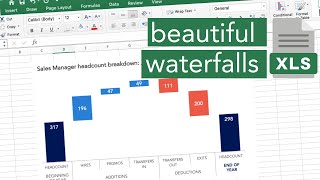
I have a question with regards to the Total Bars, in your instance EBIT.
Is it possible to have multiple sections of the total bar separately colour to demonstrate the composition of that Total?
E.g. in your instance 100 EBIT might be 50 EBIT part sales, 50 EBIT services sales. Is it possible to have a single total line with this split out please?
Hello Liam! Yes, I think that should be doable. Use the "Build a waterfall chart in any version of Excel" method that I discuss first in the video, rename column "Final" into "Final A", and insert a column "Final B" to the right of it. Same story with column "Initial": rename to "Initial A", and add/insert column "Initial B". As you are using a stacked column chart to create the waterfall chart in this method, you should be able to stack "Final A" and "Final B" on top of each other, and the same for "Initial A" and "Initial B", if there are values for all those cells. The trick is to add extra columns, not extra rows. Give it a go, and let me know if it works or not, as I have not tried it myself yet in Excel.
Great tip.. Just what i was after. Thanks :-)
Great to hear, David! Enjoy using the waterfall charts. 😎
Excellent
Thank you so much 😀 Enjoy using the charts.
Great explanation
Thank you, Panji! Enjoy using it. :-)
Super helpful dude! Saved my bacon today
Glad I could help, Alex! Waterfall charts are the coolest thing, once you figure out how to make them. 🤓
This is brilliant. thank you.
Glad you enjoyed it! Thank you for watching and commenting.
Thanks brother
Happy to help!
Can u please make a series of lectures on financial modelling course and investment banking from scratch to end
Thank you for the suggestion, but that's not really my area of expertise. I am more of an "operational finance" guy....
thank you !
You're welcome! Enjoy using the charts.
Best explanation
Thank you! Enjoy using it.
Thanks!!!
Welcome!
Great video. Can you show/explain how you format the chart to look like the initial ones shown in the video (grey background ones). Many thanks.
Hi! Thanks for the kind words. That initial graph came from an older version of Excel. Right-click the background area (just above or below any of the floating bars), format plot area - solid fill - grey.
Good stuff man, thank you!
You're welcome! Enjoy using it!
Thankyou!
Enjoy using the charts! 😊
very thank you
You are most welcome 🙂
This is very helpful waterfall chart tutorial. I follow step and finish easily. Just one area I cannot do as per your guideline. This is the part to adjust the colors for each of legends from 5:38. When I click the legend "Increase" the columns of "Decrease" and "Total" are dim and only the columns of "Increase" are bright, however when I right click to choose color, it is applied to only the Legend area in stead of the columns themselves. Can you please help me? Thank you very much.
Glad it was helpful, Dung! The problem with adjusting the colors probably depends on the way you click on these sections. Have you tried this on different types of computer, and with different devices (mouse versus touchpad on laptop)?
Thanks
Welcome!
thks
I prefer the older one when I have overalaping data
How to have values ? for exemple, volumes are in Tonnes, how did you turn it on value please ?
The graph will take the format of the source data. For example, if the source data has $ signs, then the graph will too.
How do you remove the "Total" within the legend? Looking at only the new method if that matters. Thank you in advance.
Hi Ryan! I've played around with this as well. It seems to be an "all or nothing": either you show all three data labels (increase/decrease/total), or none at all. Just trying to delete one of the three doesn't seem to work.
Oh god I was pulling my hair out couldn't figure out how to set totals. all the other videos used stacked columns and is such a hassle to set up
Agree! But once it works, it is awesome. :-) Hope the video helped to point you in the right direction.
You adjusted the y-axis to start from 80. If one does not want to do that, but wants to kind of "cut" the y-axis and then continue it...how can that be done? This in case the difference between EBIT numbers vs plus and minus shifts is larger and I would like to start my Y-axis from zero
Hello Marko! Select the Y-axis in the graph, then right-click with your mouse, and select "Format axis" where you can set the minimum and maximum bounds, the point where the horizontal axis crosses, etcetera.
Thanks for your reply. Yes, I know how to do those basic adjustments, but how to create broken Y-axis and broken bars, if the scale difference is very large between different bars I want to illustrate?
That turns out to be more complicated than I thought. A quick search led me to some examples of breaking the chart axis with adding a secondary axis in the chart, but that seems to be a lot of work. If I can find an easier way, I will make a video about it!
what a nice dutch accent_:D but thanks, useful
Happy to help!
Hi there, it helps! just one quick question, i was not able to save customized new waterfall chart as a template, is this only my issue or anything to do with MS? thanks!
Hi! I don't know the answer to that, as I never uses templates....
I would prefer the new one than ex.... a lot much easier
Yeah, I was posting both to emphasize the difference. The new version also has its idiosyncrasies....
@@TheFinanceStoryteller thank you for posting this VDOs
Many thanks! Question- (5:46 inthe video), while cliking on the "increase/ decrease" to change colirs to the green and the red, I only have possibility to change the whole legend, not the small "increase/ decrease buttons.In your example you have three frsmes and I have only one for decr/ incr and total
Could you advise please what do I do not correctly? Thanks🤔
Hi Lisinta! I think I have experienced the same issue at first. If I get "stuck" in that step, I always click elsewhere in the Excel sheet (for a "fresh start"), then click (left mouse button) on the chart, then click again on the legend, then click again on individual titles like "increase". It often takes multiple clicks to get there.... Hang in there!
@@TheFinanceStoryteller I have the same issue and have tried over and over and can not select just increase or decrease
@@tracigriffin4819 Hi Traci! The trick is in the variation of your click speed. Try it preferably on various devices (mouse, buttons on laptop touchpad) to get the "feel" for it.
@@TheFinanceStoryteller that worked. Thank you so much!!
@@tracigriffin4819 Happy to hear that, Traci! :-)
Didnt realize the live became so much easier 😂
Yep! Some functionality is improving significantly.
I had a problem changing the color for increases and decreases because it is changing just then color of the legend... so i change it one by one hahaha
Trust me, I've been there. It took a few practice rounds before I made the video. ;-) Hopefully the outcome was worth the work!
@@TheFinanceStoryteller i have the same problem. i can't change the color of the total/increase/decrease like you show. it is changing the color of the legend and not the bars. I'm using excel 2016. is that the problem?. thanks!
Hi David! As far as I know, the functionality is the same between the Excel 2016 and 2019 versions. Clicking the object can be challenging.... If I get "stuck" in that step, I always click elsewhere in the Excel sheet (for a "fresh start"), then click (left mouse button) on the chart, then click again on the legend, then click again on individual titles like "increase". It often takes multiple clicks to get there.... Hang in there! The trick is in the variation of your click speed. Try it preferably on various devices (mouse, buttons on laptop touchpad) to get the "feel" for it.
@@TheFinanceStoryteller Hi Storyteller. it still doesn't work. I get to click the individual title but when I change the color it is changing the legend area color and not the title color and its related bars for some reason...thanks!
I prefer the newer way because there's less data preparation
Ik ruik Nederlands
Jazeker! :-)
How come you are explaining how to create the waterfall from completed Waterfall !!!!
kindly Remake the video with Starting from Zero so we could know how did you do it !
Kindly fastforward to 02:45 in the video where I do exactly that.
Very useful - thank you!
Happy to hear that! Enjoy using the charts.
Very helpful, thank you!
Great to hear that, Becky! Glad it was helpful! Enjoy building your charts!