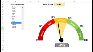
Half Circle KPI info graphic chart

Вставка
- Опубліковано 16 жов 2024
- Hello Friends,
In this video you will learn how to create Half Circle KPI Info-graphics chart in Excel.
Please download this excel file from below given link:
drive.google.c...
Watch the best info-graphics and dynamic charts from below link:
• Dynamic Graphs
Learn and free download best excel Dashboard template:
• Excel Dashboards
Learn Step by Step VBA:
• VBA Tutorial
Facebook:
/ pkan-excel-expert-9748...
Telegram:
t.me/joinchat/...
Pinterest:
/ pkanexcelexpert
************ Suggested Books ********
VBA: amzn.to/2TMMikX
Excel Dashboard: amzn.to/2WZi2Fj
Power Query: amzn.to/2Ibd7xR
Power Pivot and Power BI: amzn.to/2DCg8BB
Exam Ref 70-778 (Power BI): amzn.to/2GnWYTN
************ My Stuff ***************
Mic : amzn.to/2TLnF88
Video Editor: screencast-o-m...
Laptop: amzn.to/2PlFFFz


Best tutorial on creating half circle KPI. Thank you!!
Most welcome
ABSOLUTLEY the BEST!!!!!!!
Just fantastic! Thanks for your great job on this. you're very knowledgeable!!
Thanks for your valuable feedback.
Thanks for the useful tutorial. 😊
You're welcome 😊
thank you for this. the solution was right under my nose. thanks for the help!
Thanks for your valuable feedback
Thank you from Argentina!
Most welcome
Just what I needed... Thanks from Angola Dear Sir
Most welcome
very good tutorial thank you
Most welcome🙏
Wow this is just great, thank you very much!!!
Thanks for your valuable feedback
Grazie! From Italy
Grazie per la visione
How can you be so kind? Thank you so so much for this!
Welcome
Hello PK. Simply the best. Keep it up.
Thanks for your valuable feedback
it's simple and easy to follow, thanks! you are amazing!
Thanks for your valuable feedback
Denle su buen Like al hombre, no se nada de ingles pero sus videos estan bien explicados
best tutorial ❤
Thanks
Sir can we connect these charts with slicers to make them fully automated
Great Video Sir , I Can't Thanks you Enough
This was super helpful! thanks for sharing this
Thanks for your valuable feedback
Thanks for excellent Dashboard sir. I am facing an issue when the percentage reaches 100% because the "No fill" Section would be 0% and the complete circle is showing up instead of half circle, as the section where transperancy is set as 85% is showing up as the full circle. Can we fix this issue please?
Fantastic Job. Is it possible to put a target line on the half circle to indicate the plan %?
Please watch the below video to put the target line:
ua-cam.com/video/xxQtfXOFpWY/v-deo.html
PK the MAN
Thanks PK! This was helpful!
Thanks for your valuable feedback
Hi Sir,
Many thanks for making such kind of videos , could you please suggest me how we can apply conditional formatting in these chart
Thanks a lot PK. It is useful for me :)
Great video, thanks. Will this work on Google Sheets?
EXELENTE VIDEO AMIGO, saludos desde el salvador
Gracias por valiosos comentarios
This is great. Was looking for this. Can you also please show how to add a needle to the gauge chart?
Great!
Thanks for your valuable feedback
How would you go about making a progress chart on a shape? Specifically a 'piece of pie' / 'slice' of a circle. Is that possible so as your % gets higher for of the slice fills with a solid color? Thanks
Hi
What if the percentage is more than 100%, What should I do to keep it in like the half-circle?
Thx
Obrigado por compartilhar
thanks sir. can you please also share how we can prepare waterfall chart / bridge which is used for explaining the variance
hi sir if there is an decimal value how can we create could u please teach me
Excellent one sir, Very thankful to you for sharing excellent dash boards. Have one doubt, can we create double Half KPI chart using using pivot table. Please let me know...
Thanks Vijay for your valuable feedback. We can create is by using pivot table also. Need to some calculated fields.
@@PKAnExcelExpert Can You make a video of the subject, or please give a call on my number 9100050806. As I searched for your number in your all and couldn't found. Hence, the request. Hope you understand sir.
Hi Vijay,
I will definitely try to make such video very soon.
What if I have absolute value and not percentages?
That is clever. Thank you for the instruction. Which version of excel is this?
Thanks for watching and sharing your valuable feedback. I am using excel 2013 however it will work in Excel 2010 also.
can you do condintioning format with the text? E.g below 40% and its red?
thanks for sharing
hello how do i make a kpi properlly showing my target goal lets say i want to make a kpi for saving account so 10K being 100% and i invested 1K so my progress will show 10% i cant figure out how to make it work with numbers not only pure % , 1-% . thank you.
Hi! Thanks a lot! It was very helpful. Could you please let me know how I can move chart created in Excell to Power Point?
I tried to do it directly in ppt but could not
Oswm sir
Thanks for your valuable feedback
Thank You
Thanks for watching
I know this is 6 years old, and there might be an obvious answer to these questions...When the percentage changes, my graph does not have that sliding animation that yours does. And my text boxes are also not automatically glued to the chart, so they don't move with the chart. Can anyone help, thanks.
Sir I want to class pls suggest me you provide or not
Hi Gaurav,
As of now I am not providing classes, but in will be starting online classes for excel, vba and power bi very soon.
Present 🙄press Enter