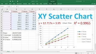
Create an XY Scatter Chart in Excel

Вставка
- Опубліковано 18 вер 2024
- Learn how to create X/Y Scatter Charts in Microsoft Excel. It's easier than you might expect, and can reveal important insights about your data. This video will show you how! ***Support Technology for Teachers and Students on Patreon***: / technologyforteachersa... Here's my entire playlist of Excel tutorials: bit.ly/tech4excel Consider saying "Thanks" by clicking the Thanks button below the video. Here's a link to the practice file for this video: bit.ly/excelxy #excel #exceltutorials #microsoft365


Thank you for explaining in detail. I couldn't figure out how to add chart elements.
I am amazed at how quickly you are able to show all kinds of things in a short video. That was awesome! Great tutorial. 😃
A very nice demonstration.
Keep uploading man love ur videos
Great video...thanks for taking time to make it
Thank you
Nice explanation
How can I make the X axis a group based on the same name, rather than numbers? Essentially I want 5 scatter plots in one. X - group name, Y = score, and individual dots named on the chart.
How would you add a secondary piece of data? please help.. SOS
E7