Table Visual with Small Multiple and Variance Arrows | Native Power BI Visual | New Power BI feature

Вставка
- Опубліковано 3 бер 2024
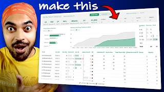
- We have got many amazing new features in Power BI native visuals, which we can utilize to create such visuals. In this demo, I am going to utilize new features like, Overlap option, Custom data label and error bars, to create a table like visual, which will also show small multiples.
Get Help into Questions Related to #powerbi, #dax, #powerquery Power BI #datamodeling, #analysisservices and #powerbiservice and #microsoftfabric
Check out our website www.powerbihelpline.com and blog-post. for end-to-end power BI solutions, Power BI templates, or any kind of Power BI questions like Power query errors, Authoring and optimizing DAX codes for complex business logic.
Follow us on LinkedIn
/ power-bi-helpline-22a2...
Email- info@pbihelpline.com
@PowerBIHelpline - Наука та технологія


thanks for your knowledge, can yor show the measure about the % variance of the video? i cant get the correct answer . The line in my charge are to large.
My variance measure is, Divide([Total sales] - [Total forecast] , [Total forecast]). However, This doesn't matter, and you can use any other expression based on your requirements.
make sure you are not missing anything especially in upper bound and lower bound measures.
You can also adjust the reference placeholder values
thanks for your prompt response @PowerBIHelpline . The question to be clearer is the following
1) I have a year slicer and another with categories, when I select a year and a category, one or more negative lines overlap the bars of the current value and I don't know how to prevent them from overlapping
2) Is there any way to dynamically adjust and overlap neither the lines nor their labels on the bars of the current value?
I would greatly appreciate your contribution.
Yeah, I got your point. and this is a very genuine issue when we fix our placeholders. please apply below changes-
Step 1- Change your [Ref1] and [Ref2] measures datatype to 'Dynamic" and use this format string in format section """"& FORMAT([Variance %],"0.0%")
Step 2-
Change Upper Bound measure with below expression -
Upper =
var _barlength =
IF(
ABS([Variance %]) > .8, 1.3, [Ref 1]+ABS([Variance %]
)
)
RETURN
IF(
[Total Sales] >= [Total Forecast],
_barlength,
BLANK()
)
Step 3-
Change Lower Bound measure with below -
Lower =
var _barlength =
IF(
ABS([Variance %]) > .8, 1.3, [Ref 1]-ABS([Variance %]
)
)
RETURN
IF(
[Total Sales] < [Total Forecast],
_barlength,
BLANK()
)
Step 4-
In the error bar section for both the error bar, Go to 'Error data label' and change the 'Label Format' to 'Absolute'
With this you will not see that overlapping bar issue for higher absolute percentages.
@@PowerBIHelpline It worked, very grateful, however the positive lines are not complemented by the amount of %, I have some, let's say a line with 34% is longer than a line with 81%, even one with 120% larger than one with a 220%.
Really, thank you for taking the time to answer, that makes you different from the rest of the community, in terms of your support for your followers, great content. Thank you very much.
Thanks for the appreciation, I realized this issue, just because you pointed it out, I am very thankful to you. and in a hurry tried to provide some work around. I know that we need to make that length little more adjusted. and i think if you carefully look into new measures, you will definitely get idea, what actually i tried to do. I hope you got the point that on what dynamic scale we need to adjust these lengths. based on the requirements.
Your Content is Uniqueness!! Please make more video on dynamic DAX because most of interviewer will ask this type of question
Thank you so much the recognition. We will definitely post more and more unique videos on dynamic DAX
Excellent! What a nice solution, thx!
You're welcome!
Good work. A wonderful and very insightful video. Thank you. 👍👍👍
Glad you enjoyed it!
Truly Amazing !
Glad you liked it
Amazing!! woah!
Glad you like it!
Can you please tell me that how you used the emojis in the titles
you can press windows and ; to get such emojis
This is AI-generated content?
I think it will take some more time for AI to generate this visual in Power BI