TOUGH EDIT! Window Pulls & Luminosity Masks for Living Room | Architecture Photography Tutorial
Вставка
- Опубліковано 17 січ 2024
- Stay in the loop on upcoming Zoom Q&A discussion calls - www.matthewaphoto.com/
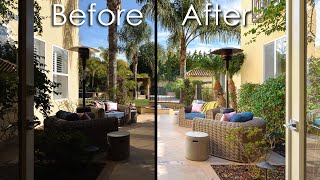
In this video I walk you through the process of shooting and editing a single image of the living and dining room at the Zen Treehouse in Bailey, Colorado.
My name is Matthew and I'm an architecture & interiors photographer based in Kansas City.
IG @matthewaphoto / matthewaphoto - Навчання та стиль


Great! You have to open the toolbox for this one!!!
Another way to do it: 1.) Take the straight shots exposed for the view. 2.) Then duct tape diffuser to the outside of all of the windows, so that the windows all become soft boxes and bounce the light all around the interior. Drape white bed sheets over the furniture if you need more of the light to go up to the ceiling. 3.) As back up, some studio flash on the dark pesky shadows. 4.) Finally edit it all together 5.) If the table top still looks milky, then add a photoshop sepia filter with high contrast and saturation.
Good video, but I'm disappointed I didn't learn how to pull a widow! 😜
Thanks for sharing this tutorial with us! Great as always!
Great video Matt! Love the detail in everyone one of your videos.
You're the best. Honestly.
Thank you so much Matthew it helps me a lot to go
Your content is amazing! Thanks for sharing tough projects like this one! Every other video you see, the images are almost always perfect, and don´t have a big challenge like this one!
Honestly. This was a ton of help! I’m literally shooting a massive window setup very similar to this tomorrow so I’m now excited to see what i can get!
Thanks for sharing!
This was super helpful. Recently, I've been working on a house edit with lots of big windows like this. Will have to try the gray layer thing. So gooooood! Thanks for sharing
Hey Matthew! Thanks a lot for sharing your knowledge. Really love your work. I sometimes really struggle with window blooming in such scenarios. Requesting you please make a video in controlling window blooming in a realistic way.. Looking forward to your response. Thanks a lot!!
I live and work in that area and have worked in many homes like that. Dark interiors and the typical Colorado ‘Cloud of Doom’ that flattens the light. Not to mention the wind. So spot on with the struggles you had. Great video and strategy working through it Matthew! Edited comment regarding window pulls.. I feel like you have to follow the client’s wishes. Unfortunately in Colorado views are super important to a lot of clients and they almost demand that stupid poster perfect looking pull. I often do it reluctantly for them but then do another more realistic image for myself.
When can we anticipate video about window pull ? Would love to see a very specific tutorial one
cheers !
Cool to seee! I like that you bring single exposures back on top to brush back in some natural vibes. Personally for me, one of the later contrast layers you added right at the end, made it feel a bit less realistic. Try toning that back a bit ; )
Exactly what I've been looking for as I experienced exactly the same scenario and like you was still unsatisfied with the result.
Freakin reflector bounce! Why didn't I think of this? Trying next shoot.
These are the toughest for sure. I would wait for the sun to go down frankly. I’d look at the plans and see where the sun is. I’d also use a polariser for this
That's a tough one for sure. I try to just never shoot those but sometimes you just have to and I take a similar approach
Your editing skill is really good, and you made good choices with all the sorts of shots you took at the place. When you were showing the troubles you had on-location, I genuinely thought to myself: How on Earth does he actually salvage this into something usable?
Ha! The rum!!!🍹
THIS! This shot is honestly the reason I consider quitting my job on a daily basis haha I honestly struggle so much with shooting spaces like this with so many windows, on top of the glare and dark interior. Thank you for making a video on this, I appreciate it so much
**random question, do you always work in "camera neutral" as a profile? - Thanks
Yeah I normally work with it in camera neutral. For a while I edited in some adobe color profile and a few snobby photographers blasted me in the comments like I was a dummy for not using camera neutral. Honestly…I don’t see a major difference. Sometimes I’ll catch a noteworthy difference but most of the time it’s negligible IMO.
i did not get the part with the color correction after the "solid"color-wall frame. you continue "i did the same with the chairs", but there you do not have that solid color frame...(but entertaining and inspiring as usual : )
Love watching your edit videos! What are your thoughts on pulling in a flash pop layer to bring back detail on table tops? I know most wood tabletops are varnished, so they become very reflective. But I tend to always try to bring back detail in highly reflective surfaces. Maybe I shouldn't be doing that?
Yeah I do that sometimes. To be 100% transparent, I was going to do that in this shot but it was just getting too cumbersome during the shoot, so I skipped it cause I just wanted to be done with it 🤣
quick question: in tight spaces, how is it possible to shoot tighter than 24mm?
Great post! So informative! question: at 10;29 You bring that new file from LR to PS and change the blending mode to "luminosity" ... what was the purpose of that and how it differs from using the "lighten" mode... thanks!
Because I wanted the brightness values of that layer. Not necessarily the color tones of it.
@@MatthewAPhoto Thanks! lighten mode then is used just to blend your "strobe' files...?
can I get the files? I'd love to try editing that.
what tripod are you using?
What camera and lens do you use?
Check out my photo gear video. It’s all listed there for ya 👍
i'm working as a marketer for several property developers for over 15 years, and this is amazing, but the cruel reality is that your hard work may have a high chance been ruined by a stupid printing company that print the brochures with color difference AND stupid marketing people and their boss cant even tell a difference...while digital platforms like fb or ig just compress the shit out of your image, and those property agents will just do a screen shot and send to their clients =.=
Important question - why is all the rum gone??
🤣🤣🤣
I believe I saw this tip on a guy that primarily does Landscape photography. To create a more natural depth of field like the eye would see, lift the contrast or use I think dehaze slider for those distant elements.
Widow pulls? ;)
Woah! Good catch. Thank you.
This contrast happens a lot here in southern Brazil, it's always complicated. I saw this video linked this week about grays in the shadows, maybe it's what I need to make the whole thing more natural, it actually opened my eyes to this issue. Hugs and thanks always for the videos!
ua-cam.com/video/21mPduQsm1g/v-deo.html
I notice canon tilt shift doesn’t have aperture ring on it. If we attach the len to a Sony body can we adjust the aperture via sigma mc 11 adapter
Who edits your UA-cam videos. You certainly don't have the time for this haha!
Imo the reason why it looks off:
#1. I think the room is too dark and shadowy. It's also odd with darker and brighter spots by the pictureframe/fireplace, it looks over-processed, like it's been dodged & burned. (Even tho u havent done that)
The overall colors in the scene aren't lively enough.
#2 My eyes go to that armchair in the middle of the room w that gold lamp behind it. You have two distinctive leading lines, the one on the left points to the red armchair (Bad). The one the right leads the viewers eye through the scene and to the outdoor seating area+view (good).
It would be interesting to see the chair+lamp removed from the scene, if it could improve the image or not. I think it could be better without the armchair.
Obviously this is not your fault, but this room is a shit show! The lighting at this time a day is absolutely horrible. When I first saw the thumbnail I was like "Oh my god, Matthew used a radial brush to highlight the fireplace?!?!". Then watching I realized that's how the light is coming through.
Do you think it would be better to take the shot at dusk/dawn, golden hour (morning or evening) or even try blue hour?
In playing around I'm finding that if I expose for the interior and the windows are crazy blown then the window pull tends to look fake. The exterior can be overexposed , but not much, to make the pull look realistic it seems. Thanks for all your videos! I love them!
When shooting the video for this, I seriously contemplated waiting closer to sunset when the light was more even and it would have made for a better photo in the end. But then I decided to go ahead because we don’t always have the luxury of shooting at the perfect time for every shot. Sometimes we gotta make do with what we got.
@@MatthewAPhotoTrue dat! So am I correct in that the "rule" to make a window pull look realistic is that the exposure itself has to have even lighting from the exterior to interior like you're talking about?
Or you have intend for the photo to have a darker/under exposed look?