It always gets me. If you know so much about mixing colors, why do you watch this. Just so you can say your smarter. This was excellent for the beginner I am. Thank you. Great job.
I have watched so many color theories, including cyan, magenta, and yellow theory (which I believe and paint by), and you are the only artist to actually say stop thinking, and paint. I spent three hours yesterday fixing a painting and not trusting my own artistic abilities. Ty.
Well Sir..watched both videos on colour mixing,i have to say that was an awakening,started taking painting classes last year and the so called teacher arrived with a bunch of colours!! Not even once told us about the primary colours and the almost unlimited colours that can be made just by mixing them.Thank you very much for your tutorial it was excellent,mind you colour making companies wont like it but who gives a...damn As far as your attitude i would not worry and i would not apologise,you did nothing wrong you simply spoke the truth Take care An Ultra beginner in painting Ioannis Athens/ Greece
I honestly don't think you would care but i am a young painter (by young i mean YOUNG... 11 to be exact) and your vids really help me understand painting much more and it helps me to keep continuing my passion for painting. Thank you so much
I love mixing colors. This gives me some parameters to work on. It's a nice change from working with graphite, and I love the feel of the paint on the palette. I hope to love the look of it on the canvas someday.
probably this is the most precious video on the internet about colors, i think you changed my life... e.e i will try a plein air with only primaries and white to test... thank you very much
Personally, Ultramarine Blue and Burnt Umber is my got-to "black" for really dark tones/shadow mixes. Like you, I use a limited palette (slightly different) of Cadmium Yellow light, Alizarin Crimson, Ultramarine Blue, Burnt Umber and Titanium White...
kommi1974 Me too. In watercolour, Ultramarine & Burnt Sienna are what I use. But I'm not against black. There's something really courageous about using black I reckon. I have some old art mags featuring artists who use black. Fascinating.
I am a beginner and even I can understand that, thank you, I have been studying and watching and mixing. I like your lesson very clear and easy to follow. Thanks Again
Thanks Brandon. I have recently switched to acrylics after years of oil. For some reason this change is daunting. You have certainly helped me with your videos. I love working with primary colors. I really like your style of painting. Keep up the good work, I am a fan! Happy Holidays
I am a moderately experienced oil painter. This video wonderfully lays out exactly what it says it is: color mixing essentials. If we can internalize what is on this video we are well on the way to creating any color we want.
great follow up on your #01 tutorial. i'm hooked on you because of the simplicity you project in both explaining and encouragement for us beginners. thank you again.
Great instructional video that is so necessary for beginners. The basic foundation is what so many are lacking including myself. I am a professional mud maker but even mud is a color! LOL. This was very helpful regarding the basic foundation for color mixing that everyone needs to take the time to wrap their heads around. Thank you.
Your a genius! I'm getting an acrylic paint set soon and they already have darker versions of the colors but I'm still gonna expirements your way and compare the two to see which ones better
Thank you for taking time to explain the process for all to understand, this was very educational. What would change if you were mixing oil colors instead of acrylic?
what about the deep ruby red paints you can buy? or the darker yellows or blues that are pure? because to me the colors you created didnt take on that sort of color, so how does that work? i am asking these to clarify because of a open ended school project i am doing with paints, and would be great full for the help!
great exercise for the beginner, to experiment and learn about color and the options you have, even with just a few colors on your palette. maybe before i clean my palette next time, i will play with the pigments. thank you
For the person that asked the original question I'm not sure if he really answered the question you were asking. Just in case I'm right you may want to try: adding just a little touch of red. Like half a scosh. You get a darker bright yellow color. If you touch that mix with a hint of blue (an 1/8 of a scosh). you get more of a ochre. The CMYK (in some order like that) isn't a new color pallet someone invented. It is what is used in printers. They use cyan, magenta, yellow and black. If you use this pallet for paints, you'll need to toss in some white on your pallet too. I be e used it and it tends to give brighter secondary and tertiary colors.
Patricio R since your comment is 4 years old I assume you might not be begginer anymore but in any case I will answer, This is a glass piece with the colored paper on its back taped from all sides of the glass. Some other people just spray paint the back of the glass.
Awesome and very informative video. I’ve tried to get a real bright turquoise shade, almost luminous, like the turquoise waters of Boracay Island but failed miserably. I know Golden Fluids has this very specific shade, it’s called Teal.Would you know how to obtain this shade, which others also call cyan?
I loved the way you done the long tonal colours the way you did, brilliant as before I didn’t understand mixing colours so thanks for doing my hard work the easy way now, 👏🏼 What are you mixing on?
Thanks for the great tutorial. What I missed was that you didnt mention the interaction of light (and therefore shadow) color. Otherwise really great overview with lots of input.
Lemon yellow, cadmium yellow, yellow ochre. Will darken, but it will change the temperature. From cooler to warmer. Light blue and magenta are important to add for the primary colours.
good job!! not just blue & yellow.. make green. Question - raw and burnt - sienna and umber. i dont want 4 tubes. can i use 1 and add to it to get the others, if so which one? one video i watched specified burnt sienna, NOT burnt umber. why?
If you paint the back side of the glass. Mid gray as you have there, you won't have to bother with the paper. Good for moving it round. ( Benjamin Moore)
How do I mix a greyish blue for a murky sea, I have played around but not really with much success. can you help, it doesn't need to be dark, sea really is never blue until the sky is very blue it's self .
the blue and a hint of red makes cool purple; the red with a hint of blue makes a warm purple; not black. For more accurate black, you need all primaries mixed together.
they are not to be mixed in equal parts. this is why many times instead of using the yellow, most artists use earth tones since they contain yellow. ultimately, whatever works for each artist is what's important ;-)
I mix water and black and then start to add structures, shadows etc. I'm self made artist and stupid. Just realized it thank to You. I start to mix more and learn! :/
So mixing the opposite colour with its opposing primary will create these tones:- Orange mix with blue, Purple mix with yellow And green mix with red...?
Very generally speaking - it really depends on what exact pigments you have and really what quality then are. Lower quality paints will yield different mixing results than the same colors of a higher quality. It's a tricky thing to talk about really but for the most part, yes. In my own palette, I've found Viridian [a cool green] to be the exact opposite of Cadmium Red and when mixing together they make grey - no different than black mixed with white. But someone else's Viridian and Cadmium Red may not do that depending on brand and other factors. So it's good to just play around with some opposites in your own palette of colors and see if there are any that create a mixture close to grey, and then you'll know.
This guy apparently thinks that "dark red" means "purple-ish red" Neither the "dark red" nor the "dark blue" is actually that. Both need some yellow added before they'll be that. Rule of paint: To darken, add a tiny bit of the colour's complementary colour - i.e. if you want dark red, add a bit of green (i.e. blue and yellow). His "dark red tablecloth" isn't dark red. It's got some blue in it. *This* is dark red: cdn.playbuzz.com/cdn/fb2d356b-1d58-4436-bbde-5ce5b84ae3d6/30828345-fffe-4e75-810a-385e11add025.png The yellow he did correctly - add it's complementary colour, i.e. purple. The other two he just essentially turned purplish, because both needed some yellow as well.
I think I remember that. Also, that green could be a lot darker without going grey. They make tube colors that are darker green. I think they're the chromium greens. Good video though. I'm learning.
Vousie V Yes, that is Calaente Red, or there about and it is the Benjamin Moore 2018 Color of the Year. I love it. And I like it thin, direct on new wood, couple apps, with a light thinned dark wood stain lightly applied and wiped right off. An Antiqued Red - it is rich!
I think this video is quite misleading for beginners trying to understand colour mixing. Black is an essential neutral to reduce the chroma of colours. I think you're confusing tone with colour here. The Red is not dark it's purple.
If possible, would post a video naming the materials used in painting, e.g., name of the board you use in this video. Kind of brushes available and their use, chemichals to use for the cleanning. I know it is basic but please share your knowledage. Thanks a lo4
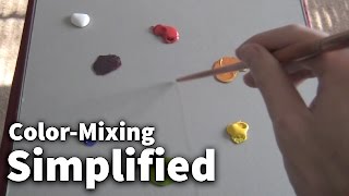
ottoma59 Glass palette with a gray piece of mat board underneath it. Water used for cleaning. I don't use any specific brushes, you can find them at Michaels, AC Moore, Aaron Brothers or whatever art store is in your area - some brands include Princeton Art Co., Simply Simmons, etc. Brush size #4 Bristle Filbert. Golden OPEN Acrylics colors include: Titanium White, Ultramarine Blue, Cadmium Red Medium, Cadmium Yellow Medium. Anything else?
Technically yes. Is it lightfast and/or will it be the correct pH for archival purposes? That's another question to consider if you want something that lasts. I personally don't know the answer to the latter. If you're just playing around though and don't care if it lasts 50+ years, then by all means go for it. I do know alot of hippy types who like to use it as a natural pigment. Then again, a lot of them like to tea stain paper as well, and that will eventually damage it in time due to the acidity of the tea.
Joe Bruno the only word used is tone. I don’t think there’s a whole lot of knowledge on color theory. Just talking in circles about how color is just a construct and doesn’t exist in the darker value sense of things lol.
Actually that doesn't look remotely black. Very dark purple, yes. I prefer mixing a cool red pigment with a cool green (alizarin crimson and viridian green for example) at about a 3:1 ratio. YMMV depending on the pigment load. However, not all black needs to be pitch black. If you've ever worked with graphite or charcoal, you know what I mean.
What do you mean you can’t make a dark yellow and it becomes a whole new color? You can take a yellow HUE and make it darker and keep it in its chromatic neutral line. And yes, it becomes another COLOR, but that is true of all COLORS. Using a black tubed black is no different. All single pigment blacks are very deep hues (usually blue-violet biased) and need to be learned about just as quickly as any other tubed paint. Barring any bounced reflected light, a color in shadow takes on a darkened form of whatever that shadow is cast upon. Using a tubed black properly is no more “dead” (or should we actually say “natural”) than mixing a black and using it. It’s so funny listening to people complain about black then turn around and mix black and use it...hmmmmm....
My issue with a tubed black is that many beginners over-use it and also use is solely on its own without mixing other pigments into it. Sure there's a time and place to use black by itself, but very rarely. The reason for mixing your own black (I usually mix Ultramarine Blue and Transparent Red Iron Oxide) is because it's very easy to either warm it up or cool it down. And usually, most dark accents or blacks in nature are very warm, hence I mix a bit more Trans red oxide into the mix to warm it up slightly. Hope that clears it up. I think black can look dead because it is over-used and use improperly within paintings, especially landscape paintings.
This is appalling. You need to learn about hue, value, chroma/saturation and study something like the Munsell system. You might not need it for your painting but if you're going to make tutorial videos then you should get your facts right first.


It always gets me. If you know so much about mixing colors, why do you watch this. Just so you can say your smarter. This was excellent for the beginner I am. Thank you. Great job.
I have watched so many color theories, including cyan, magenta, and yellow theory (which I believe and paint by), and you are the only artist to actually say stop thinking, and paint. I spent three hours yesterday fixing a painting and not trusting my own artistic abilities. Ty.
gina villaronga it doesn’t matter if the tones aren’t perfect... just mix a colour and paint! You are right 👌🏻
Thank for such a valuable teaching, as a beginner I find it easy to understand. Love and Blessings.
Well Sir..watched both videos on colour mixing,i have to say that was an awakening,started taking painting classes last year and the so called teacher arrived with a bunch of colours!! Not even once told us about the primary colours and the almost unlimited colours that can be made just by mixing them.Thank you very much for your tutorial it was excellent,mind you colour making companies wont like it but who gives a...damn
As far as your attitude i would not worry and i would not apologise,you did nothing wrong you simply spoke the truth
Take care
An Ultra beginner in painting
Ioannis Athens/ Greece
As a beginner, at 72, this was of utmost assistance. Thank you so much.
I learn so much from your tutorials! Keep them coming!!!!!
I honestly don't think you would care but i am a young painter (by young i mean YOUNG... 11 to be exact) and your vids really help me understand painting much more and it helps me to keep continuing my passion for painting. Thank you so much
Thank you for this very informative video. I appreciate your sharing your knowledge of color - mixing.
Brilliant colour tutorial for beginners, probably one of the best I have seen. Thanks
Wow thanks dude now I know whenever to watch this refresh my memory whenever I am painting.
I love it. Thank you so much Schaefer. Great job
I love mixing colors. This gives me some parameters to work on. It's a nice change from working with graphite, and I love the feel of the paint on the palette. I hope to love the look of it on the canvas someday.
probably this is the most precious video on the internet about colors, i think you changed my life... e.e i will try a plein air with only primaries and white to test... thank you very much
Again, You are a gifted teacher.
Personally, Ultramarine Blue and Burnt Umber is my got-to "black" for really dark tones/shadow mixes. Like you, I use a limited palette (slightly different) of Cadmium Yellow light, Alizarin Crimson, Ultramarine Blue, Burnt Umber and Titanium White...
I can see that working, thanks for sharing :)
kommi1974 Me too. In watercolour, Ultramarine & Burnt Sienna are what I use. But I'm not against black. There's something really courageous about using black I reckon. I have some old art mags featuring artists who use black. Fascinating.
I just started and you are very good at explaining things. I was going to ask this very question but you're already on it. So thank you.
I am a beginner and even I can understand that, thank you, I have been studying and watching and mixing. I like your lesson very clear and easy to follow. Thanks Again
Thanks Brandon. I have recently switched to acrylics after years of oil. For some reason this change is daunting. You have certainly helped me with your videos. I love working with primary colors. I really like your style of painting. Keep up the good work, I am a fan! Happy Holidays
I am a moderately experienced oil painter. This video wonderfully lays out exactly what it says it is: color mixing essentials. If we can internalize what is on this video we are well on the way to creating any color we want.
great follow up on your #01 tutorial. i'm hooked on you because of the simplicity you project in both explaining and encouragement for us beginners. thank you again.
Thank you. Great job and very clear instructions. Look forward to my test tomorrow..
Best of luck!
You inspire me to learn. Thank you for your time.
Great instructional video that is so necessary for beginners. The basic foundation is what so many are lacking including myself. I am a professional mud maker but even mud is a color! LOL. This was very helpful regarding the basic foundation for color mixing that everyone needs to take the time to wrap their heads around. Thank you.
Your a genius! I'm getting an acrylic paint set soon and they already have darker versions of the colors but I'm still gonna expirements your way and compare the two to see which ones better
Thank you for taking time to explain the process for all to understand, this was very educational. What would change if you were mixing oil colors instead of acrylic?
what about the deep ruby red paints you can buy? or the darker yellows or blues that are pure? because to me the colors you created didnt take on that sort of color, so how does that work?
i am asking these to clarify because of a open ended school project i am doing with paints, and would be great full for the help!
Just learning glad I found you u make it easier im now a subscriber thank you
great exercise for the beginner, to experiment and learn about color and the options you have, even with just a few colors on your palette. maybe before i clean my palette next time, i will play with the pigments. thank you
exellent instruction, thanks a lot as I am trying my hardest to get into painting
I think the only way you can get a true dark color is to start with a darker pigment. The colors you came up with look purple, green and brown, muddy.
For the person that asked the original question I'm not sure if he really answered the question you were asking. Just in case I'm right you may want to try: adding just a little touch of red. Like half a scosh. You get a darker bright yellow color. If you touch that mix with a hint of blue (an 1/8 of a scosh). you get more of a ochre. The CMYK (in some order like that) isn't a new color pallet someone invented. It is what is used in printers. They use cyan, magenta, yellow and black. If you use this pallet for paints, you'll need to toss in some white on your pallet too. I be e used it and it tends to give brighter secondary and tertiary colors.
Excellent tutorial! Thank you. I am a total beginner. I want to ask how to get that glass you used, with that perfect background. Thank you very much!
Patricio R since your comment is 4 years old I assume you might not be begginer anymore but in any case I will answer,
This is a glass piece with the colored paper on its back taped from all sides of the glass. Some other people just spray paint the back of the glass.
Awesome and very informative video. I’ve tried to get a real bright turquoise shade, almost luminous, like the turquoise waters of Boracay Island but failed miserably. I know Golden Fluids has this very specific shade, it’s called Teal.Would you know how to obtain this shade, which others also call cyan?
I think I understood all you wanted to say. Now lets practice heh :) thanks, you're the best!
Glad it made sense :)
Thanks a million. Great video.
I need to get down to painting rather than thinking about it.
Thanks for sharing
geraldine No problem! Have fun :)
What about Zorn pallet? He propagates cool black for portrait. Other painters too, here on UA-cam. Did you try Zorn Pallet?
I loved the way you done the long tonal colours the way you did, brilliant as before I didn’t understand mixing colours so thanks for doing my hard work the easy way now, 👏🏼
What are you mixing on?
A true Artist.
You’ve come a long way in a short time
Thanks for the great tutorial. What I missed was that you didnt mention the interaction of light (and therefore shadow) color. Otherwise really great overview with lots of input.
Thank you for your wel done tutorial. It has helped me so much
Mart
marston k
Purple....... IS THE NEW BLACK!!!!!
This was so helpful thanks so much!
Glad it was helpful! No problem!
Lemon yellow, cadmium yellow, yellow ochre. Will darken, but it will change the temperature. From cooler to warmer. Light blue and magenta are important to add for the primary colours.
good points
Thanks for this video......I learned heaps...great!!!
Very informative, like you said keep it simple....thanks, peace brother
For sure, best way to go generally. Peace to you :)
good job!! not just blue & yellow.. make green.
Question - raw and burnt - sienna and umber. i dont want 4 tubes. can i use 1 and add to it to get the others, if so which one?
one video i watched specified burnt sienna, NOT burnt umber. why?
If you paint the back side of the glass. Mid gray as you have there, you won't have to bother with the paper. Good for moving it round. ( Benjamin Moore)
Yes great idea
You are amazing! Thank you
You're so welcome!
Thanks for taking the time to show us..... =)
No problem :) Thanks for watching and commenting.
Painting is like a sport like weight lifting..haha, you have to DO IT to get better. Great analogy.
You are awesome! Thank you!
Love your videos thank you
How do I mix a greyish blue for a murky sea, I have played around but not really with much success. can you help, it doesn't need to be dark, sea really is never blue until the sky is very blue it's self .
Great teaching
Question do you recommend using glass as a pallet
the blue and a hint of red makes cool purple; the red with a hint of blue makes a warm purple; not black. For more accurate black, you need all primaries mixed together.
I know that red and blue create purple. With the colors I use, those two mixed together tends to create a darker color than mixing all 3 together.
they are not to be mixed in equal parts. this is why many times instead of using the yellow, most artists use earth tones since they contain yellow. ultimately, whatever works for each artist is what's important ;-)
Thank you so much
Thank you!!! totally helpful
I mix water and black and then start to add structures, shadows etc. I'm self made artist and stupid. Just realized it thank to You. I start to mix more and learn! :/
should show adding black.
Thank you
How did you make your pallet to put your paints on?
I would add red to the yellow to get an orangey yellow going to brown.
So mixing the opposite colour with its opposing primary will create these tones:-
Orange mix with blue,
Purple mix with yellow
And green mix with red...?
Very generally speaking - it really depends on what exact pigments you have and really what quality then are. Lower quality paints will yield different mixing results than the same colors of a higher quality. It's a tricky thing to talk about really but for the most part, yes. In my own palette, I've found Viridian [a cool green] to be the exact opposite of Cadmium Red and when mixing together they make grey - no different than black mixed with white. But someone else's Viridian and Cadmium Red may not do that depending on brand and other factors. So it's good to just play around with some opposites in your own palette of colors and see if there are any that create a mixture close to grey, and then you'll know.
How to create a light Purple just like the one in digital art?
This guy apparently thinks that "dark red" means "purple-ish red"
Neither the "dark red" nor the "dark blue" is actually that. Both need some yellow added before they'll be that. Rule of paint: To darken, add a tiny bit of the colour's complementary colour - i.e. if you want dark red, add a bit of green (i.e. blue and yellow).
His "dark red tablecloth" isn't dark red. It's got some blue in it.
*This* is dark red: cdn.playbuzz.com/cdn/fb2d356b-1d58-4436-bbde-5ce5b84ae3d6/30828345-fffe-4e75-810a-385e11add025.png
The yellow he did correctly - add it's complementary colour, i.e. purple. The other two he just essentially turned purplish, because both needed some yellow as well.
I think I remember that. Also, that green could be a lot darker without going grey. They make tube colors that are darker green. I think they're the chromium greens. Good video though. I'm learning.
Vousie V
Yes, that is Calaente Red, or there about and it is the Benjamin Moore 2018 Color of the Year.
I love it. And I like it thin, direct on new wood, couple apps, with a light thinned dark wood stain lightly applied and wiped right off.
An Antiqued Red - it is rich!
Vousie V ... mister-knows-it-better, I suppose?
How Burgundy red? My favourite
How do you make a burgundy / maroon?
I think this video is quite misleading for beginners trying to understand colour mixing. Black is an essential neutral to reduce the chroma of colours. I think you're confusing tone with colour here. The Red is not dark it's purple.
If possible, would post a video naming the materials used in painting, e.g., name of the board you use in this video.
Kind of brushes available and their use, chemichals to use for the cleanning. I know it is basic but please share your knowledage.
Thanks a lo4
ottoma59 Glass palette with a gray piece of mat board underneath it. Water used for cleaning. I don't use any specific brushes, you can find them at Michaels, AC Moore, Aaron Brothers or whatever art store is in your area - some brands include Princeton Art Co., Simply Simmons, etc. Brush size #4 Bristle Filbert. Golden OPEN Acrylics colors include: Titanium White, Ultramarine Blue, Cadmium Red Medium, Cadmium Yellow Medium. Anything else?
fantastic
How do I make camel colors
where can I ask you questions?
+Salted Right here.
+SchaeferArt just wondering what do you mean by neutralise ?nas in make it brown ?
is tumric a pigment? if so can we mix it with acrylics?
Technically yes. Is it lightfast and/or will it be the correct pH for archival purposes? That's another question to consider if you want something that lasts. I personally don't know the answer to the latter. If you're just playing around though and don't care if it lasts 50+ years, then by all means go for it. I do know alot of hippy types who like to use it as a natural pigment. Then again, a lot of them like to tea stain paper as well, and that will eventually damage it in time due to the acidity of the tea.
Thank you Zak
where do i buy these???
Ha ha ha, I need it this video before staring to paint.
great vid
All this color theory and no words like hue, value, saturation or anything.
Joe Bruno the only word used is tone. I don’t think there’s a whole lot of knowledge on color theory. Just talking in circles about how color is just a construct and doesn’t exist in the darker value sense of things lol.
Please how can I make beige?
Brown and white but mostly white. Mix together red and yellow with a small amount of blue. That should get you close to a brown. Hope that hekps
Actually that doesn't look remotely black. Very dark purple, yes. I prefer mixing a cool red pigment with a cool green (alizarin crimson and viridian green for example) at about a 3:1 ratio. YMMV depending on the pigment load. However, not all black needs to be pitch black. If you've ever worked with graphite or charcoal, you know what I mean.
What do you mean you can’t make a dark yellow and it becomes a whole new color? You can take a yellow HUE and make it darker and keep it in its chromatic neutral line. And yes, it becomes another COLOR, but that is true of all COLORS. Using a black tubed black is no different. All single pigment blacks are very deep hues (usually blue-violet biased) and need to be learned about just as quickly as any other tubed paint. Barring any bounced reflected light, a color in shadow takes on a darkened form of whatever that shadow is cast upon. Using a tubed black properly is no more “dead” (or should we actually say “natural”) than mixing a black and using it. It’s so funny listening to people complain about black then turn around and mix black and use it...hmmmmm....
My issue with a tubed black is that many beginners over-use it and also use is solely on its own without mixing other pigments into it. Sure there's a time and place to use black by itself, but very rarely. The reason for mixing your own black (I usually mix Ultramarine Blue and Transparent Red Iron Oxide) is because it's very easy to either warm it up or cool it down. And usually, most dark accents or blacks in nature are very warm, hence I mix a bit more Trans red oxide into the mix to warm it up slightly. Hope that clears it up. I think black can look dead because it is over-used and use improperly within paintings, especially landscape paintings.
you should add music to it .please
poor explanation of how pigment mixing works m8. work on your wording a bit more yeah?
Love ur videos but your lighting is awful!
Thanks for the feedback. This video was from a few years back when I was on a super tight budget but I have better lights now.
This is appalling. You need to learn about hue, value, chroma/saturation and study something like the Munsell system. You might not need it for your painting but if you're going to make tutorial videos then you should get your facts right first.
Thank you
Of course