New to Print Production?! Here's What You Need to Know

Вставка
- Опубліковано 5 лип 2024
- Print isn't completely dead and for those designers that are working on print projects, there are guidelines that need to be followed. In this video, I cover all the bases when it comes to sending your files to a printer so that your projects can look as good as how you've designed them!
Print Production Guide: tirsogamboa.com/wp-content/upl...
Hire me as a mentor: tirsogamboa.com/mentoring-sess...
Sign up for my newsletter: tirsogamboa.ck.page/b3f7bc2f89
Support the channel by buying me a coffee: www.buymeacoffee.com/tirsogamboa
00:00 Intro
00:39 Why do we still care about print?
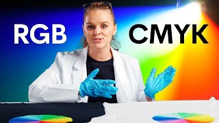
02:21 Vocabulary
04:49 Use the right program
05:31 Pre-flighting your files
11:45 Exports
13:31 Outro


This video was a great refresher on print production. Removing unused colors from the swatches panel was the gem for me.
Awesome! Hope the tiny gem was worth the watch 🙏 I should do a video on InDesign tips
Oo very intricate and informative! Love the tips, keep it up! 🙌🏽
Very helpful info! Loved the detail explanation, keep it up man!
Thanks for the support!
Your videos are fantastic. Simple, right to the point, and explained in a no-nonsense manner. Thank you so much!subscribing
Thanks so much! 🙏🙏🙏
Subscribed! This was extremely helpful. Thank You!
Amazing! Planning on covering more print, but let me know if there’s any areas I can cover ❤️
This is so helpful! I just started learning how to implement this in one of my graphic design courses and I love how you broke all of this information down! ❤
Amazing, so happy you found this helpful! ❤️❤️❤️
This is an excellent video! It's a great refresh of print production tips and I learned a couple news things.
Awesome! I’m leaning into more print design on the channel, so stay tuned ❤️
thanks for the tips and advice, I learned a lot!
Amazing! That’s all I care for. Happy to cover other topics you need help with
Great video. Thanks for sharing your knowledge!
You got it, thank you for watching!
nice thank you!
Super helpful, thank you!!
I’m so glad! Thank you for watching ❤️
Illustrator is totally fine as long as you know what to do. Only recommended for one or two page designs.
I think that limitation alone is why you shouldn’t be using illustrator. But I as I mentioned in the video, you can’t preflight images unless you do it manually, which can be time consuming. Maybe I ask, is there a reason why the greater majority of the print industry uses InDesign but you prefer illustrator?
Great video, thank you.
Thanks for watching ❤️🙏
Love this channel
Thank you so much for the support! ❤️
This was expertly explained. Thank you. Can you do a video explaining - with advice - going on a press-check?
Thank you so much! I am working on this, I will drop the link when it’s uploaded.
Great Video!
Thank you so much for watching!
nice. could you also do a video about print production tool in adobe acrobat? i'd love to see how the color separation checked.
Let me try to work on this. I’m not “fully” versed in production, but i have a lot of production friends to put something together! Thanks so much for watching 🙏❤️🙏
when you say use the right program, in this case indesign. Would affinity publisher which also works with margins and bleeds be sufficient aswell?
I’m not familiar with Affinity Publisher, but you would need to be able to check bleeds resolution and color space in order to preflight. if you’re able to do that, then that should totally work!
Thank you for such a wonderful video! When dealing with photography in a magazine that will be printed in a offset printer do you bump up the saturation of your photos or do any prepping before converting to CMYK? Sometimes when i convert it, the photo then looks a touch dull.
I usually send out all of the images for post-production and the imaging team makes sure the conversion to CMYK is close or exact to the RGB. I haven’t found a solution myself on a fix for this since you lose the brightness from RGB
If you’re doing color work in RGB on an image that will be (or even might be) converted to CMYK, be sure to have gamut warning and cmyk preview in photoshop turned on. This will show you how much the color will be dumbed down when the file is converted to cmyk. Also, if you are using adobe programs you want to have your color management set up correctly. Incorrect setup can cause a significant shift in the color when converting to cmyk. Hope this helps.
@@tirsogamboa you can open up the mid tones once you convert the pictures to CMYK. Make sure you use curves in photoshop and you can then add colour back in to specific colours such as blues reds etc to make them brighter. you can use the saturation tool to do this, select red for example then drag all of the cyan out of and increase the yellow and red until you’re happy with the contrast. This should open up the picture and increase brightness when printed. Good video. Covered the basics well.
@@d-printaustthank you!! I’m going to try this out 🙏
I was recently offered a job for a print production lead, could you elaborate the qualifications and basic duties for this job role please?
This job’s responsibilities would vary quite a bit depending on company structure, can you elaborate on the types of projects they work on?
Nowadays it is not necessary to convert RGB to CMYK. The profile for that printer takes care of all conversions. So your design will remain same. Also RGB printers are also developed. There are many advantages in RGB printers. One of the most important advantage is the 4th channel is used for transperancy which is not supported in CMYK.
I can acknowledge that this is an option… but CMYK printers are the most common by a large margin. The RGB printers you’re referring to aren’t actually printing in RGB because there's no light. They are still CMYK printers, but have additional color channels. I only promote proper process on this channel and what I mentioned in the video is industry standard. If designers follow the process I went over, this will provide them with the most consistent results.
I agree that printers most commonly use CMYK, but I think nowadays a more used industry standard is to leave the pictures RGB or whatever in InDesign and only export with the the right color profile (in Germany we use different fogra or iso-standards for coated and uncoated materials). You save time converting those images and optimize for used paper.
I have two questions-
1. Is it a good idea to design a book or something in Photoshop and then transfer it to InDesign to set bleeds and trims.
2. Why don't you use the ''High Quality Print '' option while exporting the file?
1. Unfortunately this doesn’t work for print because photoshop rasterizes the images to whatever your document is set to, but it’s not true to their original resolution. Also, you want your type to be vector so it’s clear, photoshop turns it into in image, which can pixelate. Basically, you can’t preflight for a printer and it’s significantly more work to redo everything properly in InDesign.
2. High Quality Print is a high-res PDF, but it doesn’t have the correct settings for a printer. You can certainly send it that way, but again, it’s not proper.
How I went through the steps in the video is the only true way to send files. You won’t have any issues, you’ll get the results you want, and will save you more time in the end.
hi! i have facing pages for a paperback, but when I export it as an pdf in the middle i have a line with the extra image from the other page (have bleed) is this normal? amazon didnt found some error but when i lunch preview just show odd with that line from prev page
Hi Cathy, yes, in order to do this you would have to separate the pages, not by changing it single, but instead there’s an option in the drop down of the pages panel where it says, “allow document pages / spreads to shuffle”. Click that off and it will allow you to separate the pages and maintain the left and right. The bleed will not show the page on the right or vice versa.
This was a helpful video, but I have so many questions about the printing process -- I never know where to start. I'm creating self published comic books and I can never seem to find the info I'm looking for. I worry about the colors looking muddy when printed as well as marrying the colored art (psd) and lettering (eps), that the letters won't be black enough. I think I have heard of the 60/60/40/100 before. They use words like "trapping" (where colors meet beneath the line art, before flattening layers) and "overprinting" when referring to the blackness of the letters. Hear of anything like this? Should I even worry about it? Any direction someone can point me in is more than appreciated.
For the colors looking muddy, unfortunately the colors will dull because CMYK is a subtractive process vs. RGB on screen with us additive since it adds light. The only way to come close to that same richness is to print with a Pantone, but it can get pricey. Trapping deals with alignment, I’ve never had any issues with this, but it mostly applies to illustration. For overprint, that’s what I was mentioning with the 4-color black. Use that for any elements that overlap other colors elements and you should be ok!
@@tirsogamboa thanks for taking the time to reply. This was helpful!
please explain Imposition. for broacher, magazine, book
I'm working on this. I will follow up with a link when the video is uploaded!
I finally uploaded: ua-cam.com/video/_lIojj-oyrs/v-deo.html
It's dangerous to suggest that one should create a 4-color black to use in your mechanical without explaining that it should not be used for text.
Text should be 100K to avoid potential registration problems that would make your printed piece difficult to read.
Yes you are correct! I didn’t mean to leave this note out of the video. Presumably most people will use the default black since it’s already there. In the example I showed, I was only suggesting a 4 color black for elements, like the black bubble, when you need more ink so it prints a true black.