Krita also have the ability to change the color wheel. And there's a ton like circle that i've never use. I think this tip helps a lot for people who wants to have a more vibrant look on their piece. Thanks for this my dude.
This is life changing. Ive been a traditional artist for YEARS and I sitched to digital and I got CSP, the CSP tabmate... but Im missing the basics. The very basics of digital. I dont understand how layers work. Or what each settinf does to a layer. Some videos will tell me what setting to put for shadows but not explain why. So later on when I am trying on my own to find a way to create an effect it is impossible. I genuinely need a good run down of the very basics.
@SwedePotato314 I've been doing both traditional and digital ever since I started taking art seriously and I feel this so much. Even after like 4 years I only discovered a few days ago how the multiply blend mode works from this guy and finally started using it in my art
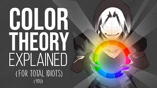
Autodesk Sketchbook has an interesting case. Its color wheel is square but black occupies one corner rather than a whole side. The other three corners have white, perfect mid-tone grey, and full saturation or your hue.
I use Autodesk Sketchbook and I got confused when he said which was value and which was saturation on his color wheel 😭 I'm still an amateur so I might be interpreting it wrong but does it still apply to Sketchbook or it's the other way around? Like the horizontal axis is values and the vertical is saturation.
@@tanoak_matsutake I've never thought about this before. After a bit of messing around, it seems to be that horizontal is saturation and vertical is lightness. However when you move the lightness, it shifts the saturation in some way. I'm not sure how to describe it better, but you can take a look yourself.
I want to said you are on another level but stop since you are not draw by the number, but now i am thinking you are another level because programing is math and i don't understand them at all
Oh! I switched to a triangular color picker ages ago, but since then i started really enjoying playing around with very dark and desaturated color palettes, and its really hard to pick those with the triangle, i think i might actually benefit from switching back to square
I like the diamond color picker! probably partially because I started out with windows sketchbook, but I genuinely think it’s really good. one corner has a fully saturated hue, one corner has white, one corner has black, and one corner has a perfectly midtone gray! and the stretch from fully saturated to fully gray is the widest part, which makes it feel really natural to be able to choose colors that are bright midtones without them being SUPER bright, you know?
ive been using the criangle color picker for 2 years now, and my colors are SO much more vibrant than they were when i started out hadnt connected the two ideas until now
i always been trying to be an artist and now i finally got the courage to do so. i been watching your videos and it has inspired me so much with ideas and background flows BTW I AM A NEW SUBSCRIBER BUT NOT TOO NEW, IT HAS BEEN A FEW WEEKS OF ME BEING A SUBSCRIBER. i love watching your videos
I actually just use the HSV/RGB sliders a lot but if I'm lazy I use the wheel. There's also the Circle variation where the circle is Hues and Saturation and the line on the side is Value. Square is for precision, and Triangle is for vibrance. That's my take on this.
Por um segundo eu esqueci que você era Br, seu inglês tá bom demais cara O vídeo é antigo, mas quanto aos mais antigos ainda eu vejo uma evolução incrível E nossa eu realmente preciso testar a roda de cores triangular
Way i see it theyre the same, but as you approach white or black your saturation will always go down, so why allow full saturation range on a value with less max saturation. Have the sat level condense down to zero at the top and bottom to make it easier to know what you're changing
Being colorblind i dont like the triangle, because i remember the position of the color i usually use are in the square, not picking them solely with my eyes. Change to triangle mean i have to learn where they are again from 0.
Imo neither are good. They take up way too much space on clip studio (i dont use clip studio often but i do know how the ui works to some extent) and they discourage shifting the hue when shading. A simple set of hsb sliders does things much better


Holy shit I've been using it for a while now and didn't know this! Thanks!!!!
SAME
Cab you tell the app
App name?
@@meriva_28 yes
Clip studio paint
6 years using clip studio, 10 years being a digital artist and just now am i learning this 😭
Me 3 years of clip studio paint..6 years digital artist..i just know this today 🥲 I feel so pathetic and ashamed of myself 😂
I also use clip studio, but I use the square one precisely because I like to highlight the value-
IS THAT A MEMEDOKIES PFP???
I'm an ibis paint user
I work with a rhomboid color picker
As a Medibang user I use the line picker :v
What
@@GlueIsYummy2Eat a color picker shaped like a rhombus
but a rhombus is linerally the same square, just from a different angle
It's still the square one just slightly turned
Krita also have the ability to change the color wheel. And there's a ton like circle that i've never use. I think this tip helps a lot for people who wants to have a more vibrant look on their piece. Thanks for this my dude.
Well it doesn't matter all that much. It goes in the square hole anyway
The TLOU art is so amazing, it's making me emotional 🥺🥺
This is life changing. Ive been a traditional artist for YEARS and I sitched to digital and I got CSP, the CSP tabmate... but Im missing the basics. The very basics of digital. I dont understand how layers work. Or what each settinf does to a layer. Some videos will tell me what setting to put for shadows but not explain why. So later on when I am trying on my own to find a way to create an effect it is impossible. I genuinely need a good run down of the very basics.
@SwedePotato314 I've been doing both traditional and digital ever since I started taking art seriously and I feel this so much. Even after like 4 years I only discovered a few days ago how the multiply blend mode works from this guy and finally started using it in my art
Autodesk Sketchbook has an interesting case. Its color wheel is square but black occupies one corner rather than a whole side. The other three corners have white, perfect mid-tone grey, and full saturation or your hue.
I use Autodesk Sketchbook and I got confused when he said which was value and which was saturation on his color wheel 😭 I'm still an amateur so I might be interpreting it wrong but does it still apply to Sketchbook or it's the other way around? Like the horizontal axis is values and the vertical is saturation.
@@tanoak_matsutake I've never thought about this before. After a bit of messing around, it seems to be that horizontal is saturation and vertical is lightness. However when you move the lightness, it shifts the saturation in some way. I'm not sure how to describe it better, but you can take a look yourself.
I dream of the day this setting will be in other apps too
@@Luminousandgraceful well i know it is at least in Krita which is what i use
I working with hexadecimal numbers because I'm colorblind...
and because I'm a programmer not an artist
I want to said you are on another level but stop since you are not draw by the number, but now i am thinking you are another level because programing is math and i don't understand them at all
all i can see is the tlou masterpiece
I like how he draws a scene instead of just potrait 🙂
Oh! I switched to a triangular color picker ages ago, but since then i started really enjoying playing around with very dark and desaturated color palettes, and its really hard to pick those with the triangle, i think i might actually benefit from switching back to square
Both are good😊
I like the diamond color picker! probably partially because I started out with windows sketchbook, but I genuinely think it’s really good. one corner has a fully saturated hue, one corner has white, one corner has black, and one corner has a perfectly midtone gray! and the stretch from fully saturated to fully gray is the widest part, which makes it feel really natural to be able to choose colors that are bright midtones without them being SUPER bright, you know?
Am I the only one crying over the TLOU 2 Ellie bday art 😭
THIS WAS LITERALLY THE THING I WAS MISSING OMG
I like the cirlcle.
@@bangssun8 real
I like the circle that Procreate has, it has the same points as the triangle, but rounded out to have space for value too
Beautiful art.
The diamond is the best. dark, light, saturation and desaturation each get a corner.
Both are the same to me but im more used to seeing the square one so thats why i use it
Imagine people's happiness when adobe put triangular collor picker in illustrator
I like the disc
ive been using the criangle color picker for 2 years now, and my colors are SO much more vibrant than they were when i started out
hadnt connected the two ideas until now
i use like the color value thingies
example:
0:red
0:green
255:blue
Oh god, RGB values is like the hardest out of them all
You, my friend, are a hardcore artist
OH MY GOD THE AMOUNT OF TIMES I'VE SEEN THIS ART OF YOURS AND I JUST FINALLY RECOGNIZED IT AS TLOU AHHHHH
OMG THANK YOU SOO MUCH🤩🤩🤩
Triangle just persoanlly just makes more sense for me
i always been trying to be an artist and now i finally got the courage to do so. i been watching your videos and it has inspired me so much with ideas and background flows
BTW I AM A NEW SUBSCRIBER BUT NOT TOO NEW, IT HAS BEEN A FEW WEEKS OF ME BEING A SUBSCRIBER.
i love watching your videos
I prefer color wheel with brightness slider
The triangle. It’s always the best shape. Hands down.
Hey I was right lol
I just realized,is that background from the last of us? It reminds me of Ellie and joel at the dinosaur museum😂
@@Asukacyber cause it is 😂
I do prefer the triangle, I’ve used it since starting digital apps for drawing
Both is good
That's good to know! 😊 I wonder if its possible for you to put a tutorial on how to choose colours using the triangle colour wheel?😮
I never do digital art (seriously at least), but this'd be useful if I ever do.
9 years of being an artist and yet until now i havent figured out why my choice of colors were so shit
man
Nothing to do with the video but i will never get tired of Navi's Hey, listen! In his videos
Bro I gave the triangular color wheel a try after seeing this, but now I can't go back
try using an OKLAB based colour picker, since that colour space preserves constant light-ness when changing hue way better than HSL
I thought they both same, but just different in shape 😭
The line one is better!!
My ass was not expecting ellie and joel pop up on my screen.
i use a tilted square one-
I actually just use the HSV/RGB sliders a lot but if I'm lazy I use the wheel. There's also the Circle variation where the circle is Hues and Saturation and the line on the side is Value. Square is for precision, and Triangle is for vibrance. That's my take on this.
clicked for the title, stayed for the art.
Ive always used square, didn't even try out thw triangle one
Will do after now, to try it
me with a diagonal square (i use ibispaint)
The last of us drawing of Joel and Ellie in part 2 in flashback I respect this art man
I like square with a linear hue selector, just like aseprite has it
I like the round more it's on procreate btw
I use a two-sided shape
As a sketchbook user on a tablet .
I have it rohmboidal in shape, but i only use the HSL bars
As an artist personally, I prefer the square
Okay... Looks like something to give a try
Por um segundo eu esqueci que você era Br, seu inglês tá bom demais cara
O vídeo é antigo, mas quanto aos mais antigos ainda eu vejo uma evolução incrível
E nossa eu realmente preciso testar a roda de cores triangular
I use the three sliders with the value next to it, to edit it perfectly
How about The ♦️♦️🔶🔷
I personally prefer multiple sliders.
THIS IS THE LAST OF US !!!!!!!
@@Dessind1jour that's what I was about to say
As an MS Paint user, I've reached enlightenment
I usually use a slanted square
I use HSL in paralell lines on inkscape / scribus / blender
Way i see it theyre the same, but as you approach white or black your saturation will always go down, so why allow full saturation range on a value with less max saturation. Have the sat level condense down to zero at the top and bottom to make it easier to know what you're changing
I like the square one bc I want to, and like to, work with darker colors :>
I use Ibispaint and there u have a spare but it's on the enge. Like a daiment or something. Idk how to spell it and I'm from Germany
@@mofb.5891 yaeh same
I like your smile 😊🤍
Being colorblind i dont like the triangle, because i remember the position of the color i usually use are in the square, not picking them solely with my eyes. Change to triangle mean i have to learn where they are again from 0.
Ibis paint user here, i work with the rhombus color wheel
i use the dodecahedron color wheel.
As a pixel art artist, i use none, u just manually change the hue, brigthness, and saturation on the libresprite menu
Thank youuuuuuu ❤
Imo neither are good. They take up way too much space on clip studio (i dont use clip studio often but i do know how the ui works to some extent) and they discourage shifting the hue when shading. A simple set of hsb sliders does things much better
With my 20000000000000000000 hours on TLOU 2 I instantly recognized that scene.
I love your art ❤️ youre amazing at it and you should start drawing with more realism instead of your cartoon style
I didn’t even know there where colour wheels that were not round or square
ellie n joel miller!
idk but i started using the hsv slider.. i feel like i know what color im picking more exactly
the last of us mentioned 🗣💯
My program only has the square I've been using it for a decade
So what you’re saying is use the square one for scary scenes and use the triangle for more bright scenes.
“Hey listen”
His smile at the end😂😂😂
Hi Canon you please make one of the circle colour wheel😢
My dungass really thought a triangle colour picker is like a pyramid colour picker
Ngl i use the HSV and RGB sliders now cause i feel like the visual color pickers are too imprecise especially on a smaller screen
Jow to change it to a triangle
I prefer the rectangle bcoz it's hv more rich color choice
This is really interesting 😮. But ever since I tried the HSL slider, the wheel just takes up space on my screen.
I feel so stupid bc I didn't realize you could change it by clicking that little icon 🙈
Loving the last of us drawing
I was just wondering why my illustrations are so dark😭😭😭
Where can i find you artworks 😊❤. Please reply 🙏
(I use circle cause thats whats in procreate!!!)
I just realized that this was tlou art 😭😭
Mine is ♦️ 😅
I use firealpaca and procreate which both have circles
NO ONE IS GONNA TALK ABT THE "THE LAS OF US REFERENCE🗣️🗣️🗣️
Good reference of the last of us
I use ms paint to do art so tysm :) (how do i get other art programs tho???)