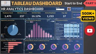
How to Add Filters to Tableau Dashboard | Create Pie Charts, Map Charts, and KPI Dashboards
Вставка
- Опубліковано 14 гру 2024
- In this Tableau tutorial, we'll dive into the process of enhancing your dashboards with interactive filters, focusing on customer segmentation and regional drop-down filters.
Whether you're a beginner or looking to refine your Tableau skills, this step-by-step guide will walk you through creating powerful pie charts, map charts, and KPI dashboards.
You'll learn how to:
Create a pie chart to visualize your data proportions
Design a map chart for geographical insights
Sort Tableau data to make your analysis more structured and intuitive
Build a KPI dashboard to track key performance metrics effectively
Add customer segmentation drop-down filters for personalized insights
Incorporate regional drop-down filters to enhance data interactivity
This tutorial is perfect for data analysts, business intelligence professionals, and anyone looking to improve their Tableau dashboard design.
By the end of this video, you'll be able to create dynamic, user-friendly dashboards that allow for real-time filtering, helping you make better data-driven decisions.
If you're ready to take your Tableau skills to the next level, hit the play button and start learning today!


