3 Ways to IMPROVE your COMPOSITION - Critique and Paint-Over!

Вставка
- Опубліковано 12 жов 2024
- LEVEL UP your PAINTING!!! Join Tisch Academy - top notch art education + EXCLUSIVE community!
Click here and get a 7 day FREE TRIAL: tisch.academy/
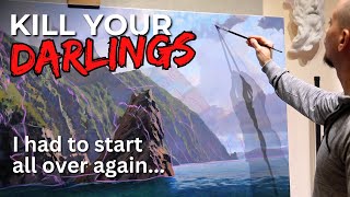
In this video, Andrew Tischler takes one of his Academy Members paintings and gives it a critique and a paint over! Here we uncover 3 ways you can improve your compositions, with BALANCE, FLOW and LIGHT.
Make sure you are subscribed for updates and to be the first to see major UA-cam releases 24 hours before they go LIVE!
tischler.nz/su...


I agree, light has so much to contribute in a painting. I'm not a landscape artist, far from it (I draw anime... yeah, cliche), but your advice really transfers to any art venture. Composition is key! Love the analogy of the seesaw. Robert is also awesome, potential is super visible, even tangible!
The Bierstadt influence is brilliant. Your critique is founded on bedrock - wonderful! Thank you and Robert for this examination...💐
Andrew you made the composition epic ❤❤
Great video as always. I have just come back to UA-cam and happy to find you still here and amazingly creative and generous as always. Thank you Andrew T.
Wow well done Andrew.
I‘ll check that out on Tisch Academy!
One of the best videos ive ever watched man. Really learnt a lot about composition and how professional painters plan thier paintings. Keep up the good work. One of the best cant emphasize more.
These videos are always very helpful. Thank you Andrew.
I really appreciate your content about composition! This topic both fascinates me and challenges me; in my paintings, I think I’m getting better, but want to consistently land it with interesting composition.
I always think of the image in terms of drawing the viewers eye into the painting, but rarely look at the overall balance. Your suggestion of asymmetrical balance is absolutely brilliant. After viewing this I immediately pulled out a blank canvas and got to work. Still in the design phase as of this posting, but what I do have so far has really lit a fire under my ass, lol. Thank you for sharing your knowledge 🙏
Nice paint over, I like you said you "couldn't help yourself", understood. When it gets good to you -just have fun and as Bill Alexander so often said "fire in there".
I get so excited everytime you post, Andrew! Thank you tons for the consistant superb content.
Andrew brilliant teaching , it's brilliant critiquing.
Clouds sky light, that's where it's at..
Buerstard I love his work, never heard of him 😮
Keep teaching, these critiques are very helpful to beginners like me...
Your brilliant and modest.
It's hard to make a comment when you're are very talented and spot on everytime! I like your work
Thank you Andrew!
I am awestruck to what you just did.
Robert's painting is beautiful!
I agree, the rule of thirds , works in landscape, and not only in still life, paintings.
Astonishing
Keep it up!
Amazing 🤩😍😍
Thanks again, Andrew
Loved this!
My god thi is so so beautifull .. thank you ❤
To Robert, I hope you feel honored by the depth Andrew went to with his critique of your work. In case you miss it... Andrew wouldn't have done as much if he didn't think it was a wonderful piece to begin with!
With that said, Robert has a wonderful original composition and the few changes I would make would be to get clouds reflected in the water along with the waterfall and cliffs, but also darken things because it is quite bright and washed out.
Delightful video, God bless you in Christ, Andrew
Hie...
Can you say us wich software you use to make this demonstration...??
Thanks for those good advices and instruction..🎉
Incredible... that's all I can say.
Well, as usual if I could paint as well as your sketches/studies, I would consider myself accomplished.
Panorama Mesdag is a circular painting with only a top and a bottom
Nice 👍🏻
I agree the waterfall could be moved a bit to the right and. Bit more beach pulled in. But mostly is was great. The second version didn’t even really look like the first. It seemed like a complete remake. It gave me the vibe of way too busy on the simplicity of Robert scene was lost. Just my uneducated opinion.
Lol if you showed me the paint over and the original I would have thought they were two totally different scenes, looks great though
vid 2:56 I didn't understand why/how the pivot point was allowed changed? I feel I'm missing something in my logic
Is it ok sacrifice some realism to improve the design?