@@jeevanprakash5482 Use paddings or set width / height in pixels. The first thing is commonly used in dynamic divs, which can change their height. And setting size in pixels is used for divs, which should be of a fixed size in any circumstances.
As usual I sort of know this but it's great to have it all confirmed and clarified - and also as usual (shouldn't be surprised by now) learnt some stuff I didn't know. Great stuff Kevin - keep 'em coming!
Thanks for making these videos, very good at explaining what properties are and what they do, with simple examples .. too many makes videos are focused on a design goal and what (multiple) css properties to use for that, rather than what individual property does, those gets complex by default and harder to wrap your head around, why they get the result that they do. So Thank You!
Hi Kevin! Thank you for this perfectly explained topic. I would be excited to watch a video from you about how to set a border with a radius and linear-gradient for a form input element. Keep up your excellent work :)
Questoin of the day: When percentages are counted from body size (body of the element) And when from the size of parent element. Usually that's not a problem, I just change display, but it's impoertant to know
Hi Kevin. Can you make a video on table styling ? How to manage table cells width for uneven cells in header and body of the table ? Also the best way to set a height on table.
I use colspan attribute on . Another project, I used grid, the css might get messy but you have a lot of control. At times, I feel like wanting to give up and make everything divs. Just my 2 cents.
A lot of people could get the impression that 'height' is useless, but some years ago when responsive websites wasn't a thing it was acually used a lot for layouts. Today it is widely used in styling of printed documents when you know what dimensions of 'paper' are.
Hi Kevin, first a big big big thank you for everything! Then, your line when you showed that the body is actually the area with all the contents and not the entire viewport was a eye-opener for me. I have always thought that the whole browser window was the body because setting the background-color to body would fill up the whole viewport. But you said that it overflows with that border example. This helped me with one of my problem with centering an element.
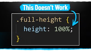
I would like to see a video of you explaining how to deal with height in general and why we cannot use % in heigh like we use in width. I struggle so much with this * Have not watched this video you posted yet
Great video :) Would be nice to have a little codepen for this to play around with now, want to experiment with combos of height: auto on the body, etc!
I rarely use a fixed height. I liken it's valid usability back to the old days when designs were table based, and as a transition from those layouts to the modern fluidity.
*TWO CLARIFICATIONS:* *1. Width of **_block elements_** defaults to 100%. Width of **_inline elements_** defaults to auto. Height of elements always default to auto. Yet this doesn't mean you can **_always_** leave out any explicit assignment to them and expect them to render as 100% or auto anyway.* Because all websites today are responsive, an element whose width/height was left to default to auto may not render as such _because another width/height assignment inherited from a smaller screen size is automatically applied._ For example, the primary (i.e. mobile) CSS assigned to an element containing both a logo and logotype may be set to width: 100%. Without assigning this element a width at higher screen sizes, we still get the full screen width for this element - regardless of having it within a flexbox and having enough screen width for a navbar as well. To overwrite this "inherited" width/height value, we have to *expressly assign* _width/height: auto;_ in the @media code for this element at the larger screen size. The only place to _safely_ leave out assignment of width or height is in elements like _body_ or higher-level container elements where you can clearly see that things won't change with device size. *2. Always assign sizing to at least one dimension of a container element for an image whose element is not dimensioned.* Images are not like text which have a specific (or default) font-size which always gives text a set size. Images need a box of defined size before they can start to render. So if you intend using auto width/height on a container for images, be sure to put a width or height in your element. Since images usually need to be able to expand or shrink with screen size/orientation, it is easier in practice to dimension the containing element for the image and make the image width say 100% of this.
Can you do a video on images? Like how to know beforehand how an image will look on a site, sizes, how to adjust which part of an image to show, responsive images etc.
Great informative videos kevin! I had a question on height in percentage. Does it refer to the height of the parent's content or content+padding+border and does box-sizing on parent affect that? I probably can test it out myself but I'm feeling lazy right now and also I would like your stance on it 😅
This was great, but I was hoping you would've touched on the problems with using height:100% and the criteria required to make it work. Frankly, I'm stumped. My scenario: In addition to the element in question that I want to be height:100%, I have its direct parent, grandparent (there are no other intervening HTML elements), AND elements all set to height:100%, but it's not working. Ugh. I'm baffled. I feel like I'm missing something super simple....
1:06 can someone throw some insight regarding why does that happen? I mean, the border seems to indicate where the body ends, but the background kinds of "overflow" it. Why is that? Wouldn't the background be limited itself to the border boundings?
Yes! And yeah, it's annoying, but it's because the content controls it, and any change to the viewport can change the height of the element, so the browser doesn't know how tall 'auto' is without first rendering it.
For the old sticky footer solution with a fixed height, I very often see a solution with height: auto; min-height: 100%; for the wrapper. Do you know why there is this additional height: auto? I think min-height should be enough, especially because auto is the default, right? Is it for old browsers? Maybe you have a link for me or some reason, can't figure this out :(
Thanks for your work Kevin. Q: How can I center vertically an icon inside a container? I recently had to do this for some homework but I feel like I hard coded it because had to be super specific on the numbers I set.
It's just the way background works on body, as I said, a bit of a quirk. I should have also shown how it works with images and gradients, because it gets a bit more strange in those situations
It seems to me that you would always want to set your body height to 100% to prevent any problems with any other element using a height of 100%. Am I wrong in assuming that?
Perfect for those riders that we add e.g. announcing version 1.x.x. click here to learn more. I can now add that in and it'll appear whenever there is content. This is also great for forms where you might have a tool tip. Great timing actually because there is no tool tips on our app and I'm building them today and this is the perfect rule for what I have planned.


Love when you cover anything CSS. I feel like I level up a little with each video. Thanks Kevin!
Good to know that I'm not alone :))
@@kaanergunlu7836 bro but without using height how do
i set my div's a particular
height?
@@jeevanprakash5482 Use paddings or set width / height in pixels. The first thing is commonly used in dynamic divs, which can change their height. And setting size in pixels is used for divs, which should be of a fixed size in any circumstances.
Daamn, I'm sure you are better with CSS than the CSS creator himself xD
Ever since I've subscribed, it seems I am getting more and more better at CSS, please keep this up! RESPECT 100
As usual I sort of know this but it's great to have it all confirmed and clarified - and also as usual (shouldn't be surprised by now) learnt some stuff I didn't know. Great stuff Kevin - keep 'em coming!
Hey Kevin, great video! It would be great to see that video about the behavior of height/ width: auto in a Flexbox/ grid context !!!
bro but without using height how do
i set my div's a particular
height?
Thanks for making these videos, very good at explaining what properties are and what they do, with simple examples .. too many makes videos are focused on a design goal and what (multiple) css properties to use for that, rather than what individual property does, those gets complex by default and harder to wrap your head around, why they get the result that they do. So Thank You!
Thanks for the kind words, really glad that you like my approach with these!
Kevin is undeniably the BEST. He's like the Boyka in the CSS Ring 😍
You simplify the complex topics and makes very easy to understand :)
Hi Kevin! Thank you for this perfectly explained topic. I would be excited to watch a video from you about how to set a border with a radius and linear-gradient for a form input element. Keep up your excellent work :)
You really are the CSS king! Love your videos so much.
I really love these kind of videos. Really thanks for all the content.
glad you like my content :D
I looked in a lot of sites to understand that, but here I found the answer :-) Next time, I will look in your channel first!
Excellent. Very useful for beginners and not only for them.
Kevin, your hair has "height: auto" after quarantine :)
haha, totally. I think this is my last video before my haircut, lol.
Useful stuff. I really dig this kind of short and 'to the point' vids you make.
I just discovered your channel and now I'm limiting the video I watch from your channel to prevent overwhelming new css knowledge.
Haha, welcome aboard!
Great video! Keep the pink background next time please, easier on the eyes haha
Questoin of the day:
When percentages are counted from body size (body of the element)
And when from the size of parent element.
Usually that's not a problem, I just change display, but it's impoertant to know
It is really wonderful to see your explanation which will clear lot of questions around min-height and height.
Hi Kevin. Can you make a video on table styling ?
How to manage table cells width for uneven cells in header and body of the table ?
Also the best way to set a height on table.
I hate tables, lol.
I'll have to build up some courage to work on that :D
@@KevinPowell Haha. I hope that day comes soon 😄
I use colspan attribute on . Another project, I used grid, the css might get messy but you have a lot of control. At times, I feel like wanting to give up and make everything divs. Just my 2 cents.
@@delulu6969 Thanks for the suggestions.
Thanks! I was running into some problem with heights, thanks for clearing things up for me!
Awesome, glad that you're enjoying my content.
A lot of people could get the impression that 'height' is useless, but some years ago when responsive websites wasn't a thing it was acually used a lot for layouts. Today it is widely used in styling of printed documents when you know what dimensions of 'paper' are.
Hi Kevin, first a big big big thank you for everything!
Then, your line when you showed that the body is actually the area with all the contents and not the entire viewport was a eye-opener for me. I have always thought that the whole browser window was the body because setting the background-color to body would fill up the whole viewport. But you said that it overflows with that border example. This helped me with one of my problem with centering an element.
Always get indepth pro tips from your channel,big thank!
I would like to see a video of you explaining how to deal with height in general and why we cannot use % in heigh like we use in width. I struggle so much with this
* Have not watched this video you posted yet
It might answer most of your questions about it :)
Thanks Kevin!!! Your videos are extremely helpful!
It was easy before this video but you made it easier that time... Txs a lot
Great video :) Would be nice to have a little codepen for this to play around with now, want to experiment with combos of height: auto on the body, etc!
thanks for the video. And yeah this video needs a part 2 with grid and flexbox
Hi Kevin!
You are awesome!
Looking forward your live on Scrimba and your Sass course in future.😁
You're doing a good job. Thanx for input.
Great explanation! Quality content as usual :)
thankyou for this video. it really helped me to understand this
Finally, I'm able to don't overflow the text on my containers, lol
You could show the mix of min-height: 100px; and max-height:100%;
That is a great connections!
I rarely use a fixed height. I liken it's valid usability back to the old days when designs were table based, and as a transition from those layouts to the modern fluidity.
I recently had some projects where max height was pretty useful. Think its rarely used but also powerful
"And we can see that we have that red border there, that's my body". Best line ever
That was really well explained, dude!
Thanks!
Hey man, I am loving the videos!
Thank you that really helped me clear lot of my doubts
great video, thank you so much!
*TWO CLARIFICATIONS:*
*1. Width of **_block elements_** defaults to 100%. Width of **_inline elements_** defaults to auto. Height of elements always default to auto. Yet this doesn't mean you can **_always_** leave out any explicit assignment to them and expect them to render as 100% or auto anyway.*
Because all websites today are responsive, an element whose width/height was left to default to auto may not render as such _because another width/height assignment inherited from a smaller screen size is automatically applied._ For example, the primary (i.e. mobile) CSS assigned to an element containing both a logo and logotype may be set to width: 100%. Without assigning this element a width at higher screen sizes, we still get the full screen width for this element - regardless of having it within a flexbox and having enough screen width for a navbar as well. To overwrite this "inherited" width/height value, we have to *expressly assign* _width/height: auto;_ in the @media code for this element at the larger screen size. The only place to _safely_ leave out assignment of width or height is in elements like _body_ or higher-level container elements where you can clearly see that things won't change with device size.
*2. Always assign sizing to at least one dimension of a container element for an image whose element is not dimensioned.*
Images are not like text which have a specific (or default) font-size which always gives text a set size. Images need a box of defined size before they can start to render. So if you intend using auto width/height on a container for images, be sure to put a width or height in your element. Since images usually need to be able to expand or shrink with screen size/orientation, it is easier in practice to dimension the containing element for the image and make the image width say 100% of this.
Sure this video gonna help me. Thanks sir..
so touching for an excellent video
Hey Kevin, height can be essential when dealing with CLS. By the way, it would be nice if you could tell us how you deal with CLS problems.
Cool hairstyle Kevin, who is your barber ?
Can you do a video on images? Like how to know beforehand how an image will look on a site, sizes, how to adjust which part of an image to show, responsive images etc.
Nice bite-size tidbit-thanks!
thank You Kevin
Great informative videos kevin! I had a question on height in percentage. Does it refer to the height of the parent's content or content+padding+border and does box-sizing on parent affect that? I probably can test it out myself but I'm feeling lazy right now and also I would like your stance on it 😅
Thanks you, new knowledge about CSS.
You're the best, Thanks.
Kindly makes videos on these topics Vanilla JS , Bootstrap 5, Gradients & functions in CSS3 and when to use gradients and function,
This was great, but I was hoping you would've touched on the problems with using height:100% and the criteria required to make it work. Frankly, I'm stumped.
My scenario: In addition to the element in question that I want to be height:100%, I have its direct parent, grandparent (there are no other intervening HTML elements), AND elements all set to height:100%, but it's not working. Ugh. I'm baffled. I feel like I'm missing something super simple....
Sir Your Very Good Explainer
When You Covered Something
Hurd Things Be Come Esay And Simple Thank You Sir
From now on, I am going to set the body always to a min-height of 100vh
1:54 so helpful!
.yourHair {
auto;
}
Hehehe
Thanks for the amazing css content!
Thanks man.
" Percentage of height is always percentage of the parent " ❤
I love css !! And i like you video
Thanks for explain it.. But no need to set height : auto. By default every elements have height auto
Very nice!
CSS is one of those things that are just filled with stupid inconsistencies just because it makes sense in a single situation. My god.
Thanks a lot!!!
Please make SEO full course with projects
1:06 can someone throw some insight regarding why does that happen? I mean, the border seems to indicate where the body ends, but the background kinds of "overflow" it. Why is that? Wouldn't the background be limited itself to the border boundings?
Great explanation
Glad you enjoyed it
VERY NICE!
Hi Kevin , Can you please make a video on Display options like flex, grid , inline-flex etc.. Thanks in advance
Excellent vídeo
Maybe a dumb question, but how would you go about centering something vertically if you don't have a set height size?
Also you can't do transitions from a certain height to auto, which kinda sucks :/
Yes! And yeah, it's annoying, but it's because the content controls it, and any change to the viewport can change the height of the element, so the browser doesn't know how tall 'auto' is without first rendering it.
Thank you!)
Can you please give an example of a horizontal card blog with text content and thumbnail width:650px and height:500px? I can't do it to be responsive.
For the old sticky footer solution with a fixed height, I very often see a solution with height: auto; min-height: 100%; for the wrapper. Do you know why there is this additional height: auto? I think min-height should be enough, especially because auto is the default, right? Is it for old browsers? Maybe you have a link for me or some reason, can't figure this out :(
Thanks for your work Kevin.
Q: How can I center vertically an icon inside a container? I recently had to do this for some homework but I feel like I hard coded it because had to be super specific on the numbers I set.
im new too but u can put
.container{
display: flex;
align-items: center;
}
hey CSS master , Please do video about fluid images (responsive images)
Love your videos.. love from India
Very very very useful ❤
Is there a difference between setting height to auto, and not setting it at all? Because from what I see height:auto is just the default behaviour.
Then what's the different between heigh auto and height fit-content?
whats the diffence between height auto and not setting the height at all
at 1:09, how the pink background color of the body overflow to fill the viewport??? please explain.
It's just the way background works on body, as I said, a bit of a quirk. I should have also shown how it works with images and gradients, because it gets a bit more strange in those situations
Just asking for clarification, 3:50 it's stuck at 500px right?
isn't 'auto' the default value of height?
What is the difference between max-hight and min-hight?
Awesome
Thanks for sharing your CSS knowledge, Kenin
{2023-01-10}
IE11... My arch nemesis
Is there any different between auto and fit-content?
It seems to me that you would always want to set your body height to 100% to prevent any problems with any other element using a height of 100%. Am I wrong in assuming that?
Perfect for those riders that we add e.g. announcing version 1.x.x. click here to learn more. I can now add that in and it'll appear whenever there is content. This is also great for forms where you might have a tool tip. Great timing actually because there is no tool tips on our app and I'm building them today and this is the perfect rule for what I have planned.
Thanks
Thank you so much (and sorry for missing this until now!)
No worries
Even John Snow would know something CSS with you. 😂
Heights have the same rules for ?
Ok but what’s the difference between AUTO and MAX-CONTENT, because as you describe, they are identical.
I am not sure why? ...but my 100% height attribute give 100% viewport height. No idea why?
I already knew this. I'm not sure why I'm here. Procrastination maybe?
height: auto is cool
but
min-height: 100vh is awesome