The problems with viewport units

–Т—Б—В–∞–≤–Ї–∞
- –Ю–њ—Г–±–ї—Ц–Ї–Њ–≤–∞–љ–Њ 15 —З–µ—А 2024
- Conquering Responsive Layouts (free course): courses.kevinpowell.co/conque...
Join the Discord: kevinpowell.co/discord
Viewport units often feel like this cheat code that makes things so much easier when you first discover them, but they actually are problematic for a number of reasons, from creating horizontal scrolling to accessibility issues and more, so in this video I look at the problems that people run into by using them and offer up some alternatives.
рЯФЧ Links
вЬЕ Discord: kevinpowell.co/discord
вЬЕ Dynamic viewport unit browser support: caniuse.com/mdn-css_types_len...
вЬЕ Codepen: codepen.io/kevinpowell/pen/Po...
вЬЕ Conquering Responsive Layouts: courses.kevinpowell.co/conque...
вМЪ Timestamps
00:00 - Introduction
00:22 - Issue 1: Using 100vw
02:00 - Issue 2: The problem with 100vh
07:28 - Issue 3: Fluid layouts
#css
--
Come hang out with other dev's in my Discord Community
рЯТђ / discord
Keep up to date with everything I'm up to
вЬЙ www.kevinpowell.co/newsletter
Come hang out with me live every Monday on Twitch!
рЯУЇ / kevinpowellcss
---
Help support my channel
рЯС®вАНрЯОУ Get a course: www.kevinpowell.co/courses
рЯСХ Buy a shirt: teespring.com/stores/making-t...
рЯТЦ Support me on Patreon: / kevinpowell
---
My editor: VS Code - code.visualstudio.com/
---
I'm on some other places on the internet too!
If you'd like a behind the scenes and previews of what's coming up on my UA-cam channel, make sure to follow me on Instagram and Twitter.
Twitter: / kevinjpowell
Codepen: codepen.io/kevinpowell/
Github: github.com/kevin-powell
---
And whatever you do, don't forget to keep on making your corner of the internet just a little bit more awesome!


Liking the new format, Kevin! No logo splash, faster intro, going straight to the juicy content. Hope it doesn't hurt your channel's metrics! Thank you for giving it a go вЭ§пЄП
Devs watch UA-cam on 2x speed, angrily scrolling until they find the code that fixes their bug, I'm /sure/ this is helpingрЯШВ
Wow, I was just the other night ranting about the vw units causing horizontal scroll and ChatGPT being unable to help me. Thank you!
you can use overflow-x: hidden; or width: 100%; instead
100vh has been problematic for me! never had to use 100vw, but it's good to see that dvh and svh are getting support! Thanks for covering this! :D
Man, these were the most productive 13 minutes I've been into since so long!
Thank you so much!
I used to do full-stack dev but quit back when IE7 support was still a thing that people sometimes had to do. I enjoy how much better things have gotten with decent html5 and css features, but my "oldschool" brain sometimes has trouble with the stuff we could never really use like this. It is great to have videos like this that distill the quirks down into manageable chunks without hours of experimentation.
Same!!
IE should be excluded from the world. Even IE10 or 11
@@ongke3655 support these days is completely unnecessary. But this was coming from back in the day when it still had 10%-20% market share. Not supporting that was basically just bad business back then.
This exact header 100vh issue on mobile. arghhhh. I think i asked about it like 6 months back on your discord channel. There was so little info on web about the new units. Was super happy to see this video. Now its way more clear how to make use of the new units. Truely appreciate your work, thanks in behalf of the whole world :D
Thanks for the video. Subbed. I used to do a lot of web design, but haven't in ages. While things have definitely improved since those days, it's a little crazy to see the struggles with the same old problems on new tech. Will use your channel to get back up to speed. Appreciate your approach/method/sharing/pace/explanation/allthethings.
I've faced many of these problems. A lot has been clarified in this video. Thank you, Kevin!
I didn't know why that annoying horizontal scroll appeared, I don't know what I'd do without your videos, thank you Kevin!!!!
This is the first video I watch from your channel and I can say, with absolutely no doubt, that I just became your fan, man! Thanks!
I've started web dev this year (through the Odin Project, which is how I found your channel incidentally!) and Issue 2 was the bane of my life last week. What's worse is that most Google results don't include svh at all - I had to *really* look to find it. But wow is it a great unit to use.
This is awesome. Good job Kevin. I'm very grateful for all of your excellent content!
Damn! You always teach me fascinating things, and make me want to tinker and play. Thank you for giving such clear ideas about how the various rules work. You're so awesome at this.
Couldn't fall back to sleep so I've been flipping back and forth between you and Web Dev Simplified. You guys make great videos. I'll definitely have to come back to this one when I'm working on my projects.
Great! I have just enrolled for the free course. I learn so much from your videos and I just love playing with CSS, so fun!
Now, haven't been excited about a CSS topic probably since CSS grid came up - since when have 'svh' units been a thing?! (Also, how could I ever miss this?!)
This LITERALLY IS a gamechanger - developing for those collapsing addressbars has always been SUCH a nuisance - thanks Kevin! рЯСН
They're relatively new, so do keep an eye on browser support, though it is pretty decent!
Thank you UA-cam algorithm for bringing me to this amazingly useful channel рЯСПрЯСП
And thanks Kevin рЯСП
oops though that was a top-level comment. oh well
ItвАЩs so sad that thereвАЩs still no real solution for 100vh on mobile. svh also doesnвАЩt seem supported by iPhone Safari which is what our clients complain about the most.
@@thedigitalceo It works on 15.4 onwards according to CanIUse, so you could set it to 100svh and then also declare 100vh as a fallback if it isn't supported by the browser (with a padding hack as well)
Love the video рЯСН A good summary of the issues and solutions that everyone should be aware of
Hey Kevin! Nice shirt рЯШБрЯ§Ш just wanted to say thanks for the clearness of your videos, always find myself learning new things every time.
wow, i've never known anything about that "svh" unity, it's an incredible solution for a lot of projects that could have problems like the showed on the video, thx kevin!
Straight to the point and well presented - perfect рЯСМ
I JUST WANNA SAY... I LOVE YOU......... IVE BEEN SEEKING FOR THE SOLUTION OF THIS PROBLEM FOR A LONG TIME WHEN I SAW YOUR VIDEO AND BAMM!!! SOLVED!!! THANK YOU!!!!!
I thought this was a contradictory post from one of your contents, glad to learn this was kind of a continuation about dynamic viewports. I stopped using viewports and started using dynamic viewports because of your videos.
Exactly what I needed! Thanks for this video, itвАЩs the best
Wow 2 days back i was searching for this !!! рЯШВвЭ§пЄП Great one
Kevin, you are a golden find
Perfect timing for this, thank you, as always
Man this was extremely informative. I definitely have used view port values a lot in the past..
@kevinpowell although the footer is not sticky "stays at the bottom" I use flex: 0 auto in the first div bellow the body, then once the content inside goes beyond the height it can initially display the footer will be at the bottom of the content. to me it's not good design to keep a footer in view, as it's taking up space all the time. Always appreciate your work Kevin.
Hi kevin , its really amazing that I have a problem in my code and in the NEXT DAY you make a video about my problem, happened already like 7 times
Once again bringing accessibility issues. Thank you so much for this.
Respect + рЯ§ЯрЯПї
Are you using something like Nvidia's Eye Contact feature? Around 1:40 your eyes suddenly change and it stood out to me.
I appreciate the content either way! Thanks for uploading.
i also spot that weirdness
That was scary as shit!
Thank you! Love your professionalism
I don't use vw for everything but sometimes I see people doing so. Now I'll give these people the link to this video :) Thanks Kevin!
So far I have only used viewport units on pages that fill the viewport exactly on regular screens, either landscape or portrait. For that use-case it works pretty well. For other use-cases I have never considered them, not because of the problems it may cause, but because the alternatives I did use came more natural.
min/max/clamp are so good. And combining them with container-query-units is awesome.
Thank you for sharing about container query units, i study responsive design right now and i had no idea those even existed...
Earlier today I was wondering how to fix a problem with an element not showing properly on mobile because of the 100vh differences between devices. Thank you very much Kevin!
Your videos are always very helpful. рЯСН
I was wrestling with this the other days, so happy to hear this because now it makes sense.
Great video. I'm investigating CSS functions now. Thanks.
Very good video ! Thanks for your always great work
Hey Kevin , thanks for the detailed information about View ports рЯШК
By the way can please explain the clamp() function in detail in a video ?
Already have one :D - ua-cam.com/video/U9VF-4euyRo/v-deo.html
What clamp() does, I used to do with calc() combined with css variables for min and max.
omg thank you so much, I have the problem with 100vh height in my project and the svh is probably gonna fix it!! Thank you!
Very helpful tips especially with 100vw. One of the points I tackle through with every project...
Absolutely game changing!
I build with a mix of units and than run a PX to REM convertor before running final checks on my responsiveness. I've found that's working for me as I get more involved with Accessibility and working with multiple developers.
You are number 1 and my best teacher!
рЯСН
Thank you sir for the SVH value trick рЯСМрЯПїрЯШК
Thanks a lot! As usual I found your video awesome. (Gone to remove all 100vh from style.css files) :)
Super helpful. Great channel!
omg thank you so much for the "100svh" tip. In my case it's a sidebar which must have the exact same height as the viewport but on tablets it was having that same issue.
thanks Kevin for another great video. Good to know you're telling people about your courses here too now. More people should learn from you, I feel like there's no one better in this field than you
Thanks to Kevin, now everything I say or do has 'awesome' in it.
This was amazing to learn about, I've just been using the h-full (100%) trick, will try out the svh way! Thanks
Pretty on point. I liked this style
Great video as always! QQ - do you use any software for eye contact? There are some weird artifacts in the video ~1:36 and ~1:42 where your pupils shift noticeably.
wonderful video as always
Oh wow, you only just uploaded. Great video!
Awesome video. Thank you.
Great tutorial man keep it up!!! Some time ago you made a tutorial about using 100vw inside a container which its width was like 960px or something, but the 100vw was not affected by the container. Can you please share that video? Thanks
Hella good video. Subscribed.
Excellent. I always want to know some solution to this problems
Hi Kevin, You now have around 600k more subscribers since writing the sign up page for the course рЯСН. Thanks for the relatable, real world content.
Thx for another usefull info :)
Oh using AI eye tracking are we? рЯШЖ
Great content as always!
1:40?
I can see the NVIDIA Broadcast! Amazing content by the way. I do web design on the side and you have helped me so much! Thanks alot
For a moment I thought I was going crazy рЯШЕ
Thanks man! dvh saved my life
Hello Professor KP! рЯШЗ I am studying UX Design. Longtime artist trying to figure out front-end development. I liked your videos right away as soon as I noticed have you kept your profile in a circle frame. Plus you kept looking back towards the camera. You must be a writer. Funny thing. I watched/listened to a couple of your videos on 1.5 and 2 playback speed.
That 100vh part was very useful because I want the comment section on videos on my site to be off screen until scrolled so the comments donвАЩt need to be loaded unless a user scrolls to see them
Nice mate, keep it up.
This is useful. Thanks.
THANKS. I think I just found a great problem in my project
Great рЯСН Thank you!
Loved it !
Thanks so much for this. I was wondering why my sidebar with 100vh was being cut off on mobile browsers
MY CSS GURU!!! THANK YOU!
Loving the Nathan Barry shirt! рЯСХ
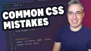
Hi Kevin, why do you declare a vw + rem als your default size in clamp? Why not just declare a somewhat larger vw? WhatвАЩs the difference?
Love your channel by the way!
Adding the rem component allows the browser to zoom, see 10:38
1:41 there is an eye glitch on Kevin face. Pretty interesting times we live in :)
Love your content
Thank you my dear sir
Thanks, I didn't know about dvh or svh. It's scary that Google/UA-cam knew I needed to see this video...
Regarding the 100vw producing scrollbar - I think it's not because the vw does not take into the account the scrollbar, but because (in case of body) there is already some margin applied on it. The scrollbar disappears when the margin is removed
This exactly too.
Yeah, this. Exactly this. When sizing elements, the default behavior is to apply the sizing only to the content area, which only includes the content itself and ignores padding, borders, and margins. You can include the padding and borders in your element sizing by declaring "box-sizing: border-box;" but then that still leaves the margins left over. You have to also set "margin: 0;" and then things should work.
You're right, i used to follow and i got better results.
This is only true for mobile browser/devices. Desktop 100vw DOES produce a scrollbar as of 2023. Chrome is in the works to provide a solution for that, it had a custom flag to enable overlay scrollbar until a few time ago. There's one hacky solution though: "width: calc(100vw - (100vw - 100%))", but I can see a case where you would want a 100vw instead of 100% through parent-child elements.
Thank you very much
I always set my body elements to flexbox column with a min-height: 100vh, then align my footer to the bottom with the content area set as flex grow. Seems to work well.
needed this
I'm glad I started playing around with HTML and whatnot after svh became a thing in the standards... Learned using them from day one. And I probably use them too much
to fix to zooming in and out problem you can use this :
html {
font-size: clamp(0.75px, 0.05vw, 1px);
}
now if style all you elements using rem in of px i.e( 100rem instead of 100px ) you get the benefits of a fluid layout resizing and the ability for your users to resize their content.
THANK YOU
Great video. Could you point me in the direction of doing a Trello or Jira style column scroll without using vh? I've struggled with and without I guess.
Awesome stuff Kevin but there is always but :D
I spend a lot of time to adjust my webiste to work on all types of mobiles and to be honest even nowadays there is a lot of mobile devices with old chrome running on it.
Imagine this situation that the button is on the bottom on the page, then even when you set height as 100vh as fallback the button will be hidden under bottom bar. One thing that I am missing here is fill-available unit. This help sometimes.
You could do a hight: 95vh; or 90vh for the fallback рЯЩВ
Happy birthday belinda!!
I like those analytics vidéos !
very very usefull info nj
Excellent рЯШК
Are you using something to fix eye contact on your videos or are you AI? Great video!
I do use a utility class to make panels restricted to a container look like they are full viewport width (width: 100vw; margin-left: calc(50% - 50vw).
I got it from an Andy Bell tutorial. I've not seen any horizontal scroll issues though. Could just put overflow-x: hidden on parent of course. Will have to chck this, but there's no other way to do this one really.
good tip
UA-cam recommend me this today. And I can't stop my finger to subscribe him.
svh! What a life saver вЭ§пЄП
didn't svh / dvh. Cool tip, thanks
Times before s/dvh's something like calc(100vh - 16px) or just random numbers in parts with 100%.
Font-size's in vw, remember that also before clamp.
Both have been bad roughly since post IE8.
Great video. Do you have an entire video on clamp and min? That would be great. Thanks!
I do! ua-cam.com/video/U9VF-4euyRo/v-deo.html
@@KevinPowell It was indeed a very informative video, thanks! :)
Thank рЯСН