What are your favorite idents from Yle TV2? Mine would be the Tesvisio ident, the Tamvisio ident, and the 2nd, 3rd, 4th, 5th, 6th, 7th, 8th, 9th, 10th, 11th, 12th, 13th, 14th, and 15th idents from Yle TV2!
From 4th to 15th because all of three Finnish idents are good even in modernization of branding, it's still stable unlike other countries like PBS where back then some idents are good, some idents are bad but now some of them is literally just a generic branding or ITV had some local stations and all of them are good until 2002 identify lost resulting to aired as ITV in united way.
You can also said Brazilian idents were also good too even in modern era but few of them are bad like InterTV. (a Globo affiliated) You can also said Japanese idents were good too but the problem is that there a law that you cannot upload any broadcasting-related material just like France.
If anyone is wondering about the overlapping dates, I posted a comment on the TV1 ident history explaining that situation. Some notes pertaining to TV2 specifically here: * Tamvisio was a separate channel from Tesvisio (both channels were regional), but they were run by the same company. When Yle bought the company, they merged all of those assets into one new channel (TV2). * The rebranding to TV2 happened on 7.3.1965 (Tesvisio last closed down the previous day). The first logo used for TV2 was a static image (no animation), with a jingle similar to that on TV1 (possibly even the same jingle?) * The 5th logo (1990-1992) was first used on 1.6.1990, and remained in use through to 31.12.1992.
* The 4th logo (1987-1990) was first used in June 1987 (possibly 1.6.1987) TV2 also kept their "short" idents around for longer, since they still needed them - not for MTV; but for FST (Finlands Svenska Television, i.e. Swedish-language programming), which was treated as a similar kind of block as MTV had once been. (FST was not exclusively on TV2, but TV1 had less of it.) This continued until September 2007, when FST completely moved over to FST5 (a channel that had been created already in 2001). It was renamed to Fem ("five" in Swedish) in 2012 and merged with Yle Teema (documentaries) in 2017, both still on channel 5 (and with a similar "one channel, two networks" approach as was once done with YLE/MTV, showing once and for all that old habits die hard).
Awesome ident history of YLE TV2, Jonty! Just like the YLE TV1 idents, the idents from YLE TV2 are interesting! My favorite ident from YLE TV2 would be the 5th ident, because the concept in the ident is brilliant, the animation is amazing and the ident overall looks stunning to look at! The saxophone tune is also good! However, the 6th ident looks like a knock-off of the BBC Two logo from 1991-2018. Overall, a great ident history!
Hello Jointy, after UAV Entertainment, next is based on popularity from your recent poll on your community tab (i.e. UAV » KTCA/TPT » UNC-TV » TPA » EMIFilms) or randomly picked? (i.e. UAV » ?)
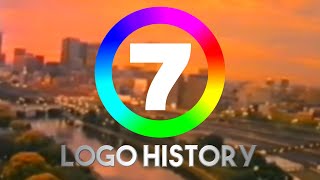
The 10th ident is not one of my favourites. Don't get me wrong, the design of the "2" logo looks interesting but, it just looks bland to look at. Having just an number "2" in a generic font like Arial with one line in it is just downright disappointing. As for the animation of the lines forming the "2", it looks very interesting and beautiful, but it still looks bland. And the things that I like about the ident is some of the other variations, like the people and children having fun, and also the music, which sounds so beautiful, but... I don't know why, but the ping in reverse at the end just gives me chills. Probably because it ends abruptly. But yeah, aside from the beautifulness of the music and the variations of the ident (like the people dancing and children playing), this is probably the weakest out of all the YLE TV2 idents.


What are your favorite idents from Yle TV2? Mine would be the Tesvisio ident, the Tamvisio ident, and the 2nd, 3rd, 4th, 5th, 6th, 7th, 8th, 9th, 10th, 11th, 12th, 13th, 14th, and 15th idents from Yle TV2!
6th logo because of the music
All.
From 4th to 15th because all of three Finnish idents are good even in modernization of branding, it's still stable unlike other countries like PBS where back then some idents are good, some idents are bad but now some of them is literally just a generic branding or ITV had some local stations and all of them are good until 2002 identify lost resulting to aired as ITV in united way.
You can also said Brazilian idents were also good too even in modern era but few of them are bad like InterTV. (a Globo affiliated)
You can also said Japanese idents were good too but the problem is that there a law that you cannot upload any broadcasting-related material just like France.
All from the above
FUN FACT: The 2001-2002 was the only thing, that did rarely have "Coming Next" screens, which made the intro very legendary!
So this is what Santa watches on his TV.
I like most of logos because of music! It sounds really great! BTW, again great logo history, Jonty!
Thanks!
If anyone is wondering about the overlapping dates, I posted a comment on the TV1 ident history explaining that situation.
Some notes pertaining to TV2 specifically here:
* Tamvisio was a separate channel from Tesvisio (both channels were regional), but they were run by the same company. When Yle bought the company, they merged all of those assets into one new channel (TV2).
* The rebranding to TV2 happened on 7.3.1965 (Tesvisio last closed down the previous day). The first logo used for TV2 was a static image (no animation), with a jingle similar to that on TV1 (possibly even the same jingle?)
* The 5th logo (1990-1992) was first used on 1.6.1990, and remained in use through to 31.12.1992.
* The 4th logo (1987-1990) was first used in June 1987 (possibly 1.6.1987)
TV2 also kept their "short" idents around for longer, since they still needed them - not for MTV; but for FST (Finlands Svenska Television, i.e. Swedish-language programming), which was treated as a similar kind of block as MTV had once been. (FST was not exclusively on TV2, but TV1 had less of it.) This continued until September 2007, when FST completely moved over to FST5 (a channel that had been created already in 2001). It was renamed to Fem ("five" in Swedish) in 2012 and merged with Yle Teema (documentaries) in 2017, both still on channel 5 (and with a similar "one channel, two networks" approach as was once done with YLE/MTV, showing once and for all that old habits die hard).
Also some of these were handovers to MTV, Mainos-TV.
I love the 4th, 7th, 10th, 14th and 15th logo
Awesome ident history of YLE TV2, Jonty! Just like the YLE TV1 idents, the idents from YLE TV2 are interesting! My favorite ident from YLE TV2 would be the 5th ident, because the concept in the ident is brilliant, the animation is amazing and the ident overall looks stunning to look at! The saxophone tune is also good! However, the 6th ident looks like a knock-off of the BBC Two logo from 1991-2018. Overall, a great ident history!
I love the 5th ident! Beautiful music, with stunning animation to go with it! A perfect mix for a television ident!
I don't know if you can call it a knock-off, but it's definitely inspired by it and indeed uses the same typeface (Gill Sans), just stretched.
It's not a knockoff, the BBC doesn't own the Gills Sans font.
I like the intro so much
Episode 218 will be UAV Corporation
Favourite ones 15:55
Ah this is amazing, since i am also from Finland🇫🇮
Nice! I love Finland! It's one of my favorite countries!
Next Logo History is… UAV Corporation!
Hello Jointy, after UAV Entertainment, next is based on popularity from your recent poll on your community tab (i.e. UAV » KTCA/TPT » UNC-TV » TPA » EMIFilms) or randomly picked? (i.e. UAV » ?)
Hey, can you do PBS North Carolina for episode 219?
[Episode 217] TV-Kerho / Tes-TV / Tesvisio / Tramvisio / Yle 2 Logo History (1965-Present)
On the 1993 to 1997 logo, the 2 looks like the 2 for BBC 2 from 1991-2018.
hm? yes logo over
The 10th ident is not one of my favourites. Don't get me wrong, the design of the "2" logo looks interesting but, it just looks bland to look at. Having just an number "2" in a generic font like Arial with one line in it is just downright disappointing. As for the animation of the lines forming the "2", it looks very interesting and beautiful, but it still looks bland. And the things that I like about the ident is some of the other variations, like the people and children having fun, and also the music, which sounds so beautiful, but... I don't know why, but the ping in reverse at the end just gives me chills. Probably because it ends abruptly. But yeah, aside from the beautifulness of the music and the variations of the ident (like the people dancing and children playing), this is probably the weakest out of all the YLE TV2 idents.
At least some of the variants are creative. Like that one with the chair, and the one with the snowflakes, and the ones with children.
Section One And Two (NO VIDEO FOOTAGE) : 0:15
Hello!
Hello!
@@JontyMaster I marked my calendar for March 30th, Are you mark for calendar for Aug 31?
What's happening on August 31st?
@@JontyMaster I have a clue to you:
It's 65th anniversary at Aug 31.....
🟪🟪🟪🟪🟪🟪
🟪🟪🟪🟪🟪
⬜ 🟦🟦🟦 ⬜
⬜ 🟦🟦🟦 ⬜
⬜⬜⬜⬜⬜
⬜⬜⬜
⬜⬜⬜
I hope you like this emoji art
Scottish Television! Also I like your emoji art!
Request: DreamWorks Animation Television
featuring DreamWorks Television
Ez 6:43