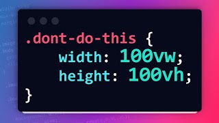
Use 100dvh, not 100vh (CSS Units)
Вставка
- Опубліковано 25 чер 2024
- 👉 NEW React & Next.js Course: bytegrad.com/courses/professi...
Hi, I'm Wesley. I'm a brand ambassador for Kinde (paid sponsorship).
👉 Add authentication to your app FAST: bit.ly/3QOe1Bh
👉 NEW React & Next.js Course: bytegrad.com/courses/professi...
👉 Professional JavaScript Course: bytegrad.com/courses/professi...
👉 Professional CSS Course: bytegrad.com/courses/professi...
👉 Discord: all my courses have a private Discord where I actively participate
🔔 Email newsletter (BIG update soon): email.bytegrad.com
⏱️ Timestamps:
0:00 100vh Problem
1:44 Solution
#webdevelopment #programming #coding


My Professional React & Next.js course is OUT NOW now! Find it here: bytegrad.com/courses/professional-react-nextjs -- this is the #1 resource to master the latest React & Next.js, my absolute best work.
These mini videos are so informative yet so rare. Thank you for making these kinda videos. 🙏😊
Thanks for this. I make a ton of "fullscreen" apps making GIS and weird art with three.js, so relevant to a lot of what I make.
Perfect solution, before it i was using the position fixed. I had wasted lots of time trying to find the perfect solution.
maybe we should use dvh for mobile design because vh browser support rate is about 10% higher also vh works well on desktop. useful tutorial thank you.
It makes me sad that we have to even take these things into consideration. That mobile browsers just disregard specifications entirely is crazy.
I didn't knew that, impressive content man❤
Thank you sir. ❤❤❤
i think you almost always want to use `svh`.
on desktop browsers this will almost always be equivalent to `vh`.
on mobile, the problem with using `dvh` is that your components will constantly resize depending on if the address bar is present or not. the user almost always starts in small viewport mode anyway
great tips!
good tip! thanks
thank you :)
Will this not cause layout shift when scrolling up? If so would you recommend trading off CLS score for accurate screens?
Thanks bro, from chile
Goood stuff!
100% is the best solution
Amazing!
Nice tutorial however, i noticed that dvh on fixed menu bar on mobile causes a little flicker when scrolled up. How do i fix that?
great videoo!
IE should be removed from caniuse.
I have a 1920 1080 p screen i downloaded a UA-cam tutorial about html css website and he assigned 150px size to h1 element which looks good on his screen but on my screen it was too big. So different screen resolutions can make an element look different even if the same px size is assigned to it??
Interesting, I think px should look the same
Yes, a pixel can change between devices. Pixels are "relative" to screen density. 150px can look different in a low-density screen or high-density screen. The size of 150px don't change, but visually you see the difference because the density.
I never knew about this. I’m learning about frontend development and always use 100vh or just vh/w where applicable.
I have a question before I transition. I see that it says devices on iOS before 15.4 aren’t supported. What will happen if I only specify say 100dvh - will it fallback to just 100vh?
if you are using custom css then you could basically do this
item {
height: 100vh;
height: 100dvh;
}
so that if dvh isn't supported it will just use the vh unit instead
I had problems with animations which were bound to scroll position. When you scroll down and up (with "dvh") on a mobile device the height of the viewport changes and that causes scroll position measure changes. And my content was jumping
What do you use to create animation?
Great tip thanks!
Don't know if it's just me -- but your videos are always a little difficult to hear. Maybe consider boosting the volume a bit? Cheers :)
The “stuff” is called browser chrome.