Thank you for watching and commenting on this video. Your support is highly appreciated 👍🏻👍🏻👍🏻 If you haven't done already, please go ahead and press on that SUBSCRIBE and bell buttons in order to get notified about new videos I publish. If you'd like me to explain any specific topic, please write it as a comment here 👇🏼 and I'll try my best to create a video about it 👍🏻 Thanks again 😊
@@excelrati I am using your Graph for Actual vs Budget metrics. Your approach is much better than on other channels. I wish your other videos are in English though :)))
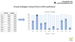
Perfect thanks Karim , As a Financial Analyst in the corporate economics department we do a lot of comparison between the Actual numbers and our forecast so this chart will be useful to help me tell the story in a better way thanks
Thank you Karim ! I like very much the explanation and your tips. Today I learn a new things and found them very useful . Looking forward to watch your next video
This is exactly what I am looking for to prepare actual vs budget to management. Thank you so much!! I have subscribed to your channel and look forward to learning more.
Thank you so much and welcome to the channel. I'm afraid line chart is not available on horizontal bar charts. A workaround you might want to consider, even though not perfect is maybe to use a stacked bars chart (not combo) based on a table that has an additional column that will add a small black bar on the relevant place. Maybe it won't show as a line that is larger than other parts of the bar, but it might be good enough. I hope I explained the idea 🙃... If not, feel free to ask 🙂


![Lp. Сердце Вселенной #60 РОЖДЕНИЕ ЛОЛОЛОШКИ [Финал] • Майнкрафт](http://i.ytimg.com/vi/YoR0pAV9FVQ/mqdefault.jpg)

Thank you for watching and commenting on this video. Your support is highly appreciated 👍🏻👍🏻👍🏻
If you haven't done already, please go ahead and press on that SUBSCRIBE and bell buttons in order to get notified about new videos I publish.
If you'd like me to explain any specific topic, please write it as a comment here 👇🏼 and I'll try my best to create a video about it 👍🏻
Thanks again 😊
The best one ☝️ thank you!
You are most welcome Alexey 🙂
@@excelrati I am using your Graph for Actual vs Budget metrics. Your approach is much better than on other channels. I wish your other videos are in English though :)))
@@alesAk99501
So nice hearing that 🙂
I wish I had the time to have everything translated to all languages as well 🙂
Perfect thanks Karim , As a Financial Analyst in the corporate economics department we do a lot of comparison between the Actual numbers and our forecast so this chart will be useful to help me tell the story in a better way thanks
You are most welcome 🙂
Glad to hear you liked it. I'm sure you will like more the more you use it 💪🏽
Thank you Karim ! I like very much the explanation and your tips. Today I learn a new things and found them very useful . Looking forward to watch your next video
Thanks a million Marina. So glad you found it useful 🙂
Next video should come soon 👍🏻
This is exactly what I am looking for to prepare actual vs budget to management. Thank you so much!! I have subscribed to your channel and look forward to learning more.
It's my pleasure 🙂
Thank you for taking the time to write this. Much appreciated 🌷
Thanks for sharing your hardwork!
You are most welcome 🌷
Thank you Karim! very clear and helpful
Thanks Eyal. Glad you found it useful 🙂
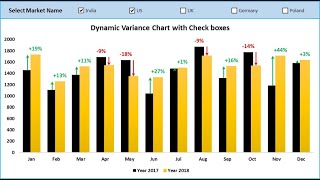
Thank you Karim for a clear explanation for this new type of chart :-)
It's a pleasure 🙂
Thanks and is possible to add 2 senario like if it is rev and moving both in the same graph with filter option
Hi Naveen
Thank you for watching.
I'm not sure I understood your comment/question.
Can you please elaborate?
Very cool and nice deomnstration, big likes for the tricks Karim
Thanks a lot Farid. So glad you liked it 🙂
Well done brother, super useful as usual!!
Thanks a million brother! Glad you liked it 🙂
Good tricks
Thank you 😊
Thanks Karim.... very useful
Thank you 🙂
Thank you for this!
You are most welcome 🙂
Will this work also if we have one common target every month but the actual sales differ?
of course.
just put the same number on the plan for all. :)
Which version excel you are using. Because we don't have option recommended chart
2016. you don't need the recommended chart option for this. you need the combo chart 🙂
I have version 2010 so that's why the combo chart is not built in the excel
@@noorm516
based on a quick search on Google, it seems Excel 2010 does support combo charts...
Thanks this one will helps me a lot:)
It's a pleasure 🙂
how will you do it for older version of excel... no combo for the choices of graphs?
Hi Marlon.
Can you provide more details about the version and exact missing part?
Thank you, very helpfull indeed :-)
You are most welcome 😊
Great video, is it possible to make it vertical with this format? I could not see vertical line chart. So I could not use the copy paste shape trick.
Thank you so much and welcome to the channel.
I'm afraid line chart is not available on horizontal bar charts.
A workaround you might want to consider, even though not perfect is maybe to use a stacked bars chart (not combo) based on a table that has an additional column that will add a small black bar on the relevant place. Maybe it won't show as a line that is larger than other parts of the bar, but it might be good enough.
I hope I explained the idea 🙃...
If not, feel free to ask 🙂
@@excelrati Thank you for the fast reply. Definitely subbing your channel btw,
@@calendil
My pleasure 🙂