For the grid auto-fit, there is a little trick for if the screen gets to narrow: Use the min() function within the minmax(). repeat(auto-fit, minmax(min(12rem,100%),1fr)). The 100% will kick in if available space is less than 12rem
Shouldn't this be max(12rem, 100%) rather than min(12rem, 100%) for it to mean that ? Here it seem to mean "Minimum size is the smallest of 12rem or 100%"
To be fair, it depends on the element you're applying it to. Which is the case with alot of things in CSS. It's perfectly fine to use as long as you know what you're doing. It's fantastic for tables for example. Just keep the inheritence in mind. Here's a crass example: 100% of the body will default to 100% of the AVAILABLE area, as opposed to 100vw that doesn't take the scrollbar into consideration. If you want to base somethings off of the bodys width and it has a scrollbar, you should go with percent as if you use vw, it will essentially make your content look ever so slightly missaligned as your right hand side is now off by a noticable difference on normal screens & laptops. The scrollbar takes up 17 pixels in chrome, which will not be taken into consideration with vw - so if you want something that is truely centered for example, you should go with % instead of vw. As a fun example, make a div 50% of the body width and then under that a div that is 50vw, and you will see what I mean (need the scrollbar to see it, so fill the rest out with some junk or set the height of both of them to 60vh)
I’m studying computer science, but I was self-taught in HTML, CSS, and a bit of JavaScript before I started 1.5 years ago. And the more I’m sitting with Java and MySQL databases, the more I look forward to and fall in love with frontend again, haha! 😆
@@dancehalllyrics1303 Yeah. I've been coding professionally for close to 20 years, another 7 or so before that for fun. Started on the frontend, have done full stack, embedded, etc. Frontend is my happy place. CSS is so cool. Good luck with your career!
@@HypherNet Thank you! I simply don’t get it when people say, “CSS is hard”, “Frontend is boring”, and so on. I mean, first of all, you don’t have to worry a second about data transferring/data manipulation. Second of all, you get instant feedback on the code you write, instead of when doing backend, you’ll have to kind of guess what the computer is interpreting your code as. And if it doesn’t meet your requirements, you’ll pretty much just have to guess where something has gone wrong, because the computer won’t be your friend with its cryptic and often non-understandable error messages, whereas with CSS, you get the benefit of the visuals, too! :)
I haven't really commented yet but I wanted to take the time to do so. CSS has been clicking more and more for me. You say that you aim to make CSS enjoyable, or at least less painful for some in a lot of videos. I've been appreciating using CSS more lately, and I'd say a huge part of that is thanks to you. Have a happy New Year
I discovered your channel a couple of months ago and I'm really impressed. I am a web development teacher and I use some of your tips and examples with my students. I usually adapt your examples to the level of my students, but this video is sooo good that I would show it directly to them in class if it had subtitles. Keep it up! Greetings from Spain.
@@franksolinsky2365 Yes, it has auto-generated subtitles and I can auto-translate them them to Spanish, but the translation is quite poor. My students wouldn't understand anything and I would have to stop the video every so often to explain what Kevis is doing. It takes me less time to generate an example like Kevin's myself.
Man. How can you always guess my current problem? I'm struggling with this f....g shit right now. Yesterday and today. Thank you a lot for clarifying!!!!!
I was confused by mixmax till it turned out to be a typo. Great thing to cover though. I've been told about this but never did get around to researching why % and overusing calc was bad. Thank you for saving us from boring research 🤣
Usually if you are not an expert i recommend going with some testing. I.e. add 6 articles. Test different resolutions. The more you test. The more bugs you find. The more you understand how to use properly units
8min in, had no idea about that! I think just designing around fixed containers is the way to go, so instead of different things collapsing at different times, your site is always one of 3 or 4 designs, makes life way easier
When you put the percentage to 33.333 and said don't do this I felt SO called out because I've done the same thing to align 3 dropdown boxes and although I was very ashamed of it I was running very near a deadline lmao. Guess it's time to sneakily update some pages at work...
Really goes to show that there's so such thing as "the best way" to do anything in every possible situation. Percentages, like everything else, are a tool that has its place. I'm still happy to use fixed pixel sizes for certain things if it's the best tool for that job.
ahhhhh i wish you were my teacher. your explanations are like breathing fresh air. i dont even watch your channel to try to find solutions to my projects, I just enjoy and use what i learned later.
sir I really like your all videos this is my first day on your channel and I watched I think 5,6 video in one day because your video is helpful in all areas😇😇
Kevin, I really appreciate your teachings. However, some of the principles you talk about do not work for my job, where the designer wants a particular layout at a particular screen size. Do you think you can make a video about how to talk to web designers about best practices in the web, so that the work for the front-enders is easier? :D
I learned it the hard way. It is a small project but the css is really long, and i used viewport and percentage at wrong places, now i am not willing to fix them manually, i just added max-width in each of them for meanwhile 🤣 Btw i am just learning so i think that's just part of the process :)
not related to the video but a while ago i realized that css really needs a feature that we can edit existing colors, similar to `calc` change saturation and hue, brightness and opacity etc, anything you can do with filters and since it doesnt exists i always have to use a lot pseudo or pseudoish elements for stuff, so i can edit them with filters, and opacity and stuff alternative is using --primary-color-transparent --primary-color-1 2 3 4 etc, which is not ideal with vanilla css i think best solution atm is doing something like this: - use hsla - have --primary-hue --primary-saturation --primary-lightness --primary-alpha - then do things like this, hsla(calc(var(--primary-hue) * 1), calc(var(--primary-saturation) * 1.2), calc(var(--primary-lightness) * 1), calc(var(--primary-alpha) * .75)) i think since web framework im using lets me change style with js, i can just generate the style with js too and have stuff similar to `background-color: ${color.primary.a(.75).s(1.2)}`
If only css had a way to define custom units and then set them via javascript. I am not talking about properties, but similar to how rem can be used in this way, but dev-defined.
I was thinking the same thing, I was going to say something that calculates padding + border and subtracts it automatically when you use that dev-defined measurements, so for example, width: 100av (available space) with padding 5px border 1px would make the div width: calc(100% - 12px), but without having to use calc()... if anyone follows that lol
@@Element_Finland rem is typically set to 62.5% (10px) for ease of coding and to allow for dynamic user scaling of font-related things. Also rem is a global unit, so it can be overriden at root with javascript. For web apps to accomodate interface behaviors at different resolutions and window aspect ratios I had to track those through javascript and set rem each time window changes. But this way rem no longer can fulfill its primary font-related role. So would be nice to have a root level unit for all kinds of dev-defined measurements that can be set and reset, and leave rem alone for its primary use case.
i stil use % alot. but lately i started to use vw vh alot. for layout and stuff % vw vh is good. for fonts and stuff em rem px maaaaybe % but honestly depending on the place every unit can be useful.
Just now hearing about fr. I still can't believe CSS hasn't grown past the percentage problem. I've been doing hobby webdev for over a decade, and I always wished that we could just use percentages to mean, "Percent of space remaining in parent" instead of "Percent size of parent", and so many of my problems would be erased.
Make video about writing little css, or css good practices, I always end up writing a lot of css I'm not a web developper I don't know if it is always the case
What about using % for container divs? Like, width:80% + margin auto I know someone who uses % and it annoys me sometimes but is it actually a bad practice in this case or just a preference thing?
At times it's fine, but people use it in the wrong situations. For a container, a width in a percentage is fine, as long as you have a max-width on there to stop it at one point
This might be a stupid question but if I want to control the number of child elements on a row, then I do need to use specific widths, dont I - flex-basis or for grid repeat(number of columns, 1fr)? The grid solution is only for when you don't care about the number of items per row as long as they fit nicely? Like a sidebar with widgets?
I'm willing to admit that I've written CSS for like 8 years and still don't know how the keyword auto-fill actually works. I would watch the hell out of a video on auto-fit.
On my side not using % it's like not using metric in 2022. Simplicity is key in our world where everything is on top of anything and everything and more and more reliant on X framework on the edge.
There are times when percentage is useful, but with modern things like flexbox and grid, it's really not something we need very often. Combined with gap, it can be downright problematic. The amount of CSS I help people with where the solution is to stop using "fixed" percentages (like 33.333%) - there is probably a better word for that, but whatever - is overwhelming. If you understand when and where to use percentages, it's fine, but most people just blindly throw numbers in there and it falls apart, and a lot of the time the solution is to not use something like fr with grid, or to use flex and not even use percentages anywhere.
When you're using flexbox and you have 1 image and a paragraph as the only children. You want them to display one next to the other. Why the paragraph takes more spaces than the image? Even when you use flex: 1 1 1; The image tends to get smaller or shrink compare to the paragraph.
I have fallen in love with CSS though. I've been programming in low level languages since I was a kid in the early 90s. I only picked up web development in the past year so I could help my parents' church with their site. CSS is great. It's incredibly easy to learn but the skill cap is nearly infinite. I have to stop myself from writing 1000000x over-engineered scss files now.
Yo guys: noob question: i used different favicons on my website for my homework, used some spans and added the favicon as background for 1 of them, for the second i added the favicon with the id from the website. If i plan to turn that favicon - lets say a menu button- which of these 2 is the correct approach?
On your real life example theres an issue right ? For ultra wide screens if the side content is not fixed max size then we will see columns where we want to have rows
Hi Kevin, a couple of questions. 1. My VS Code reports that 'container-type' is an unknown property. I am using the latest version of VSC. IS this supported? 2. I notice an HTML error in your file. You have not closed the inside of the . However your VSC does not show there is an error. Does the CSS still work correctly with this kind of error? I come from an XML background where the software would complain about any errors.
1. `container-type` is a perfectly fine property, it's just only been implemented by browsers for the last 6 months or so. VSCode has never been very up to date so missing things like this is to be expected. 2. Closing tags are optional, but recommended(browsers are expected to close tags when the parent closes or the document ends if no closing tag is specified - this can cause bugs though if you start nesting the same element as a closing tag for it will always be understood to be the last opened). HTML was based on SGML, of which XML is a more strict interpretation(which is why they're so similar), there's been attempts to unify them(XHTML), but that didn't really work because a lot of developers were lazy(causing errors they didn't want to fix) and IE refused to support it correctly(forcing you to use the wrong doctype, going into quirks mode randomly on valid documents, etc).
Believe it or not, a lot of developers aren't that aware of responsiveness in general and other measuring units that css has. I cannot understand how did this happen though, but stills being a fact hahaha
ua-cam.com/video/vQAvjof1oe4/v-deo.html - His grid-ish technique uses %. If you need a fixed number of columns with flexbox, there aren't many options. Of course, this is why I avoid Flexbox, but there are some cases where it's the better option and a % might be needed.
I've come to this video three times already because you showed some functionality that was exactly what I need, yet the video did not help me at all because you didn't post the whole code.

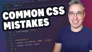


For the grid auto-fit, there is a little trick for if the screen gets to narrow: Use the min() function within the minmax().
repeat(auto-fit, minmax(min(12rem,100%),1fr)).
The 100% will kick in if available space is less than 12rem
Oho, very cool!
Shouldn't this be max(12rem, 100%) rather than min(12rem, 100%) for it to mean that ?
Here it seem to mean "Minimum size is the smallest of 12rem or 100%"
@@vukkulvar9769 when the screen gets smaller than 12rem, 100% is less than 12 rem. So min()
To be fair, it depends on the element you're applying it to. Which is the case with alot of things in CSS. It's perfectly fine to use as long as you know what you're doing. It's fantastic for tables for example.
Just keep the inheritence in mind. Here's a crass example: 100% of the body will default to 100% of the AVAILABLE area, as opposed to 100vw that doesn't take the scrollbar into consideration.
If you want to base somethings off of the bodys width and it has a scrollbar, you should go with percent as if you use vw, it will essentially make your content look ever so slightly missaligned as your right hand side is now off by a noticable difference on normal screens & laptops.
The scrollbar takes up 17 pixels in chrome, which will not be taken into consideration with vw - so if you want something that is truely centered for example, you should go with % instead of vw. As a fun example, make a div 50% of the body width and then under that a div that is 50vw, and you will see what I mean (need the scrollbar to see it, so fill the rest out with some junk or set the height of both of them to 60vh)
The more I learn about css, the better I feel about working on the backend. Haha. Good work!
I’m studying computer science, but I was self-taught in HTML, CSS, and a bit of JavaScript before I started 1.5 years ago. And the more I’m sitting with Java and MySQL databases, the more I look forward to and fall in love with frontend again, haha! 😆
@@dancehalllyrics1303 Yeah. I've been coding professionally for close to 20 years, another 7 or so before that for fun. Started on the frontend, have done full stack, embedded, etc. Frontend is my happy place. CSS is so cool. Good luck with your career!
@@HypherNet
Thank you! I simply don’t get it when people say, “CSS is hard”, “Frontend is boring”, and so on.
I mean, first of all, you don’t have to worry a second about data transferring/data manipulation. Second of all, you get instant feedback on the code you write, instead of when doing backend, you’ll have to kind of guess what the computer is interpreting your code as. And if it doesn’t meet your requirements, you’ll pretty much just have to guess where something has gone wrong, because the computer won’t be your friend with its cryptic and often non-understandable error messages, whereas with CSS, you get the benefit of the visuals, too! :)
Learned atleast 3 things today. Thank you for the video Kevin. :)
Thank you so much!
I haven't really commented yet but I wanted to take the time to do so. CSS has been clicking more and more for me. You say that you aim to make CSS enjoyable, or at least less painful for some in a lot of videos.
I've been appreciating using CSS more lately, and I'd say a huge part of that is thanks to you.
Have a happy New Year
I discovered your channel a couple of months ago and I'm really impressed. I am a web development teacher and I use some of your tips and examples with my students. I usually adapt your examples to the level of my students, but this video is sooo good that I would show it directly to them in class if it had subtitles. Keep it up! Greetings from Spain.
It does have subtitles. Click CC at the bottom and select your language from the settings cog wheel.
@@franksolinsky2365 Yes, it has auto-generated subtitles and I can auto-translate them them to Spanish, but the translation is quite poor. My students wouldn't understand anything and I would have to stop the video every so often to explain what Kevis is doing. It takes me less time to generate an example like Kevin's myself.
@@isaac66626 I see. I had not considered that. Too bad it is not more helpful.
I literally just ran into a similar overflow problem today relating to grid and this really helped. Thanks a lot 👍😄
Caught this right on time. I'm just starting out and it'll be great to know what's best at an early stage.. Thanks for your videos
you found the right channel
All my years as a dev and I never considered this at all. I have had so many issues with percentages. Thank you so much!
Once again, Kevin distinguishes himself as a heavyweight. Thanks for all your terrific content.
Man. How can you always guess my current problem? I'm struggling with this f....g shit right now. Yesterday and today. Thank you a lot for clarifying!!!!!
I was confused by mixmax till it turned out to be a typo. Great thing to cover though. I've been told about this but never did get around to researching why % and overusing calc was bad. Thank you for saving us from boring research 🤣
Usually if you are not an expert i recommend going with some testing. I.e. add 6 articles. Test different resolutions. The more you test. The more bugs you find. The more you understand how to use properly units
As always - amazing video! Thanks Kevin and Happy New Year ^_^
8min in, had no idea about that!
I think just designing around fixed containers is the way to go, so instead of different things collapsing at different times, your site is always one of 3 or 4 designs, makes life way easier
Thanks for this video, a lot has changed since i last designed web pages (~2010 if i remember correctly)
When you put the percentage to 33.333 and said don't do this I felt SO called out because I've done the same thing to align 3 dropdown boxes and although I was very ashamed of it I was running very near a deadline lmao. Guess it's time to sneakily update some pages at work...
Really goes to show that there's so such thing as "the best way" to do anything in every possible situation. Percentages, like everything else, are a tool that has its place. I'm still happy to use fixed pixel sizes for certain things if it's the best tool for that job.
ahhhhh i wish you were my teacher. your explanations are like breathing fresh air. i dont even watch your channel to try to find solutions to my projects, I just enjoy and use what i learned later.
sir I really like your all videos this is my first day on your channel and I watched I think 5,6 video in one day
because your video is helpful in all areas😇😇
my favorite css rule is make-work: please; it makes the css work the way i want
Who uses percentages when you can rewrite CSS for all viewports( every dimension that exists )
I know (think 🤔) this is a joke, but also way to close to reality, lol.
Usually I have 1024 media queries
@@KevinPowell Hey Kevin do you think all the possible css units exist already or are they still going to make another one 😂
@@good-luck-ugo Just wait for, svh, lvh, dvh, svw, lvw, dvw, svmin, lvmin, dvmin... vi, svi, vb, etc, etc.
I mean, it would work, but at what cost?
Answer: depends how much the devs make per hour
Great video kevin!
wow, CSS has evolved so much since my front-end dev days 😮
Kevin, I really appreciate your teachings. However, some of the principles you talk about do not work for my job, where the designer wants a particular layout at a particular screen size. Do you think you can make a video about how to talk to web designers about best practices in the web, so that the work for the front-enders is easier? :D
Thanks to this video i know how to use the mixmax property 😂.
Excelent content as usual Kevin 👏
Hmmm, I've being away from HTML rendering for a while, Chrome can now do crazy tricks with CSS. I'm impressed.
I learned it the hard way. It is a small project but the css is really long, and i used viewport and percentage at wrong places, now i am not willing to fix them manually, i just added max-width in each of them for meanwhile 🤣
Btw i am just learning so i think that's just part of the process :)
Definitely into favorites. Thx a lot for your content =)
Amazing video! Thank you
Thank you thank you thank you! Your videos are so inspiring!
very helpful, thanks!
Great help!👍🏽
not related to the video but
a while ago i realized that css really needs a feature that we can edit existing colors, similar to `calc`
change saturation and hue, brightness and opacity etc, anything you can do with filters
and since it doesnt exists i always have to use a lot pseudo or pseudoish elements for stuff, so i can edit them with filters, and opacity and stuff
alternative is using --primary-color-transparent --primary-color-1 2 3 4 etc, which is not ideal with vanilla css
i think best solution atm is doing something like this:
- use hsla
- have --primary-hue --primary-saturation --primary-lightness --primary-alpha
- then do things like this, hsla(calc(var(--primary-hue) * 1), calc(var(--primary-saturation) * 1.2), calc(var(--primary-lightness) * 1), calc(var(--primary-alpha) * .75))
i think since web framework im using lets me change style with js, i can just generate the style with js too and have stuff similar to `background-color: ${color.primary.a(.75).s(1.2)}`
Cool, like! Thx! Q: Can you make a video on the difference between auto-fit and auto-fill grid values?
A ton of respects to this guy
Thanks
Thank you
The “fr” unit should be part of the acceptable units for width and height.
2:50 here, have a horrible, evil, but perfectly working solution calc(100% - 15rem - var(--gap-size))
I love calc - solves so many issues. Just use it sparingly as it is a bit on the slow side.
If only css had a way to define custom units and then set them via javascript. I am not talking about properties, but similar to how rem can be used in this way, but dev-defined.
Do you have an example of an use-case and a definition? I'm curious
I was thinking the same thing, I was going to say something that calculates padding + border and subtracts it automatically when you use that dev-defined measurements, so for example, width: 100av (available space) with padding 5px border 1px would make the div width: calc(100% - 12px), but without having to use calc()... if anyone follows that lol
@@Element_Finland rem is typically set to 62.5% (10px) for ease of coding and to allow for dynamic user scaling of font-related things.
Also rem is a global unit, so it can be overriden at root with javascript.
For web apps to accomodate interface behaviors at different resolutions and window aspect ratios I had to track those through javascript and set rem each time window changes.
But this way rem no longer can fulfill its primary font-related role. So would be nice to have a root level unit for all kinds of dev-defined measurements that can be set and reset, and leave rem alone for its primary use case.
Hi Kevin.. Please do a quick insight on display:inline-flex.
i needed it
I'm a bit fan of `flex`, but i think i should start to use `grid` more often.
I had honestly wondered if you could ramp up the fr count on it.
i stil use % alot. but lately i started to use vw vh alot.
for layout and stuff % vw vh is good. for fonts and stuff em rem px maaaaybe %
but honestly depending on the place every unit can be useful.
its work!
Just now hearing about fr.
I still can't believe CSS hasn't grown past the percentage problem.
I've been doing hobby webdev for over a decade, and I always wished that we could just use percentages to mean, "Percent of space remaining in parent" instead of "Percent size of parent", and so many of my problems would be erased.
Make video about writing little css, or css good practices, I always end up writing a lot of css I'm not a web developper I don't know if it is always the case
What about using % for container divs?
Like, width:80% + margin auto
I know someone who uses % and it annoys me sometimes but is it actually a bad practice in this case or just a preference thing?
At times it's fine, but people use it in the wrong situations. For a container, a width in a percentage is fine, as long as you have a max-width on there to stop it at one point
👍
5:10 , "don't do this please" is killing me
This might be a stupid question but if I want to control the number of child elements on a row, then I do need to use specific widths, dont I - flex-basis or for grid repeat(number of columns, 1fr)? The grid solution is only for when you don't care about the number of items per row as long as they fit nicely? Like a sidebar with widgets?
For context I have a Wordpress Block where users/editors can choose the number of blocks per row. Just wondering if I can leverage this...
I tend to use max-width a lot in my work.
I'm willing to admit that I've written CSS for like 8 years and still don't know how the keyword auto-fill actually works. I would watch the hell out of a video on auto-fit.
On my side not using % it's like not using metric in 2022.
Simplicity is key in our world where everything is on top of anything and everything and more and more reliant on X framework on the edge.
There are times when percentage is useful, but with modern things like flexbox and grid, it's really not something we need very often. Combined with gap, it can be downright problematic. The amount of CSS I help people with where the solution is to stop using "fixed" percentages (like 33.333%) - there is probably a better word for that, but whatever - is overwhelming. If you understand when and where to use percentages, it's fine, but most people just blindly throw numbers in there and it falls apart, and a lot of the time the solution is to not use something like fr with grid, or to use flex and not even use percentages anywhere.
I remember years ago trying to get a webpage to look right by adding things like: left: 23px etc lol
If anyone says they haven't done that they're lying 😂
Today I had a problem like this but with flex. Flex-wrap, gap and some items 50%. I had to use calc. Felt like a hack.
Ah yeah, I hate that so much, lol. Another reason I prefer grid :P
When you're using flexbox and you have 1 image and a paragraph as the only children. You want them to display one next to the other. Why the paragraph takes more spaces than the image? Even when you use flex: 1 1 1; The image tends to get smaller or shrink compare to the paragraph.
I have fallen in love with CSS though. I've been programming in low level languages since I was a kid in the early 90s. I only picked up web development in the past year so I could help my parents' church with their site. CSS is great. It's incredibly easy to learn but the skill cap is nearly infinite. I have to stop myself from writing 1000000x over-engineered scss files now.
"Nobody knows" - best of the year
Cool!
I just wanna know whats up with the width on the container in the first exampol
Yo guys: noob question: i used different favicons on my website for my homework, used some spans and added the favicon as background for 1 of them, for the second i added the favicon with the id from the website. If i plan to turn that favicon - lets say a menu button- which of these 2 is the correct approach?
Sir Have a lovely day 😊
I learned a lot from CSS Fred Armisen.
Is it ok to use % for Margins and Paddings???
Hereby petitioning W3C to add `mixmax` function to CSS
What if I don't want my site to work on anything other than a full-screen 16:9 pannel? Why would this be useful to me in that case?
Thank you. You'll never stop learning coding. Like almost everyday you find new ways. And this here is awesome^1000
Can someone tell me why "min-width: 55em" in the media query instead of some pixel value?
.sidebar-grid on which element?
.card on which elements?
Hi Kevin, visual studio @container doesn't seem to work. Is there something stopping it from working?
It's support isn't fantastic yet, so vs code linting might warn against it
In width, you add a bunch of values, where can I learn css like that?
On your real life example theres an issue right ? For ultra wide screens if the side content is not fixed max size then we will see columns where we want to have rows
ah, remember the good old days with 33.33333% and 66.66666%?
me neither
I'm madly and deeply in love with both CSS and KP :)
Chatgpt can't do this. Instead of the Turing test, we should have the css test
Hi Kevin, a couple of questions.
1. My VS Code reports that 'container-type' is an unknown property. I am using the latest version of VSC. IS this supported?
2. I notice an HTML error in your file. You have not closed the inside of the . However your VSC does not show there is an error. Does the CSS still work correctly with this kind of error? I come from an XML background where the software would complain about any errors.
1. `container-type` is a perfectly fine property, it's just only been implemented by browsers for the last 6 months or so. VSCode has never been very up to date so missing things like this is to be expected.
2. Closing tags are optional, but recommended(browsers are expected to close tags when the parent closes or the document ends if no closing tag is specified - this can cause bugs though if you start nesting the same element as a closing tag for it will always be understood to be the last opened). HTML was based on SGML, of which XML is a more strict interpretation(which is why they're so similar), there's been attempts to unify them(XHTML), but that didn't really work because a lot of developers were lazy(causing errors they didn't want to fix) and IE refused to support it correctly(forcing you to use the wrong doctype, going into quirks mode randomly on valid documents, etc).
I've been avoiding using CSS percentages as much as possible, they don't feel right lol
The moment you try to use % with flex the problem starts..
CLAMP
use CLAMP
You guys use CSS ?
Fr Looks very handy, but alas in WordPress this is not an option. At most i can choose from px rem em % vw ch
I have never seem fr as an option.
Who tf uses % for grid and flex I’m wondering
Believe it or not, a lot of developers aren't that aware of responsiveness in general and other measuring units that css has.
I cannot understand how did this happen though, but stills being a fact hahaha
I see it pretty much every day, lol
ua-cam.com/video/vQAvjof1oe4/v-deo.html - His grid-ish technique uses %. If you need a fixed number of columns with flexbox, there aren't many options. Of course, this is why I avoid Flexbox, but there are some cases where it's the better option and a % might be needed.
I've come to this video three times already because you showed some functionality that was exactly what I need, yet the video did not help me at all because you didn't post the whole code.
Mfw the most human readable value in CSS is apparently a bad choice 😑
this is kinda BS, this completely depends on what elements you are using.
this is why I'd rather use frameworks than waste my time fiddling with these kinds of stuff
*_I hate CSS_*
Css is simple, you make it feel overwhelming.
Who uses percentages when you can rewrite CSS for all viewports( every dimension that exists )