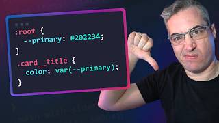
If you want to maintain a constant relationship between text elements and still have it responsive use pow(). font-size: calc(---size * pow(1.5, 4)); then put the clamp on --size
@@NotKyleChicago In the CSS code snippet you provided, pow is used as a function within the calc() expression to calculate the font size. Here's a breakdown of how it works: * calc() function: This function allows you to perform mathematical calculations directly within CSS values. * pow(1.5, 4): This expression represents the pow function being used with two arguments: * 1.5: The base number. * 4: The exponent. * pow() function: This function calculates the power of the base number raised to the exponent. In this case, it calculates 1.5 raised to the power of 4, which equals 5.0625. * Final calculation: The calc() function then substitutes the result of the pow() function into the expression, resulting in: font-size: calc(--size * 5.0625); This means the font size will be calculated by multiplying the value of the custom property --size by 5.0625. Therefore, pow in this context is used to calculate the exponent of a number within the calc() function, allowing for more dynamic and flexible font size calculations based on other CSS values.
Please remember that there are many different use cases for browser based applications. For example, my company provides browser based live scoreboards for sport stadiums. We use these units so that the content remains identical independently from the platform, TV, projector, giant LED screens, etc. Use what is appropriate for your job.
i'm not generally sure about this one.. that's directly too much of definitions, 1 fluid type annotation on root set as a font-size, then rem-ing everywhere else is probably my decision.. maybe id create a utility for myself that will generate these "steps" for me, but i feel like this is way too boilerplaty and in so many cases is an absolute overkill.. thanks for the interesting tip anyways!
Don’t make text size responsive at all. The layouts / containers can (and should) be flexible so the text will fill the available space on each resolution. Just go with fixed font sizes and adjust at certain breakpoints with media queries
Nice! I think I will have to revisit a website I did and adjust using the clamp property! With I had known, thank you for this tip!! Using view-port width was my go to for awhile and not I have a better understanding.
Thank you for walking through clamp() like you did here. It never truly made sense to me before but this example and your explanation REALLY helped!!!!
Jesus wept, are people just overcomplicating things for no reason? The entire point of REM is that it's relative to the root of the document, not its ancestors. Put the clamp() font-size stuff in the html element and then specify multiples of REM however you see fit for your actual text content. No need to magic number things or use an insane number of arbitrary custom properties, just 1 item that does the fluidity and every size thereafter derived from it. Fudging the vw unit in the clamp is still horrible though, but done once could be an acceptable trade-off. Or, and here's a WILD idea, don't have completely responsive text. Even with different pixel densities, all device categories are generally in the same ballpark as each other, so just set up a few media queries with common width ranges and set a fixed unit size for font-size. Hell, put these fixed sizes on the html element and stick with rems for actual text and not only do you preserve the proportionality of size across your different text elements, but you automatically adjust everything based on your device. And browser zooming works are expected as well. However, the difference between zooming the browser and a user's font size preference for the browser are two different things, and px for font sizes regardless of where you use them is going to break the latter.
Scaling font sizes for me only make sense when you have design elements with a fixed width and height. 1rem (usually 16px by default) looks perfectly fine on ANY device. Increase regular text a little but on mobile if necessary, but that's it. I actually worked at a company where they scaled everything by setting a calculated font-size via javascript on the html element and scaled EVERYTHING with rem. They considered it perfectly fine, even though everything would jump until all scripts were loaded, everything was too large on phones and tablets in landscape and font sizes were down below 10px on mobile, basically treating the entire page as if it was an image with a width of 100% and height of auto.
@@Azurryu well, that sounds...competent. Honestly I'll never understand how supposedly professional developers can think insane shit like you describe, or what I see in my own place of work, is a good idea. Hell, how the idea even formed in the first place.
When i start to build my first web page during my college days. I often use vmin & vmax for font size. After sometimes only i came to know that these font units won't bring responsiveness 😅
I immediately got triggered when I saw the thumbnail "font-size: 5vw", thinking "who on earth does this way?!" LOL. Font clamping with a scaling factor generator is what I usually use all the time and I've been trying to get my designers to do the same because, not only it is so much more easier to implement and it's not based on some arbitrary sizing, it is consistent and it's visually pleasing to look at.
There’s just one issue: zooming. In most browsers, zooming doesn’t change the font size or affect REM units. Even with a 200% zoom, 1rem will still render as 16px instead of 32px. REM only adjusts if someone manually increases the font size in their browser settings to 200%. The regular zoom is in most browser the default zoom. Text zoom is mostly hidden in settings, because it also is effected by OS settings.
You're current that it doesn't change the font-size or `rem` in the strictess of definitions, but it does zoom in/out because it's changing the size of the pixel unit. Even if you set your font sizes in pixels, it will increase decrease the font size. If you zoom to 200%, you've effectively made your CSS pixels 2x bigger than they used to be (because a CSS pixel is not a screen pixel). You can see it in my demo, and you can try it right now on UA-cam, or any other site. You can also see in the video when I have the font-size in viewport units and zoom in and out, the margin on the sides of the pages is increasing/decreasing because of it (because the pixels are getting bigger/smaller), but the font-size isn't changing. As long as you use em, rem, pixels, or whatever else, you can allow the site to zoom in and out. There are ways to allow for font scaling without zooming. Wikipedia has a control for this right now, and I think offering that is awesome, but as long as you can zoom in/out and have larger/smaller text without any issues, it's perfectly fine.
@@KevinPowell Hey, I really enjoyed your video, but just wanted to clarify a small point! Zooming (graphical zoom) is more of a fallback mechanism and doesn’t fully comply with WCAG 1.4.4, which focuses on scaling text across all websites using relative units like rem or em. When you adjust the font size in the browser, it applies globally, and that’s the ideal way to ensure accessibility for users who need larger text. You made a great point about the Wikipedia feature-it’s awesome! But for users who rely on larger text, they’ve probably already set a default font size in their browser, making that control less useful for them. Also, about your vw*rem solution, if you’re already using relative units for both the min and max font sizes, that should be enough to ensure a good balance without complicating things further. Thanks again for the great video-it was mostly spot on, just thought this might help clear things up a bit! :)
How much did I do font: #vw back before clamp? all the time on some major sites and still see it when I go to them. Should I have, nope but what could we do instead. @media 1, 2, 3, 4, 5, 6, 7, 8, 9, 10 and that was a pain.
If it's very large text, you can get away with it, which I'm going to hope is the case if they're being particular with line breaks... I'd probably try pretty hard to educate them on how the web works though, in a very polite way with examples of why not being anal with line-breaks is important.
Seems like they've addressed the main points I made about issues with viewport units. I've never used it myself, and generally I'm not a fan of overly-fluid designs, but without having used it, I can't say for sure... but they seem to have taken accessibility in mind 👍
If you're working on government websites, certain private business sites, healthcare or education websites, you HAVE to follow accessibility guidelines by law.
As ZeeZeeGaming said, accessibility rules are generally written in stone. A lot of companies have already faced lawsuits around inaccessible websites, in the US and EU, and the EU is making their accessibility rules even stricter very soon... That said, there are times when it's less likely to be an issue, like a very large font-size where it probably doesn't matter if it can't be zoomed in on. But as I showed in the video, most of the time if you only use viewport units for font-sizes without a clamp, you're going to get either too big at one point, or too small. Someone out there on their 54" widescreen display is going to full-screen your site and end up with some *very* big type 😆 I'd also say I'm giving some recommendations and best practices here, and in knowing those, it means that you can usually find the times when it's okay to break the rules as well :)
Just because 99.99% of cases should not use vp units for fs, there are legit reasons to do so. Saying don't use them is disingenuous. Always use the right tool for the job.
@@Mecabricks Aha, interesting use case and I see your point now. Definitely the 00.01% of uses though and whilst you're right that accessibility isn't harmed in that case and nor is the design very fluid, sometimes people just need simple rules to follow and saying "never" is probably more helpful than harmful even if not quite correct. You can still deliver on a scoreboard use case without straight viewport units.
yes, because "cutting edge" CSS techniques are pushed by grifters and elitists trying to make CSS - and web development as a whole - significantly more complex than it needs to be in order to shill their unnecessary tools and products, and lock out the self-taught from emerging markets. If somebody with "industry experience" says X is a good approach, it'll instantly be copied by everybody who doesn't know better.
I’m experimenting using clamp in combination with container query units like font-size: clamp(1.125em, .625em + 7.25qci, 2.25em) And I can say, it‘s kind of neat, but also buggy. As long as I don’t resize the Chrome window, everything is fine. But the Chrome tab dies so often if I do. Don‘t have a clue why. 🥲


Utopia keeps being awesome! Good on them for calling out WCAG failures.
If you want to maintain a constant relationship between text elements and still have it responsive use pow(). font-size: calc(---size * pow(1.5, 4)); then put the clamp on --size
What is pow()? I'm thinking power, as in "2 to the power of 3 equals 8".
@@NotKyleChicago
In the CSS code snippet you provided, pow is used as a function within the calc() expression to calculate the font size.
Here's a breakdown of how it works:
* calc() function: This function allows you to perform mathematical calculations directly within CSS values.
* pow(1.5, 4): This expression represents the pow function being used with two arguments:
* 1.5: The base number.
* 4: The exponent.
* pow() function: This function calculates the power of the base number raised to the exponent. In this case, it calculates 1.5 raised to the power of 4, which equals 5.0625.
* Final calculation: The calc() function then substitutes the result of the pow() function into the expression, resulting in:
font-size: calc(--size * 5.0625);
This means the font size will be calculated by multiplying the value of the custom property --size by 5.0625.
Therefore, pow in this context is used to calculate the exponent of a number within the calc() function, allowing for more dynamic and flexible font size calculations based on other CSS values.
basically as @DeepTitanic said but without the --size var, they just use 1rem 😎
Please remember that there are many different use cases for browser based applications. For example, my company provides browser based live scoreboards for sport stadiums. We use these units so that the content remains identical independently from the platform, TV, projector, giant LED screens, etc. Use what is appropriate for your job.
i'm not generally sure about this one.. that's directly too much of definitions, 1 fluid type annotation on root set as a font-size, then rem-ing everywhere else is probably my decision.. maybe id create a utility for myself that will generate these "steps" for me, but i feel like this is way too boilerplaty and in so many cases is an absolute overkill.. thanks for the interesting tip anyways!
Oh man... I just got done making a thing with 'vw' units. Now I gotta go back and change stuff. Grumpy hand clap in your general direction 😏
well shit... (although I use clamp with it)
same !
I use Calc and clamp
Same, lots of designs I do can't be done otherwise
Same, never had any issues with the min and max of clamp.
Yupp
Don’t make text size responsive at all. The layouts / containers can (and should) be flexible so the text will fill the available space on each resolution. Just go with fixed font sizes and adjust at certain breakpoints with media queries
Nice! I think I will have to revisit a website I did and adjust using the clamp property! With I had known, thank you for this tip!! Using view-port width was my go to for awhile and not I have a better understanding.
Thank you for walking through clamp() like you did here. It never truly made sense to me before but this example and your explanation REALLY helped!!!!
this vw trick is actually really cool for game UI's where everything must scale uniformly
Yeah it can definitely be useful for things like that :)
Thanks for the video. I haven't used it in production yet, but I've been liking some prototyping I've done with container-query-units and clamp.
Great tip! Utopia's accessibility check is a huge deal.
Jesus wept, are people just overcomplicating things for no reason? The entire point of REM is that it's relative to the root of the document, not its ancestors. Put the clamp() font-size stuff in the html element and then specify multiples of REM however you see fit for your actual text content.
No need to magic number things or use an insane number of arbitrary custom properties, just 1 item that does the fluidity and every size thereafter derived from it. Fudging the vw unit in the clamp is still horrible though, but done once could be an acceptable trade-off.
Or, and here's a WILD idea, don't have completely responsive text. Even with different pixel densities, all device categories are generally in the same ballpark as each other, so just set up a few media queries with common width ranges and set a fixed unit size for font-size. Hell, put these fixed sizes on the html element and stick with rems for actual text and not only do you preserve the proportionality of size across your different text elements, but you automatically adjust everything based on your device. And browser zooming works are expected as well.
However, the difference between zooming the browser and a user's font size preference for the browser are two different things, and px for font sizes regardless of where you use them is going to break the latter.
Scaling font sizes for me only make sense when you have design elements with a fixed width and height. 1rem (usually 16px by default) looks perfectly fine on ANY device. Increase regular text a little but on mobile if necessary, but that's it.
I actually worked at a company where they scaled everything by setting a calculated font-size via javascript on the html element and scaled EVERYTHING with rem. They considered it perfectly fine, even though everything would jump until all scripts were loaded, everything was too large on phones and tablets in landscape and font sizes were down below 10px on mobile, basically treating the entire page as if it was an image with a width of 100% and height of auto.
@@Azurryu well, that sounds...competent. Honestly I'll never understand how supposedly professional developers can think insane shit like you describe, or what I see in my own place of work, is a good idea. Hell, how the idea even formed in the first place.
When i start to build my first web page during my college days. I often use vmin & vmax for font size. After sometimes only i came to know that these font units won't bring responsiveness 😅
Thank you for highlighting accessibility as a measure of successful web design.
I immediately got triggered when I saw the thumbnail "font-size: 5vw", thinking "who on earth does this way?!" LOL.
Font clamping with a scaling factor generator is what I usually use all the time and I've been trying to get my designers to do the same because, not only it is so much more easier to implement and it's not based on some arbitrary sizing, it is consistent and it's visually pleasing to look at.
I am still barebacking CSS with DP for font-size :)
I like `font-size: clamp(16px, 3vw, 20px);`
Well, I'm still using good old px with different media queries for different screen sizes, works just fine.
ox is not accessible. Static font sizing should be avoided as changing font size in the browser doesn’t work. Use rem/em as a minimum.
I'm using Bootstrap, are rfs functions included? Or should I use your technique?
There’s just one issue: zooming. In most browsers, zooming doesn’t change the font size or affect REM units. Even with a 200% zoom, 1rem will still render as 16px instead of 32px. REM only adjusts if someone manually increases the font size in their browser settings to 200%.
The regular zoom is in most browser the default zoom. Text zoom is mostly hidden in settings, because it also is effected by OS settings.
You're current that it doesn't change the font-size or `rem` in the strictess of definitions, but it does zoom in/out because it's changing the size of the pixel unit. Even if you set your font sizes in pixels, it will increase decrease the font size. If you zoom to 200%, you've effectively made your CSS pixels 2x bigger than they used to be (because a CSS pixel is not a screen pixel). You can see it in my demo, and you can try it right now on UA-cam, or any other site.
You can also see in the video when I have the font-size in viewport units and zoom in and out, the margin on the sides of the pages is increasing/decreasing because of it (because the pixels are getting bigger/smaller), but the font-size isn't changing. As long as you use em, rem, pixels, or whatever else, you can allow the site to zoom in and out.
There are ways to allow for font scaling without zooming. Wikipedia has a control for this right now, and I think offering that is awesome, but as long as you can zoom in/out and have larger/smaller text without any issues, it's perfectly fine.
@@KevinPowell Hey, I really enjoyed your video, but just wanted to clarify a small point! Zooming (graphical zoom) is more of a fallback mechanism and doesn’t fully comply with WCAG 1.4.4, which focuses on scaling text across all websites using relative units like rem or em. When you adjust the font size in the browser, it applies globally, and that’s the ideal way to ensure accessibility for users who need larger text.
You made a great point about the Wikipedia feature-it’s awesome! But for users who rely on larger text, they’ve probably already set a default font size in their browser, making that control less useful for them.
Also, about your vw*rem solution, if you’re already using relative units for both the min and max font sizes, that should be enough to ensure a good balance without complicating things further. Thanks again for the great video-it was mostly spot on, just thought this might help clear things up a bit! :)
What is qci? I don't remember seeing that unit type before.
How much did I do font: #vw back before clamp? all the time on some major sites and still see it when I go to them.
Should I have, nope but what could we do instead. @media 1, 2, 3, 4, 5, 6, 7, 8, 9, 10 and that was a pain.
hey sir, I'm a beginner and I want to know more about the pseudo elements
Back to the drawing board
Found a height with vw today on the codebase. And not it didn't make any sense.
Bootstraps Sass RFS system uses calc with em and vw
Can you make a tutorial on how to make Drake’s 100 GIGS Site?
What if the client is reallllly uptight of about never ever having text that line breaks how they don't want it to line break, on any screensize?
Not sure that's even possible with responsive design! You would potentially fall down the hole of overflow 😮
I mean use Clamp and text-wrap:nowrap;
Then test it on the 5 common breakpoints and you should be fine.
Mostly for company names and or slogans.
If it's very large text, you can get away with it, which I'm going to hope is the case if they're being particular with line breaks... I'd probably try pretty hard to educate them on how the web works though, in a very polite way with examples of why not being anal with line-breaks is important.
Hi, what so you Thing about Finsweet Fluid responsive generator?
Seems like they've addressed the main points I made about issues with viewport units. I've never used it myself, and generally I'm not a fan of overly-fluid designs, but without having used it, I can't say for sure... but they seem to have taken accessibility in mind 👍
Why isn't the Variable part of Clamp function not wrapped in a calc() function?
Is something wrong in doing so?
you could put the calc() in there if you want, but you don't need to. clamp(), like min(), max() and others don't require a calc() to do calculations.
@@KevinPowell
Oh! Okay. Thanks. I've been adding the calc() believing that it's necessary.
I have a sass function for this
That seems like a good approach. I hope we can do similar with CSS soon.
Real Front-end Friends use "1in" for H1, "2in" for H2, etc.
It doesn't technically say you can't make users resize the window to change text size 😂
One criterion, two criteria. "Criterions" is not a thing :)
Some backend nerds says: Frontend is easy!
Watch this, mf!
Ummm... I don't like rules written in stone. I think many things can be done if you know when and why you're doing them.
If you're working on government websites, certain private business sites, healthcare or education websites, you HAVE to follow accessibility guidelines by law.
As ZeeZeeGaming said, accessibility rules are generally written in stone. A lot of companies have already faced lawsuits around inaccessible websites, in the US and EU, and the EU is making their accessibility rules even stricter very soon...
That said, there are times when it's less likely to be an issue, like a very large font-size where it probably doesn't matter if it can't be zoomed in on. But as I showed in the video, most of the time if you only use viewport units for font-sizes without a clamp, you're going to get either too big at one point, or too small. Someone out there on their 54" widescreen display is going to full-screen your site and end up with some *very* big type 😆
I'd also say I'm giving some recommendations and best practices here, and in knowing those, it means that you can usually find the times when it's okay to break the rules as well :)
Setting font-size to the p element is common bad practice... please don't do that.
Just because 99.99% of cases should not use vp units for fs, there are legit reasons to do so. Saying don't use them is disingenuous. Always use the right tool for the job.
What is the legit reason that would have you disregard accessibility?
@@n_mckeanbrowser based scoreboards displayed on big LED screens in stadiums. These units work perfectly for this use case.
@@Mecabricks Aha, interesting use case and I see your point now. Definitely the 00.01% of uses though and whilst you're right that accessibility isn't harmed in that case and nor is the design very fluid, sometimes people just need simple rules to follow and saying "never" is probably more helpful than harmful even if not quite correct. You can still deliver on a scoreboard use case without straight viewport units.
I learnt not to do that the hard way 😂
Please use whatever works in the context of the design being implemented and don't pay any attention to the has-been hipsters on UA-cam.
Inaccessible design is lazy and immoral.
Just use clamp with VW and problem solved.....
Still not accessible.
@@n_mckean why are u gay?
People really do this?
yes, because "cutting edge" CSS techniques are pushed by grifters and elitists trying to make CSS - and web development as a whole - significantly more complex than it needs to be in order to shill their unnecessary tools and products, and lock out the self-taught from emerging markets.
If somebody with "industry experience" says X is a good approach, it'll instantly be copied by everybody who doesn't know better.
First❤🎉
I’m experimenting using clamp in combination with container query units like
font-size: clamp(1.125em, .625em + 7.25qci, 2.25em)
And I can say, it‘s kind of neat, but also buggy. As long as I don’t resize the Chrome window, everything is fine. But the Chrome tab dies so often if I do. Don‘t have a clue why. 🥲
Huh, that's strange. I haven't run into issues yet, but I haven't played with it too much yet either.