Hi Andy, I have converted measure to discrete measure and dragged at rows field. Once I dragged at row field the discrete measure value has splitted into different months instead of one value, even for sparklines also. In columns I kept date in month format.
windows function is my key to the project currently working on. after almost 2 weeks struggle I have reached the right video. Awesome. Thank you:) I need to have bar graph and sparkline in same sheet for the same measure is this achievable.
Great video, creating one table seems to work great when all the metrics are uniform like stock data and not pre-aggregated. Any idea how this could be done against multiple metrics that are pivoted into two columns (Metric name|Metric Value) but a mix of pre-aggregated and non aggregated data such as Total Social Followers on a specific day and Sum(Sales)?
Hi Andy, this was really helpful and I've implemented it in my company dashboard. I was looking for a way to conditional format change %, i tried multiple methods and nothing seems to work with this graph. Please suggest a way om how i can achieve my use case
Hi Andy, Thank you for the video. It was very informative. Is there a video that says how to color code those KPIs in the table? For example If I need to color code Last week Volume green if it above a certain value and red if it is below a certain value, will I be able to do that? Thanks in advance.
Can I have a follow up question? I want to conditionally color format the percentage change or add another indicator column with colored up and down arrow, is that doable?
Really nice detail introduction! Thanks! Question, if I have a general Date which longer than my [Sales]'s date, how could I fetch the date of first non-zero data in my [Sales]? Try to create a first non-zero date, let's say Start Date, then build a 3,6,9 month interval from the Start Date, finally find the max value of that interval and highlight. Thanks a lot.
I don't know why I'm finding Tableau functions harder to pickup than both Excel and R - in those programs you wouldn't need two sum functions (window_sum, sum) and both a null and a 0 in one formula. Guess I just need more practice, but the functions themselves don't seem very intuitive just yet.
@@vizwiz Hi Andy.. This dataset is with Stock data. I use Tableau public and I recently started using Tableau. It didn't come with stock data. Wondering if you could upload the dataset pls. ( Thanks in advance
@@udayabanunagarajan5401 Sorry about that! I've just uploaded it here - data.world/vizwiz/sample-stock-prices Also, if you download a workbook from Tableau Public, you can unzip it and the data will be there.
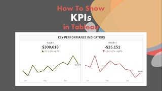
Thanks, Andy, for your video showing how to create KPIs and Sparklines in the same graph. NOW, I want to turn my % change from last time period column into a horizontal bar graph with positive or negative percentages on the X-axis, so when people click on the "% change..." sorter you get a nice Pareto chart next to the sparkline with ranges from most positive to most negative. I can almost do it: When I make % change continuous and put it next to the header in the columns shelf, I get a second chart to the left of the sparkline with % change in the x-axis, but my results are weird: say, when % change is -10%, it shows a vertical bar at -10% instead of a horizontal bar extending from zero to -%10. I can't figure out how to tell Tableau I want a horizontal bar chart at that point. Any ideas?
Hi Andy, thanks so much for these videos, all of them very useful. I am trying to apply your method to my particular case; however, the KPI calculations for each graph show two panes. It seems Tableau is splitting the chart into two. The first pane shows Null in the KPI column along with the line chart with prior data. The second pane shows the KPI value along with a dot that represents the value of the KPI in another chart. I hope this makes sense. I am using lookup function to find the value that I am looking for (which is already an aggregated variable). This is how my Lookup function looks like LOOKUP(IIF(ATTR([cf_fyear])=ATTR([cf_current year]), [cf_turnover rate type], null). [cf_turnover rate type] is a calculated variable. is this causing that the chart splits into two? Any help would be greatly appreciated. Thanks
Great video! What if I want to show an "Actual" and a "Target" column? The problem is, I have a single field containing all the values and a second field that identifies if the value is "Actual" or "Target". I am trying to use the "EXCLUDE" function but it is giving me a headache since the results are ATTR and they are not compatible with the function. Is there a workaround to avoid transforming my data?
Assuming you have a column named "Actual/Target", create two calculated fields. One will be something like IF Actual/Target = Target THEN Value END. And then another calc for Actual. This would then results in two columns instead of one and you could then compare those.
Thanks @@vizwiz . I was able to achieve it using your idea of AVG(0) public.tableau.com/profile/naveen.reddy#!/vizhome/Logic-SparklinesLineChart-DisplayLabelsattheendandDisplayKPItotherightofSparkline/SparklinesDisplayColumnontheRight I still have one small issue, which I am not able to figure it out. I have this text alignment issue where the FIRST and LAST value columns are lining (aligning) up with the Sparkline chart first and last value. I am unable control the alignment of these columns that are left and right to that of Sparkline chart. Any suggestions on it.
Hey Andy, this seems useful for showing a single KPI (Volume) - any way to replicate the same view for multiple KPIs? Only way I can think of is to repeat all of the calculated fields, for each Measure, on separate sheets and combine.
Hello great video! I was wondering how would the calculation look like if I wanted to use a count distinct on a dimension for last week volume? Getting aggregate errrors
Hi Andy, Is it possible with % change, on a month by month basis, have the numbers change either red or green to show a positive move or negative move. Also is it possible to plot a benchmark with the % change being relative to the benchmark?
Hi Andy, can you please tell us how to calculate daily change? In my dataset there are weekends and holidays & hence I cant use Max Date - 1. There has to a better way to find the previous date with data. Thanks


I would love to see a tutorial from the 3 persons that disliked this video
Hi Andy, I have converted measure to discrete measure and dragged at rows field. Once I dragged at row field the discrete measure value has splitted into different months instead of one value, even for sparklines also. In columns I kept date in month format.
windows function is my key to the project currently working on. after almost 2 weeks struggle I have reached the right video. Awesome. Thank you:)
I need to have bar graph and sparkline in same sheet for the same measure is this achievable.
Yes. Dual axis chart.
Great video, creating one table seems to work great when all the metrics are uniform like stock data and not pre-aggregated. Any idea how this could be done against multiple metrics that are pivoted into two columns (Metric name|Metric Value) but a mix of pre-aggregated and non aggregated data such as Total Social Followers on a specific day and Sum(Sales)?
Hi Andy, this was really helpful and I've implemented it in my company dashboard. I was looking for a way to conditional format change %, i tried multiple methods and nothing seems to work with this graph. Please suggest a way om how i can achieve my use case
Hi Andy,
Thank you for the video. It was very informative. Is there a video that says how to color code those KPIs in the table? For example If I need to color code Last week Volume green if it above a certain value and red if it is below a certain value, will I be able to do that?
Thanks in advance.
you are incredibly amazing!! i cant wait to see you publish more! huge fan here!
Hi Andy, is it possible to apply conditional formatting on % change value (negative red and positive green)
Why, why, why? Why is it so easy? This is a video that every Tableau user that does analytics should watch. Great work and thank you!
That was my reaction exactly.
Can I have a follow up question? I want to conditionally color format the percentage change or add another indicator column with colored up and down arrow, is that doable?
Yes I have same question
why do we need the window_sum to make the last week dimension?
Very good! I'll have to watch it few more times. Thanks.
Really nice detail introduction! Thanks!
Question, if I have a general Date which longer than my [Sales]'s date, how could I fetch the date of first non-zero data in my [Sales]?
Try to create a first non-zero date, let's say Start Date, then build a 3,6,9 month interval from the Start Date, finally find the max value of that interval and highlight.
Thanks a lot.
one of the most helpful tableau videos on the tube
Phenomenal. Thank you Andy!
The Datediff function seems not working properly if the MAX Date is less than 14 days of the current month.
What’s the calc you’re using?
I don't know why I'm finding Tableau functions harder to pickup than both Excel and R - in those programs you wouldn't need two sum functions (window_sum, sum) and both a null and a 0 in one formula. Guess I just need more practice, but the functions themselves don't seem very intuitive just yet.
This is a great video! great stuff in this video. Thks Andy!
very useful tips, thanks.
Awesome Video! Will be using this on my next KPI Dashboard!
You're going to make me look like a rock star. Thanks Andy!
The way they sneak in these long ass commercials before these videos now is awful
It pays the bills.
🏆
Lot's of good ideas in here, thanks Andy.
Keep up the good work.. your videos are awesome!
Awesome video. Where can I download the dataset?
I’ve added a link to the workbook in the description. The data set is Superstore that comes with Tableau.
@@vizwiz Thank you so much Andy..
@@vizwiz Hi Andy.. This dataset is with Stock data. I use Tableau public and I recently started using Tableau. It didn't come with stock data. Wondering if you could upload the dataset pls. ( Thanks in advance
@@udayabanunagarajan5401 Sorry about that! I've just uploaded it here - data.world/vizwiz/sample-stock-prices
Also, if you download a workbook from Tableau Public, you can unzip it and the data will be there.
@@vizwiz Thank you Andy.. learnt lot of tips from this usecase.
I just love your videos! Thank you!
Thanks, Andy, for your video showing how to create KPIs and Sparklines in the same graph. NOW, I want to turn my % change from last time period column into a horizontal bar graph with positive or negative percentages on the X-axis, so when people click on the "% change..." sorter you get a nice Pareto chart next to the sparkline with ranges from most positive to most negative. I can almost do it: When I make % change continuous and put it next to the header in the columns shelf, I get a second chart to the left of the sparkline with % change in the x-axis, but my results are weird: say, when % change is -10%, it shows a vertical bar at -10% instead of a horizontal bar extending from zero to -%10. I can't figure out how to tell Tableau I want a horizontal bar chart at that point. Any ideas?
Hi Andy, thanks so much for these videos, all of them very useful. I am trying to apply your method to my particular case; however, the KPI calculations for each graph show two panes. It seems Tableau is splitting the chart into two. The first pane shows Null in the KPI column along with the line chart with prior data. The second pane shows the KPI value along with a dot that represents the value of the KPI in another chart. I hope this makes sense. I am using lookup function to find the value that I am looking for (which is already an aggregated variable). This is how my Lookup function looks like LOOKUP(IIF(ATTR([cf_fyear])=ATTR([cf_current year]), [cf_turnover rate type], null). [cf_turnover rate type] is a calculated variable. is this causing that the chart splits into two? Any help would be greatly appreciated. Thanks
Great video! What if I want to show an "Actual" and a "Target" column? The problem is, I have a single field containing all the values and a second field that identifies if the value is "Actual" or "Target".
I am trying to use the "EXCLUDE" function but it is giving me a headache since the results are ATTR and they are not compatible with the function.
Is there a workaround to avoid transforming my data?
Assuming you have a column named "Actual/Target", create two calculated fields. One will be something like IF Actual/Target = Target THEN Value END. And then another calc for Actual. This would then results in two columns instead of one and you could then compare those.
Thank you
Brilliant
Hi Andy,
Is there any way to display KPI's to the right of Sparklines?
You could probably create additional columns with AVG(0) and then make each of those text mark type.
Thanks @@vizwiz . I was able to achieve it using your idea of AVG(0)
public.tableau.com/profile/naveen.reddy#!/vizhome/Logic-SparklinesLineChart-DisplayLabelsattheendandDisplayKPItotherightofSparkline/SparklinesDisplayColumnontheRight
I still have one small issue, which I am not able to figure it out. I have this text alignment issue where the FIRST and LAST value columns are lining (aligning) up with the Sparkline chart first and last value. I am unable control the alignment of these columns that are left and right to that of Sparkline chart. Any suggestions on it.
Superb!
how to make the line graph end point from a circle to a pointer/arrow
Change the Mark type to a shape and use an arrow.
fantastic!
how would you sum each column if you wanted to see how your stocks did in total? love this video!
Thank you so much Andy, I'm wondering with sparklines in the same graph, would it be possible to color code the discrete values, e.g. the % change?
In this setup, since they are discrete fields, you cannot color them by a value.
thanks Andy, that's what I thought.
Thanks. How could you achieve that though
Love your videos! Keep them coming!!!!
Hey Andy, this seems useful for showing a single KPI (Volume) - any way to replicate the same view for multiple KPIs? Only way I can think of is to repeat all of the calculated fields, for each Measure, on separate sheets and combine.
That's correct, unless you pivot all of your measures into a single column.
Can we add last month and last year sales in it along with week in the same graph??
You are awesome ... Very useful 👍
I assume this would also work with different measures as well? Like suppose you wanted to add stock price to the grid as wsll?
Yes
WOW! Great video!
Hello great video! I was wondering how would the calculation look like if I wanted to use a count distinct on a dimension for last week volume? Getting aggregate errrors
Hi Andy thanks for this, is it possible to add top 5/10 feature to this chart? i tried this but hitting issues.
Wooow!
great job!
Incredible !
Question - have you done a how to video or pdf on doing the simple stuff in tableau
Ex.
1. Create header
2. Use dimension to sort on the row shelf.
Wow, you are really great at showing me the flow and why behind your creations.
That’s very kind of you, thanks!!
Simple and concise, thanks for the tips Andy
You bet!
thank you!
Thanks! Really great showcase! Question: what's "prior week volume"? Is that the week volume before the last week?
In this case prior week means 1 week farther back than the latest complete week.
Do you have any tableau videos show to color your chart by conditions. Like poor performances are red, good is green?
When the numbers in certain ranges?
Many examples on my blog.
Great video! Where can I find this dataset?
Hi Neha. If you download the workbook, unzip it, the data is included. Otherwise, it’s using Sample Superstore which comes with Tableau.
Was able to find it here! onedrive.live.com/view.aspx?resid=43EBDBC5D5265516!12533&ithint=file%2cxlsx&authkey=!ADsMkrHsEgp_Yrk
Hi Andy, Is it possible with % change, on a month by month basis, have the numbers change either red or green to show a positive move or negative move. Also is it possible to plot a benchmark with the % change being relative to the benchmark?
Hi Andy, can you please tell us how to calculate daily change? In my dataset there are weekends and holidays & hence I cant use Max Date - 1. There has to a better way to find the previous date with data. Thanks
This is solved on the forums I believe. Check there.
@@vizwiz thanks Andy. I have dug up a few forums and articles but haven’t found any help. When you time can you please refer to a forum/article?