Happy to have discovered your channel! You speak so eloquently/your communication is very clear. Looking forward to learning from you. Thanks for sharing
Wow, this is a game-changer! The 8-point grid system is a secret weapon for leveling up your UI design skills. The beauty of this system lies in its simplicity and effectiveness. By adhering to an 8-pixel increment, you create a harmonious rhythm and alignment throughout your design, making it visually appealing and user-friendly.
This is excellent. I am familiarising myself with Figma prior starting work on my first prototype and this is so massively helpful. Also your delivery is excellent, perfect pacing, everything clearly defined. Also it helps to humanise the content having you in screen, as you talk through each point. First rate.
@uxtshili this was EXTREMELY helpful. I love the way you explained everything with the visuals. Thank you so much. So happy I found your channel. I'm a new subby.
Interesting to see and watch how you redesigned the screens with your concept!!! Makes it a unique tutorial and i love the hands-on approach style of teaching
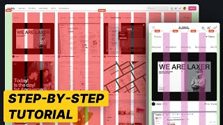
great video but i wish you showed us a demo on how exactly you went about redesigning the ui and fitting them into the proper grids. you just said you did it without any example. you're a great teacher just sthng to keep in mind for next time
Great video, I'd just say, you don't necessary HAVE TO do everything in multiples of 8, such as image height... yes it is better for visual harmony and rhythm, but there may be use-cases where you may "break the rules" while still aligning the element correctly within the 8point grid, and it doesn't necessarily mean it's wrong :) neither will each element ALWAYS adhere to a certain number of columns, e.g. your company logo may span more width than width of single column within its aspect ratio, but it doesn't necessarily mean you will right away scale it up all the way to the width of two columns, just to fit the columns layout :)
Found this super helpful and engaging! Thank you! My only question was; I read that gutters should be at least 24 to promote good spacing, but in the video you went with 8 and 16. What I should I stick with?
There are different variations of this out there. The most important thing is to make sure things are consistent. Some people use the 4point grid system, so 24 could work for the websites, but thats too much space for mobile.
Hey. Apologies, I thought I explained it well enough. Try watching the video slowly, stop and pause it, and follow along on Figma. Let me know how you get on.
Perfect. 2 questions. First its ok when i do something on 1440. My client if she/he have 1920 resolution, how they will see on prototype? I f you put actual size, they will se it small. IF they see it from a 13macbook actual size they will see it perfect. And second, for the developers, when they will do it larger screen above 1440, how i can export photos, i mean for a full screen 1920? I must design also the 1920?
Prototypes usually fit to the screen. If you're designing responsively, the final design should minimise and fit to the screen. I'm not too sure about 1920, but this is where you work collaboratively, talk to them ask them what is best and you can try different things out together. That is what I do at work.
I mentioned in the video that its up to you what size you choose, as long as you're using multiples of 8. But you should be collaborating with your developers, and decide together what size is best
Something i do not understand is that we put a 8point grid then we hadd over a column system... ? so horizontally i need to ignore the 8point system right ?
Its a bit trickier, better to just measure all the elements. All my boxes, the sizes are multiples of 8. But you can experiment with rows, by playing around with the settings. Choose rows and the size to 8px
Good question. No screen widths can vary because tech manufactures make screens of all sizes. Which is why we focus on making it responsive to fit any size 😊


Let me know how you have found using the grid in your designs 🙂
It's been so helpful. It makes work easy.
Why is your desktop Margin so low? I have seen other developers use a bigger margin for desktop. Why is this?
Happy to have discovered your channel! You speak so eloquently/your communication is very clear. Looking forward to learning from you. Thanks for sharing
Thanks so much and welcome ☺
Wow, this is a game-changer! The 8-point grid system is a secret weapon for leveling up your UI design skills. The beauty of this system lies in its simplicity and effectiveness. By adhering to an 8-pixel increment, you create a harmonious rhythm and alignment throughout your design, making it visually appealing and user-friendly.
Yes game changer indeed! Thank you for watching 😊
Using grid in design has been so helpful, tshili you are the bomb🔥.. love your teaching skills
Happy to hear that! Thank you for watching
Great video.
I love that you explained the design process and decision in a simple way.
Thanks.
Thank you! Glad it was helpful!
So refreshing to hear a great voice. Thank you!
Thanks for watching 😊
Tshili you're simply the best. You're my teacher henceforth. I'm so happy I discovered your channel. Love the way you teach. Great work 👏
Thanks so much, I'm glad you like it 😊
This is excellent. I am familiarising myself with Figma prior starting work on my first prototype and this is so massively helpful.
Also your delivery is excellent, perfect pacing, everything clearly defined. Also it helps to humanise the content having you in screen, as you talk through each point. First rate.
Thank you so much for your kind words, Im glad it was helpful
Great job with the visual hierarchy. Improved the rhythm so much.
Thank you for watching!
Ma'am....I love you. Your explanations are clear and easy to understand.
Thank you, I'm glad you find them useful
perfect explanation! thank u so much
Glad it was helpful!
Thanks for the explanation. Very thorough 💛
Glad you found it useful
Thank you for sharing, i am sticking with 8 grid system in all my designs.
Amazing! Thank you for watching
1 year ago video has worn you a subscriber 😊😊.
I'm a beginner, just start
@@ziontech1586 thank you for watching
Very useful and practical content!! Absolutely what I need. Thank you so muchhh :)
You're very welcome!
@uxtshili this was EXTREMELY helpful. I love the way you explained everything with the visuals. Thank you so much. So happy I found your channel. I'm a new subby.
Thanks for your kind words, I'm glad you found it useful
Interesting to see and watch how you redesigned the screens with your concept!!! Makes it a unique tutorial and i love the hands-on approach style of teaching
Thank you very much! Glad you found it useful 😊
More video like this thank you so much
@@asoume24 will be making more soon 😊
great video but i wish you showed us a demo on how exactly you went about redesigning the ui and fitting them into the proper grids. you just said you did it without any example. you're a great teacher just sthng to keep in mind for next time
Sorry about that, will keep in mind next time 😊
So helpful thank you
You're so welcome!
superb video thank u
@@sergeyagronov9650 thank you for watching
You are a great Teacher. Thank you :)
Thank you for watching
Great video, I'd just say, you don't necessary HAVE TO do everything in multiples of 8, such as image height... yes it is better for visual harmony and rhythm, but there may be use-cases where you may "break the rules" while still aligning the element correctly within the 8point grid, and it doesn't necessarily mean it's wrong :) neither will each element ALWAYS adhere to a certain number of columns, e.g. your company logo may span more width than width of single column within its aspect ratio, but it doesn't necessarily mean you will right away scale it up all the way to the width of two columns, just to fit the columns layout :)
Yes I totally agree, but that is advanced design thinking 😅 this rule helps those who are struggling to make their designs look polished
Great video! I’ve deffo seen an improvement in my work!
Glad to hear!
thank you.
Thank you nfor watching
Good job,i cant wait to see the video on colors.
Coming soon! Thank you for watching
Interesting. Thank you
Pls make a video on components
Thank you for watching. Yes its on the list 🙂
This helped so much! Thank you!
Glad it helped! 😊
Informative :)
Glad it was helpful!
very good content! thank you :)
Thanks for watching 😊
So helpful! Thank you
You're welcome!
This is amazing! thank you for sharing!
Glad you enjoyed it!
Thank you !
Thank you for watching 😊
thank you. great video dear
Thanks for watching 😊
The redesign is killer
Thank you
Also a video on how to make userflows would be nice
Thanks
It's on the list!
Thanks for this
Couldn't agree more!... Grids really makes my work neat
Sometimes, I use 4pt...I hope that's okay too?
Absolutely!
Nice one, can you do a video on how to ideate and make sketches
Great idea!
Great!Thanks!
Thank you for watching 😊
Super helpful.
Thank you for watching
MUCHAS gracias!
De nada! Thanks for watching
Great video!!! Does the 8pt grid system applicable to web design
Thank you. Yes it does. I show it at 03:07 if you watch that part again
Fantastic
Thanks for watching
Found this super helpful and engaging! Thank you!
My only question was; I read that gutters should be at least 24 to promote good spacing, but in the video you went with 8 and 16. What I should I stick with?
There are different variations of this out there. The most important thing is to make sure things are consistent. Some people use the 4point grid system, so 24 could work for the websites, but thats too much space for mobile.
@@uxtshili ahhhhh right, thank you x
you could have shared this file for our understanding beginners
Hey. Apologies, I thought I explained it well enough. Try watching the video slowly, stop and pause it, and follow along on Figma. Let me know how you get on.
@@uxtshili Thankyou for your response I have gone through the video if we would have got reference file what you were explaining it would be helpful
Perfect. 2 questions. First its ok when i do something on 1440. My client if she/he have 1920 resolution, how they will see on prototype? I f you put actual size, they will se it small. IF they see it from a 13macbook actual size they will see it perfect. And second, for the developers, when they will do it larger screen above 1440, how i can export photos, i mean for a full screen 1920? I must design also the 1920?
Prototypes usually fit to the screen. If you're designing responsively, the final design should minimise and fit to the screen. I'm not too sure about 1920, but this is where you work collaboratively, talk to them ask them what is best and you can try different things out together. That is what I do at work.
What numbers in the 8-grid should I use when working with frames (1512x982) Is it the same as deskshop?
Hi I use 1400 wide, any length
Subscribed ❤️
Thank you for watching
🎉
For desktop you are only using 32px Margin. I see many developers use like 90-120px. Any reasons for this?
I mentioned in the video that its up to you what size you choose, as long as you're using multiples of 8. But you should be collaborating with your developers, and decide together what size is best
What about row? Tshili
Great question. If you make sure you’ve measured the sizes properly, they will align.
@@uxtshili but from my knowledge on Row I use 800 for count
Type : center
Gutter 0
Height 8
For me to get a proper alignment
Something i do not understand is that we put a 8point grid then we hadd over a column system... ? so horizontally i need to ignore the 8point system right ?
Thats a good point I need to make a part 2 video. But you can also use the same grid horrizontally if you need it
How do you grid vertically
Its a bit trickier, better to just measure all the elements. All my boxes, the sizes are multiples of 8. But you can experiment with rows, by playing around with the settings. Choose rows and the size to 8px
❤❤❤❤❤
😊😊
Why the grid called 8 point grid if you are using px? It sound confusing, I think it is better to called it 8px Grid System.
You're right! But the words are used interchangeably even though theyre technically not the same.
best videos!
Thanks so much 😊
Great video, i was just wondering how the screen’s width is related… shouldn’t it be a multiple of 8 too?🤔
Good question. No screen widths can vary because tech manufactures make screens of all sizes. Which is why we focus on making it responsive to fit any size 😊