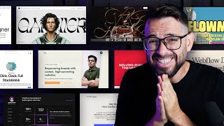
Website Footer Design Inspiration (Best practices in 2024)
Вставка
- Опубліковано 7 вер 2024
- Web Designers, do not neglect your footers! A footer is the last thing a user sees when they scroll down to the bottom of the page. So use the opportunity to grab them before they close the window.
Here’s some live examples and best practices to show you what footer excellence looks like in 2024.
Learn to design high-end websites with our Web Design Pro course 👉 bit.ly/3yPCYG8
Featured websites:
53w53.com/
revenant.tv/
madebyshape.co...
www.framer.com/
www.figma.com/
www.designisfu...
hoodzpahdesign...
secrid.com/
kozowood.com/
acctual.com/
localstudio.fr/
www.baggu.com/
teenage.engine...
📱 Find us on SOCIAL MEDIA
Matt's UA-cam channel 👉 @MattBruntonUK
Flux Academy's Instagram 👉 / flux.academy
Flux Academy's TikTok 👉 / fluxacademy


Weirdly enough, for me this was inspirational not for the footer but the various elements used in footer that I could use in my designs. Thank you.
Hope you enjoyed this one. Shout out to all the brilliant designers and companies featured. ✌
The overhead shot is of Cleveland Williams knocked out by Ali in 1966. It is not an overhead of the Sonny Liston knockdown shown in the famous "face" photo.
As to footers, so much of footer design depends on the nature of the business. I doubt if most users bother to scroll to a page end anyway. The nav bar tells them what the site map would. People interested in the legal status of an organisation will scroll to the end. As will those curious as to who the web designer was since many sites have a link to the web design company at the page end. A JavaScript calendar/diary is a common feature in a footer. As is a signup button for a newsletter. And of course the odd boast about prizes won and distinguished accreditations.
Thanks for this. maybe you can do a series on Mobile version designs. Weall seem to focus on desktop designs while ingoring a major platform
That was awesome and very inspiring. I've been kinda stumped with footer designs for awhile now, but somehow seem to pull them out. Especially lately. Bookmarked this video for future ideas...can use all the help I need.
Great to hear!
Second looks sick
Footer is a second hero
Great for web/desktop inspiration, but what is with mobile view/mWeb - mobile first? It's different UX here.
how does it works in mobile size
Have a look! All the links are in the description.
What program did you use to edit this video?
Adobe Premiere Pro
all of these are simply horrible.
Dont like my comment 🍀
ok....