Creating Matrix Visual

Вставка
- Опубліковано 25 лип 2024
- Welcome to our comprehensive tutorial on inserting and customizing a Matrix in Power BI! Whether you're a beginner or looking to refine your data visualization skills, this video will guide you through the process of adding a Matrix visual to your Power BI reports.
🔍 What You'll Learn:
Understanding what a Matrix visual is and its benefits
Step-by-step process to insert a Matrix in Power BI
How to configure rows, columns, and values in a Matrix
Customizing the Matrix for better readability and aesthetics
Tips and tricks for effective data presentation using a Matrix
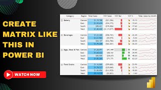
📊 Why Use a Matrix in Power BI?
A Matrix visual is a powerful tool in Power BI that allows you to create cross-tabular reports. It's perfect for displaying data in a compact and readable format, helping you to compare and analyze data across multiple dimensions.
📘 Additional Resources:
Calendar =
VAR Days = CALENDAR ( DATE ( 2016, 1, 1 ), DATE ( 2018, 12, 31 ) )
RETURN ADDCOLUMNS (
Days,
"Year", YEAR ( [Date] ),
"Month Number", MONTH ( [Date] ),
"Month", FORMAT ( [Date], "mmmm" ),
"Year Month Number", YEAR ( [Date] ) * 12 + MONTH ( [Date] ) - 1,
"Year Month", FORMAT ( [Date], "mmm yy" ),
"Week Number", WEEKNUM ( [Date] ),
"Week Number and Year", "W" & WEEKNUM ( [Date] ) & " " & YEAR ( [Date] ),
"WeekYearNumber", YEAR ( [Date] ) & 100 + WEEKNUM ( [Date] ),
"Is Working Day",not WEEKDAY([Date]) in {1,7}
)
👍 Like, Share, and Subscribe!
If you found this video helpful, please give it a thumbs up and share it with others who might benefit from it. Don't forget to subscribe to our channel and hit the bell icon to stay updated with our latest tutorials!
💬 Join the Conversation:
Have questions or suggestions? Drop them in the comments below. We love hearing from you!