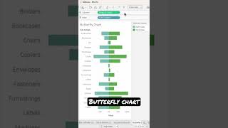
Tableau speed charting | 50 charts in 50 minutes

Вставка
- Опубліковано 22 лип 2024
- In one of the top-rated sessions for TC17 and TC16, Tableau Zen Masters Andy Kriebel and Jeffrey Shaffer raced the clock and counted Tableau tips. Andy and Jeff are stepping it up for TC18 and will be attempting 50 charts in 50 minutes. Don't miss this fast-paced and fun session.


I always wait for this session in TC
The problem with the lollipop chart is that the dots start at the center rather than at the outer edge. This makes the chart look ugly if the dot is large enough to cover the entire bar (on a low quantity). It's of course possible to offset the dot with a custom shape, but it'd be nicer if there was a simple checkbox to fill whether the dot starts at the left edge, center, or right edge.
Hi @everyone - where do we get to see these datasets from?
I would love to see the power BI guys try and do this type of presentation :P
I think it would be better if there's a timestamp for each chart type on the description so it's easier to check
“Axis” not “Access”
The pareto charts line didn't go to one hundred percent...
Not all of the chart was shown. It went waaaay over to the right...
@@AndyHolt2 right on, thanks for the response man! Great video!
@@LBizKid04 It's good, eh? There's always a few great little gems in there, however good you are