What Makes This Logo Great? The Story Behind the Milwaukee Brewers' Classic 'Ball In Glove' Logo

Вставка
- Опубліковано 8 вер 2024
- In this All Sports History video, we'll take a look back to the late 1970's when the Milwaukee Brewers in one of the greatest sports moments of all time, introduced the iconic “Ball-In-Glove” logo. The design quickly became a modern classic and a symbol for the Brewers, the community, and baseball fans alike. So why after almost two decades was the logo replaced, and why did it take the team so long to bring the logo back? In today’s video we’ll take a look back at how the legendary Milwaukee Brewers logo came to be and why it has remained so popular to this day.
What this "Milwaukee Brewers documentary" video includes:
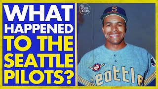
The Milwaukee Brewers history actually begins in Seattle, when in 1969 Major League Baseball expanded and added four new teams to the league. The San Diego Padres and Montreal Expos joined the National League, while the Kansas City Royals and Seattle Pilots joined the American League. After only one season, the Seattle Pilots found themselves in deep financial trouble and were heading for bankruptcy. Immediately following the conclusion of their first season, Pilots owner Dewy Soriano met with car salesman and former Milwaukee Braves minority owner Bud Selig about selling the team to Selig. Both sides met over the course of several weeks, and during game one of the 1969 World Series, the two men agreed on a deal for $10.8 million dollars.
On April 1, 1970, the Seattle Pilots officially relocated to Milwaukee and changed their name to the Brewers. The team decided on the name “Brewers” as a homage to the defunct minor league baseball team, the Milwaukee Brewers. Originally, Bud Selig wanted the Brewers to wear blue and red Milwaukee Brewers jerseys, much like the Braves did when they were in Milwaukee. But due to the time constraints, the Brewers were forced to use the same blue and gold jerseys that the Pilots wore the season before (just with updated naming). As for the logo, the Brewers opted for a simple “M” logo on their caps, which was also a nod to the block M logo that the Milwaukee Braves used. During this time, the Brewers also introduced the “Barrel man” logo which was inspired by a similar Barrel man logo that the minor league Brewers had also used. These logos would remain as the primary branding for the Brewers for eight seasons.
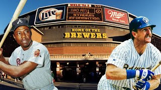
By the late 1970’s, the Brewers were looking to update their branding and phase out their older logos. During this time, the team also held a design contest for a new logo. A college student named Tom Meindel submitted what would become the winning sports logo design. In Meindel’s original concept, the now iconic, “Ball-In-Glove'' logo had brown and yellow colors and featured hidden elements. The fingers on the baseball glove portion of the logo, when isolated, makes an “M” shape for Milwaukee. The thumb and pocket area of the glove form the letter “B” for Brewers, with a baseball in the middle. When all put together, it forms the letters “M-B” for Milwaukee Brewers. The new branding proved to be a hit, and the Brewers also improved their play on the field. They finished the 1978 season with a 93-69 record, which earned Bud Selig the MLB executive of the year award. The Brewers new found success would carry on into the following seasons with Milwaukee Brewers playoffs appearances. The team clinching the 1982 ALCS, earning the first ever Milwaukee Brewers World Series appearance. With that, the club continued to use the Ball-In-Glove logo for the rest of the 1980’s and into the early 1990’s highlighting some of the brewers best moments.
Despite the Milwaukee Brewers highlights of the 80's, a new logo in 1994 for the 25th anniversary of the team. They'd used it for the rest of the 1990’s, until the year 2000, when they introduced an updated logo to mark the final season of the club playing at Milwaukee Brewers Stadium (County Stadium). The new logo featured the word “Brewers” in front of a baseball, with two stems of barley underneath (as barley being a key ingredient to beer making). The team would use this logo, and a simplified letter “M” version of it introduced in 2017, during most of the Milwaukee Brewers Ryan Braun era. As with the 25th anniversary, the team wanted to celebrate the major milestone of 50 years in Milwaukee by rebranding with new logos. A new design was introduced that updated the classic "Ball-In-Glove" look, that thrilled Brewers fans. In 2011, Bleacher Report ranked the 50 best baseball logos of all time and placed the Brewers’ Ball-In-Glove logo number 8 on their list, while surprisingly placing the Barrel man logo at number 2.
So what did you guys think about the Brewers logo ranked number 8 on BR's all time baseball logos list? Would you place it higher or lower on the list? Let me know in the comments below!
What Makes This Logo Great? The Story Behind the Milwaukee Brewers' Classic 'Ball In Glove' Logo


Hey everyone! What did you guys think about Bleacher Report ranking the Brewers logo as number 8 on their all time baseball logos list? Would you place it higher or lower on the list? Let me know in the comments below!
Because im biased as a brewers fan...its number 1 on my list.
The Brewers' current logo is the #1 best MLB logo, right alongside the Blue Jays' current logo.
While there are other sports logos that are more well known / popular, if rankings are based STRICTLY on the logo itself & associated sport it is arguably THE perfect sports logo. Team initials combined to create the gear used in the sport.
Replacing the logo was one of the Brewer's biggest mistakes. I was ecstatic when they brought it back. Truly one of the professional sports most classic logos.
Agreed!
Now they just to bring back the 90’s cursive Brewers and pinstripes jersey.
I'm not even a Brewers fan and I love that logo! It's one of the best of all time!
Agreed!
It’s really helped by their awesome uniforms that pop and do a good job of capturing the Brewers icons with grain leaves
Totally agree!
im from canada, i never realized the letters m and b were in the logo ... i just saw the ball and glove. great design ! :)
Hard to unsee once you see it! Amazing logo in my opinion.
the baseball is part of it too, all together its for Milwaukee Brewers Baseball'
@@KerryGlaman i watched the highlights of the most recent brewers' game last night and now i see the m and the b in the logo before i even notice the baseball, things are reversed ! i also appreciated seeing the mascot going down the slide after the grand slam ! "look at that guy !" ;) (june 30th 2024)
@@mikehalpern384 Thats "Bernie Brewer" going down the slide.
@@KerryGlaman thanks for the information ! yes, bernie definitely looked happy going down the slide after a grand slam, special occasion ! i'll have to do a google search on bernie brewer now to read more about the mascot and that great slide celebration ... ;)
I've had the ball and glove logo tattooed on my right shoulder since 2006 or so. I've always liked the logo, and I hope they never get rid of it again!
That’s awesome!
The Milwaukee Brewers Classic logo is brilliant. 😀👍⚾️
Indeed it is!
Absolutely iconic. Best logo of all time IMO.
Agreed!
As a graphic artist, I’ve always loved this logo design. It’s definitely one of the best logos in the MLB. And I’m not a Brewer’s fan necessarily, but I would like to see them finally win a championship.
Yeah I’m not a Brewers fan either, but I’ve always admired the logo.
The logo should've never been replaced.
Agreed!
Especially since the one that replaced it (the interlocking M B) was, IMO, incredibly ugly
When you're a small market team with little success and haven't been around for a century, constant change is inevitable. Anything to help merchandise sales.
The ball in the glove mb has always been my favorite logo for the Milwaukee Brewers.
Mine too!
I would like to see a continuation of this series. This is well put together and I think you're on to something here.
Thank you! Yeah I’d like to do videos on other logos like the Nordiques, Whalers, Expos, etc.
@@AllSportsHistory Nordiques logo is on par with this one. Similar style, too. Always loved them both.
The minor update to the ball and glove logo during the 2020 redesign is perfection. They better not ever change the logo we have now.
As a kid in WI, I always wondered why the glove had three fingers. Took me a long time to realize they had a cool logo.
I always liked the expos uniforms, but I couldn't figure out what their logo meant or what an expo was. Thanks to the internet I now know these things
I was mad in the 90s when they changed it. It has always been my favorite logo.
In 1901, the Milwaukee Brewers were one of the original teams in the American League. The next season, they moved to St. Louis and became the Browns. Today, they are the Baltimore Orioles.
Correct
So the original artist didn't get any royalties for his iconic logo. Glad he got paid fairly and what bragging rights the guy had. I would be honored if a team used my idea.
Yeah, I think the artist mentioned he was disappointed when the team moved away from the logo in the mid '90s, but was happy it would live on in throwback uniforms, and other memorabilia. Sadly, he passed away before the Brewers brought it back in 2020.
@@AllSportsHistory When the Boston Patriots started in 1960, their helmet logo was a simple tri-corner hat with the player's number beneath it. Worcester Telegram cartoonist Phil Bissell created the original "Pat Patriot" logo unintentionally. He simply drew a picture of a Minuteman hiking a football, to go along with an article about the new team. Billy Sullivan liked it so much that he made it the official Patriots logo. Bissell never got any royalties for it, and I think he never asked for any. The real reason why the Patriots don't use it anymore is because Pat Patriot is too colorful. It was the most ornate logo in the NFL, but it was very difficult to reproduce. Sullivan was toying with ideas and even came up with a new logo around 1979. But a fan poll voted overwhelmingly in favor of Pat Patriot.
The "Flying Elvis" logo was created in 1992, because then-owner James Orthwein wanted to move the team to St. Louis and re-name it the "Spirits" (after Charles Lindbergh's airplane). That's why the logo is a sort of "ghostly" image. Fortunately, Bob Kraft owned Foxboro Stadium and refused to let the Patriots out of the lease. Orthwein finally caved in and sold the team to Kraft for a then-record price of $200 million. (Kraft admitted he "overpaid" for the team. Can you believe that?)
The Buffalo Sabres got their name from a name-the-team contest. The guy who suggested it only got season tickets for the first year
@@ianlalonde5373 So did the Philadelphia Flyers. One of the prizes for winning the contest was a 21" color TV set. The PC monitor I watched this video on is 21".
The team profits from the use of the logo. The logo is the product of the artist's labor. Continuing royalties paid to the artist are fair and merited. As long as the Brewers use the logo as a marketing tool to generate revenue the artist should receive royalties [edited]
The MB ball and glove logo is simplistic, in a good way and feels iconic. I like that logo. I think the interlocking MB is the worst, it just looks too busy.. The M with the barley or grain is a great logo as well.
Agreed, the 90's interlocking MB and its muted colors just feels lifeless compared to the Ball in Glove.
@@AllSportsHistory I'm surprised they didn't use teal, that would have been even more 90s
Expos logo was really good as well.
Yeah I’d like to do a video on their logo as well.
One of my very favorites hat I purchased was an all black with white outline of this logo. Dope logo
Yeah the all black looks sick
I love this logo!! It’s perfect
Keep making these! I love learning about logos. I’d love to see one about the Chicago Bulls
Yeah I definitely want to continue this as a series. The Bulls have a classic logo as well, haven’t changed it since the 60’s!
I will say... the second rebrand (the M with the little stalk of wheat underneath) was actually pretty good as well. The ball and glove logo is waaaaaaay better, of course, but that other one was pretty good.
You did a FANTASTIC job on this video. Very professional. Excellent work.
Thank you very much! Glad you enjoyed the video :)
Nice video but I do have to tell you that the 2000 logo update was for the then-scheduled opening of Miller Park for the 2000 season. However the crane collapse pushed back the opening for 2001.
Ah my bad, thanks for the added context!
I love that they brought the old logo back, but I still like the original version and colors better. It would be so cool if the Brewers went all in for nostalgia and reclaimed the powder blue uniforms from the 70s and early 80s, also.
Yeah they sort of brought back the powder blue with the city connect but I’d love to see a true throwback uniform brought back.
Agreed! That would arguably make them the greatest and imho most unique stand-out "blue colored" teams in the entire MLB and make them even more "iconic" I guess? Loved the vid!
Thus is arguably rhe best logo un MLB history. Theres no debate 🎤
Anyways. Heres a few suggestions for a few videos.
Why is the Manning family so important in the NFL?
What happened to the Tampa Bay Mutiny?
What happened to the San Diego Rockets?
Why are rhe Dallas Cowboys so valuable?
The story behind former Islanders GM Bill Torrey?
Why is PNC Park so special?
Those are all great ideas, especially the Mutiny, Rockets, and PNC park ideas.
Lol. WTF are you smoking? Ludes?
What a nice content
The reason why this logo is so beloved is the exact reason why I loved it growing up - you could draw it, essentially from memory, and easily. You don't want to know how many things I doodled the Brewer logo on growing up...
I admit that I never really cared for the "Germanic Lettering" of the 1990's, and I always thought the 2000 rebrand was essentially a kow-tow to Miller Brewing.
The Ball-In-Glove is, IMNSHO, the best logo in baseball.
That's a great point, I remember drawing all of the MLB logos as a kid and the Brewers was a favorite of mine to illustrate.
I grew up only knowing this brewers logo and was upset when they changed it as I believe it’s one of the most clever designs in all of sports and it warms my heart to see it return.
Yeah so glad it’s back!
Hartford Whalers also had an iconic logo
Agreed, that Whalers logo is a classic!
Now this is a good video
Thank you!
I would go number 1 for the ball and glove logo
Yeah, go Brew Crew!
Only Bud Selig could replace something so original and unique like the 80s brewers logo with something so sterile and dull like the Brewers jerseys of the 00s.
Haha agreed!
As a Canadian who really does not follow baseball but loves Logos. My top 3 have to be 1. BlueJays (not because I am Canadian but just because it is good!), 2. NY Yankees. (So Iconic) 3. Milwaukee Brewers (Because it is BASEBALL!!!!). These are the top 3 logos in the MLB I can think of.
I’ve always loved the Blue Jays classic logo and type font on their jerseys. Instantly recognizable and unique.
The ball in glove is the best. From an on old Cards fan
Agreed!
That blue and yellow/cream is the predominant color of many things around the city, mainly being all the highway sound walls and bridge beams. 😂
Great video! I think now you are going to have to do a video on the Phoenix Coyotes
Thank you! Yes I’m working on the coyotes video as my next one :)
The mustache in the thumbnail is what makes this logo great
💯
@mrpopsful that thumbnail is a picture of Rollie Fingers the great relief pitcher….heard of him????,!!!..I hope you will reply to this
@@sherryhannah9262 i have heard of him. I think he was part of some kind of mustache club with the A's with Catfish Hunter and someone else.. I thought it was maybe Dennis Eckersly but he wasnt on the team yet
I am a Brewers fan from Upstate NY. I have the Brewers mit cap and love it, but for some reason, I prefer to wear the "wheat" cap. They are hard to find but bought multiple ones. Nonetheless, the Brewers have always had a great look.
Interesting, didn’t know they’ve become hard to find. I even like the newer alternate logo with the wheat as baseball seams.
@@AllSportsHistory They are not available on the Brewers Fanatics website. Found a place in LA that still have them in stock.
Some team logos or team uniforms should never be changed.
Agreed!
As a kid I thought it was lame to use a baseball glove. I was an adult before I really saw what it was and now I think it's one of the best logos in sports!!
Yeah I remember thinking it was odd to see a baseball glove as a logo when I was a kid. Once I realized how it has this duel purpose of symbolizing the “MB” but also is a baseball glove, I absolutely loved it.
When I was a less-than-observant kid, I did not care for this logo as I thought it was too kid-focused and cartoonish.
When I got older and finally saw the MB, I realized it was the best logo in pro sports.
Yep definitely one of the best!
Fans were never happy when then-GM Sal Bando abandoned the ball and glove for the Notre Dame ripoff known as "Motre Bame," and even during the Barley-M years--a drastic improvement over its immediate predecessor--there were constant calls for its return. It's one of the best logos in the sport--clever, and purely _baseball_ in a way that few others in MLB even come close to.
Couldn’t agree more, especially with the purely baseball part. I think that’s exactly right.
The MB glove top 3 logos in MLB
Agreed!
6:16 Do you also the notice the difference with the baseballs in each on? The old logo kind of had a yellowish s shaped or it kind of looks very similar to the Pepsi globe logo from the late 1990's to 2009. The Baseball in the new logo has 2 curved gold lines to emphasize the part of the baseball with the stitch marks at at from ends and this is the part that pitchers typically hold when pitching the ball. As a Brewers fan, that was something I noticed. But I would have rank the Ball and Glove logo as the number 1 MLB logo personally.
It was only about 4 years ago when I realized that the Brewers mit was a M & B.
You are not alone, a lot of people never realize it all!
The hand in the pocket is beyond cold. This dude fucking rules. That being said... it's fucking embarrassing that us Americans have only gotten 1 medal in shooting.
It's a great logo. I'm generally not a fan of letters comprising a logo, but this case transcends that. The only other exceptions I can think of are The Hartford Whalers, The Montreal Expos, and the Green Bay Packers. Other than that, letters are unimaginative for the most part.
I’d also throw in the Nordiques “N” shaped igloo logo.
I agree. I used to run a fantasy football league called the Couch Potato Football League; all team names had to be potato themed. I designed helmets and uniforms for the league. Most teams were named after potato dishes and I just used monograms for logos. The potato does not really lend itself graphically.
@@tygrkhat4087 Kinda funny.
@@AllSportsHistory Yeah, pretty good too. I'd love to see the Nordiques back in the league.
Next episode- 'What Makes This Mustache Great' featuring Rolly Fingers.
Would definitely make a “Top ten greatest facial hair in baseball history”
The ball and glove is brilliantly simple. The one in the late 1990s was far more complicated and puzzle-like, which makes it garbage for a logo. If a kid can easily doodle a simple, universally recognizable logo they saw on a team or product they liked, then it is a winner as far as brand recognition. As a Wisconsinite, I was angry when they got rid of the ball and glove logo, and thrilled when they brought it back.
Some random Milwaukee artist came up with the ball and glove logo, just as a random St Norbert’s art student designed the iconic Packer “G” logo… meanwhile the Milwaukee Bucks spend millions changing logos every 15 years
Yeah what the Bucks have now is decent, it feels more like a happy medium between the old 60’s style and their more recent branding since the 90’s/00’s.
The "m" over "b" logo with baseball in "mitt" is the sh*t. Not sure who ranked 7 spots ahead of them, but how creative is the "m over b" logo? I watch all three of our major sports (and, yes [admittedly], MLS and WNBA sometimes). Who has this creatively of this logo???
I agree, it should be ranked higher. It’s definitely one of the best of all time!
Barrel-man was not an attractive logo, and I was glad to see it gone. But the ball-glove logo is brilliant - so simple and compact.
Bucks have a pretty good logo also.
Sometimes you just get a perfect logo and should just stick with it. Back in state quarter days, people from Wyoming I knew just wanted theirs to be “the horse.” They got it.
I like the antlers in the Bucks logo. They create a basketball
I’m 41, and I just noticed the MB about two years ago. 🤦🏼♂️
From George Nemitz, you don't know me, but I say the logo for the team stays whether you like it, or not.
I prefer the gold of the last Brewers jerseys but the ball and glove logo is better.
The ball and glove logo was the reason I became a Brewer fan. I thought it was the best logo in baseball. Sadly the designer of it committed suicide a few years ago.
Barrelman was fun.
Ive always thought the ball and glove logo was cool. I might go buy the cap bow even though i dont folllw the team.
Not a brewers fan myself but I had a hat when I was a kid.
Only one other team logo is at the same caliber of cleverness as the Milwaukee Brewers glove logo and that is the Hartford Whalers logo, before they became the Hurricanes.
Agreed! I’ll probably do another video on the Whalers logo sometime soon.
I always thought it was a baseball glove with a ball for 40 years. Then one day I noticed it was an mb.
I will never drink another miller beer for their part in trying to replace this legendary team logo with their crap malt barley M
It’s impossible to objectively rank MLB logos with so many iconic ones. I enjoy the mb but it always felt like a lesser design of what became the Phillies P (retro). I also really like the similar area styling of the O’s Oriole head and the Mariners trident M. Then there’s the classic Yankees, Dodgers or Giants interlock initials. The also classic and stark Boston B, Pirates P, and the simple but symmetry of the Angels halo A. I think the only think we can all agree on is the Nats W looks like Walgreens and Cleveland’s flying baseball logo is awful (especially compared the the classic C they were previously using).
lol yeah those Cleveland logos remind me of the old windows flying toasters.
MLB Rule 3.03(g) No part of the uniform shall include a pattern that imitates or suggests the shape of a baseball.
Clearly MLB doesn’t feel that strongly about that rule or they’d enforce it with the Brewers!
Fun video, thanks! We’re long-time Brewer fans, and Barrel man is my least-favorite logo. Ball-in-Glove is clever, perhaps one of the best ever logos. But I also like the “M” underlined by barley logo more. Just a preference.
The ‘90s logo I HATED! As soon as I saw it, I wondered aloud “BM as a cap logo?? How long will it take for them to be called ‘the shit heads?’”
I actually like the colors & font of the letters. But that “BM” on the cap was just an awful idea.
Yeah that 90's logo just seemed to lack any personality or charm.
Speaking as a working designer and a Cubs fan, I have to say the only thing I like about the Brewers is their logo. It’s pretty perfect. Now, if only my favorite team would ditch their lame mark…
Would be interested in seeing what you’d come up with for a new Cubs logo!
The ball in glove logo should be #1. The barrel man logo can drop down to 50.
before i start watching, ive just realised the thumb and palm with the ball was a 'b.' i
Yep exactly!
I can't stand seeing the m and the b connected. Just looks wrong. The original was perfect.
Yeah I prefer the original version better as well.
I'm A lifelong Cubs fan that HATES the Brewers, how have I somehow never noticed that the glove is a MB?!
You’ll never unsee it now!
Money over B*tches. LOL
well Brewers took the season series from ya so maybe you'll do better next year. (probably not though) :)
The pocket and thumb were the B while the fingers were the M
Exactly
Selig Auto is still in Milwaukee and you can still buy a new car there.
and people still think it’s a “boring logo; it’s just a baseball and a glove”. Durrr
It’s definitely one of the most unique logos in sports!
I thought it was a sports logo tragedy when they dumped the classic ball & glove for the ugly hideous MB & bats diamond logo. The color combo of the 90's was pretty hideous as well, navy, gold & green 🤮. So glad they brought the logo back and I actually like the current updated version of it a bit more and prefer the darker shade of midnight blue instead. Makes the yellow gold pop and stand out more as oppose to the royal blue. Now if they can just leave it be and don't change a thing ever.
Yeah I couldn't believe that it took them so long to bring it back!
EAU CLAIRE MENTIONED
It stuns me the amount of people who don't realize it's an M and a B.
It’s surprising to me too!
Like most people, I think the original ball and glove logo should have never been changed. It still looks a little off with the connected M and B. Same with the lettering and the colors. Every sport does this stupid crap, and then they wonder why they lose fans. It's never just the logo, or this or that. MLB, NFL, NASCAR, NHL, etc.
Yeah, some things are not great and can be changed, but this was always one of the best things about the Brewers. The old uniforms had style and were unique. A lot of the past couple decades have looked processed and bland. Even the throwback uniforms (in most sports) look like "our modern take" on the old uniform.
A lot of traditions and things of that nature are really stupid. I can name two dozen things off the top of generational stupidity and lack of critical thinking. The thing about things like baseball, is that it was supposed to be a timeless thing. Something that only changed when necessary, like safety for example. It's an old school game. Sports organizations seem to forget the best days of their respective sports, and try for the "casual fans," which never works. The more of the past you can hold onto, the better, or you lose why people came to it in the first place.
8 is way lower than 1.
Should be higher!
I recall when the yearly SI baseball preview came out and I saw the changed logo. Insane and so much worse
A little m on top of a driver hitting a golf ball.
lol that's one way to look at it!
The ball in the mitt logo is without a doubt, the best Milwaukee Brewers logo but that Bleacher Report 50 greatest baseball logos of all time? It’s pretty infamous for being an overall terrible group of selections. They have at #1 the worst Oakland A’s logo in the ball clubs history. It’s also inaccurate as to when the logos were used. And forget about the short paragraphs explaining each logo, they read like one of the reporters brought it home and let his nine-year-old write it up.
Yeah I'm pretty sure the BR article was designed as rage bait, which most of these kind of lists are lol.
I actually like the milwaukee logo from the 2000s the best and uniforms better.
Yeah they're not bad, a whole generation grew up on them and will probably one day push to bring them back.
The people of Washington waited decades for Major League Baseball and the team they got and the antique stadium they played in was very bad. It was awfully cruel to millions of citizens to just sell off the team after only two seasons.
If this logo was great, why was it gone in 1994? and they also added green as a color
At the time the team felt it was dated and too “70’s” looking. For the 25th anniversary they wanted to introduce a new logo that reflected the taste of the mid 1990’s, hence the darker, muted colors and the addition of green.
The haven't driven it into the ground yet. Give them time. They'll have a really annoying player to go with it. Luckily retro wasn't big when Braun was.
I hope not lol
If you're a brewer of whatever beverage you make. I really think a ball inside a glove doesn't make for a good Logo as far as representation of a team🤷♂️
That’s a fair point, but a lot of teams logos aren’t representative of the team name and lean more on representing the city instead. Giants, padres, Rockies, dodgers, Yankees, Mets, etc.
I know most of you don't see it; but it is in most logos of our time... Mason's love their duality. There is a 3 and 6 in this logo, or 666
The only great thing about the Brewers is that logo!
nah, they are a young, fun, fast team.
😅😅😅
It ain't cool I like the m with the wheat on it
That one was a little too bland for me.
@@AllSportsHistory it's a classic
I like how it looks like a beer logo
@@White_sox_fan Yeah it's not a bad logo, I just really like the clever incorporation of the MB into the baseball glove design. It's also a very clean and easily recognizable symbol, which makes it great in my opinion.
@@big_lolo_01 Yeah it's a cool nod to the beer industry and Milwaukee but I just think the baseball glove is a really clever and great looking logo.
That 1990’s logo was horrible.
I swear I’m the only brewers fan that hates the logo. I honestly think it should have stayed in the 70s, the logo used in the 2000s and 2010s was sooooo much better
I left the same exact comment so glad I'm not alone this logo is dated rubbish
@@oppositeofthetruth You're both wrong.
Sure beats the Montreal Expos WORST logo of all times. elb.
I don’t know, I’ve always liked the Expos logo 🤷
@@AllSportsHistory It doesn't look like an M. It looks like elb.
It's a clever logo but for me it's also very "cartoonish" and not professional.
Not like the distinctive M caps w/ the barley. Absolutely great look...going back to that glove logo was a step back.
I disagree but I get that people are really attached to the M with barley look.
well that's just like your opinion man
Who said it was GREAT? Nobody I know..I think you're living in FANTASY LAND
I mentioned Bleacher Report in the video ranking it number 8 on their all time list, BUT you don’t have to like it.. that’s ok. I’m curious what you have against it?
Everyone I know loves it.
you edited this comment and it's still this bad? wow good job
theres nothing important about team logos. especially milwaukees
Logo nihilism, I love it.
sure thing buddy, time for bed.
Worst logo design ever. Looks like something a high school art student would design for a contest.
You were close, it was actually a college art student who designed it.👍
Answer? Nothing. 70s crap. Crew has looked much better.
All good, what logos do you consider great?