I hope you know what a fabulous contribution you are making to the world (and I am not being sarcastic here). So many professionals spend so many hours on decks and yet fail to communicate their message... You are just making their lives so much better through this channel.
Hi Paul, the step-by-step animated visual evolvement is a quantum jump in improving the value of your videos. Also, the way you structure the video (Intro, tell what you want to tell, tell it, tell what you told) and the conversational tone adds to the jump in quality and value. Congrats, keep on going!
It's a great pleasure to watch someone really masterful do their magic! And a bonus that you managed to very clearly convey the logic of what you were doing. Thanks!
Generally, those great at preparing slide deck are not good at explaining the rationale, and those good at explanations are not good at their creativity. You're great at both Creativity and Explanation. While as a great coach, your videos helps to put our perspective in a right direction - in a simple yet effective way. Your courses are simply great for all consultants. Many Thanks for this great video!👍
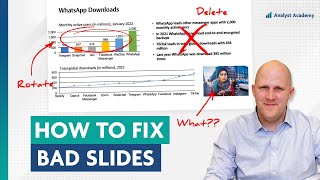
The high/low estimate chart can be improved by using a simple horizontal line that goes from 0 to 1. Mark 5% as low estimate, 22% as high estimate, and scrap the 17% number entirely - it’s quite distracting from the low/high estimate that we want to communicate.
@@lifebasesolutions3405 Yep - that screamed out at me - plus the original key showed a solid line and the diagram showed a dashed. Completely destroys the credibility of the presenter ... "If you can't simplify correctly - why should I trust the rest of what you say?" Although I did wonder if part of the reason is to distract from the written words - it feels like a word soup to make the person sound knowledgable - I hope the remaining slides justified that 22%. Are they saying that companies running massive mining sites aren't doing scheduling in a computer? The other statements are also heavily contextual. So I am not sure the idea of the poor slide was to distract from the poor message - utilising "My Eyes Glaze Over" and leveraging the brand to make the viewer minimise the questioning.
I think the fact we are calling the estimate data out is actually a failure to communicate the facts in the title. A spread of 17% between high and low is material as it could be a qualifier for the client. Is a closer to 5% improvement worth my resources? What are the conditions that could get me closer to 22%? This whole slide needs to be reworked, imho.
Also, for the column chart in the first example, it seems that 22% IS the high estimate while 5% is the low estimate. Not sure why they bothered to include the 17% unless they were just trying to illustrate the uncertainty, but it adds extra confusion between what seems to be a min and max number.
yeah, this column chart doesn't make sense. There are 2 estimates: a low one of 5% and a high one of 17%. No reason that I can see that you'd add them together.
I've never had one client who had a slide deck presentation prior to my design work. So I've had nothing to compare my designs too. So thank you for this video.
Once again, great work with how the whole video comes together and your valuable insights. Really really appreciate you taking the time to give these lessons for free, basically. One thing I would add to the last example is perhaps a key takeaway box to put the additional details you removed and new ones (i.e., EBITDA and the specific technologies they mentioned in the title but didn't talk about after)
Great changes and inspirations! If you like a good title - then why should PowerPoint decide where to line brake? Second slide, I‘d break manually after „agenda“ to make it easier to grasp the two parts of the title. Third slide (final title version), I‘d push the „and“ to the next line. And probably get rid of the „for the future“ (what else to plan for?). But that‘s just me not liking the font size to decide how my information is served. 😊 Thank you for inspiring ideas especially on how to make the graphs much easier to digest!
I've not subscribed on my first video on many channels, but here is one. I can immediately see the relevance of your content and your comments section is value add. Well done.
Super interesting design walkthrough and I'm glad that you explicitly mentioned "corporate style" in the video. Coming from physics, I was quite surprised how much 'tribalism' there is in different domains of knowledge on what constitutes a great slide. For example, my advisor for my Master's Thesis would reject your (reworked!) slide number 2 as "that's not your slide, those are the notes for what you want to say". In physics, we work a lot less with text and a lot more with geometrical representations of the concepts when constructing our slides. Your video gives me a great insight into a different tribe of slide making :)
I just came across your channel, randomly. The last 2 videos where you show us rather than just explaining see fantastic! I've subbed based on these 2 videos, hoping you'll upload more like this! 🤞
Hello Paul, this is probably the first time I am commenting on any video on UA-cam. Loved the way you cleared the slides. I am gonna go through all of your videos, that's a sure thing. :)
I would love to see some of these design/redesign videos take accessibility for colorblind and visually impaired viewers into account. The third slide in this video, in particular, used very similar colors with low contrast to denote difference. Bolder color choices or patterns might make improved accessibility. For example, keeping the dashed line would be preferable for those with trouble discerning color AND (as someone else mentioned) to those viewing the slides printed in black and white.
Overall, these improvements are great, and it's inspiring to see the improvements you've made. In the first slide, the High Estimate is 22%, and is the estimate that the title of the slide wants the end users to focus on. 17% is simply the difference/delta between the two estimates, and is the range that the additional value could fall into for the client. I agree with others, and was also my first thought that the 17% doesn't need to be included at all (maybe in the speaker notes only). It doesn't make sense, in any similar scenario, to add the high and low estimates together.. they are meant to show a range. Overall, well done improvements.
Very nice. It reminds me why I loved to read the Tufte books (20 years ago or so). First slide: I don't think the desciption of the levers should be in the slide. It's adding an element of documentation to the visual which should just be in an accompanying text. If they must stay, I think the alignement needs to be worked out (through standardized text length) Last slide (wrote this before watching you do some, enjoy): I think the CAGR line can be removed as the message is 4% on revenues and this number should go on the revenue graph. I would add a vertical line for 2013, or use continuous lines until 2013 and dashed lines for the forecast. The x-Axis can be improved with higher dashes every 5 years and by spelling out the years in full every 10 years starting with 2000 and ending with 2020. Last but not least, the average industry EBITDA margin, which is actually the ratio of the two curves, should not be underneath the graph but shown in the graph as the spread between the lines and you only need three values (25, 40, 30) since it is approximate.
fantastic. would be very interesting to see something similar related to data stories in BI tools, like Power BI, Tableau and Qliksense. These gain more and more popularity among consultants, since they provide some "dynamic" during presentation to customers/clients.
At slide 2 I would think about bolding key words. It helps a lot for slides with much text to grasp the essence of each of the 8 points while glancing over it. Just 1-2 words and not the whole thing. For slide 1 I would make the description of the graph pop more out.Its hard to read what the graph really is about since the grey is very light. Overall great job
Absolutely Inspring ! Sincerely, thankyou for such real/genuine information v. fluff. I will now try and find what course will teach me what you demonstrated in this video. Question: Do you have the skills to do the same with short instructional videos. I find sooo many very frustrating from a learning perspective (too cluttered, too distracting etc..). So same concept as written material but video material. Thankyou!
On the first slide you discussed my attention was first drawn to the "bar chart" on the right and then I started looking for textual items that would support the numbers.
For Slide 3, I would consider the need for the deck to be easily understandable if it was printed in black and white. That said, I would keep the ebitda as a dotted line. Thanks for sharing!
I was wondering why they even included EBITDA in the graph. It's not supporting the message of revenue growth expectations. I'd rather present revenue growth only and maybe with a range of expectations (as uncertainty band) instead of a fixed number. It's not like every mining company is (was) expecting 3.9% CAGR. But that would of course require to redo the analysis or at least extract uncertainty as well.
Sorry for all the separate comments, but I think in the second example, the gradient is meant to show that while all of the elements may have some impact, the ones on the bottom have the most, so it is sort of an ordered list and the gradient is meant to show that they all contribute, but strongest correlation at the bottom, which splitting it into two distinct groups kind of removes.
Yea, definitely agree on that one. The way he redid the slide makes it look like the second four are somewhat separated from the other ones, which is not really the point of the original slide.
I've learned so much from your channel during past week. Thank you! It would be great if you can cover differences between different industries like consulting, education, etc.
Is there a reason you include all the extra white space on top and bottom of the slide when you are going through your edits? Not sure if that was the original aspect ratio, but it makes it look like there is a lot more visual room to expand and that the content is artificially constrained.
Good video. I found the chart a little confusing and you definitely improved it. I was thinking I'd maybe add an arrow graphic/chevron pointing upwards alongside the bar chart to indicate the upward possibilities being implied by the chart message. Overall I really liked what you said and did here. Small changes that make a big impact.
@6:14 Levers - need to simplify down to 2 to 3 words. "IoT enabled equipment selection" is not the lever "Equipment Selection" is the lever. How you are going improve or move that lever is part of the description. Likewise for Improved Equipment Maintenance - ... Equipment Maintenance is the lever... you're going to do X, Y and X within that "lever" as part of the description.
Exactly! Words on slides should be the cues to the value being added by the presenter with expertise or insight gleaned from data. Otherwise, the audience can just read the deck.
Hi Paul, Are you using a iPad pen to carry out all the changes through an iPad Pro? Btw on the final chart I wouldnt have such a bright colour for the %ovals, try in same colour as Today as well changing the ovals to triangles and see if it works. Finally, do you have anything on Kutools!
the only thing I didn't see u address was the 6X6 rule. A bunch of those bullets just needed condensing. You don't have to have complete sentences and it's actually better to let the audience fill in the blanks with your verbalizations and their thoughts because then they're more engaged with the presentation. just thoughts. about to finish my masters degree so brushing up on presentation skills before I have to go and sit through a million painful presentations next week, and host a few myself. wish me luck!
How do you demonstrate the drawings on the chart you do on screen, Paul? I need to do similar and teach analysts how to write better charts via a zoom instruction class. What equipment are you using please? I would love to be able to show charts and how I am making changes. Thank you!!
Hi Claire, I just use a drawing tablet from a company called XP-Pen. The tablet is hooked up to my laptop and I have the PowerPoint slide in presentation mode. Hit Ctrl + P to turn the cursor into a pen. Good luck!!
That first chart was very confusing to me. It talks about making improvements and if the company implements the improvements, they could see a 5% increase on the low end and a 17% increase on the high end....but then they added the two together for a total of 22%. How do you add a high and a low estimate? Seems like the low estimate would be 5% and the high estimate 22%; meaning a variance of 17%. Or, if the high estimate is 17%, you shouldn't have the 22% at the top. What am I missing or misinterpreting?
0:40 a quick disclaimer before i start. 1:40 the pictures should be removed; the overall flow and structure of the slide; top to bottom and left to right 3:10 make people focus on the title: be big and bold enough; move away the legends and percentage info that isn't belong there. 3:20 the purpose of legend: many times, you ask audience to move back and forth, and not concentrating. 4:15 we're debating whether to put column than stacked chart. But the reasoning is that, column suggests the trend, which we don't want to put that message. 6:10 how to deal with text-heavy slide, is that we add icons that fit the message of each of these levers. 7:00 frame the entire deck as a normal deck. 7:30 it goes outside of margin here. 8:10 it doesn't look good but it makes logically more sense. 8:30 move this legend down here and also move away the blended color. 9:30 so we decide to make it into spit into 2 sections. 10:10 we want to let audience focus on: first, second, and third. 10:50 that's visual and logical connection rather this puke orange color. 12:05 it's too much going on here and it's hard to read the title. 12:30 next thing is lines: too many lines. 14:25 create space for title: we don't need legends here and distract the audience. 15:00 not only the overall trend, but focus on the last section of trend. 15:35 put "today" to fix a miss: they don't put the historical and projected trend 16:15 make that message pop just a little bit more. 16:22 apostrophes
Slide 2... I think you could use the takeaway box as the heading (with slight modification) and it'd improve the clarity of this slide by a ton. Currently, it is again, completely uninspiring. The slide may also need to be broken into separate slides. One focusing on the strategic aspect, and one focusing on improving the efficiency of digital systems. Some of the points in the digital systems category also aren't drivers of value. Like cybersecurity is important, but it's like saying that you have a doctor's office in your office building. That's a whole separate function from the function of creating business or economic value, and the responsibility for that would be given to someone else than the business or economic strategists.
Superb 💛 !! Insightful 📝 Sir could u help me with in my case the lack of clarity & guidance to follow the path of starting service based consultancy has become a problem as my field of construction design & drafting industry ( Hvac ) there aren't enough mentors to guide & show path specifically as it's not something which is in trend like Information technology sector & many clients prefer people with already 1 or 2 yrs of experience on projects.. what do you think should i be doing in such a situation ? Also pls suggest some best or ur favourite books to know practical tips on online money making as service providers..
Great tips! But I fear the focus for these layouts was to make them easy to fill and produce quantity over quality. Or at least that was my experience when I was building slides all day everyday ;)
Hello, thank you for the great content. Would your firm also consider a video on Integrated or Annual Reports? Many firms seem to be moving towards these mediums over recent years thanks to the rise of the large amounts of ESG reporting necessary (letters from BoD, plans for sustainability/net zero, etc.).
Hi Paul, for the third slide, what's your take on making the "USD billion" a Y-Axis label as opposed to leaving it at the top? My thought was that it could increase title space, but was curious what you thought?
That could work fine, but I'm not sure how much space it would create since it's already so close to the axis anyway. Rotating the text vertically and placing it to the left of the axis would save some space, but generally I try to avoid rotating text because it hurts readability.
I can give you a pretty good approaches for slides to get it converted into client ready to creative slides to make your agenda clear while presenting it, the basic creative is done by autoshapes and icons, and a professional creative has shapes but in that we can't give any 3D effect bcz after that it looks pretty clutter slide that doesn't make any sense of being professional and icons are pretty good option for creativity rather then using an pictures and in "key message layout" we have to only use icons not bugs after that for charts thinkcell are simple to understand and if you want to make it understand in another way then jump on sanky chart and for table creation you have to maintain a grid standard with margin and alignment and the utmost priority should be use of margin you have to start your content from left and end it over to right to make your slide more readable and less cluttered and for every dense content slide use "detail layout"
What do you think about the studies by David JP Phillips? Many of them run contrary to the recommendations you're making. (not in presentation structure, but rather the content adjustements)
Excellent work!! 👌 You wrote that you used the XP-Pen tablet to do the drawing, but how do you do the transitions in the video between original slide and the modified one, with the elements moving as animations?
Late to this but if these slides are destined to be presented onto a screen to an audience, they need to be completely re-worked to greatly reduce the text and present the ideas one at a time. When these slides first hit the screen, the audience will start to read them and from that point forward will ignore the speaker. At a minimum, animate the bullets to appear as the speaker discusses them.
Slide 3... I feel that the point of this slide would be easier to understand if it was just stated as text. For example: "Industry growth was stale up until 2002 with revenues of around $200 billion / year. Since then implementation of new technologies caused a jump in growth to an average of 6% per year. As of today, the revenue is $800 billion / year. And we expect a continued average growth in the industry of around 4% per year up until 2025, at which point the industry should grow to around $1.3 Trillion per year" If the average industry EBITDA margin needs to be mentioned, that can just be stated in a sentence as well. Like so: "Up until 2003, the average EBITDA margin per year was 25%. Recently it has spiked to 40%. And we expect margins to remain at around 30% going forward as we implement new technologies." After stating the actual point, if you also added graphs for each, that could make it a little easier to drive home the point. But most likely any intelligent person would've created a mental graph after reading the text.
Thanks Gavin! I think a shaded area would definitely draw the reader's eye. In this case I would be careful when using it though because you don't want to attract too much attention, because that would take the focus away from the 4% CAGR line. A shaded area also slightly emphasizes that part of the chart as "projections" (i.e. uncertain data), versus how it is now which makes the data feel more like "expectations". But in truth, you could probably go either way.


Our new data visualization course is live! Head to our website for a free preview.
I hope you know what a fabulous contribution you are making to the world (and I am not being sarcastic here). So many professionals spend so many hours on decks and yet fail to communicate their message... You are just making their lives so much better through this channel.
❤
Hi Paul, the step-by-step animated visual evolvement is a quantum jump in improving the value of your videos. Also, the way you structure the video (Intro, tell what you want to tell, tell it, tell what you told) and the conversational tone adds to the jump in quality and value. Congrats, keep on going!
Thank you Frank! Really appreciate the feedback.
For aspiring consultants, this is one of the best video in UA-cam right now
It's a great pleasure to watch someone really masterful do their magic! And a bonus that you managed to very clearly convey the logic of what you were doing. Thanks!
Just thought - this is definitely artful
Many thanks!
Generally, those great at preparing slide deck are not good at explaining the rationale, and those good at explanations are not good at their creativity. You're great at both Creativity and Explanation. While as a great coach, your videos helps to put our perspective in a right direction - in a simple yet effective way. Your courses are simply great for all consultants. Many Thanks for this great video!👍
Thank you! I'm so glad the videos have been helpful.
The high/low estimate chart can be improved by using a simple horizontal line that goes from 0 to 1. Mark 5% as low estimate, 22% as high estimate, and scrap the 17% number entirely - it’s quite distracting from the low/high estimate that we want to communicate.
I agree and actually don’t understand why the sum of the high and low estimate are taken. I would say it’s one or the other.
Agree. Shouldn’t the high estimate be 22%? 17% appears to be the difference. It’s a confusing chart.
@@lifebasesolutions3405 Yep - that screamed out at me - plus the original key showed a solid line and the diagram showed a dashed.
Completely destroys the credibility of the presenter ... "If you can't simplify correctly - why should I trust the rest of what you say?"
Although I did wonder if part of the reason is to distract from the written words - it feels like a word soup to make the person sound knowledgable - I hope the remaining slides justified that 22%. Are they saying that companies running massive mining sites aren't doing scheduling in a computer? The other statements are also heavily contextual.
So I am not sure the idea of the poor slide was to distract from the poor message - utilising "My Eyes Glaze Over" and leveraging the brand to make the viewer minimise the questioning.
Totally agree...estimates are not additive therefore the top estimate looks to be 17%; whoever did it did not communicate or explain well
I think the fact we are calling the estimate data out is actually a failure to communicate the facts in the title. A spread of 17% between high and low is material as it could be a qualifier for the client. Is a closer to 5% improvement worth my resources? What are the conditions that could get me closer to 22%? This whole slide needs to be reworked, imho.
Also, for the column chart in the first example, it seems that 22% IS the high estimate while 5% is the low estimate. Not sure why they bothered to include the 17% unless they were just trying to illustrate the uncertainty, but it adds extra confusion between what seems to be a min and max number.
Glad you pointed this out. I had the same exact thought!
yeah, this column chart doesn't make sense. There are 2 estimates: a low one of 5% and a high one of 17%. No reason that I can see that you'd add them together.
I've never had one client who had a slide deck presentation prior to my design work. So I've had nothing to compare my designs too. So thank you for this video.
WowI wish this was covered in uni. 4 years into my career and I learned so much. Thank you!
Once again, great work with how the whole video comes together and your valuable insights. Really really appreciate you taking the time to give these lessons for free, basically. One thing I would add to the last example is perhaps a key takeaway box to put the additional details you removed and new ones (i.e., EBITDA and the specific technologies they mentioned in the title but didn't talk about after)
Great changes and inspirations! If you like a good title - then why should PowerPoint decide where to line brake? Second slide, I‘d break manually after „agenda“ to make it easier to grasp the two parts of the title. Third slide (final title version), I‘d push the „and“ to the next line. And probably get rid of the „for the future“ (what else to plan for?). But that‘s just me not liking the font size to decide how my information is served. 😊 Thank you for inspiring ideas especially on how to make the graphs much easier to digest!
This is an incredible quality material for all who have to develop a presentation. Thank you for sharing this content!
I've not subscribed on my first video on many channels, but here is one. I can immediately see the relevance of your content and your comments section is value add. Well done.
Thank you!! I agree the comment section is very helpful. Really appreciate everyone’s input.
Super interesting design walkthrough and I'm glad that you explicitly mentioned "corporate style" in the video. Coming from physics, I was quite surprised how much 'tribalism' there is in different domains of knowledge on what constitutes a great slide. For example, my advisor for my Master's Thesis would reject your (reworked!) slide number 2 as "that's not your slide, those are the notes for what you want to say". In physics, we work a lot less with text and a lot more with geometrical representations of the concepts when constructing our slides. Your video gives me a great insight into a different tribe of slide making :)
I just came across your channel, randomly.
The last 2 videos where you show us rather than just explaining see fantastic!
I've subbed based on these 2 videos, hoping you'll upload more like this! 🤞
I really enjoyed both the content you taught and the way you taught it! It was so satisfying to watch while being informative 💯
Hello Paul, this is probably the first time I am commenting on any video on UA-cam. Loved the way you cleared the slides. I am gonna go through all of your videos, that's a sure thing. :)
Thank you!! Hope you enjoy the other videos.
Great eye at details. Excellent and intuitive reviewing skills. A clear mind that explains in a way that makes so much sense. Thank you.
Thoroughly enjoy the way you walk through the process
I would love to see some of these design/redesign videos take accessibility for colorblind and visually impaired viewers into account. The third slide in this video, in particular, used very similar colors with low contrast to denote difference. Bolder color choices or patterns might make improved accessibility. For example, keeping the dashed line would be preferable for those with trouble discerning color AND (as someone else mentioned) to those viewing the slides printed in black and white.
Overall, these improvements are great, and it's inspiring to see the improvements you've made. In the first slide, the High Estimate is 22%, and is the estimate that the title of the slide wants the end users to focus on. 17% is simply the difference/delta between the two estimates, and is the range that the additional value could fall into for the client. I agree with others, and was also my first thought that the 17% doesn't need to be included at all (maybe in the speaker notes only). It doesn't make sense, in any similar scenario, to add the high and low estimates together.. they are meant to show a range. Overall, well done improvements.
Very nice. It reminds me why I loved to read the Tufte books (20 years ago or so).
First slide: I don't think the desciption of the levers should be in the slide. It's adding an element of documentation to the visual which should just be in an accompanying text. If they must stay, I think the alignement needs to be worked out (through standardized text length)
Last slide (wrote this before watching you do some, enjoy): I think the CAGR line can be removed as the message is 4% on revenues and this number should go on the revenue graph. I would add a vertical line for 2013, or use continuous lines until 2013 and dashed lines for the forecast. The x-Axis can be improved with higher dashes every 5 years and by spelling out the years in full every 10 years starting with 2000 and ending with 2020. Last but not least, the average industry EBITDA margin, which is actually the ratio of the two curves, should not be underneath the graph but shown in the graph as the spread between the lines and you only need three values (25, 40, 30) since it is approximate.
fantastic. would be very interesting to see something similar related to data stories in BI tools, like Power BI, Tableau and Qliksense. These gain more and more popularity among consultants, since they provide some "dynamic" during presentation to customers/clients.
Wow. This is amazing!
At slide 2 I would think about bolding key words. It helps a lot for slides with much text to grasp the essence of each of the 8 points while glancing over it.
Just 1-2 words and not the whole thing.
For slide 1 I would make the description of the graph pop more out.Its hard to read what the graph really is about since the grey is very light.
Overall great job
Absolutely Inspring ! Sincerely, thankyou for such real/genuine information v. fluff. I will now try and find what course will teach me what you demonstrated in this video. Question: Do you have the skills to do the same with short instructional videos. I find sooo many very frustrating from a learning perspective (too cluttered, too distracting etc..). So same concept as written material but video material. Thankyou!
On the first slide you discussed my attention was first drawn to the "bar chart" on the right and then I started looking for textual items that would support the numbers.
More of this type of content, please. Thank you for sharing!
Noted!
Great video paul. I came across your channel a few days ago and it's great to see such good content out there. All the best for your upcoming vids.
For Slide 3, I would consider the need for the deck to be easily understandable if it was printed in black and white. That said, I would keep the ebitda as a dotted line. Thanks for sharing!
I was wondering why they even included EBITDA in the graph. It's not supporting the message of revenue growth expectations. I'd rather present revenue growth only and maybe with a range of expectations (as uncertainty band) instead of a fixed number. It's not like every mining company is (was) expecting 3.9% CAGR. But that would of course require to redo the analysis or at least extract uncertainty as well.
A great episode Paul, appreciate all of your hardwork and dedication to teach us the best way to present our pitch.
Sorry for all the separate comments, but I think in the second example, the gradient is meant to show that while all of the elements may have some impact, the ones on the bottom have the most, so it is sort of an ordered list and the gradient is meant to show that they all contribute, but strongest correlation at the bottom, which splitting it into two distinct groups kind of removes.
Yea, definitely agree on that one. The way he redid the slide makes it look like the second four are somewhat separated from the other ones, which is not really the point of the original slide.
More! We want more of this.. i want more of these
Brilliant work. I loved watching you clean that up. Well done.
this kind of the video is inspiring, and very helpful !!! (to me, and to my team)
the PPT/PDF material is shared as well ,
Thank you !!!
Love this - analysis - it helps us to go through that logical rationale flow when we are doing our charts
Nice! That does look much better
Loved this clip. Great pace and equally impressive improvements to the slides 👏
Great eye for design and visualizing data! :) Awesome stuff.
Brilliant, THANKS !
I've learned so much from your channel during past week. Thank you!
It would be great if you can cover differences between different industries like consulting, education, etc.
Nice to see someonke fighting back against the design horrors that are churned out every day, in bulk, in presentation decks.
Very helpful tips. Perfection is achieved when there is nothing left to take away (Antoine de Saint-Exupéry).
Very good video. I enjoyed learning. Thank you.
Glad to hear that!
great feedback and comments on the slides.
Is there a reason you include all the extra white space on top and bottom of the slide when you are going through your edits? Not sure if that was the original aspect ratio, but it makes it look like there is a lot more visual room to expand and that the content is artificially constrained.
Learnt a great deal. Thank you
For a beginner like me this is very helpful .
Great & concise explanation! Thanks!
I loved this video, thanks for sharing
Good video. I found the chart a little confusing and you definitely improved it. I was thinking I'd maybe add an arrow graphic/chevron pointing upwards alongside the bar chart to indicate the upward possibilities being implied by the chart message. Overall I really liked what you said and did here. Small changes that make a big impact.
I really liked this style of video. Thank you for talking us through your thinking!
I love this kind of vid. thanks a lot
@6:14 Levers - need to simplify down to 2 to 3 words. "IoT enabled equipment selection" is not the lever "Equipment Selection" is the lever. How you are going improve or move that lever is part of the description. Likewise for Improved Equipment Maintenance - ... Equipment Maintenance is the lever... you're going to do X, Y and X within that "lever" as part of the description.
Exactly! Words on slides should be the cues to the value being added by the presenter with expertise or insight gleaned from data. Otherwise, the audience can just read the deck.
Hi Paul,
Are you using a iPad pen to carry out all the changes through an iPad Pro? Btw on the final chart I wouldnt have such a bright colour for the %ovals, try in same colour as Today as well changing the ovals to triangles and see if it works. Finally, do you have anything on Kutools!
Excellent work!
Awesome video! Thanks 👍🏼
the only thing I didn't see u address was the 6X6 rule. A bunch of those bullets just needed condensing. You don't have to have complete sentences and it's actually better to let the audience fill in the blanks with your verbalizations and their thoughts because then they're more engaged with the presentation.
just thoughts. about to finish my masters degree so brushing up on presentation skills before I have to go and sit through a million painful presentations next week, and host a few myself. wish me luck!
How do you demonstrate the drawings on the chart you do on screen, Paul? I need to do similar and teach analysts how to write better charts via a zoom instruction class. What equipment are you using please? I would love to be able to show charts and how I am making changes. Thank you!!
Hi Claire, I just use a drawing tablet from a company called XP-Pen. The tablet is hooked up to my laptop and I have the PowerPoint slide in presentation mode. Hit Ctrl + P to turn the cursor into a pen. Good luck!!
That first chart was very confusing to me. It talks about making improvements and if the company implements the improvements, they could see a 5% increase on the low end and a 17% increase on the high end....but then they added the two together for a total of 22%. How do you add a high and a low estimate? Seems like the low estimate would be 5% and the high estimate 22%; meaning a variance of 17%. Or, if the high estimate is 17%, you shouldn't have the 22% at the top. What am I missing or misinterpreting?
Amazing content and great presentation. Thank you!
Really good! Thank you.
Amazing transformation
Hi Paul, thank you very much. This was incredibly helpful. Do you have a video on how to create an executive summary? If not, can you create one?
Very good.
Insightful and no bs
Great video, but can you tell me how you created the bubble numbers?
This is incredible
good job and inspiring what you did on the slides
0:40 a quick disclaimer before i start.
1:40 the pictures should be removed; the overall flow and structure of the slide; top to bottom and left to right
3:10 make people focus on the title: be big and bold enough; move away the legends and percentage info that isn't belong there.
3:20 the purpose of legend: many times, you ask audience to move back and forth, and not concentrating.
4:15 we're debating whether to put column than stacked chart. But the reasoning is that, column suggests the trend, which we don't want to put that message.
6:10 how to deal with text-heavy slide, is that we add icons that fit the message of each of these levers.
7:00 frame the entire deck as a normal deck.
7:30 it goes outside of margin here.
8:10 it doesn't look good but it makes logically more sense.
8:30 move this legend down here and also move away the blended color.
9:30 so we decide to make it into spit into 2 sections.
10:10 we want to let audience focus on: first, second, and third.
10:50 that's visual and logical connection rather this puke orange color.
12:05 it's too much going on here and it's hard to read the title.
12:30 next thing is lines: too many lines.
14:25 create space for title: we don't need legends here and distract the audience.
15:00 not only the overall trend, but focus on the last section of trend.
15:35 put "today" to fix a miss: they don't put the historical and projected trend
16:15 make that message pop just a little bit more.
16:22 apostrophes
Wow! Thank you!
Slide 2... I think you could use the takeaway box as the heading (with slight modification) and it'd improve the clarity of this slide by a ton. Currently, it is again, completely uninspiring.
The slide may also need to be broken into separate slides. One focusing on the strategic aspect, and one focusing on improving the efficiency of digital systems.
Some of the points in the digital systems category also aren't drivers of value. Like cybersecurity is important, but it's like saying that you have a doctor's office in your office building. That's a whole separate function from the function of creating business or economic value, and the responsibility for that would be given to someone else than the business or economic strategists.
so clear and excellent
In the second example, swap the key enablers to the left.
Thank you so much
this was brilliant.. thanks so much for sharing
Superb 💛 !! Insightful 📝
Sir could u help me with in my case the lack of clarity & guidance to follow the path of starting service based consultancy has become a problem as my field of construction design & drafting industry ( Hvac ) there aren't enough mentors to guide & show path specifically as it's not something which is in trend like Information technology sector & many clients prefer people with already 1 or 2 yrs of experience on projects.. what do you think should i be doing in such a situation ? Also pls suggest some best or ur favourite books to know practical tips on online money making as service providers..
Great tips! But I fear the focus for these layouts was to make them easy to fill and produce quantity over quality. Or at least that was my experience when I was building slides all day everyday ;)
you nailed it.....
Great content, thank you!
Great job Paul, you've managed to improve the slide in 6-9 years - would that make it to steerco thou? #needasap, #plsfix
The 3rd section doesn’t have any labels for X and Y axis perhaps look at the slide from a different perspective
thank you very much
Hello, thank you for the great content. Would your firm also consider a video on Integrated or Annual Reports? Many firms seem to be moving towards these mediums over recent years thanks to the rise of the large amounts of ESG reporting necessary (letters from BoD, plans for sustainability/net zero, etc.).
Great job
Hi Paul, for the third slide, what's your take on making the "USD billion" a Y-Axis label as opposed to leaving it at the top? My thought was that it could increase title space, but was curious what you thought?
That could work fine, but I'm not sure how much space it would create since it's already so close to the axis anyway. Rotating the text vertically and placing it to the left of the axis would save some space, but generally I try to avoid rotating text because it hurts readability.
I can give you a pretty good approaches for slides to get it converted into client ready to creative slides to make your agenda clear while presenting it, the basic creative is done by autoshapes and icons, and a professional creative has shapes but in that we can't give any 3D effect bcz after that it looks pretty clutter slide that doesn't make any sense of being professional and icons are pretty good option for creativity rather then using an pictures and in "key message layout" we have to only use icons not bugs after that for charts thinkcell are simple to understand and if you want to make it understand in another way then jump on sanky chart and for table creation you have to maintain a grid standard with margin and alignment and the utmost priority should be use of margin you have to start your content from left and end it over to right to make your slide more readable and less cluttered and for every dense content slide use "detail layout"
What do you think about the studies by David JP Phillips? Many of them run contrary to the recommendations you're making. (not in presentation structure, but rather the content adjustements)
So helpful
I was checking your website and I couldn’t find accreditation information.
Great video!
Yes - more of this "thought process" style.
You just popped up on my feed!! Great job! Hope all is right
How crazy! Nice to hear from you!
Is there any Add In for Power Points that you would recommend
Excellent work!! 👌
You wrote that you used the XP-Pen tablet to do the drawing, but how do you do the transitions in the video between original slide and the modified one, with the elements moving as animations?
I’m guessing he created animations in PowerPoint or keynote, just for our benefit
@@j10001 Okei, I didn't know you could make these kind of animations with Office tools.
Late to this but if these slides are destined to be presented onto a screen to an audience, they need to be completely re-worked to greatly reduce the text and present the ideas one at a time. When these slides first hit the screen, the audience will start to read them and from that point forward will ignore the speaker. At a minimum, animate the bullets to appear as the speaker discusses them.
I would say numbering indicates and ordinal hierarchy. It should be some kind of bullet.
Slide 3... I feel that the point of this slide would be easier to understand if it was just stated as text. For example:
"Industry growth was stale up until 2002 with revenues of around $200 billion / year. Since then implementation of new technologies caused a jump in growth to an average of 6% per year. As of today, the revenue is $800 billion / year. And we expect a continued average growth in the industry of around 4% per year up until 2025, at which point the industry should grow to around $1.3 Trillion per year"
If the average industry EBITDA margin needs to be mentioned, that can just be stated in a sentence as well. Like so:
"Up until 2003, the average EBITDA margin per year was 25%. Recently it has spiked to 40%. And we expect margins to remain at around 30% going forward as we implement new technologies."
After stating the actual point, if you also added graphs for each, that could make it a little easier to drive home the point. But most likely any intelligent person would've created a mental graph after reading the text.
Great job Paul! In the last example, would replacing the “today” marker with a shaded area for the forecast draw the reader’s eye better?
Thanks Gavin! I think a shaded area would definitely draw the reader's eye. In this case I would be careful when using it though because you don't want to attract too much attention, because that would take the focus away from the 4% CAGR line. A shaded area also slightly emphasizes that part of the chart as "projections" (i.e. uncertain data), versus how it is now which makes the data feel more like "expectations". But in truth, you could probably go either way.
@@AnalystAcademy thanks Paul! Insightful as always.
I would also consider using dashed lines for the period after “today” to further show that they are projections