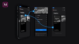
Neumorphism or Soft UI Tutorial | 2020 UI Design Trend
Вставка
- Опубліковано 2 лис 2024
- New Videos Every Tuesday & Thursday!
Have a Great Day! Join the Notification Squad: click the bell 🔔
Subscribe: www.youtube.com...
Learn UI/UX Design and Adobe XD 👩💻👨💻(60% OFF)
Learn: www.udemy.com/...
Join the channel and become a Member ❤️
Get exclusive content from me and help support the channel.
Join: / @caleredwards
SOCIAL: @CalerEdwards 💙
Dribbble- dribbble.com/C...
Instagram- / caleredwards
Twitter- / caleredwards
Behance- behance.net/Cal...
Website- caleredwards.com
Hangout on the Discord server! 💜
Discord: / discord
▶ Programs I am Using: Adobe XD
▶ Music: Epidemic Sound 🎹
In this Adobe XD Tutorial video we will look at Neumorphism or Soft UI. I will cover how this design trend looks and how to set it up in your own designs. This might be the best 2020 trend for UI design. Let me know your thoughts in the comments. Enjoy the video :D


With this i make it experiment 15 years before, i make it desgin for web, ecommerce and that was so pure beuty. I think, this is digital way of design and our future.
It has grown on me can’t wait for the full design tutorial
I adds depth on mobile screens. Dark matte color will benefit from this style and is a great way to soften the power of the hi-def screens on our devices.
Thanks for sharing. Happy new year Caler
Hey Caler, Happy New Year. Please share a video on the best UI/UX Tools for 2020.
Happy new year, Caler! ;)
Happy New Year :D
Although I enjoy neumorphism and I use it (mostly with dark modes since it's really hard to get good accessibility ratings with brighter colours using it), I feel like it ends up adding a lot of clutter to the design
I agree, so far with my testing I like using it for a minimal amount of elements instead of it being used throughout the entire design. I feel like It is a good way to draw attention to specific elements this way.
@@CalerEdwards I personally only like to use this effect for smaller elements of my design such as buttons or frames, rather than each element extruding from the background. I really like the design, some people are just going a little overboard.
Happy new year! Thank you for everything Caler!
Nice one Caler!
What about xenomorphism?
Cool! Clear, light and fancy!
Thank you!
I really like the style however I really don’t think it’s going to be used in production project. What do you think?
I believe you are correct because this style would take a lot of time to implement for accessibility, so most companies will stay away because of that. But a few might put the time and money in to it and find how they could use it in their designs/products.
@@CalerEdwards Check CRED App play.google.com/store/apps/details?id=com.dreamplug.androidapp&hl=en
Great tutorial nad great channel! Thanks for you content m8
Thank you for the upload x
3:56 You can add a glow (basically just a colored shadow) to the circle graph/chart to make it neumorphic.
great explanation bro
Nice tutorial, thank you
I like the look. Cards was starting to get old. I do like it better in the dark themes though because the light and dark drop shadows seem to be just that more visible making the shape really pop. On the light backgrounds the lighter drop shadow is often so hard to make out that you don’t get the 3D effect and then it looks like we are back to flat design.
I'm working on a world editor for Survivalcraft (similar in Minecraft) and I plan on using neumorphism in it
Saw this trend on Instagram or dribbble, applied on a simple app “Corsa VPN” at App Store and now I see this everywhere xD
Good trend for one time . Everyone “must” make it for one of their apps xD
Meanwhile in Figma you can apply as much drop shadows as you want. :) Great tut.
Can you please show me a complete mobile ui any full page with figma?
hey i just luv ur channel and also i want a video on "how to get reviews on your work" like i don't know how to post my work in dribble or behance
awesome i am building someting using this
How to create inner shadow Neumorphism in Adobe Xd
Waooo l love this Tutorial one of my favorite Tutorial! Plz plz More Videos about this
Great one, thanks
I love this trend but ppl were talking about the different screens people have and how it might not be good
Yea accessibility would require a lot of testing to ensure it looks good. I want to do some testing myself to see how it can be used correctly.
What about a collection of micro interactions in AE!?
You didn't talk about inner shadow.
How do we pick colors shades for the main object color
I select the mid tone first and go slightly lighter and darker for other two. From there I adjust till I like the effect. I did see an article that you could use a color blender to make this easier, but I have not tried it yet.
Can you find a link to the article?
Nice video ! But isn’t is hard to code that kind of Ui ?
I wouldn’t say hard but the developer might not enjoy it lol. I would just use the same styles for all the elements and add classes to adjust each element at the end to speed it up.
It really isn't that hard. You can just add a box-shadow to the element you're working with and it allows you to choose multiple shadows.
Also, make it a variable and you can basically use it to any element
It is no problem as long as you only use shadows and gradients. You can do very complex styles with it.
interesting! thank you
It looks beautiful but I don't think the trend will stay very long because it isn't practical for big projects
That's great!
For neumorphism, why use 2 elements? Instead use inner shadow and drop shadow
Interesting
WHY ADOBEXD DOES NOT HAVE A JUSTIFY BUTTON :(((
I personally don't really like the style. It feels sloppy sometimes, compared to the modern tight designs that I'm used to.