What's the Right Image Size for your Website
Вставка
- Опубліковано 30 тра 2020
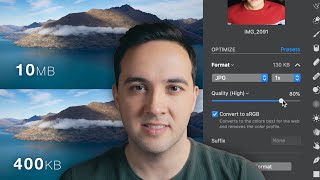
- When replacing old images on your website with new ones, it is important to make sure the images you add to your website are the right dimensions. Here are three ways to help you figure that out.
IN THIS PLAY LIST
1. What is of Image Optimization - • What is Image Optimiza...
2. What is the Right Image size for your Website - • What's the Right Image...
3. How to Edit Images for your Website [Pixlr.com] - • How to Edit Images for...
4. How to Add Images to your WordPress Website using Elementor - • How to Replace and Add... - Навчання та стиль
![How to Edit Images for your Website [Pixlr.com]](http://i.ytimg.com/vi/a-VWWuQSy44/mqdefault.jpg)
![How to Edit Images for your Website [Pixlr.com]](/img/tr.png)


Thank you, I was searching for this for long time.
Thank you, very helpful. I was hoping you would also show how to make an image to fit the size I need. Do you have a tool recommendation?
I made this video, it may help - ua-cam.com/video/a-VWWuQSy44/v-deo.htmlsi=MEF-ERa5LYP_QuoU
Thank You, Sir
Thank you!
Glad is was helpful.
tried scrolling over images on apple website posts but was not getting the intrinsic value, just rendered size for some reason, using chrome
Oh, well you can use the intrinsic value as a guide to the aspect ratio (dimensions) and then just make the image a bit larger to be sure it looks good on larger screens.
So if I had a grid system I should not use an image with huge width and height but only has a mas width of what it could reach in the grid syatem of the large screen so I could reduce aome of the data insted of using an image with a big dimenstions and then shrink or grow to reaize acording to the reaponsive grid is that right ???
Yes. Some grid systems will auto crop images for you (depends on which plugin/widget/theme you are using). But to ensure best results. Crop to the dimensions you want (1x1, 4x6, 16x9) so it matches the dimensions of the the other images. Then resize it. If you can click the image and it opens in a lightbox, then resize it to a max width of 1920px - that is most common size of desktop monitor. If it doesn't open on click and is just a static image you could make it even smaller. That make sense?
@@Web907 kinda look Iam new to all of this I dont use wordpress or anything like this I code myself by using html and css I did not get to javascript yet 😅
But I had big problems and zero info when it comes to dealing with images on the web or responsively And someone said that you should not use the full width of your image just use a placeholder to know what will be the full size of your rows and columns on the large screens (default image shapes) and then use this as a guide to resize the images of yours to fit becouse if you depend on the grid system responsive way or manually creating a small width and height resizing it by yourself inside the css , then the browser will take much time to load becouse it renders the html first which contains the source of the full width image
Do you get me ?
@@AhmedABD0077 Ah, yes. Unfortunately, I am not that familiar with coding it via html/css, especially when it comes to responsive coding. Every browser is different. I would assume you would use placeholders, and then have them pull in a good quality (but compressed) version of the image. I would recommend trying and image set to 1920x1080 with 72ppi. If you know the image will never be full screen, then try a 960x540. But again, I typically work with wordpress so much of this is done for me. Good luck.
Could you kindly tell me, what kind of theme you are using in wordpress for this video?
That is the Astra theme using the Elementor page builder. Astra is OK. Elementor ROCKS!
What software did you use to screen record?
Camtasia.
this video presumes you already have a container full of images - im trying to work out what my image sizing should be so I can create my container
Yes, this is more of a "reverse engineer" approach. For creating a new container you'd want to know if the container is going to be full width, or if it is just a column within another container or what. Assuming it is full width then the standard size for an image is 1920 pixels wide. Then just do math from there (1/2 column container would be about 800-1000 pixels wide, etc). But keep in mind most web page builders will make the images responsive, so they will adjust their size according to the device they are being displayed on. Hope that is helpful.
@@Web907 thanks. How does one find out the width of their device?
@@alexanderson1193 Every device is different. You never know what the visitor will be viewing with. But there are standards. For the most part design for a standard desktop 1920x1080. Most page builders (whether you are using Wix, Squarespace, Weebly Elementor for WordPress, etc.) will automatically resize the site and images based on device viewing it. What are you using to build the site?
@@Web907 you should make a video on it. i come up to this video to seek solution of this problem.