Great video! 10 mins of your work takes me hours😂 I'm just starting out on my UX design journey, and I really like your style of tutorial, please upload more🙏🏻
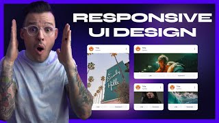
Hello :) I've been struggling to make my desktop design responsive and I've been following every step in this video. However, you created a mobile design on Figma, not a responsive design, right?
I love your videos, and they are really helpful, but the music in the background is irritating and distracting. Maybe in the future you could leave out the music or choose music that is not as distracting. Just a genuine request from someone with adhd. Keep up the good work!
Great video! I'd love to see how you would create a longer landing page, what type of styles/components you setup or import for a typical project... etc.
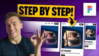
Congrats and thank you for this amazing video! I have some questions to do about your mobile design. For this hero, don't you think that the image in the background might work better if you use absolute position and put some top padding on this autolayout to adjust the position of the other elements? About the CTA, don't you think that buttons needs to appear in the first view of the user? Usualy when I prototype a hero section, I set the frame as 360x640 to consider the smallers screens.
Hey! Yes those are some good opportunities as well. If we set the object in the background it might cause some contrast issues which is why I opted from adding it on top. On the buttons, that could also be a good thing to explore! I designed this imagining anything inside that frame was above the fold, so 100%
That's one way of doing it and then adding a dark gradient overlap on the hero image that would make the texts stand out more. As far as the CTA buttons, one way to handle that on mobile is to make them fixed positioned to the bottom. Another cool trick you could do is to use the sticky positioning, which would have the exact same effect as the fixed position until the user scrolls to the bottom. This is a popular technique if you were to have a large footer at the bottom and whenever you hit the footer the buttons will scroll up and the footer content will begin to scroll up
I'm curious if there's a way to create this functionality at the component level? Container queries are possible now in CSS and built for this exact thing. If you know of a way please make a video! I've searched but couldn't find anything on it for figma
I think I do understand and I am struggling with making that work in figma, but no luck so far. seems like there is no way to have it all stacking automatically the way you want by simply streching the desktop to mobile.. if thats what you were reffering to? It can, for really simple desing, but this one still needs to be rearanged and tweeked to show how it turns into mobile or tablet as well.
@@jeremygarcia2083 now I am not sure what do you mean? you need to build autolayout in a way to be able to adjust automatically, but it works for really simple blocks and pretty useless if you ask me.


How would you have done this design? There's no wrong answer!
What's the hotkey for xray mode?
Shift cmd/ctrl X!
Too much confusing
Great video! 10 mins of your work takes me hours😂 I'm just starting out on my UX design journey, and I really like your style of tutorial, please upload more🙏🏻
More coming 💯
Great video explaing design on Figma , however the title is misleading - you created a mobile design on figma not a responsive design on figma
hey, sorry I'm having trouble understanding
@@ArnauRos do you mean by responsive the ability to simply go from desktop to mobile with only reducing the width of the artboard?
Hello :) I've been struggling to make my desktop design responsive and I've been following every step in this video. However, you created a mobile design on Figma, not a responsive design, right?
Something I was struggled, hopefully next time I won't. Thanx man.
Glad it helped :)
I didn't know figma had outline mode, that's so helpful. thanks
Happy to help!
I love your videos, and they are really helpful, but the music in the background is irritating and distracting. Maybe in the future you could leave out the music or choose music that is not as distracting. Just a genuine request from someone with adhd. Keep up the good work!
Great video! I'd love to see how you would create a longer landing page, what type of styles/components you setup or import for a typical project... etc.
Congrats and thank you for this amazing video!
I have some questions to do about your mobile design.
For this hero, don't you think that the image in the background might work better if you use absolute position and put some top padding on this autolayout to adjust the position of the other elements?
About the CTA, don't you think that buttons needs to appear in the first view of the user?
Usualy when I prototype a hero section, I set the frame as 360x640 to consider the smallers screens.
Hey! Yes those are some good opportunities as well. If we set the object in the background it might cause some contrast issues which is why I opted from adding it on top. On the buttons, that could also be a good thing to explore! I designed this imagining anything inside that frame was above the fold, so 100%
That's one way of doing it and then adding a dark gradient overlap on the hero image that would make the texts stand out more.
As far as the CTA buttons, one way to handle that on mobile is to make them fixed positioned to the bottom. Another cool trick you could do is to use the sticky positioning, which would have the exact same effect as the fixed position until the user scrolls to the bottom. This is a popular technique if you were to have a large footer at the bottom and whenever you hit the footer the buttons will scroll up and the footer content will begin to scroll up
😮
:O
Great video! But it's a tutorial, take it easy next time I find it hard to keep up because you didn't cover it well
Noted!
How can I enable X-ray mode? Thankssss
shift cmd/ctrl X
Which is better Figma or Webflow?
Both are different tools, figma for design, webflow for front end :)
Very underrated channel. You make me learn more clearly than other UA-camrs. 😇
How is it underrated?
People, please stop using the word underrated. you do not know how to use it. This is not a good use of the word.
I'm curious if there's a way to create this functionality at the component level? Container queries are possible now in CSS and built for this exact thing. If you know of a way please make a video! I've searched but couldn't find anything on it for figma
hey, not sure what you mean here
I think I do understand and I am struggling with making that work in figma, but no luck so far. seems like there is no way to have it all stacking automatically the way you want by simply streching the desktop to mobile.. if thats what you were reffering to? It can, for really simple desing, but this one still needs to be rearanged and tweeked to show how it turns into mobile or tablet as well.
@@lunatico981 I´m curious. Not all designs adjust automatically, right?
@@jeremygarcia2083 now I am not sure what do you mean? you need to build autolayout in a way to be able to adjust automatically, but it works for really simple blocks and pretty useless if you ask me.
what about tablet
it would be a smaller version of desktop basically
Are there any sites that provide these type of 3D images that we see in the hero section ?
Specifically these type of abstract designs I wouldn't know, there are some 3d designs marketplaces but not this style
can you tell us please where you got this exact image from that you use in the video? the swirly bg image, thank you @@ArnauRos
I really appreciate this chill and concise teaching style
I appreciate that!
Love this! 🔥🚀
Glad you like it Contra, good to see you here again you guys are doing great work!
@@ArnauRos of course! We love your content 💛
"Sorry, but how are you doing? You are not telling properly.