CSS Flex-wrap | Learn CSS with Animation

Вставка
- Опубліковано 9 лют 2025
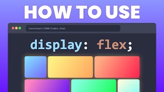
- flex-wrap is a CSS property used in flexbox layouts to control whether the flex container should wrap its items onto multiple lines if they can't fit in a single line.
`nowrap`: Keeps items on a single line, allowing overflow.
`wrap`: Permits items to wrap onto multiple lines if needed.
`wrap-reverse`: Enables wrapping onto multiple lines in reverse order.
Syntax 👇
.card {
flex-wrap: nowrap | wrap | wrap-reverse;
}
#CSS #Flexbox #WebDesign #ResponsiveLayout #FrontEndDev #shorts


Very neat explained
Save kese kren
Keep doing this