Create a Responsive Grid System for Web & UI Design | Figma Tutorial

Вставка
- Опубліковано 27 вер 2024
- In this video, I'm going to show you how to create a responsive grid system for your web and UI/UX design projects in Figma fast.
Remember to subscribe: bit.ly/3US49pf
👉 Become a UI Designer with my UI Design & Figma Mastery course:
bit.ly/43v79vX
👉 Get my FREE UI/UX Design e-book here:
bit.ly/3MRfDrz
📸 Instagram: / uiux.arash
Who is Arash Ahadzadeh? Well, I'm a UI/UX designer and a university instructor with 7+ years of experience, and I teach people how to design great user interfaces and experiences. I've helped over 30,000 students become UI/UX designers from scratch worldwide.


👉 Become a UI Designer with my UI Design & Figma Mastery course (17+ hours and 130+ lessons):
bit.ly/43v79vX
@DesignWithArash Please organize the playlist in a order from beginning to advance. Thanks
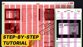
Desktop
Columns - Count = 12, Gutter = 32, Margin = 160, Type = Stretch
Rows - Count = 1000, Gutter = 8, Height = 8, Type = Top
Tablet
Columns - Count = 8, Gutter = 16, Margin = 32, Type = Stretch
Rows - Same as desktop
Mobile Columns - Count = 4, Gutter = 16, Margin = 16, Type = Stretch
Rows - Same as desktop
I'm blown away with the clarity and informativeness of the tutorial
Glad to hear that.
THIS IS THE ONE MOST EXPLAINED VIDEO I HAVE EVER SEEN SO FAR IT WAS SO HELPFUL
Hey Arash, I appreciate the amount of effort you put into making your videos. They are of the highest quality, detailed, well explained and easy to follow. You teach really well. Keep it up brother. Great stuff!
Glad you like them! Thanks a lot.
"I'm super excited to watch this video! A responsive grid system is like the backbone of a well-structured design, ensuring that everything falls perfectly into place, no matter the device or screen size. Figma is a fantastic tool for designers, and learning how to set up a responsive grid system in it is a game-changer.
Thank you.
I don't like videos, because I use the like button as a playlist, but I'll leave a comment, to boost UA-cam algorithms for you, because you deserve it. Good video.
Thank you so much. I hope you found the content helpful.
I've never see such type of explaination on anyother channel.
Just WOW 👋
Thank you so much.
Even for the most simple points you deliver so much value! Congratulations for such quality!
Thank you very much, I am a web developer and just got interested in designing my own interfaces from scratch, this is very helpful!
No problem. Glad it was helpful!
Thank you Arash, it was very helpful to set up the responsive grids for cross-device UI design. That homepage page you used in the example is pretty awesome, please make a tutorial on how to design such a clean and intuitive web design in Figma. Many thanks!
No problem. Glad it was helpful! Sure. I’ll keep that in mind.
The best tutorial on Grid systems. You saved my life😩
Glad it was helpful!
Your speed of explanation, the way u walk thru the designing task it great. It helps to grasp the concept easily. Other tutorials are too fast or they miss out the in between steps
Teachs more than a course in minutes! Insane and kick-ass content!!! 🤘 🤘
Thank you so much.
Dude, that's awesome. You covered all of my questions with well, detailed explanation, keep going!
Thanks dear Fatemeh. Glad it helped.
Thanks a lot for your video. Thanks to it, I was able to complete an assignment for a UX design course at university =) Everything was very clear and easy to follow =)
No problem. Glad it helped.
Hey Arash, I have got a lot of inspiration and learned many different things about UI design from your videos. Now i really feel interest in UI design. I need an internship right now as this will be counted as one of my courses in my University.And with the internship done i will complete my graduation.
I barely comment on videos but arash you are exceptional WOW
Thank you so much. That's so nice of you.
Great video! Good length and not a wasted second, all info was significant and well explained.
Glad you liked it!
Best Grid System tutorial ever my friend. Thanks!
Thank you so much. Glad you think so.
Clear and concise. Best video on the subject. Thanks
Glad it was helpful! Thank you.
easy to listen and understand. for noob english like me. thank u so much ❤
No problem.
Great video Arash! Very helpful explanations of the role of grids in responsive & consistent web design. I particularly enjoyed the recommendations on gutter, margin, container sizes for each frame. A very useful starting point :)
Thank you. Glad it was helpful, Tamara.
You are awesome. This was really helpful guide for Figma. Thanks a lot.
Thank you. Glad it was helpful!
Thank you. Your videos help me a bunch 🙏
No problem. Glad it helped.
Arash, you're the best! Addressed all the points I needed to hear about! Thank you again!
Thank you so much. Glad it helped.
Thank you, my friend. You have the talent to explain.
I appreciate that! Thanks.
Ur videos are so valuable and to the point..Thank you!
Glad you like them! Thanks.
best explanation of grids .
Thanks.
Bro, you're simply the best! Thank you so much for your tips. You teach very well! Best regards from Brazil
I appreciate that!
This is a fantastic tutorial, explains the website concept and grid system very well. A must-watch for my students, so that I don't have to talk so much :D
Great work!
Thanks. Glad you found it helpful.
I love the way you're teaching. very clear and useful. Damet garm Arash jan. go ahead man.
Thanks a lot. Ghorboonet 😃
@@DesignWithArash mokhlism ghorban. Haha
Your channel is like the best for me so far
Thanks. Glad you liked my content.
Hello Arash! From Brazil and loving your great great content! Thank you so much for all your effort n time. Have a nice week and wonderful day!
Hi. Thank you so much. Glad you liked my content. Have an awesome day.
Thank you for making your tutorials so easy to follow
Great video!! Congratulations! 👏
Thank you!!
A really good explanation, thank you!!
Glad it was helpful!
Answered a question Ive had for months about layout!! Great video!
Glad I could help!
Really nice video, thx for your work. Greetings from Argentina.
No problem. Thank you.
Hey Arash! This video was everything I needed! Thank you.
Hi Faranak. Glad it helped.
I like the image goes outside of the grid
Thanks.
so valuable for me thanks a lot for your effort arash
Glad to hear that.
Thanks for such good content you did =)
My pleasure!
explained perfectly understandable. Thanks☺
You're welcome 😊
The best video I've ever watched on youtube about grids and sizes. Congratulations! 👏
Glad you liked it! Thanks.
Wow, amazing video, clear explanation, thankyou!
Glad it was helpful!
Wow. Allyour tutorials are so well explained. Thanks!!!
Glad you like them!
Thank you so much Arash, learned a lot from this tutorial, many thanks
No problem.
Respect button🙏
Thank you
Thank you so much Arash! This is a very helpful tutorial.
You're most welcome!
Thanks for describing every single detail in the process. Great and Helpful Video.
No problem.
Easy and on the point
Thanks.
This video is pure gold! Thank you.
Thank you so much.
this is great !thank you so much all my question are answered!:)
No problem.
Thank you so much for this piece, it was really very helpful to me. I just subscribed yesterday and I am loving it.
GOD bless. ❤️
No problem. Welcome to the channel.
Thats really helpful tutorial video for designers :)
Thanks. Glad it helped.
kamal kr diya babbeeee.....chas a gye a
you well deserve the like and subscribe dadash :)) that was very informative! thanks!
Thank you so much. Merci.
Question about responsiveness: When it says it is responsive, does the spacing between elements (cards, buttons, title and text, etc.) remain the same size or vary proportionally?
hello arash i wish i can subscribe more than once 😀 on your channel, bro you are one of the best tutors i have on youtube, you keep impacting many lives god bless you for that .
Hi. Thanks a lot. I appreciate it. Welcome to the channel.
Thank you so much Arash! It was very helpful! 🙏
My pleasure 😊
Awsome !!! Thank you for sharing your knowledge. So well explained !
Glad it was helpful!
thank you very much! this is very helpful
No problem. Glad it was helpful!
thanks Arash for this
No problem.
Great tutorial!
Thanks.
That's really amazing 😍
Thanks.
Thank You, this is very helpful
No problem.
Thank you so much. I hope you get tons of subscribers soon! :D
You are most welcome. Thank you.
Very helpful video, thanks! :)
Thanks.
Thanks for your content!
No problem.
Awesome tutorial. It was handy and helpful. Keep doing so great. Thanks!
Glad it helped! Thank you.
Hey, nice video, But always try to set grid layout according to bootstrap as many developer use that only and there should some max-width for 1400px like it's 1320px max width for it, for 1200px it 1140px. Like this your design can make more sense for developer to make and QA to run test. And if you will resize your container will not resize, so can you make how to resize your containers
thankyou, This has cleared my lots of doubts
No problem.
Could you please tell me why Desktop Frame of Figma is 1440 and not 1920? I mean most users use 1920x1080 resolution and when they open the website then the website will be in 1920. Now if you say we use 1440 then you are designing something that will not be used by most users.
That's not how it works because we don't design for that dimension only. We will design another frame for a larger resolution (1920) with a different grid. So we usually design two desktop frames (one small and one large).
YOU ARE AMAZING!!! thank you so much!
Thank you very much.
سلام آرش عزیز
حالت مرکز و چپ و راست بیشتر برای چه طرح هایی کاربرد داره؟
Very well described and very helpful. Thank you.
No problem. Glad it was helpful!
Very insightful. Thanks Arash.
My pleasure! Glad you liked it.
Quality content mate. Keep up the awesome work.
Thank you so much. Glad you liked it.
Noted hahaha , thank u for the valuable information sir .
No problem.
amazing tutorial, thanks!!
Thanks a lot. It was complete for responsive.
No problem. Glad it helped.
Thanks man
Thnx for this. its really helpfull
Glad to hear that.
Just Great ! Thank you.
Thank you so so much. This video helped me a lot.👏
No problem. Glad it helped.
Thank you !
No problem.
Thanks Arash this is really helpful!
For the next maybe you can cover about Saas Design/dashboard grid system.. 😁
Thanks for the idea! Sure.
This is a very helpful tutorial.
Thanks.
Glad it was helpful!
Hey there, great video! One question tho, why do you use the 1440x1024 frame for desktop and not the 1920x1080 since it's the most used screen size?
Hi. Thanks. Usually we don't create a fluid layout for the 1920px screen's width. We usually create a fixed layout grid for such a large dimension. It's safe to design a project using a 1440 wide screen because you can easily make it adapt to larger and smaller screen sizes.
You've explained it so much better than my UI teacher 🥲 Thank you so much, this was incredibly helpful!
You're very welcome! Thank you so much.
@DesignWithArash Please organize the playlist in a order from beginning to advance. Thanks.
Thanks a lot dear❤
No problem 😊
Straight to the point, 100% understandable = sub!
Glad you liked it. Welcome to the channel.
HI Arash ..How you calculate your Margin 160 for container size 1120...my question is how to calculate margin size based on container size ?
I have a question. How does this 8pt grid system work with texts when you have not only column grid guide but also rows of grid guide?
If I prioritise 8pt system of padding and spacing, it doesn't follow the baseline of the rows which I made with 8pt height. It is because if we hover the element it shows the spacing from the text box not the text itself.
I think it all matters of which I chose but I would like to know the standard way of doing this and your suggestion. Thank you for the great tutorials!
Well, if you use a 4pt baseline grid and you make sure that the text leading is divisible by 4 as well, then your text will be aligned perfectly with your baseline grid but keep in mind that it is not a must.
Very helpful, thanks man
Glad it helped.
very usefull. Thanks!
No problem.
Nice video, thanks👍
No problem.
Clear and concise
Thanks.